An Oasis in a Sea of Sands
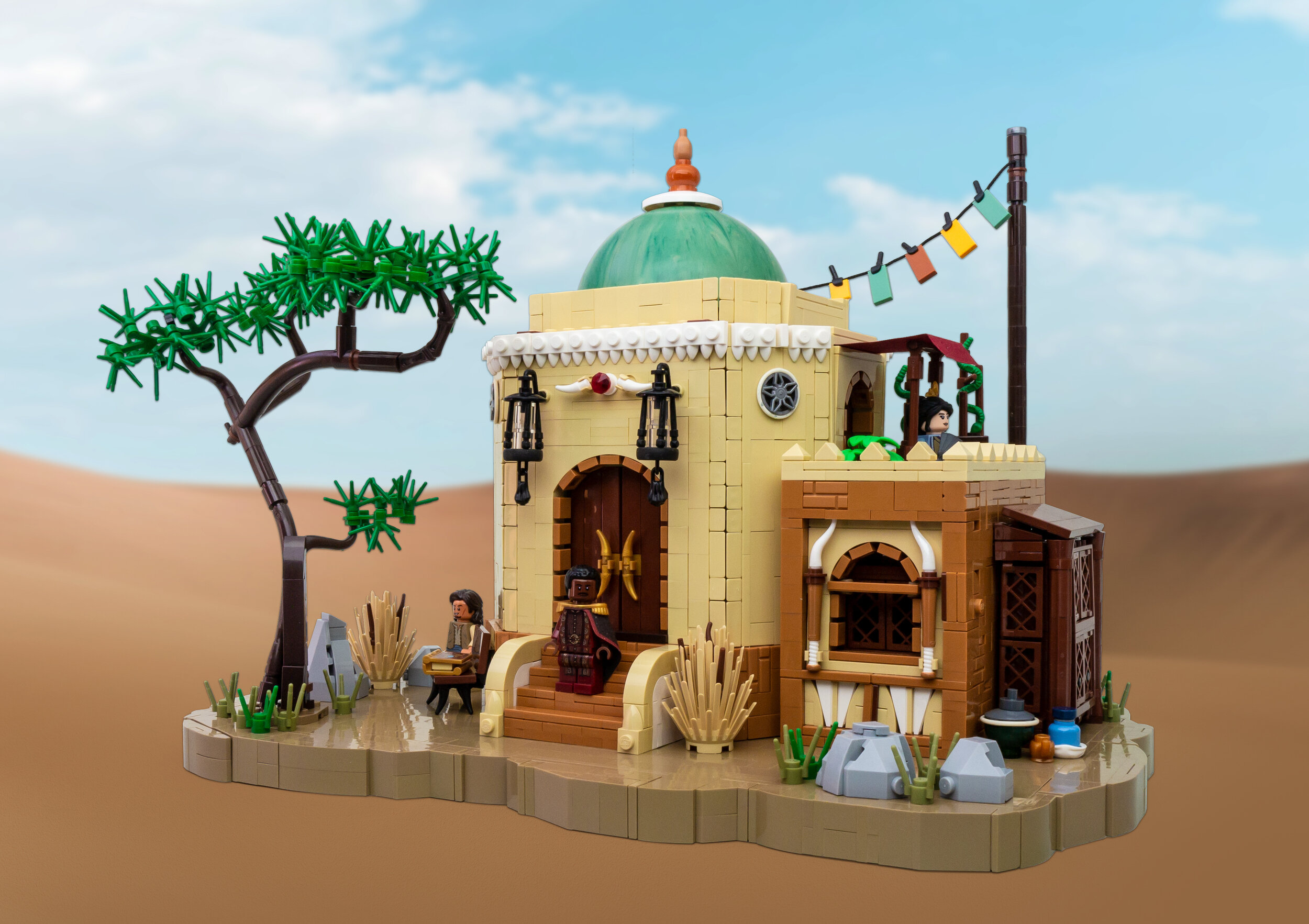
/It is rare to see LEGO builds that stray off the beaten path, especially in a theme as established as Castle. Marcel V’s (Flickr / Instagram) latest medieval fantasy domicile though does just that, and takes us into a fantastical Middle Eastern setting and swaps the stereotypical lush backdrop for a sea of sands.
I fell in love with it right away. Its perfect composition, details, and of course the interesting texture work makes for something that deserves a closer look.
Naturally, I wondered how it came together, and thankfully Marcel was happy to oblige:
I’m into artworks—doesn't matter if they are from games, movies or made up fantasy artworks. I like to scroll through those on platforms like Reddit or Pinterest.
Concept art is definitely something I rely on myself, but what I found interesting was what he said next. While most builders—me included—build rather organically, Marcel instead has a very methodical approach:
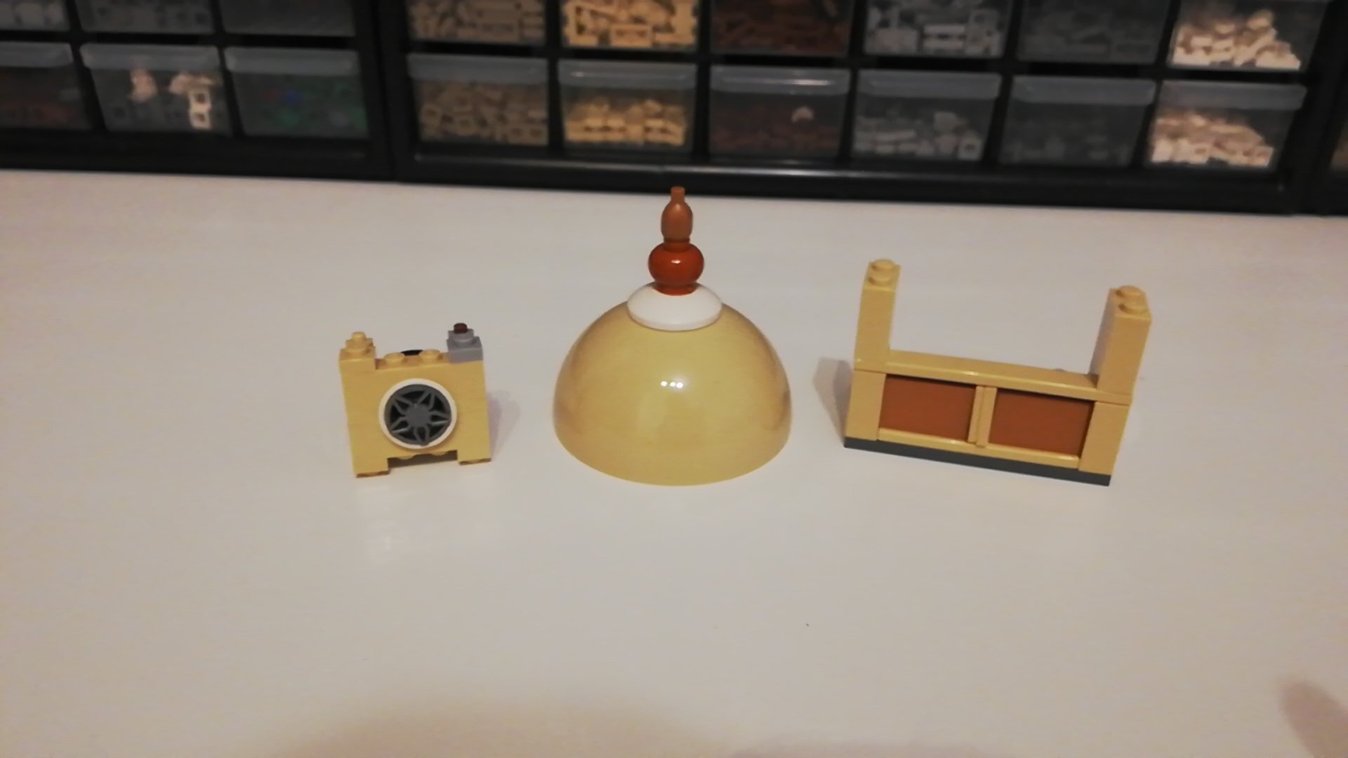
At the beginning of the building process I plan the general layout using a scribbled ‘blueprint’—think about the main colors and sketch some details like windows, a roof or other major details, which should stand out in the final build.
He was also kind enough to share an early work-in-progress (WIP) image that is simply a collection of little details and ideas that would later become part of his beautiful abode:
But how does all of this come together? The core looks fairly complex with angled walls seamed by cheese slopes, resulting in interesting geometry while also providing additional texture on the otherwise fairly plain main building.
The walls are a mix of snotted segments (at the “corners”) and regular walls with studs on top. The snotted segments rely on a inversion so that I could attach cheese slopes on both sides of the wall. I use the pivot part to invert—one of the most useful parts out there. For octagonal builds in general, I try cheese slope against cheese slope or cheese slope against a tile or brick to create various different angles.
Not pictured there but definitely eye-catching on the final model are the two lanterns that are hanging on either side of the door. Delicate and ornate, they add just the right amount of detail—and one wonders, what kind of sorcery is going on to keep them from falling apart.
I like filigree details, and lanterns have always been a thing. Iconic castle builders like Cesbrick or Derfel Cadarn had great ones. I played around with small black parts (levers, hands, wands, etc.) and found a way to use the rubbery grip of a small tire.
The tires provide extra friction while the dishes towards the top make sure they follow the shape of the cones—simple but smart, my favorite kind of detail work!
But of course, I also had to ask about that unique looking tree that balances the build and adds a splash of color to it:
The dinosaur tail in dark brown is one of my favorite parts (featured in almost every MOC of mine) and I used it to build an Acacia, something I haven’t seen in a MOC with eastern architecture—they typically feature palm trees.
And with all of that we didn’t even mention the lovely texture work on the right, the 1x1 tiles and plates that create a wonderful frame inside the door and window arches, the hidden minifigure baseball bats, or the green snakes on the upper floor that represent exotic plants winding themselves around wooden poles.
There’s just so much going on, and it all comes together to create a stunning and fantastical mansion—something I’d definitely love to see more of!
Thanks to Marcel for sharing some interesting details and for teaching us a thing or two. It’s always a pleasure to step into such an oasis of a build and getting it to share it with our readers!
What is your favorite detail of Marcel’s creation? Leave your thoughts in the comments below.
Do you want to help BrickNerd continue publishing quality articles like this one? Become a patron to show your support, get early access, exclusive swag and more.


