BrickHeadz Blueprints: A Middle Earth Study of Shape and Form
/BrickHeadz—you either love them or hate them. When the LEGO BrickHeadz theme was first announced in 2017, they were met with a very polarizing response among AFOLs. Personally, I fall somewhere in the middle (yes, I know that this directly contradicts my statement in the previous sentence where I made it quite clear that you either love or hate them—just go with it). I think they’re a fun medium, but I’ve never been particularly interested in BrickHeadz. However, I am a massive Middle Earth fan, so when it was announced that LEGO would be releasing several Lord of the Rings-themed BrickHeadz, I couldn’t help but get excited.
This excitement was only magnified when I was given an amazing opportunity to receive early copies of sets 40630, 40631, and 40632 from LEGO (a massive thanks to BrickNerd for the opportunity!). As such, I thought this would be the perfect chance to take a closer look at the BrickHeadz format and figure out what exactly defines the BrickHeadz aesthetic. I then took these principles and applied them to other subjects, from animals and furniture to entire vignettes, to see how the BrickHeadz aesthetic could be expanded to a whole range of subject material besides figures.
The Essential Features of BrickHeadz Figures
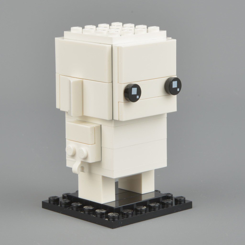
After carefully examining the BrickHeadz catalog, I’ve identified four essential features that really define the BrickHeadz aesthetic: 1) a cube-ular and boxy shape, 2) minimalist black eyes, 3) consistent standards for the legs and arms, and 4) a lack of mouths or noses. While most of these features do have certain exceptions within the BrickHeadz range, they serve as a good basis to work off of.
The blank BrickHeadz figure from 41597 Go Brick Me perfectly demonstrates the essential characteristics of BrickHeadz.
Totally Cube-ular
The first and most important of these features is their cube-like shape. Unlike Angus MacLane’s CubeDudes, They are all built around a central cube, which tends to be 4x4 in size but will occasionally vary. For example, Gollum is only 3x3. However, their cube-like proportions are always the same.
However, it must be made clear that BrickHeadz aren’t limited entirely to straight lines and boxy proportions. Many figures feature complex and curvaceous hair that contrasts wildly with the squareness of the rest of the figure. The Balrog is another great example of this—he’s built around the same cube that all BrickHeadz are, but he’s got horns, wings, and fire added on top of this base, none of which follow the boxy standards of the figure’s base.
All of these heads are built around a simple cube, and yet they’re all incredibly different, thanks in large part to their unique and complex hair or hats.
The Eyes Have It
The second essential feature of BrickHeadz is the eyes. The minimalist black round 1x1 tile with 2 white specks has become deeply ingrained within the BrickHeadz identity, and they don’t look quite right without it. Exceptions to this rule can be seen in several early BrickHeadz sets such as 41585 Batman, but otherwise, this feature has been constant across the BrickHeadz theme for the past few years (figures without eyes, such as 41629 Boba Fett, notwithstanding). That said, you will sometimes see slight variations in the design. For example, the Balrog’s eyes in set 40631 are the same print, but with a yellow background rather than a black one.
Eeeeeeeeeyes
Going Out On A Limb
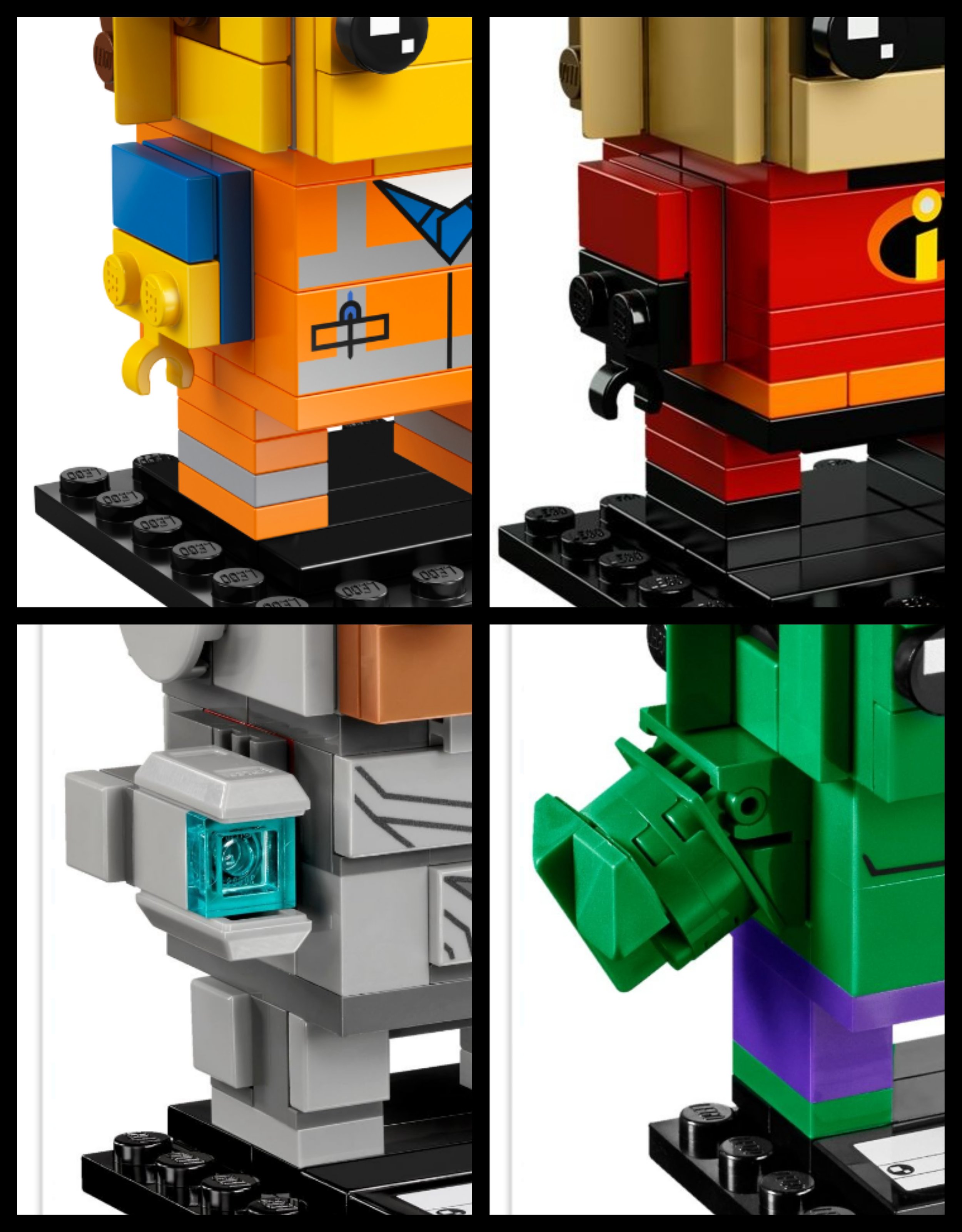
Another consistency across the BrickHeadz range is the standardized arms and legs. The legs are simply built using a 2x4 plate with a 1x2 brick stuck to the bottom at both ends. The arms consist of a 1x2 tile and 1x2 plate with a horizontal clip attached to a 2x2 plate. Examples of both of these can be found below. As with many features of the BrickHeadz, though, there are a plethora of variations on this basic design to match the uniqueness of the various characters depicted in the range. For example, Frodo has shorter legs that are only 2 plates tall, while the Balrog has fire coming off the sides of his legs. Arwen, on the other, hand, doesn’t have legs at all, opting for a dress instead.
And I thought that T-Rexes had it rough in the arm department!
A Blank Expression
The final feature of BrickHeadz figures is the distinct lack of mouths and noses, which is one of the most polarizing aspects of the figures. However (and I’m sure you’re tired of hearing this by now), once again, there are exceptions to this rule on some of the more unique figures in the range. Several figures, including 40272 Halloween Witch and 40420 Gru, contain noses, while 41588 Joker and 40492 La Catrina include mouths. Additionally, a lot of BrickHeadz based on animals such as 40271 Easter Bunny and 40377 Donald Duck contain mouths and noses in order to properly capture their subjects’ looks. Other non-human characters with distinct faces such as the Demogorgon in 40549 and the Balrog also understandably differ in this regard.
Depending on who you ask, the lack of mouths and noses imbues the figures with either a lovable charm or a hollow horror.
Now I know that I just listed off about a bazillion exceptions to all of these supposed principles, so you might be wondering what the point of these principles even is in the first place if you can get around them all so easily. One thing I discovered during my own experimentations is that, while you can make exceptions, you can only make so many before it becomes too many. The general rule that I ended up developing is that, as long as you use the first principle (it must always be built around a cube) in combination with any one of the other principles, it will probably work. However, you always need a minimum of two of these principles in play. That said, the more of these principles used, the better.
Testing the Limits of BrickHeadz Figures
Now that I’d analysed the essential features of BrickHeadz, I wanted to see just how versatile the BrickHeadz structure was by creating some of my own BrickHeadz based on some more unique non-humanoid character designs. BrickHeadz are a very different style from what I typically build, so I found myself having to constantly remind myself to trust in the BrickHeadz principles rather than following my natural instinct.
Shaping Shelob
Keeping with the LOTR theme, I decided to start by trying to recreate Shelob. While LEGO has tried its hand at BrickHeadz animals several times, most of them have maintained a humanoid posture, so I thought a giant spider would be an interesting break from the usual BrickHeadz fare.
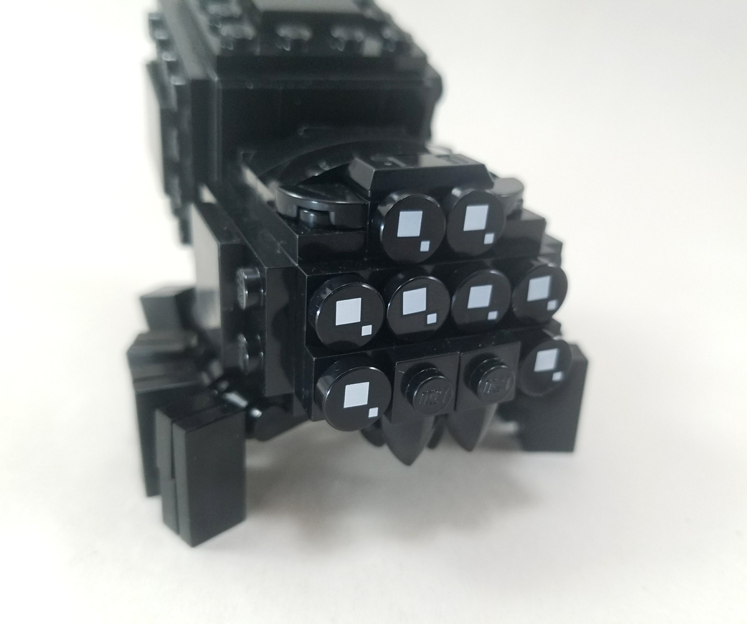
Shelob
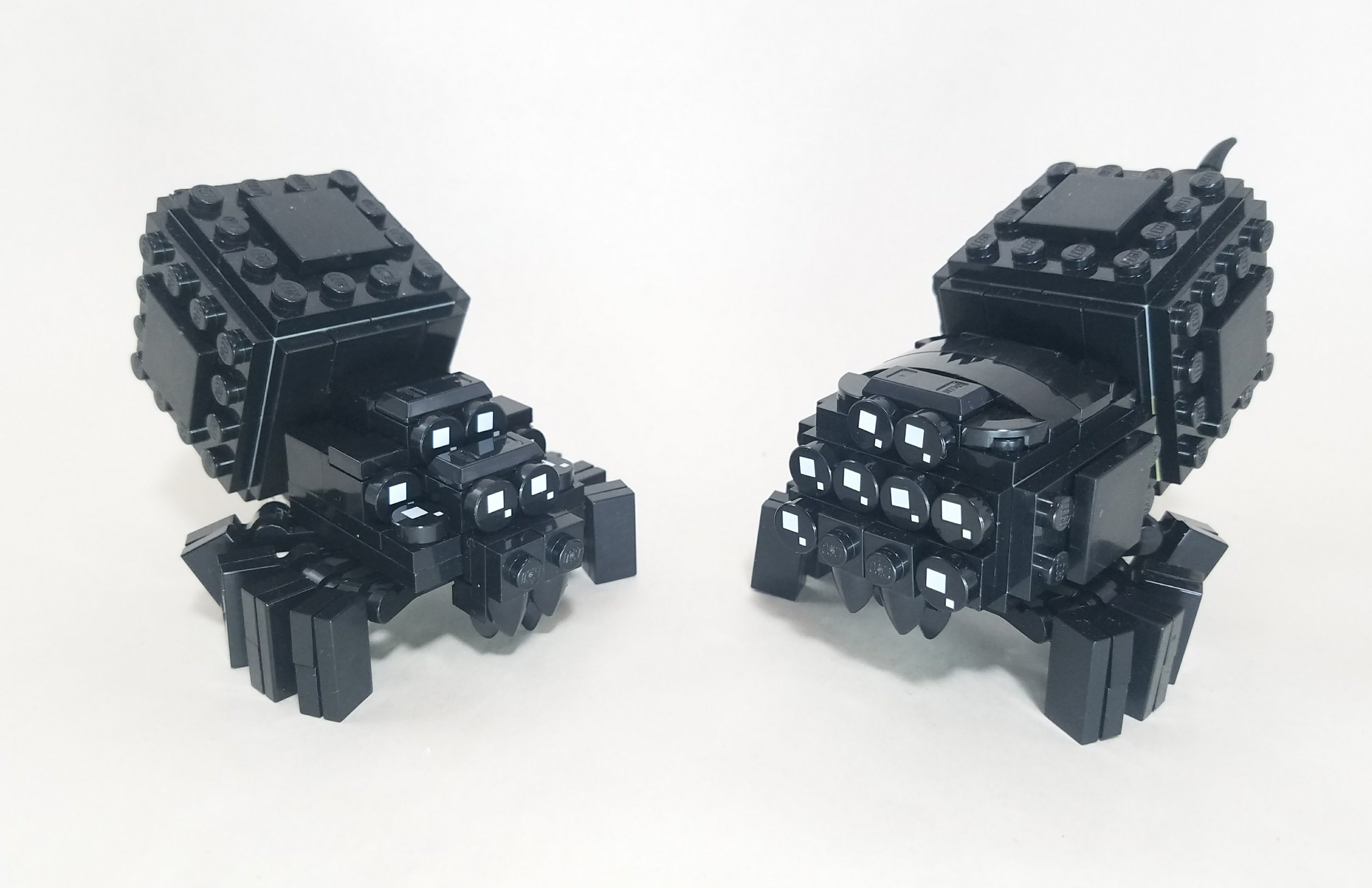
My original attempt was… less than successful. The biggest problem was that it didn’t properly capture the BrickHeadz aesthetic. The legs and thorax looked pretty good, but something was off about the head. I had failed to implement the first principle of BrickHeadz figures—everything must be built around a basic cube. I had jumped straight into fancy shaping and forgotten about the foundation. I redid the head, this time starting by building a cube and then adding onto that.
My original attempt (left) and final version (right)
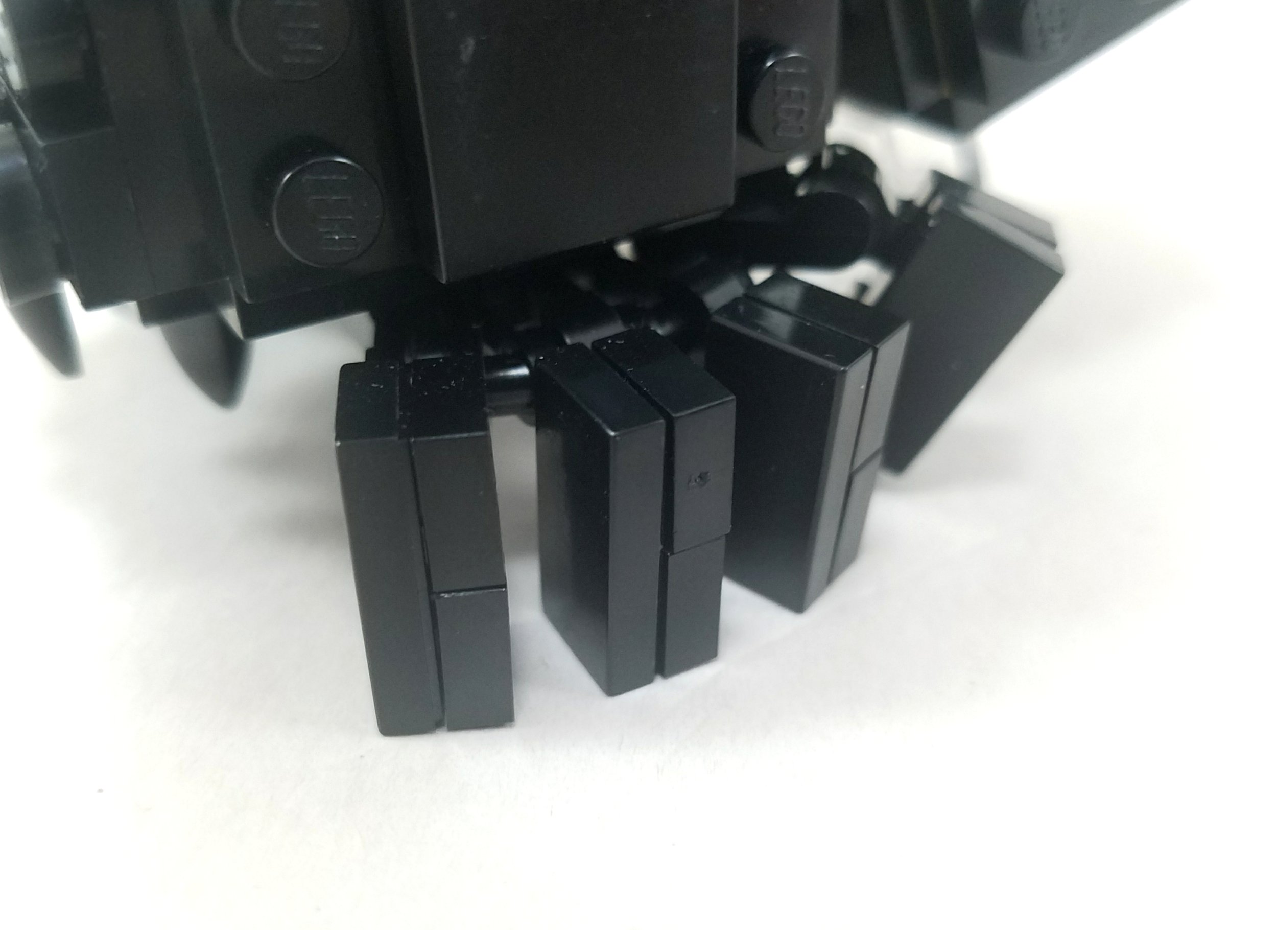
Obviously, Shelob is very different from the typical BrickHeadz character, so not all of the BrickHeadz principles applied here. Being an animal, I did include a mouth (or at least several pincers), and she doesn’t have conventional arms or legs. However, I did try my best to keep with blocky spirit of the conventional figures when creating her legs, and I made sure to use the classic BrickHeadz eye piece for her eyes.
Keep an Eye Out
For my next figure, I decided to build the Eye of Sauron. A giant sentient eye sitting at the top of a tower seemed like the perfect opportunity to see just how versatile the BrickHeadz medium really was. While it is based around a basic 4x4 cube, I wanted to make sure that there was still detail and texture added on top of it to add interest. I’m not sure that it truly captures the heart of a BrickHeadz figure, but it certainly gets the idea across. In that sense I’d regard it as a success overall, albeit one which could use further refinement.
Sauron
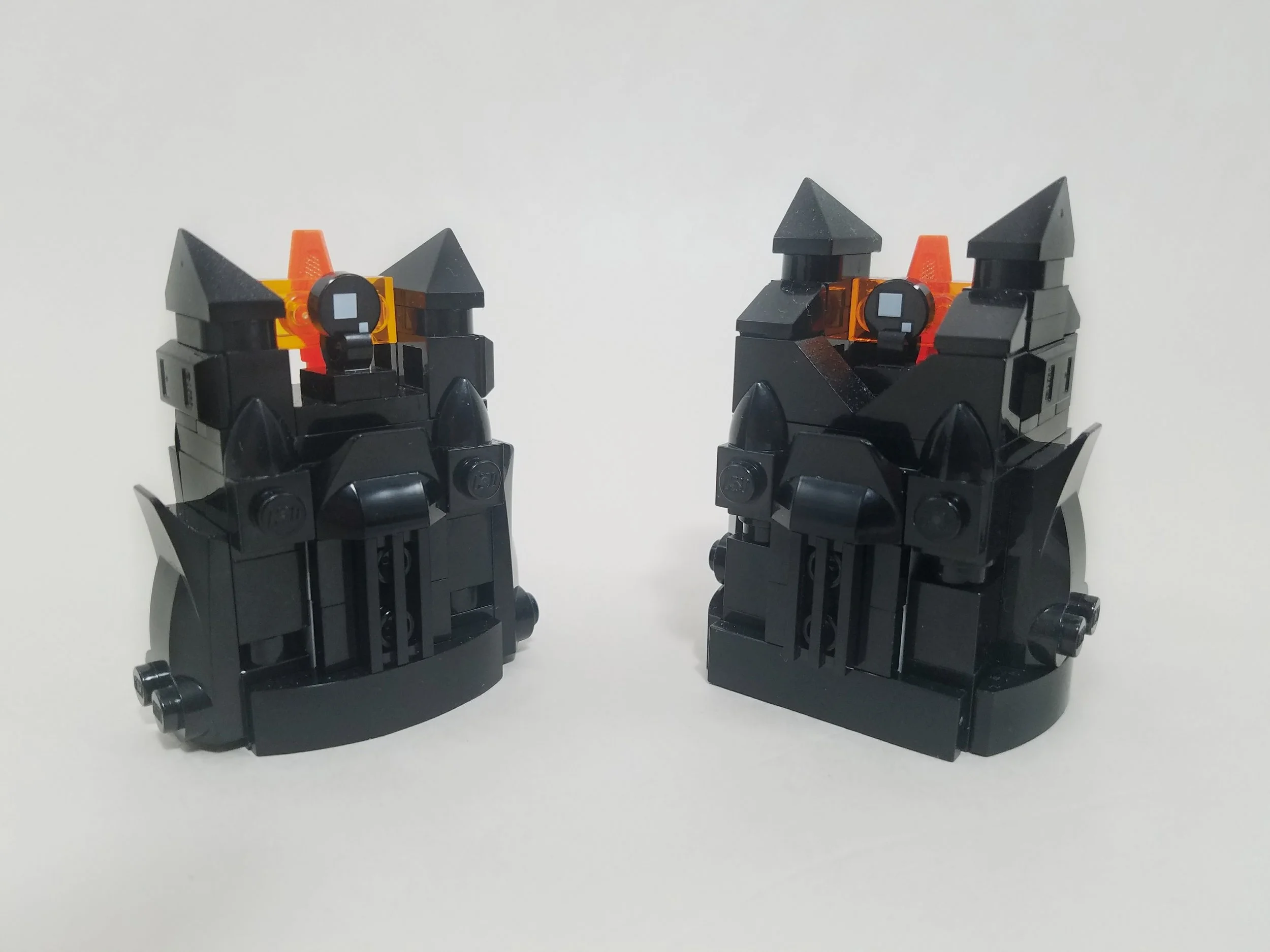
One thing I wanted to test with this model was whether a BrickHeadz had to be a perfect cube or if it would still be recognizable if I built it around a rectangle. I tried building around a 2x4 base first, but it came across more as a generic chibi take on Sauron rather than specifically a BrickHeadz. I then adapted it into a 4x4 figure, which was a little more successful in capturing the BrickHeadz aesthetic. Conclusion: being blocky isn’t enough, it’s got to be a perfect cube.
My original attempt (left) and final version (right)
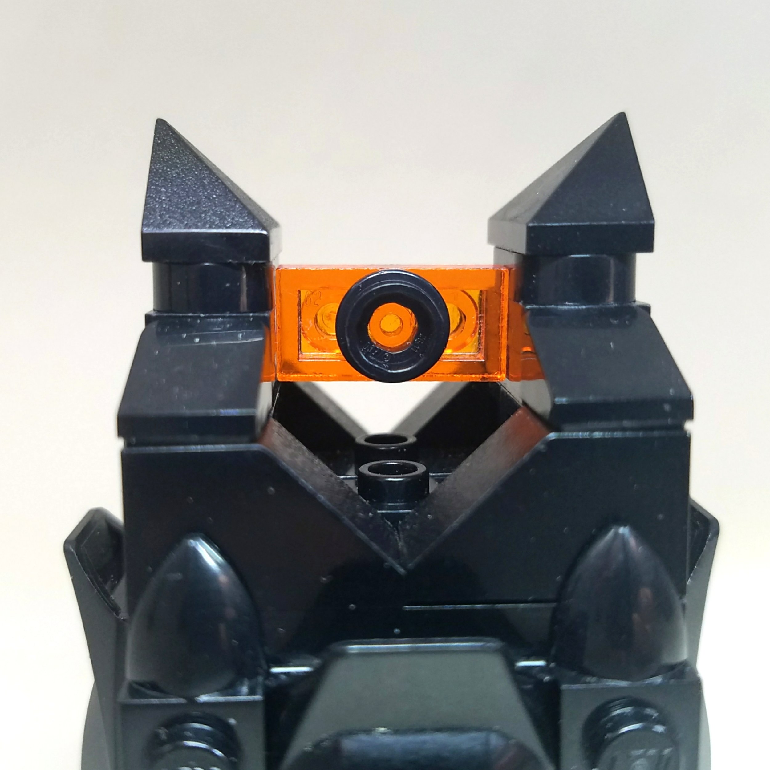
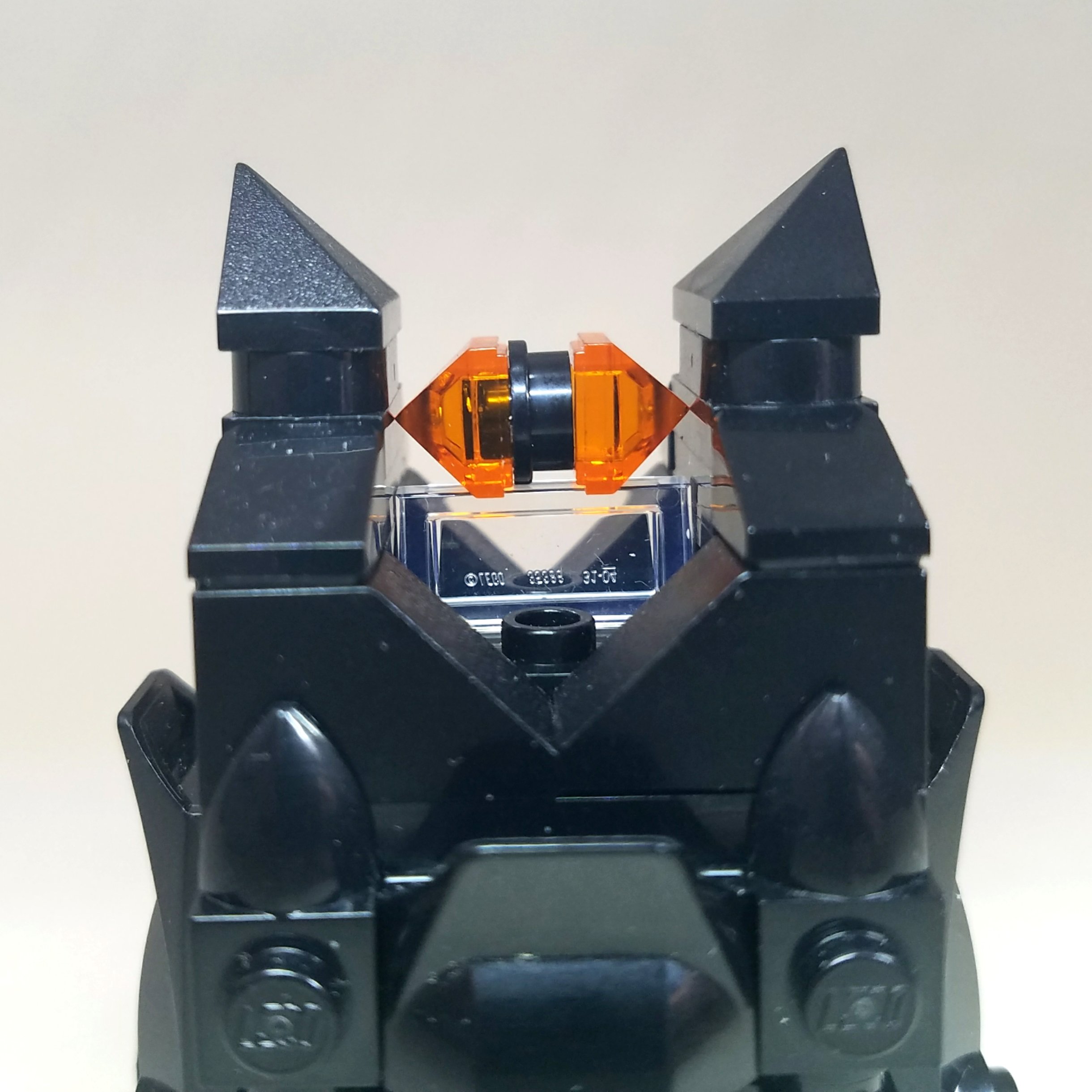
I also tried several different methods of building Sauron’s iconic eye, a couple of which can be seen below. While I think the eye on the right looks pretty good, it just didn’t feel quite right for a BrickHeadz figure. In the end, I ended up using the BrickHeadz eye piece, which really gave it that BrickHeadz touch.
Nasty BrickHeadzes
However, while the BrickHeadz style is remarkably versatile, it does have its limits. For example, take Gollum here. I mean no offense to whoever designed him, but there’s… something very disturbing about him. I’m certainly not claiming that I could do any better. The thin and hunched figure of Gollum simply doesn’t lend itself well to the blocky confines of the BrickHeadz aesthetic, and the result is some weird gremlin-alien-baby hybrid.
Everywhere I go I see him haunting me. There is no escape from the Gollum.
The same applies to the battle droids from Star Wars, Jack Skellington from The Nightmare Before Christmas, and other such characters with thin, skeletal bodies. They simply aren’t compatible with the BrickHeadz aesthetic. A compromise will need to be made either in character accuracy or BrickHeadiness.
Bill Cipher
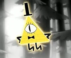
Another limit that the BrickHeadz theme has is in capturing characters that are invariably tied to a specific non-cubular shape. For example, take Bill Cipher, the main villain in the hit cartoon show Gravity Falls. I spent longer than I’d like to admit trying to figure out how to BrickHeadify his triangular shape, but it just couldn’t be done (although I’d love to see someone else try to give it a crack). Admittedly, Bill Cipher is a bit of an outlier and this problem won’t apply to most characters, but it’s still something to keep in mind.
Going Beyond Figures
While LEGO hasn’t touched this area much in any of their official sets, there are a few examples of props appearing across the range. Notably, 40554 Jake Sully and His Avatar contains a BrickHeadz-compatible wheelchair and 75317 The Mandalorian and the Child contains a pram for Grogu. 40541 Manchester United Go Brick Me and 40542 FC Barcelona Go Brick Me each include a soccer net to accompany the figures, while several of the figures in the BrickHeadz Pets subtheme (they really couldn’t have called it Petz!?) contain small accompanying pieces of scenery. While these were promising signs that it is possible to apply the BrickHeadz aesthetic to more than just figures, I wanted to take these concepts and expand upon them even further.
A Porcelain Throne
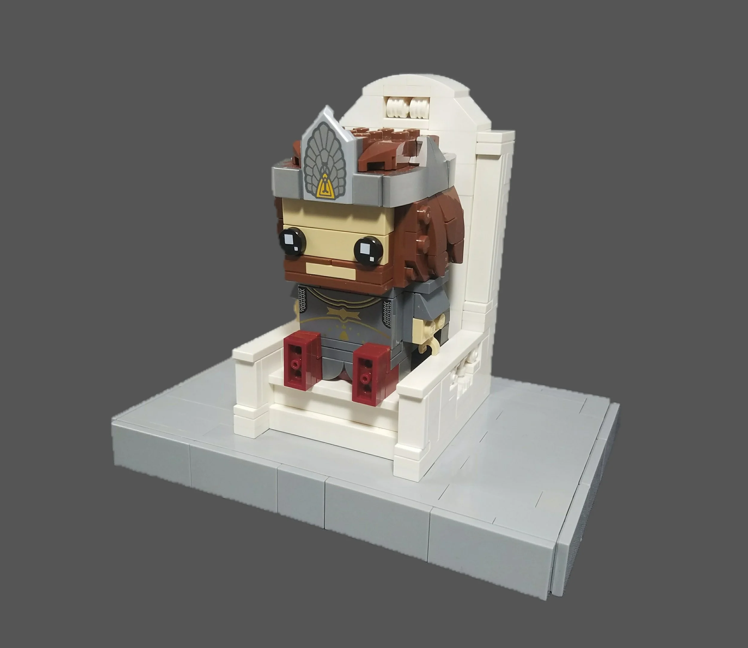
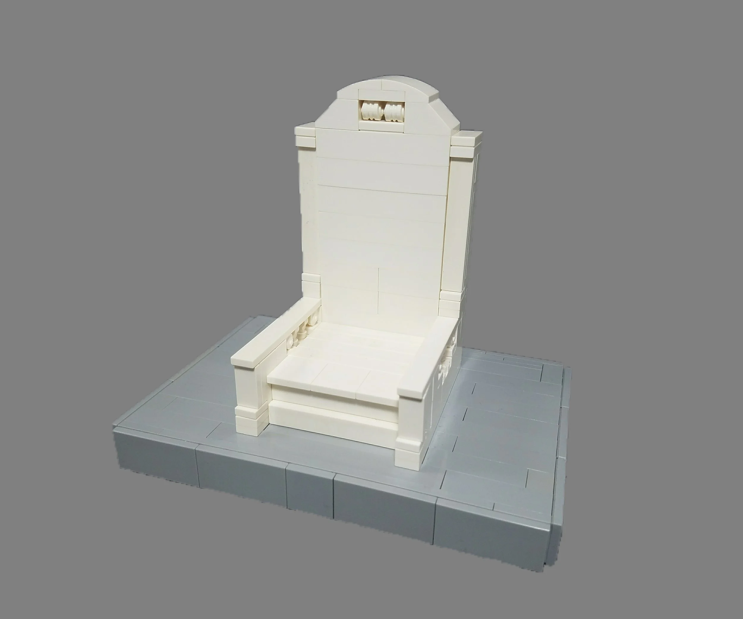
To start, I wanted to try building some BrickHeadz-compatible furniture. The Gondorian throne seemed like a logical model to accompany the Aragorn BrickHeadz, so I set to work and came up with this throne based on the design seen in the movies.
The throne of gondor
The throne design is fairly simple, which made my job pretty easy, with the most notable challenge being several ⅗ stud offsets across the model. My biggest qualm with the model is the fact that nothing about it inherently screams “BrickHeadz” without the context of the figure. All-in-all, though, I think it works pretty well, and it certainly establishes proof of concept.
Marshes, Marshes, Marshes
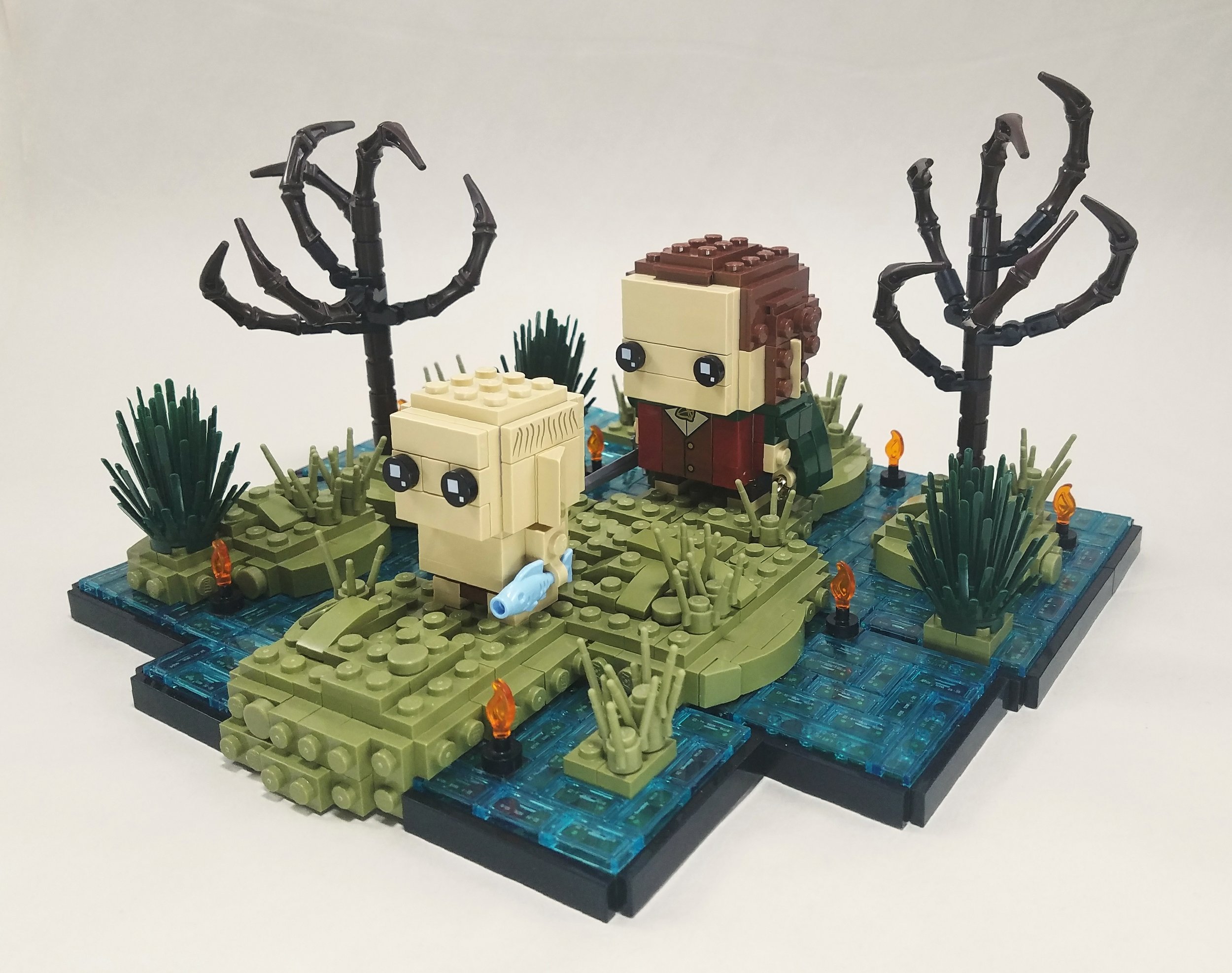
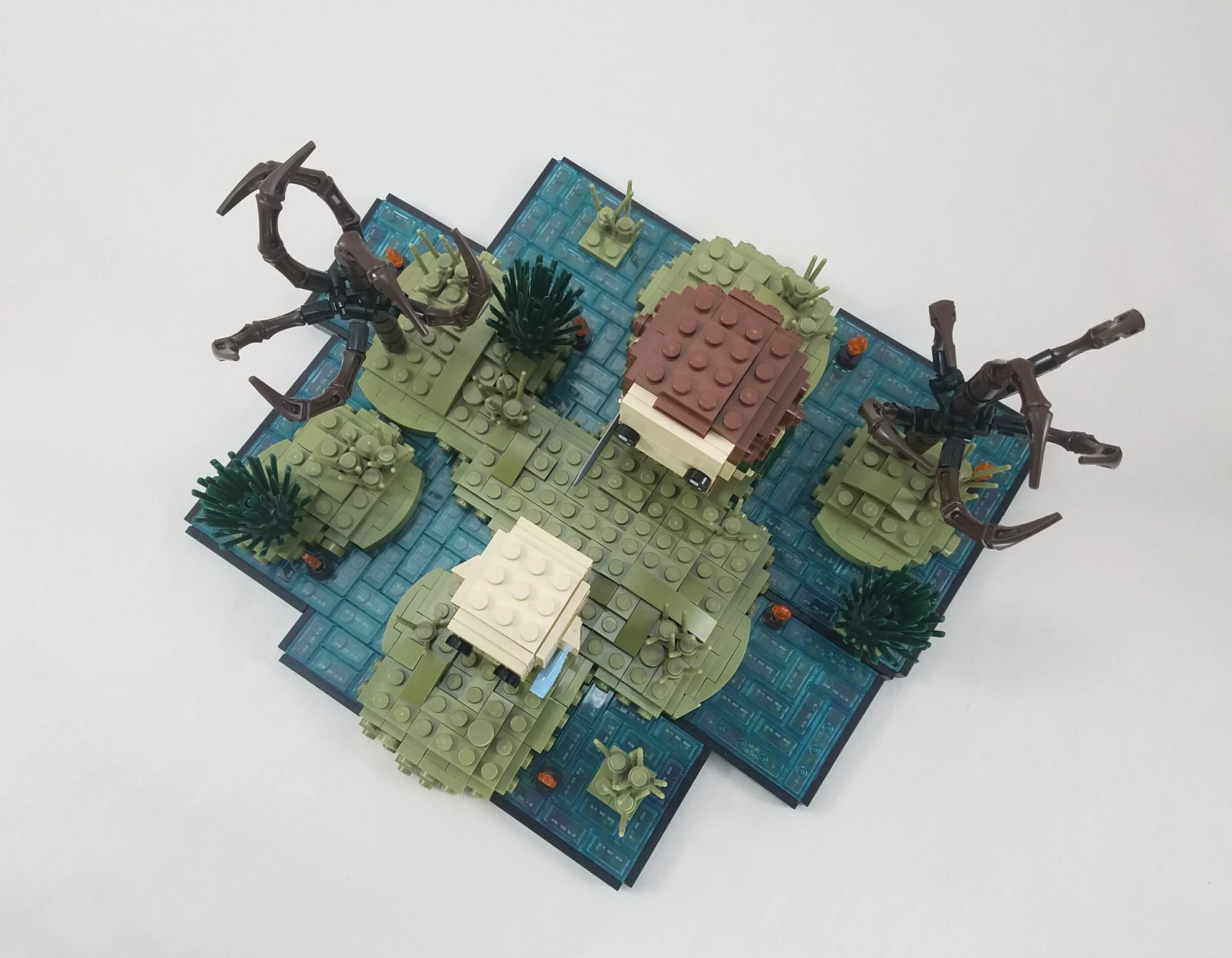
I also wanted to try making a landscape in a BrickHeadz style. I ended up settling on the Dead Marshes as the subject of my next build as I figured it would go rather nicely with the Frodo and Gollum BrickHeadz.
The dead marshes
I built all the chunks of land around cubes which I then covered with olive green plates and slopes to give them a little bit more natural shaping. The cubes forming the foundation of the islands can be seen more clearly from above.
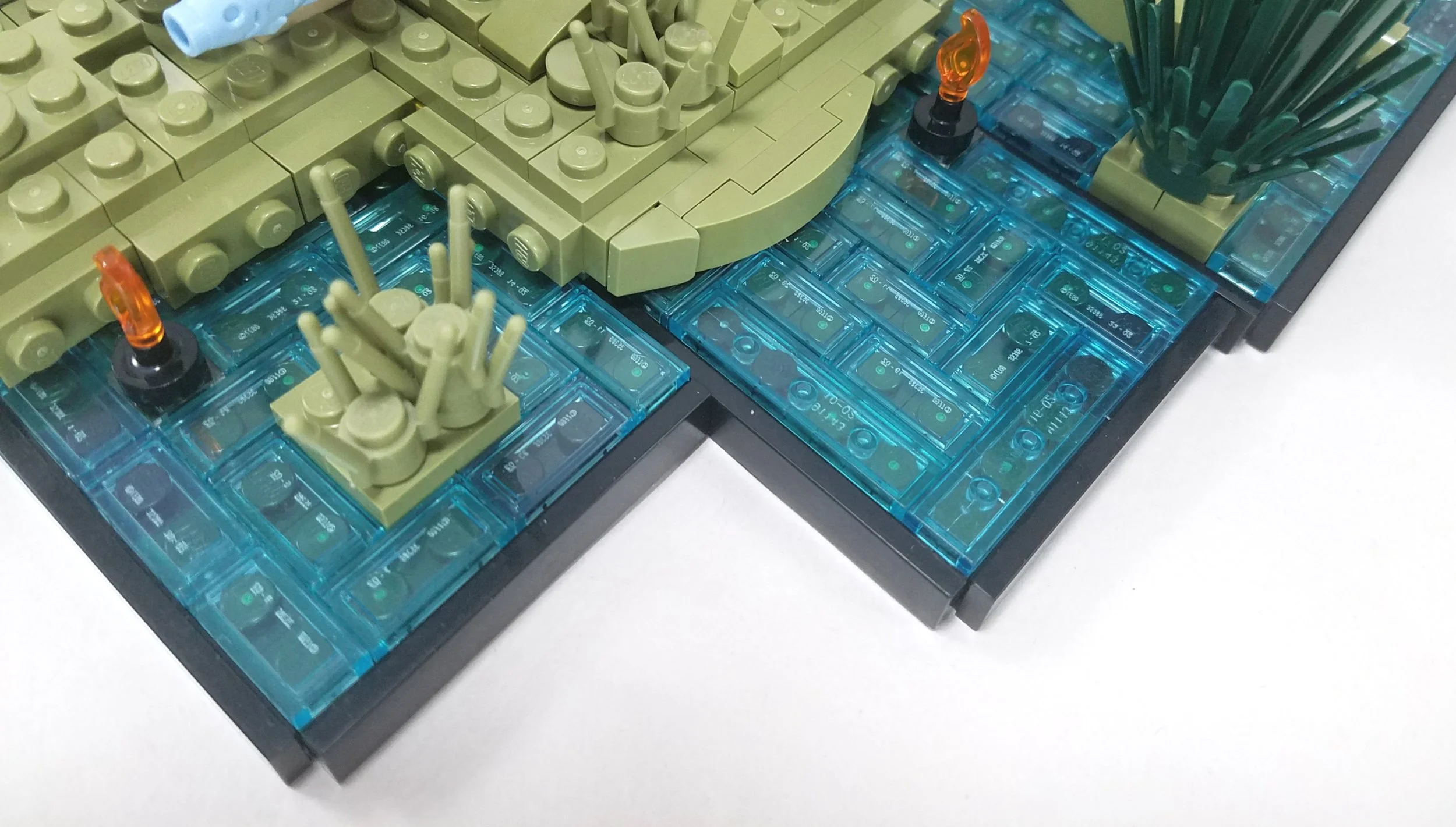
I also tried building the water in tiered square chunks to further compliment the blocky nature of the figures. I had originally hoped to make the top layer of the water trans-clear to let the green underneath through more clearly, but unfortunately I didn’t have nearly enough pieces in the color. As such, I had to resort to trans-light blue, leaving the water looking a lot more vibrantly blue than I would have liked.
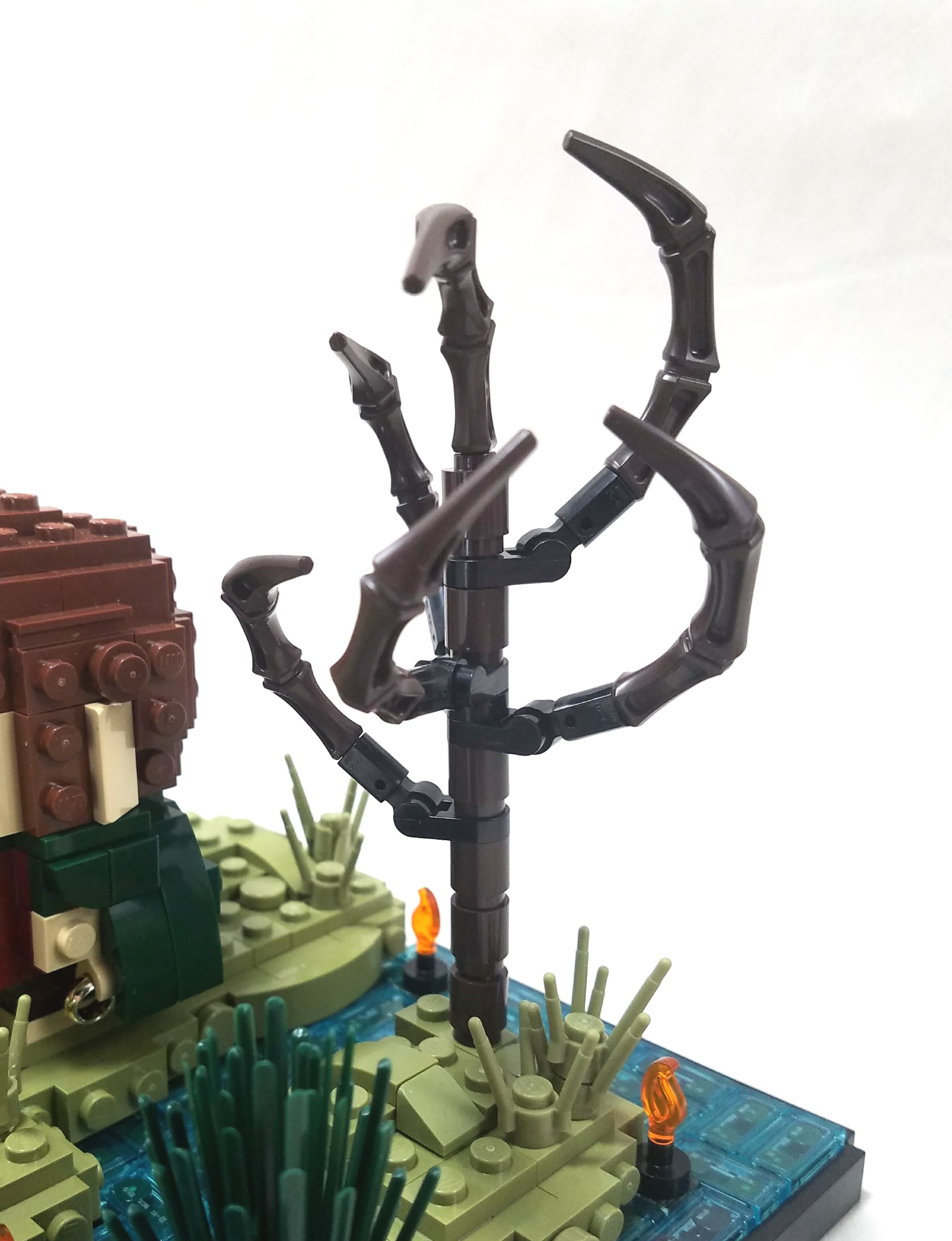
I also added a few final details to finish the scene. The trees are pretty simple, using just four unique pieces, but I think they work well with the cartoony BrickHeadz style. The 2x2 prickly bush piece works remarkably well at this scale, and a few grass stalks scattered around finish out the plant life.
Finally, I added in several candle flames strewn across the marsh. While many of these details are completely out of scale compared to the figures, I find that this suits the BrickHeadz style quite well. If you look at the BrickHeadz sets, the accessories that accompany the figures are also generally too small, and that distortion of scale is a central part of the BrickHeadz aesthetic.
Building Bridges
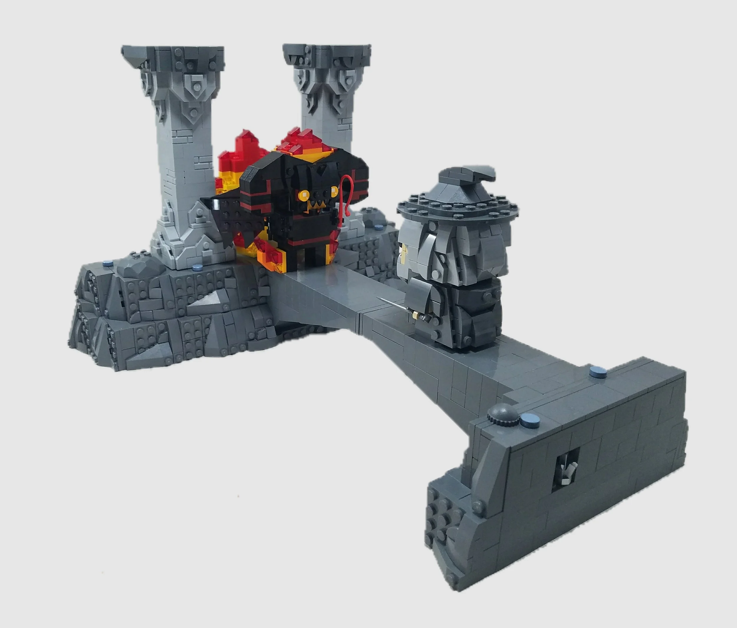
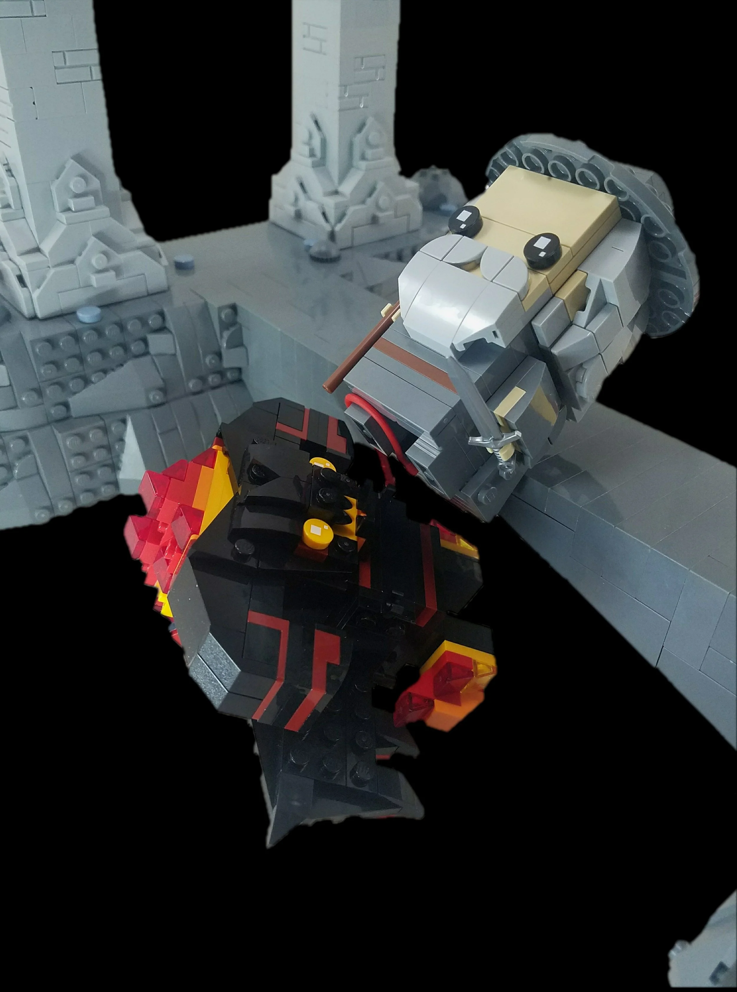
It should be no surprise what I chose to depict for my final BrickHeadz build. From the second that the sets were announced, I instantly knew that I just had to recreate the iconic showdown between Gandalf and the Balrog on the Bridge of Khazad-Dum.
you shall not pass!
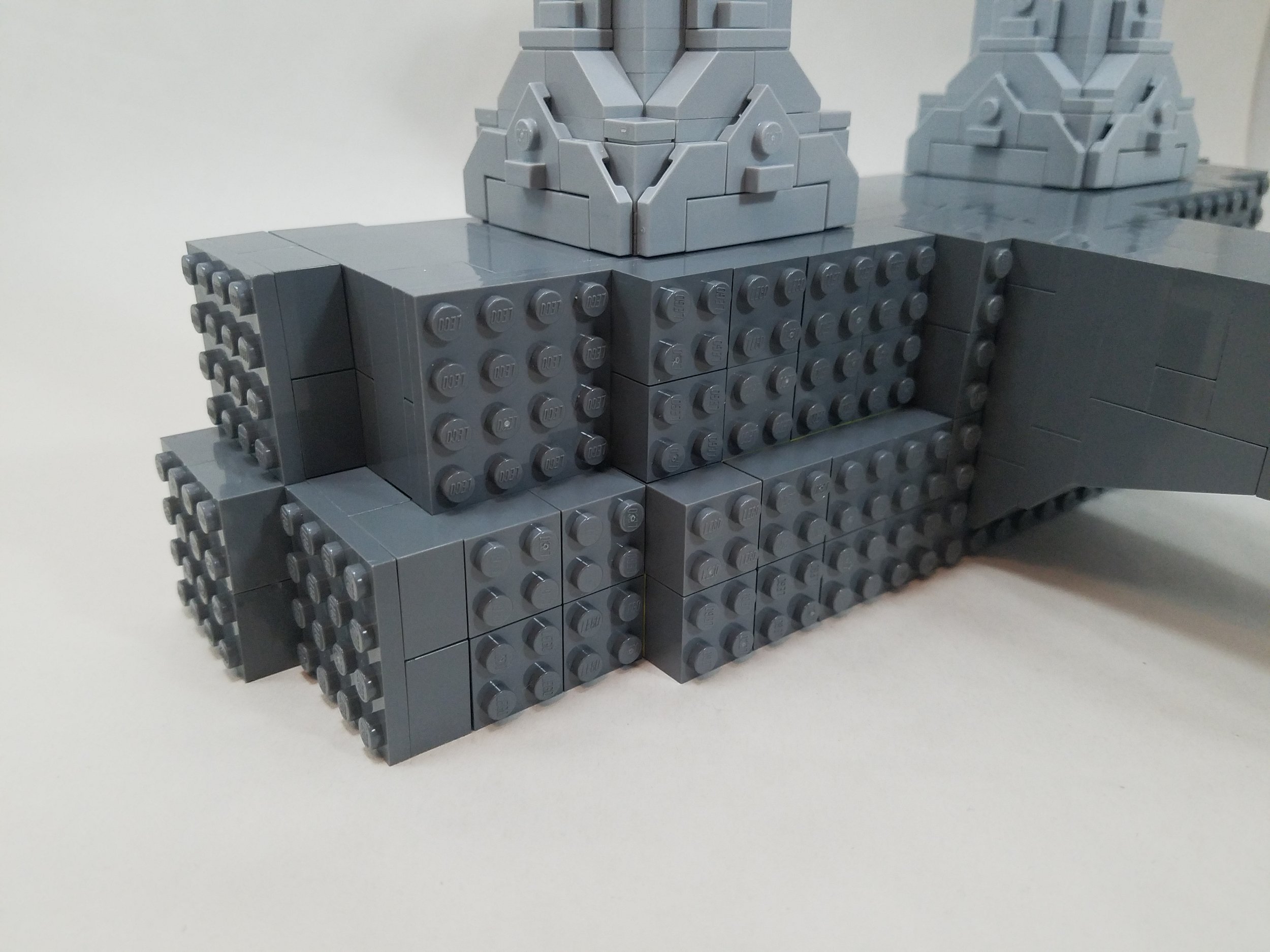
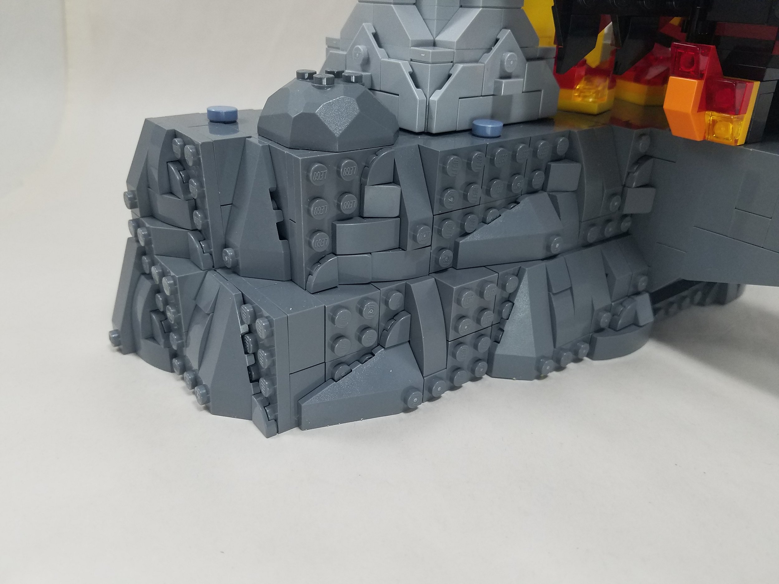
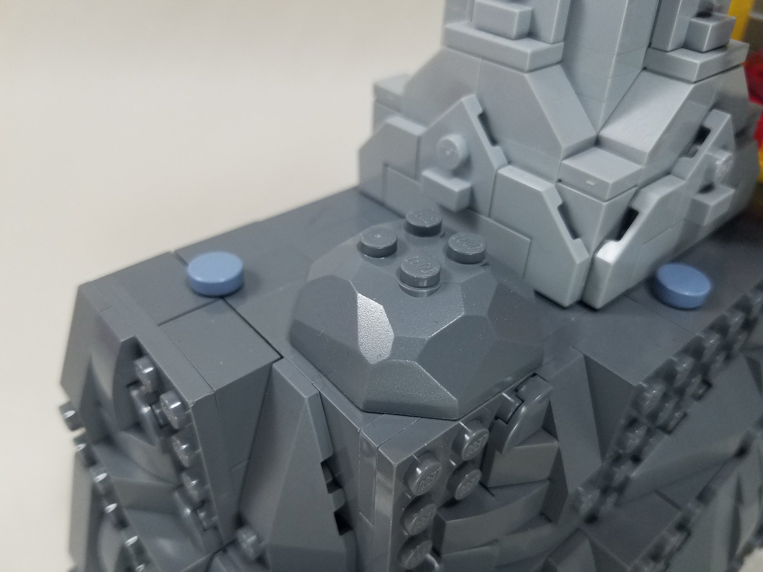
I built the rockwork using the same principles used to build BrickHeadz figures—I built simple cubes, which I then covered in slopes. I think that this ends up serving the BrickHeadz style really well, capturing a nice balance between cuby abstractism and realistic detail.
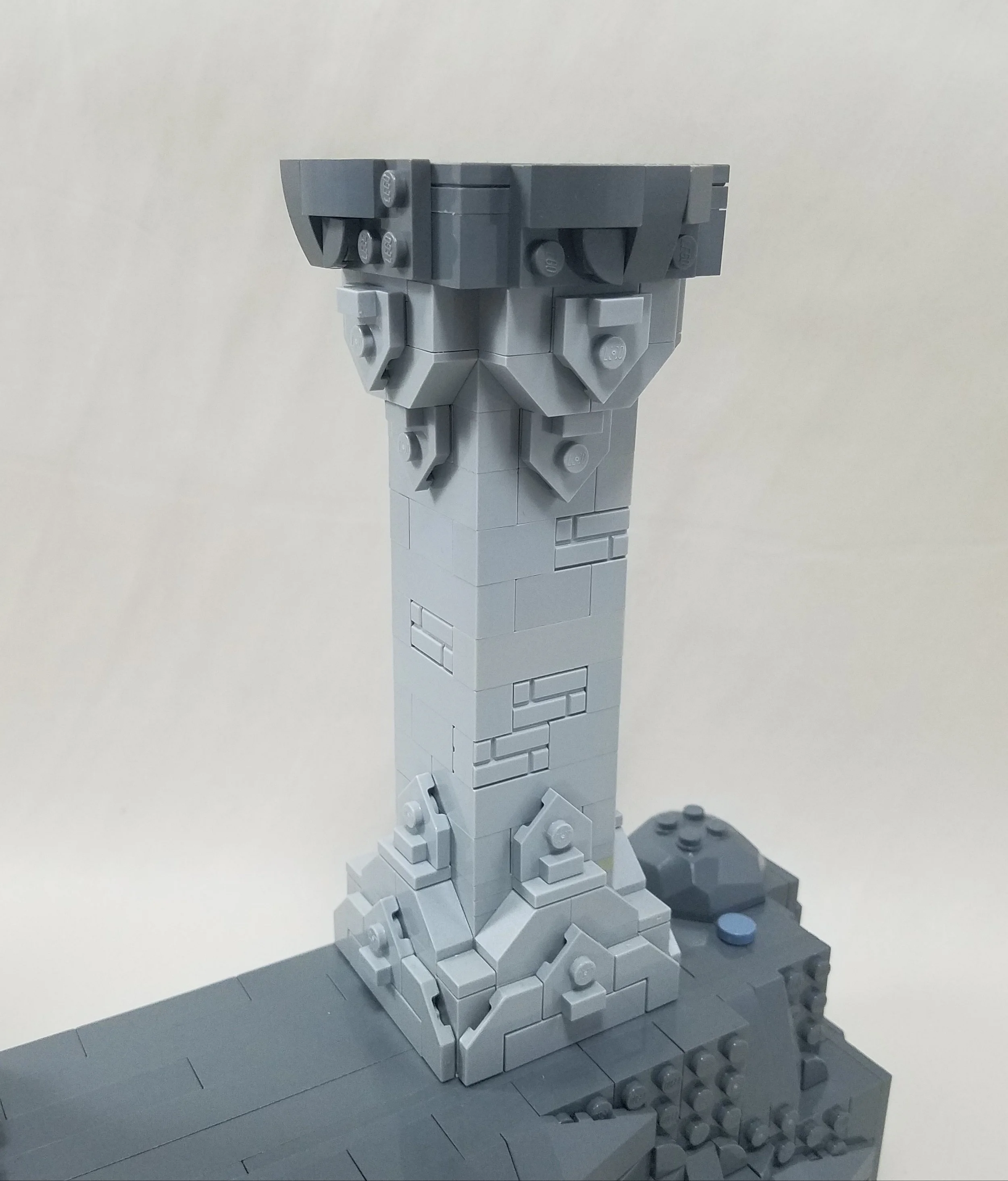
The columns were one of the more interesting parts of the build. Luckily, their design fits quite naturally into the BrickHeadz style, so I was able to follow the design seen in the movies pretty closely. Originally, the columns were much taller, which looked better overall, but just didn’t quite fit the BrickHeadz aesthetic.
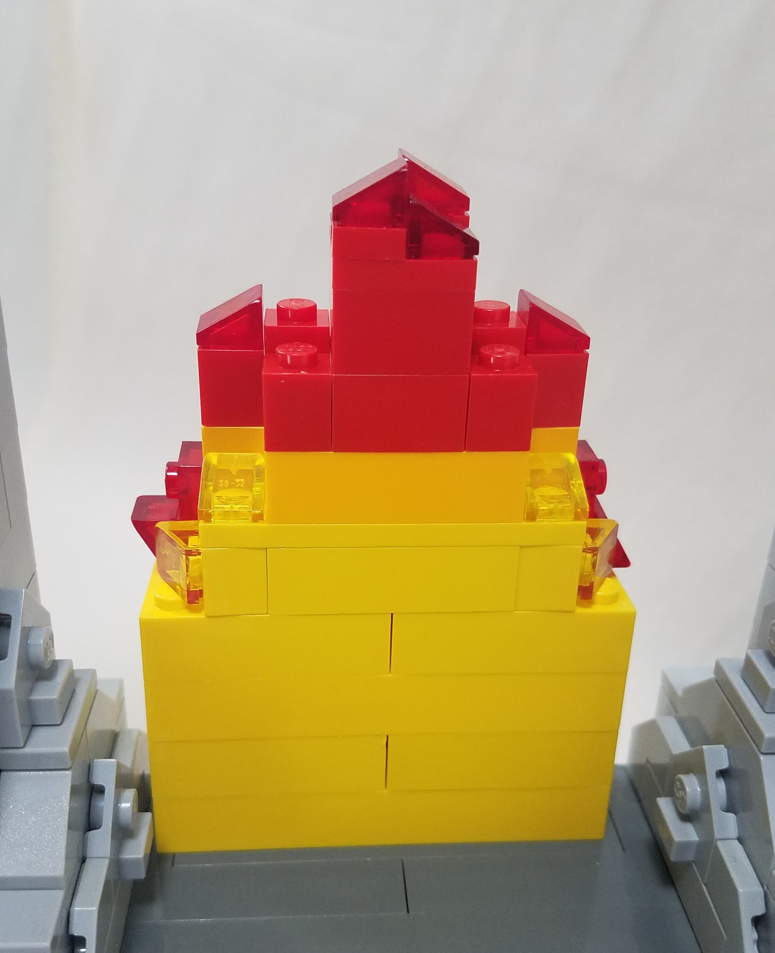
After building everything else, the scene felt somewhat bland. Gandalf and the scenery are all dominatingly gray while the Balrog is black, with the only color in the scene coming from the fire on the Balrog. In order to add a little more color, I added in some more fire behind the Balrog. It’s very chunky and doesn’t really work on its own, but works well in the overall scene when hidden behind the Balrog. I also scattered a few sand blue 1x1 round tiles throughout the scene to give a little more color to the ground.
Finally, with all the parts in place, I couldn’t help myself from creating this masterpiece:
fly you fools!
Cubes to Curves
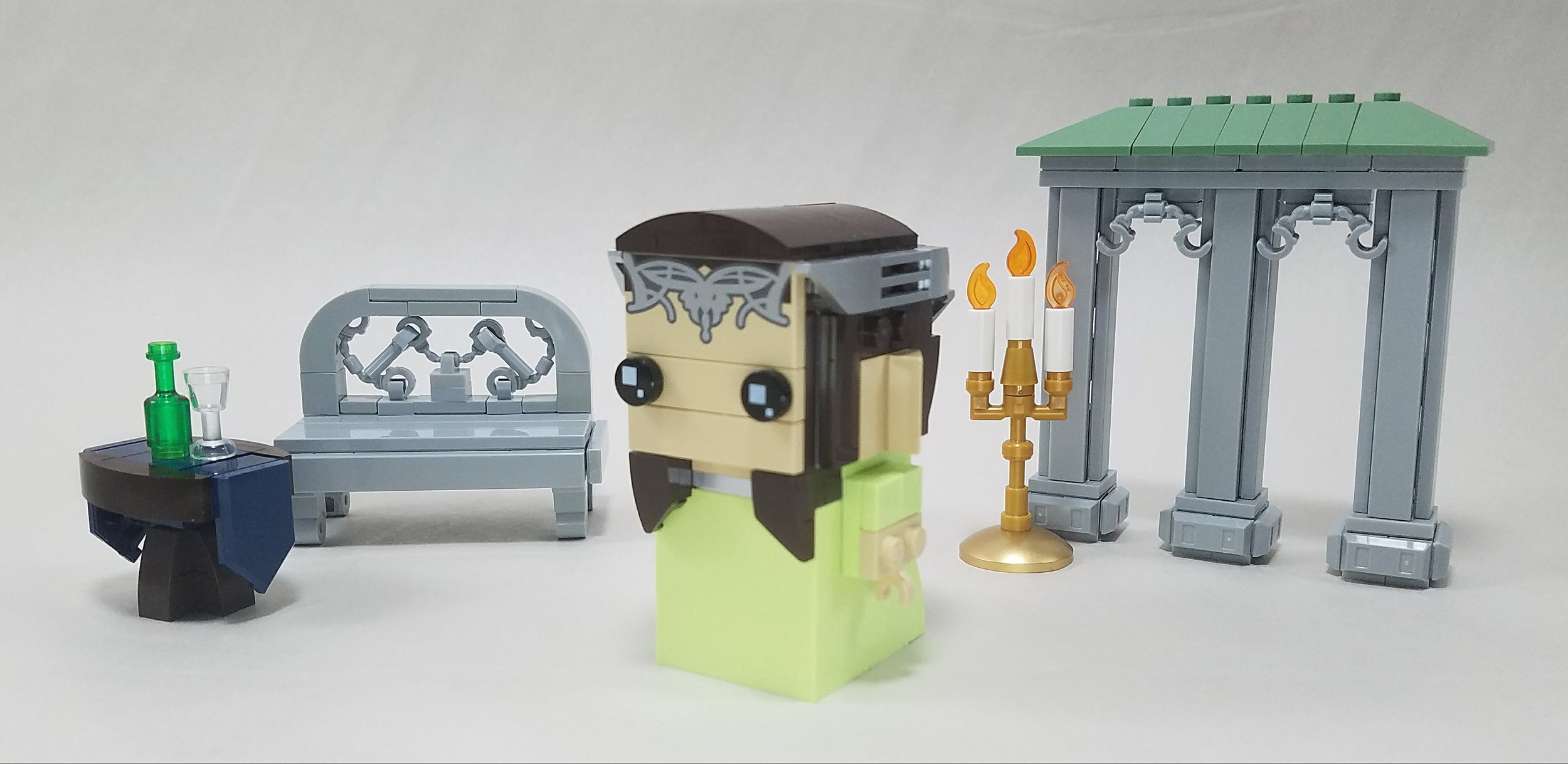
It’s important to note once again that there are limits to what can be done with the BrickHeadz aesthetic. It’s good for blocky shapes and more simple designs which work well for the Dwarven architecture of Khazad-Dum, but it isn’t very good at capturing elegant and complex designs such as those characterized by the elves. I tried to mess around with building a scene of Rivendell to go along with the Arwen BrickHeadz but struggled to find a good balance between the blocky design of BrickHeadz and the fancy aesthetic of elven architecture.
some of the bits and pieces i came up with while trying to build rivendell
We Don’t Need Roadz
Before I wrap this up, I’d like to give a shoutout to jp velociraptor who built a BrickHeadified DeLorean time machine from the Back to the Future franchise for the Doc Brown and Marty McFly BrickHeadz! That’s right, you can make vehicles for BrickHeadz too!
Beyond BrickHeadz
While the BrickHeadz theme is certainly not to everyone’s taste, it can be a really fun style to work in. So far, though, LEGO has only tapped into a smidgen of these possibilities, focusing almost exclusively on figures. I believe that there’s still a lot of potential to be explored, and I think that my experimentations prove that.
From animals to architecture and landscapes, the essential principles that make up the BrickHeadz aesthetic can be used for a lot more than just figures. I know I’ve had a lot of fun messing around with this medium and testing its potential, and I hope you’ve enjoyed this journey into the world of BrickHeadz too!
DISCLAIMER: These sets were provided to BrickNerd by LEGO. Any opinions expressed in this article are those of the author.
What are your favorite BrickHeadz characters? Leave your thoughts in the comments below.
Do you want to help BrickNerd continue publishing articles like this one? Become a top patron like Charlie Stephens, Marc & Liz Puleo, Paige Mueller, Rob Klingberg from Brickstuff, John & Joshua Hanlon from Beyond the Brick, Megan Lum, Andy Price, John A. and Lukas Kurth from StoneWars to show your support, get early access, exclusive swag and more.


