Lettering in LEGO: The Wordplay of 41839 Message Board
/Today’s guest article comes from Australian builder Kristel Whitaker, known for her whimsical builds and her continual exploration of colourful tile techniques. She shares her experience building LEGO’s new 41839 Message Board set on BrickNerd’s behalf.
Editor’s Introduction
A few weeks back, BrickNerd was offered a new LEGO “message board” set. As with most offers through the LEGO Ambassador program, we needed to respond quickly, knowing little about the set. With the recent retirement of the DOTS theme, we were at least curious to see what new direction LEGO might take with lettered signage. If nothing else, we hoped that some new brick-built font styles or techniques would be featured.
This led to a discussion amongst ourselves about all of the notable brick-built alphabets that the LEGO MOC building community has developed through the years. Here are a few of the notable examples that came to mind:
A person whose font development and colorful designs had stood out the most to us recently is Kristel Whitaker. She had implemented a LEGO font reminiscent of the Bauhaus Stencil Lettering System (Kombinations-Schrift) designed by Josef Albers in the 1920’s. The Albers system was quite compatible to being built out of DOTS tiles, as its geometric components are made up entirely out of squares and quarter circles. Kristel’s contemporary take on Albers’ stencil font has proven to be quite popular in the LEGO building community, with many people putting it to use in their own custom builds.
Kristel is also a major creative force when it comes to the collaborative layouts built by Eurobricks at Brickworld Chicago each year. As part of this year’s “Best Large Group Layout” winning “Scala Murder Mystery Mansion,” she created this stylish Scala sign, among other things.
With her keen eye for fonts and bold use of colour, we thought that a “message board” set could be a perfect one to send Kristel’s way to get her assessment. Read on to hear her first impressions, her ideas on how you might improve and enhance this set for yourselves, and the ways she (and her daughter) thought to put those parts to good use.
A Look At the LEGO 41839 Message Board
Kristel Whitaker
I was excited when BrickNerd initially reached out to me to do an article about a soon-to-be-released 41839 Message Board from LEGO. I had always wanted a message board for my kitchen so that I could stop my habit of putting random things all over the fridge! Yes, there is absolutely no good reason why I haven’t gone out and bought an actual message board before now. Let’s just put that down to laziness.
Anyway, I became a little less excited once the pictures of the message board finally started appearing online. It is not what most of us would imagine a “message board” to be or to look like. Based on the set name, I thought the set would have been more like the prior Message Board (41951) or Big Message Board (41952) sets from the recently retired DOTS theme. Instead, this set resembles more of a decorative sign, the kind that has an inspirational message written on it and placed on a bookshelf or mantelpiece. Perhaps if the set had been named “Decorative Sign” instead, my expectations would have been set differently.
As a message board, one of the first thoughts I had was that I would struggle to say anything nice about this set. Unlike DOTS, the colour scheme and font style for this sign are very constrained. The building-block approach to constructing words also limits how the lettering can be arranged. But I put those thoughts aside, and I started to think of what I might do to make the set more appealing, especially adding some colour to what is otherwise a very beige set.
It turns out that my daughter was also thinking about what she could do with the set. She was way more excited about the set than I was, and wanted to use it to make a nametag for one of her favourite dinosaur plushies. With that spark of inspiration, we opened the set together and she immediately started building.
What’s In the Box?
Actually, that is a lie. She didn’t immediately start building because there was some serious pre-sorting to be done. Surprisingly, the paper bags were NOT numbered and appeared to each contain a random selection of parts (six large bags, two medium bags, and six little bags). And there are so many parts that this isn’t a case of just “dump them out and rummage through them” to find what you need.
The box itself was quite big and weighed just over 2 kilograms (or 4 ½ pounds for my American friends). Interestingly, nowhere on the box does it state how many pieces there are in the set [Editor’s note: This is a standard difference between the European box sent for review vs. the global box many of us in other parts of the world are used to seeing]. LEGO.com tells me it is 1,743 pieces. Out of those 1,743 pieces, there are quite a few interesting parts.
The part I was most excited about was the 1x2 tile wedge (the one with the cut corner). You get quite a few of these in white in each variation (left and right cut). I’m looking forward to when this piece becomes available in a whole bunch of other colours.
While my daughter got stuck into building a name plate for “Yut” (short for Yutyrannus), I started by doing the obvious – looking at what my colour options were. Needless to say, she finished well before I did.
Note: Yutyrannus is not spelt with a diacritic on the first u. My daughter was just having fun with it.
Word Play
While I had the pieces required to swap out the dark tan in the letters, the same cannot be said for the white parts. Four parts are critical and not that easily swapped out with other pieces:
2x4 wedge plate, pointed in left (65429) and right variations (65426)
1x2 tile wedge in left (5091) and right (5092)
These are available in other colours, but I did not have enough in any one colour to do something more interesting. So, using white as the main surrounding colour would have to be. The first variation that I came up with is a rainbow of colours:
The set instructions have you place each letter directly adjacent to the next one. For this “Every Heart is Awesome!” sign, I changed the spacing of the Technic frames so that there was some vertical space between the words. Unfortunately, this limited where I could place the words as it is dependent on having access to and aligning the holes in the Technic frames in the back. I would have liked the words ‘heart’ and ‘is’ to have been closer together.
This spacing could be fixed by swapping out the Technic liftarm frames for larger ones, meaning two or more letters attached to one frame instead of one frame per letter. I don’t see this as an issue, as with this type of message board, you would normally build a particular message and then leave it for a while. Unfortunately, I couldn’t try this out. My problem is that all of the larger frames I have are sitting inside Technic cars. If you are familiar with how Technic vehicles are put together (locked in with pins, layer upon layer), you know that there was no way I was going to attempt to pull those apart!
Speaking of pulling things apart, the Message Board theoretically gives you the flexibility to change the message, but that requires some effort. Most of the letters have a unique pattern for the dark tan component, meaning that changing a letter is an exercise in stripping the ‘letter’ back to a bare 6x8 white plate and starting again. And the frame you place those 6x8 plates onto needs to be changed each time you change the words, unless the new phrase just happens to have the same number of letters in each word!
Colouring Inside the Lines
As for the techniques used to shape the letters themselves, there are a few things that stand out to me that are not ideal. First, I am not a fan of seeing raw negative space around the outside edges of the curved tiles. This is especially true around the Y and the R, and to a lesser extent the S. Unfortunately, I wasn’t able to find a satisfactory solution to this. Going more square and less curvy works to some extent, but that is not a solution for the Y.
One alternative is to use tiles on top of the plates to spell out the letters, but it would be quite a departure from the negative space approach used in this set. A somewhat more radical solution is to use only letters that do not have the issue. However, doing that leaves us with … H, I, K, M, N, T, V, W, and Z. Maybe calling it a solution is a bit of a stretch!
Another thing that bugs me about the lettering aesthetics is the variation in the number of exposed studs surrounding each letter. This is quite evident in the Yutyrannus sign, with a much higher density of studs on the left-hand side compared to the right-hand side. When it comes to brick-built font aesthetics, I think it is important to have consistency in both the lettering design as well as in the parts used to fill the white space surrounding them.
Despite all of those criticisms, I do think this negative space lettering technique has a lot of potential when it comes to exploring various colour patterns that are not as easy to replicate using traditional building techniques. Turns out, there are quite a few viable options to explore: vertical stripes, horizontal stripes, diagonal stripes, big stripes, and diamonds…
The diagonal stripes and diamonds were a little tricky and could only be done by having some of the colour showing on the outside edges. Admittedly, that’s only an issue to the extent (a) those particular letters are on the outside edges of the word and (b) someone is looking at it sideways rather than front-on. The bigger limitation is the number of letters that this can currently be used for; however, that may improve as the 1x2 wedge tiles become more readily available.
Frame of Mind
Once I considered this set as being one for building “decorative signs” to display more permanent messages (rather than the temporary messages found on message boards), I had the idea to build this sign:
Admittedly, this sign looks better in this image than it does in real life. (It would also be truer to life if it said, “I Don’t Got This!”)
However, since I had my heart set on having a message board, I took inspiration from the prior DOTS message boards and developed this hybrid solution. The 6x8 lettered plates are directly attached to hidden studs on the board, with the remaining surface being tiled.
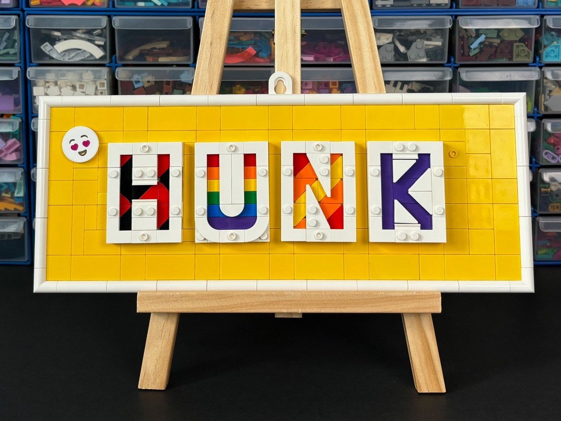
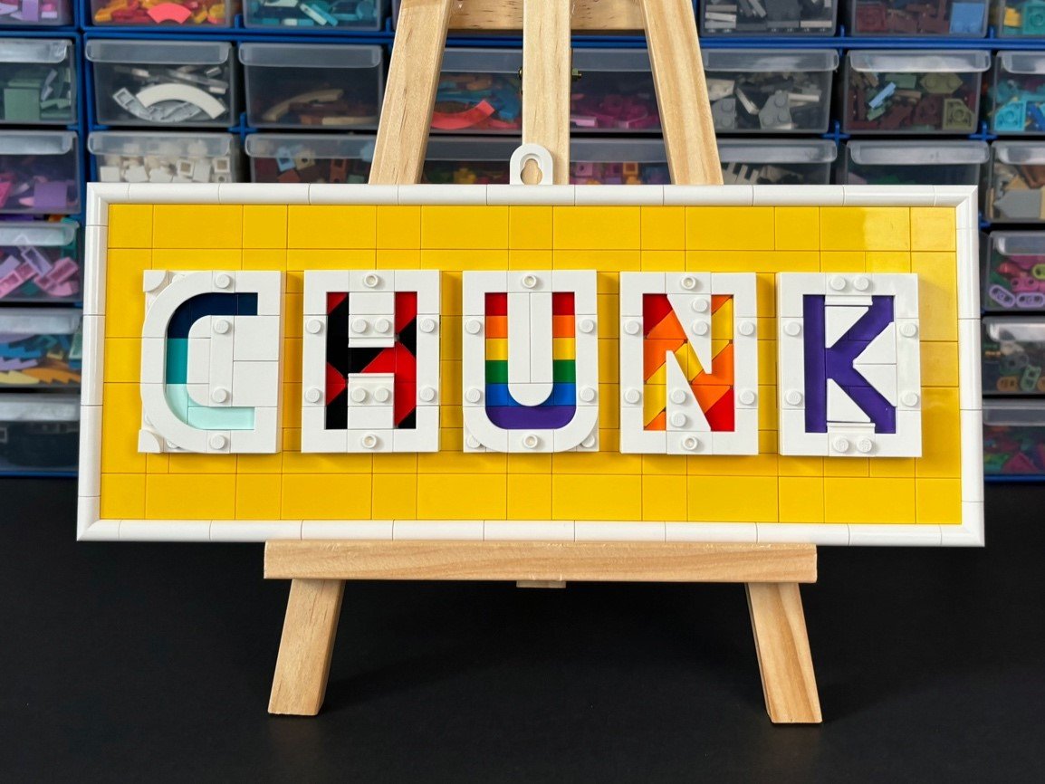
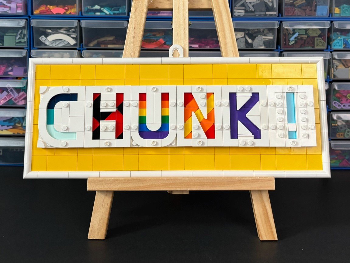
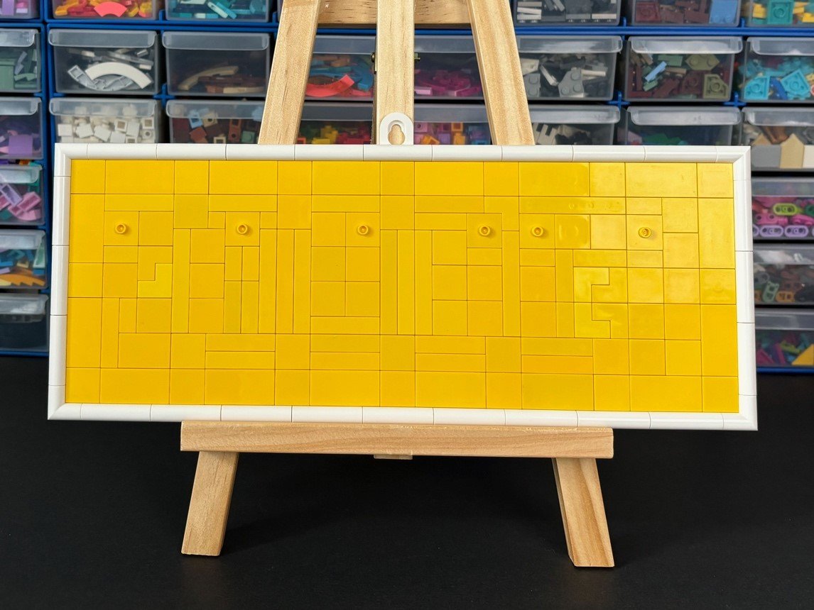
Combining these message boards can be a little chunky, but I quite like this concept. You can easily change both the letters (assuming those letters are already built and at hand) and the length of the word. It is very reminiscent of those easily rearranged alphabet refrigerator magnets many of us had as children… assuming you still have room on your refrigerator to place them.
This combined approach delivers on what a message board should be; a place where you can easily and quickly write new messages. The frame can also be expanded if you want a bigger board to place more letters. If I thought I could get away with it, I would hang this sign on the door to my daughter’s room and change the word to match whatever mood she was in.
Final Thoughts
All joking aside, the best bit about this set was definitely the quality time I spent building with my daughter. I almost forgot to mention that the instructions are separated into separate sections that make it an easy set to build with others. There was one booklet on how to build the frame and then four unfoldable posters that showed how to make the individual letters, numbers, and punctuation marks.
This set is probably targeted more at people who want to build their own decorative sign but don’t really know where to start. It was certainly a quick way for my daughter to create her own sign for Yut. For more experienced MOC builders, I'm not sure this set will offer you much beyond a nice selection of parts to use for any white or beige projects you have in mind. The techniques used to make the lettering were certainly interesting, but as I mentioned, they are a little rough around the edges.
As for me, it’s back to trying to find a space on my fridge to leave a message!
The LEGO 41839 Message Board is available for $100 US.
DISCLAIMER: This set was provided to BrickNerd by LEGO. Any opinions expressed in this article are those of the author.
What are your impressions of the new message board set? Leave your thoughts in the comments below.
Do you want to help BrickNerd continue publishing articles like this one? Become a top patron like Charlie Stephens, Marc & Liz Puleo, Paige Mueller, Rob Klingberg from Brickstuff, John & Joshua Hanlon from Beyond the Brick, Megan Lum, Andy Price, Lukas Kurth from StoneWars, Wayne Tyler, Monica Innis, Dan Church, and Roxanne Baxter to show your support, get early access, exclusive swag and more.


