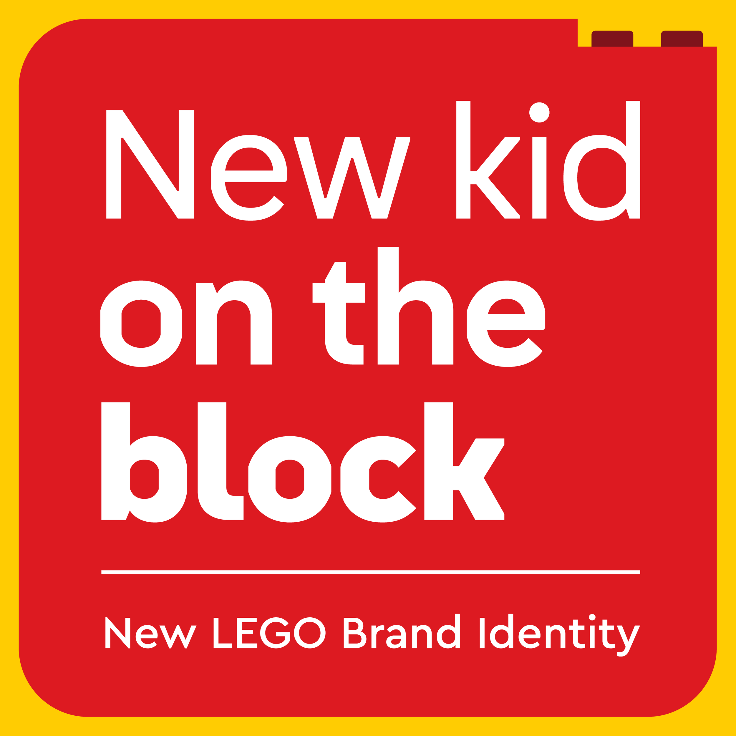
A Close Look at LEGO’s New Visual Brand Identity
/In not-so breaking-news, something that has flown mostly under the radar of most in the brick-osphere—LEGO has updated their brand identity in partnership with Interbrand.

You may now be thinking “What is a brand identity?” and that’s totally fair because it likely won’t have much of an effect on you as seasoned hobbyists already loyal to the brand. A brand identity is a term that collectively describes all of the visual elements that make up a brand. The colours and shapes of advertising, the typefaces chosen for written material, the word-choices used to craft a certain personality or ‘voice’, and of course the logo go into creating a recognizable identity.
It was only a few months ago that I brought up the (at-the-time) current brand font and identity with the use of Cera Pro! Is a mere four years too short of a turnaround on a new look for the brand?
A SAMPLE FROM THE (NOW OBSOLETE) LEGOLAND BRAND TYPOGRAPHY GUIDE

A Gradual Shift
For some context, the last time I can recall an official LEGO Identity change at this level was the Corporate Identity rolled out in 2010.

some internal postcards that were produced in the 2010 Corporate style
No doubt you’ve probably seen this flat style of outlines, minifigs and dots around somewhere. Perhaps you emailed customer service in the early 2010s or received any logistically entangled mail years ago? Public-facing corporate documents of the era were plastered with the iconic minifigure. Even the buildings at LEGO’s corporate headquarters in Billund are decked out in this specific scheme!


COURTESY OF FLICKR USER DAN BRACE
FROM WAYNE TYLER’S INSIDE TOUR
It was an incredibly cohesive style, with the Chalet typeface being geometrically precise, the grid system of studs, the adherence to brick scale, and the minifigures breaking that grid. It may have been a little too perfect and then a little too easy to break the rules.
As new blood came into the company, new ideas came through departments, and new customers required different things, the style was diluted through the years and slowly but surely replaced with other things. This new identity recently launched bargains a similar level of structure, so let's see what “LEGO look” we’re in for!
Written in Plastic

COURTESY of Interbrand
The first and perhaps most obvious update is the brand font. Meet Typewell! This completely custom font co-designed by Colophon Foundry and Interbrand designers gets its name from the oft-quoted origin of the LEGO name—Leg Godt, meaning Play Well. The most striking feature of this font is its use of LEGO brick geometry to create the spacing, curves, and angles. Sure, it makes the font a little quirky, but isn’t that where the personality shines through?


I did some scouting around to see if this typeface had been used yet, and it seems it has been under our noses since late last year! (Sneaky LEGO!) With the launch of the LEGO Insiders Club for kids, and the revamp of the Classic theme boxes, the Typewell font has already been integrated, and I presume we’ll see more of it with each new release of anything LEGO.
Shaping Up

Rethinking what a ‘font’ is yields surprising results
The second part of this visual strategy comes in the form of another type system but in the form of bricks. Created in collaboration with type designer Stuart Brown, this system takes digital silhouettes of LEGO elements and confines them to a font that can be typed and spaced in such a way that they conform to the brick system.
COURTESY OF INTERBRAND
What this allows for is the ability for anyone within the company to quickly create accurate and interesting element-driven shapes for text boxes, backgrounds, and frames. From what we’ve seen so far, email marketing seems to have taken this concept on favourably as most EDM campaigns (Electronic Direct Mail) in the last few months share this aesthetic.
Dynamic Play

MOCKUP STREET ARTWORK COURTESY OF INTERBRAND
‘Action Graphics’ make up the last major part of this new look. Interbrand has developed a suite of styled LEGO elements designed to add a playful spirit to images. It’s yet to be seen how these will be fully realised, but it’s a nice addition to add another playful spark to the brand’s personality.

bricks can convey different feelings when used in certain ways
All Together Now
A refreshed visual identity is great for marketing, but will it affect our beloved sets themselves? Well, take a look at the below Classic set 11034 that incorporates the new typeface, the new ‘clutch system’ elements, and the refreshed colour palette to really show the point of all of this (shown next to an older styled box).

FROM OUR VERY OWN DAVE SCHEFCIK in singapore! Lego Classic Theming brings all of these elements together in Full force.
Personally, I felt the classic sets always seemed a little lost. They were like a side dish to Creator visually speaking. Now though, you’d struggle to create a more engaging, playful, positive box for this set than what you see here! Look at the whimsical but confident appearance, a look that just oozes the fun and joy of the bricks inside.
So what will come next? I think we can only begin to imagine how this new visual brand will make itself known, but now as you see the subtle changes made you will know what is going on.

COURTESY OF INTERBRAND
But why now? LEGO seems to be doing fine as a company. Why invest considerable resources to refresh the brand? Looking at another recent piece of news, LEGO was recently voted the most reputable brand for the second year in a row, so perhaps it was the right time to shake down their (at times divergent) multi-faceted appearances and drive home a more cohesive look.
designed by me with all the new brand elements.
I know I’ll “Typewell” for years to come.
What do you think of LEGO’s new brand identity? Let us know in the comments below!
Do you want to help BrickNerd continue publishing articles like this one? Become a top patron like Charlie Stephens, Marc & Liz Puleo, Paige Mueller, Rob Klingberg from Brickstuff, John & Joshua Hanlon from Beyond the Brick, Megan Lum, Andy Price, Lukas Kurth from StoneWars, Wayne Tyler, Monica Innis, Dan Church, and Roxanne Baxter to show your support, get early access, exclusive swag and more.