The LEGO Color Palette: 2023 Edition
/Best of BrickNerd — Article originally published Jan. 24, 2023 and updated on Jan. 14, 2024.
In 2016, The LEGO Group published its colour palette listing all the moulding colours in production. Seven years on, and with no sign of an updated palette being released, I thought it would be a nice exercise to update the 2016 palette for all the new colours released since then. Additionally, I’m going to re-organise the colours into families, mainly to appease my OCD for understanding the world by organising it!
© The Lego Group
Some terminology before we begin. I am going to use BrickLink colour names as they are simpler while also being more widely used across the community. And apologies to our American readers, but I am going to spell ‘Colour’ and ‘Grey’ in the Oxford (and The LEGO Group) tradition.
This is a long article, so if you want to go straight to the final answer, the palette below is where we get to. You can also download a PDF of the palette and all the slides in this article via this link.
Why Now?
Most experienced builders and collectors will likely already know the current colour palette inside out, but there are still good reasons to do this exercise:
Since the 2016 colour palette, four new solid colours have appeared (Coral, Neon Yellow, Medium Tan and Medium Brown) and Dark Turquoise has been brought out of retirement.
To my knowledge, there isn’t one simple A4 sheet of paper with an accessible list of just the current colours. There are several comprehensive lists available on sites like BrickLink and Rebrickable, but these are often mixed with retired colours which can be daunting to people new to the subject.
I want to establish colour values (RGB, Hex, HSL) that are as close as possible to the real-life colour of bricks and replicate these on the palette.
Understanding the relationships between these colour values lets us put them into logical and structured families, similar to understanding the characteristics of an element from its position on the periodic table.
It will help us see if there are any glaring gaps in the current line-up, and for a bit of fun, try and predict which colours may come next…or brought back from retirement like the ever popular Sand Red.
First Rate Colour Resources
Before we begin, I wanted to acknowledge Ryan Howerter for his work compiling an extremely detailed and comprehensive list of all current and retired LEGO colours. His visual guides on Flickr are also first rate and I cannot begin to comprehend the amount of time and effort it would have taken to compile this original research.
I’ve also really appreciated Tom Alphin’s articles over at Brick Architect. Understanding the LEGO Colour Palette and Hard to Find LEGO Colours are incredible articles which clearly a lot of love and work went into. I think both Ryan and Tom are both well worth a follow or supporting on Patreon for the resources they’ve created for free (as well as BrickNerd of course, if you are not a Patron already).
What The Hex?
You are likely aware of the RGB codes used on computers (hex codes are essentially the same, just presented in a different way), however, the RGB system makes it difficult to visualise a specific colour from its value. For example, RGB 129, 158, 135 (Hex #819E87) is the value of a specific LEGO colour, but it is almost impossible to tell which colour it is just from its value (the answer is at the end of this article).
Hue, Saturation and Lightness (HSL) is a much more perceptive way to present the same information. I’d recommend Tom’s article which does a great job of explaining colour theory and the benefits of using HSL over RGB if you want to learn more.
At a very high level, hue represents the colour (Red, Yellow, Blue), saturation represents how bright or dull each hue appears (100% = Brightest, 0% = Pure Grey), and lightness represents how light (up to 100% Pure White) or dark (down to 0% Pure Black) each hue is. I’ve prepared the following cheat sheet which may help further.
The Colour Problem
50 Shades of Grey… Sand Green, Magenta and the rest
The LEGO Group does not publish colour specifications for their bricks, printed materials or website which all require a slightly different colour definition to represent that colour accurately in those spaces. In addition, bricks of the same colour can sometimes have slightly different shades making it difficult (and maybe impossible) to get the precise colour value.
We could think about using colour values from one of the many LEGO sites, but the variation in colour definitions is actually quite different between each site, and also not obvious which site is most accurate.
The diagram above, shows some of the colour variations and differences are clear to the eye. The differences can also be expressed numerically when we plot them on a Hue vs Lightness chart.
The differences are large enough for me to make a separate attempt to get to the most accurate colour value possible. At this point, I’m going to change my objective from getting a 100% accurate colour value, to getting one that is ‘close enough’ to use for the exercise of grouping colours into families.
And for this, I am going to use Pantone.
Pantone and Human Colour Perception
OK, before any stern letters arrive with the editor, let me caveat my approach by accepting Pantone is not the perfect tool for this task. I thought about using a colourimeter, but given my lack of experience and the complexity and price of different models, I concluded that it would be like giving the keys of a Formula One car to someone who’s just passed their driving test.
Pantone is a much simpler system for a novice like me. Matching physical bricks to the nearest one of 2,161 Pantone colours is something I think even I could manage (although doing it after a few beers yielded some pretty erroneous results as I found to my detriment).
Pantone is usually used in the opposite way where a specific Pantone colour is used to define precise colours of products, prints and even national flags. I’m reverse-engineering this process for my purposes.
Pantone Distribution
I have plotted the 2,161 Pantone colours by hue and lightness below to see what kind of accuracy we might get from this method. The coverage is comprehensive, meaning even if I select accidently the second nearest pantone colour, it will still be very close to the actual value.
What’s really interesting about the graph is that the Pantone colours are not distributed evenly across the colour space; instead, we get distinct clusters, like clumps of stars strewn across a galaxy. This is because the human perception of light is different to the distribution of all the possible colours of light that can be created. Humans can detect differences more easily in the densely populated areas, while in the sparsely populated areas, differences in shade are more difficult for us to tell apart.
For example, Lime (75°) and Erin (135°) are the same distance apart as Red (0°) and Yellow (60°), but it is much more difficult to see the difference in those ‘green’ hues than it is in the Red-Orange-Yellow range. Ultimately, this means Pantone needs fewer colours in those areas to get good coverage of the colours as we perceive them.
If this is of interest, I recommend checking out the Swedish Natural Colour System (NCS) which is a colour model based on human perception, rather than basing it on all the theoretical colours of light. It has four unique hues (Red, Yellow, Blue and Green) set equal distances apart. All remaining hues are made up of a mix of these four main colours, with equal distance in between, better reflecting human perception.
© NCS
Creating a 2023 Palette: Mix and Match
I matched by eye (I know!) 41 of the 44 solid LEGO colours to the nearest Pantone colour. This wasn’t possible for Black, White or Neon Yellow and so I have used estimations for them. This isn’t too much of an issue for Black or White as we’re going to put them in a greyscale group, so the colour precise colour value is less important. It would have been nice to get Neon Yellow, but I wasn’t prepared to pay for a separate Pantone guide covering neon colours.
Matching LEGO bricks to PAntone colours by eye.
Creating Colour Families
Firstly, I’m going to group White, Light Bluish Grey, Dark Bluish Grey and Black into the ‘Greyscale Family’. They are at the extremities of lightness and saturation, and therefore grouping them separately by hue would be less useful than grouping them together.
Four more colours stand out when we look at the relationship between hue and saturation in the chart above. Sand Green, Sand Blue, Olive Green and Dark Tan all have a saturation below 30%. This gives them a much more ‘subdued’ and ‘natural’ appearance which perhaps explains their popularity among the community. These four colours will form the ‘Sand Family’. Despite its higher saturation, I am also going to include Tan, as I want to keep it in the same group as its buddy, Dark Tan.
Now we’ve removed the extreme colours, we can group the remaining 35 colours based purely on their hue.
Deciding the groups was a mix of science and artistic license. Some families were straightforward, such as the Erin, Cerise and Violet families. However, others were less clearcut such as the Cyan, Capri and Azure families. Some families could have been combined into larger groups such as the Amber and Yellow families or Capri and Azure, but they didn’t look quite right when the colours were presented together.
You will notice some oddities in the relationship between the colour names and the name of the family they are in. The four Bright Light Blue, Medium Blue, Blue and Dark Blue are technically a shade of Azure. To add to the confusion, Medium Azure and Dark Azure are actually a shade of Capri!
Don’t worry too much about this. Even though colours with a specific name may not technically be that colour, the names are much more practical for everyday use. It would be a bit silly if we started calling Yellow ‘Amber’, or Dark Pink ‘Dark Cerise’ just to appease science.
Non-Solid Colours
The remaining non-solid colours are straightforward to add to the palette. I’ve placed the six ‘metals’ (Pearl, Metallic, and Chrome colours) in a separate section along with Glow-in-the-Dark White. The Transparent, Glitter and Satin colours match nicely to the colour families already created and so I placed them below their solid equivalents.
I only included colours that appeared in 2022 or 2023 as listed on BrickLink. This means some colours, like Satin-Trans Black which last appeared in 2021, may come back onto the palette if they are still available for use over in Billund. In total there were 44 solid colours and 29 non-solid colours coming to a total of 73 colours on this completely unofficial palette.
Conclusion
I hope you’ve found this LEGO colour analysis of some interest. For me, I’ve found it useful to have a simple A4 reference that has close to accurate colour values and is organised into logical groups to refer to. But the real joy of the exercise was to learn a little bit of colour theory, which is a fascinating and complex subject (especially for an accountant).
It may be a cliched metaphor, but ‘Going down the Rabbit Hole’ couldn’t be a more appropriate description of what it’s like to learn a little about the history of LEGO colours. It’s interesting, it’s addictive, and it’s all-consuming.
Again, tremendous respect and thanks to Ryan Howerter and Tom Alphin. Without their work, it would not have been possible to have written this article and they have clearly endured a lot more time in Wonderland than me. And, oh yes, I almost forgot—the answer to the question at the start of this article was of course… Sand Green.
You can download the high-resolution images from this article in this PDF document. The Pantone, HSL and HEX values of the 44 colours from this article can be found in this Excel.
The new unofficial LEGO colour palette for 2023 built out of brick
Addendum – The Retirees
I made a start on the retired colours, but so far, have only managed to compare samples for about 50%. This is very much a work-in-progress but given how stunning the graph looks with over 100 colours plotted, I wanted to share it now.
Some of the colour values may change significantly when (or more likely if) I get around to acquiring samples. It is also not a comprehensive inventory of all the historic colours. For this, the full list of all retired, rare and unreleased colours can be found on Ryan’s site.
Matching rare LEGO bricks to PAntone colours by eye.
2024 Update: Three New Colors!
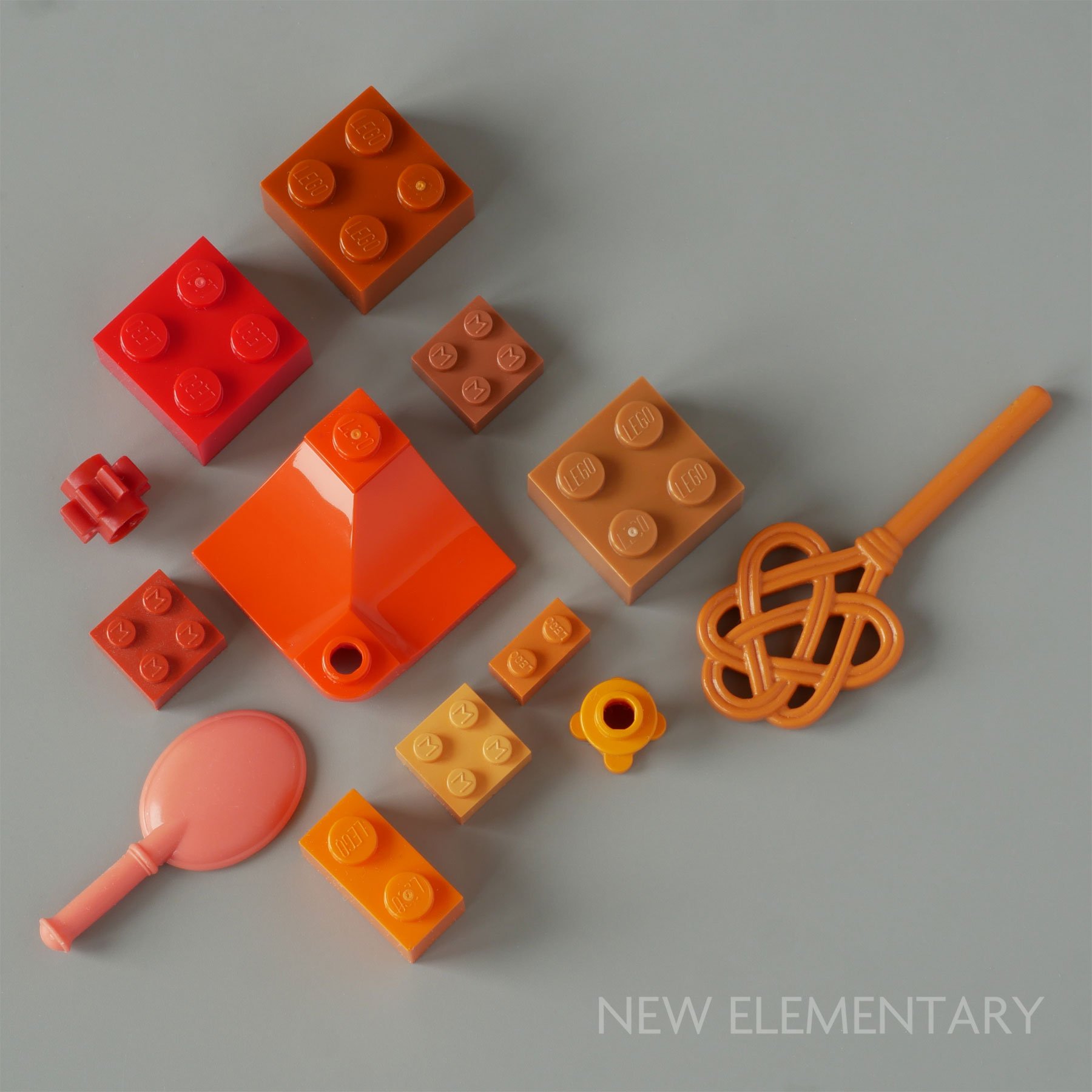
On January 1st 2024, The LEGO Group released three new solid colours – Reddish Orange, Umber Brown, and Sienna Brown – taking the number of solid colours to 47. Reddish Orange, as its name suggests, fills the gap between the colour space between Red and Orange and has already appeared in multiple sets, including 42639 Andrea’s Modern Mansion. (It was close to a color we hypothesized would appear last year.)
Images via New Elementary.
Umber Brown and Sienna Brown look like they will follow the lead of Medium Tan and Medium Brown, being used almost wholly for minifigure, minidoll, and BrickHeadz skin tones.
These four, plus Light Nougat, Nougat, Medium Nougat, and Reddish Brown bring the total number of common skin tones to eight (excluding yellow).
Look out for our updated colour palette article for 2024, which will be appearing on BrickNerd very soon.
What do you think about our LEGO colour palette? Let us know in the comments!
Do you want to help BrickNerd continue publishing articles like this one? Become a top patron like Charlie Stephens, Marc & Liz Puleo, Paige Mueller, Rob Klingberg from Brickstuff, John & Joshua Hanlon from Beyond the Brick, Megan Lum, Andy Price, Lukas Kurth from StoneWars, Wayne Tyler, Monica Innis, Dan Church, and Roxanne Baxter to show your support, get early access, exclusive swag and more.


