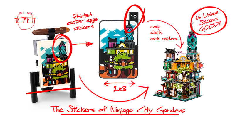
The Stickers of Ninjago City Gardens
/Best of BrickNerd: Weekend Highlight — Article originally published April 8, 2021.
Stickers are controversial among adult fans of LEGO. Some AFOLs think they are an essential part of a LEGO set. Others think they are a “cop-out” to providing printed elements. Even others are totally anti-stickers because they mar pristine LEGO bricks in a new set (and are perhaps frustrating to place at the correct angle as well). In this series, we will take a close look at LEGO stickers, the depth and value they add to sets, the details that you might overlook, and uncover some of the stories and Easter eggs hidden within.
Working as a graphic designer for about eight years now, I think that I’ve never really given my “career partners” from the LEGO Group the respect they deserve. I know what you are thinking: “Well, you should have because they are graphic designers, too!” Indeed, they are some of the best in the world based on the sheer number of details they cram into a sticker sheet nowadays. I have noticed that they have been stepping up their game in this area in the last few years, particularly. (Look at what was being produced around the 2000s and compare that to more modern LEGO sticker sheets. Quite a contrast, right?) For some stickerless AFOLs, we are missing a whole love language of LEGO that’s right beneath our noses.
At the beginning of my career, I didn’t have the obsession for detail that I currently have. The more you work in a certain job or task, the more you get better at it as time passes. The same goes for noticing the deep detail in a LEGO set—you have to start somewhere. If you are not familiar with the impact that LEGO stickers can have on a set, I would implore that you take some time to enjoy this post and the comparisons made. I suspect that you will find that future sets you build might look empty compared to those garnished as they were meant to be. So before I wax poetic any longer, here’s a glimpse of what you have been missing! (And don’t feel bad; I didn’t come to a realization about the impact of stickers until about a year ago.)
Today, my task is to convince you to just let go, and place those stickers. And I can’t think of a better set to illustrate this than the beautiful 5,685-piece 71741 Ninjago City Gardens.
Take a look at this overview comparison gif to see how the stickers make the set come alive. The added details make the set feel lived in, help set the scale for our minifigure friends, and give it a life of its own. To me, stickers take the model from feeling like a decent MOC to a refined set. Yes, it would be delightful to have each of these pieces as permanently printed parts, but that increases set cost, production complexity and honestly gives less freedom to the designers to have a bit of fun… and they have indeed been having fun!
Color Palette & Layout
At first glance, the three sticker sheets seem chaotic. The compact sheets seem over-stimulating with heavily detailed stickers of paintings, ice-cream flavors, bedding, street signs for movies, and more. The first two sheets are on a white backing while the third is clear to allow for some see-through detailing on transparent elements.
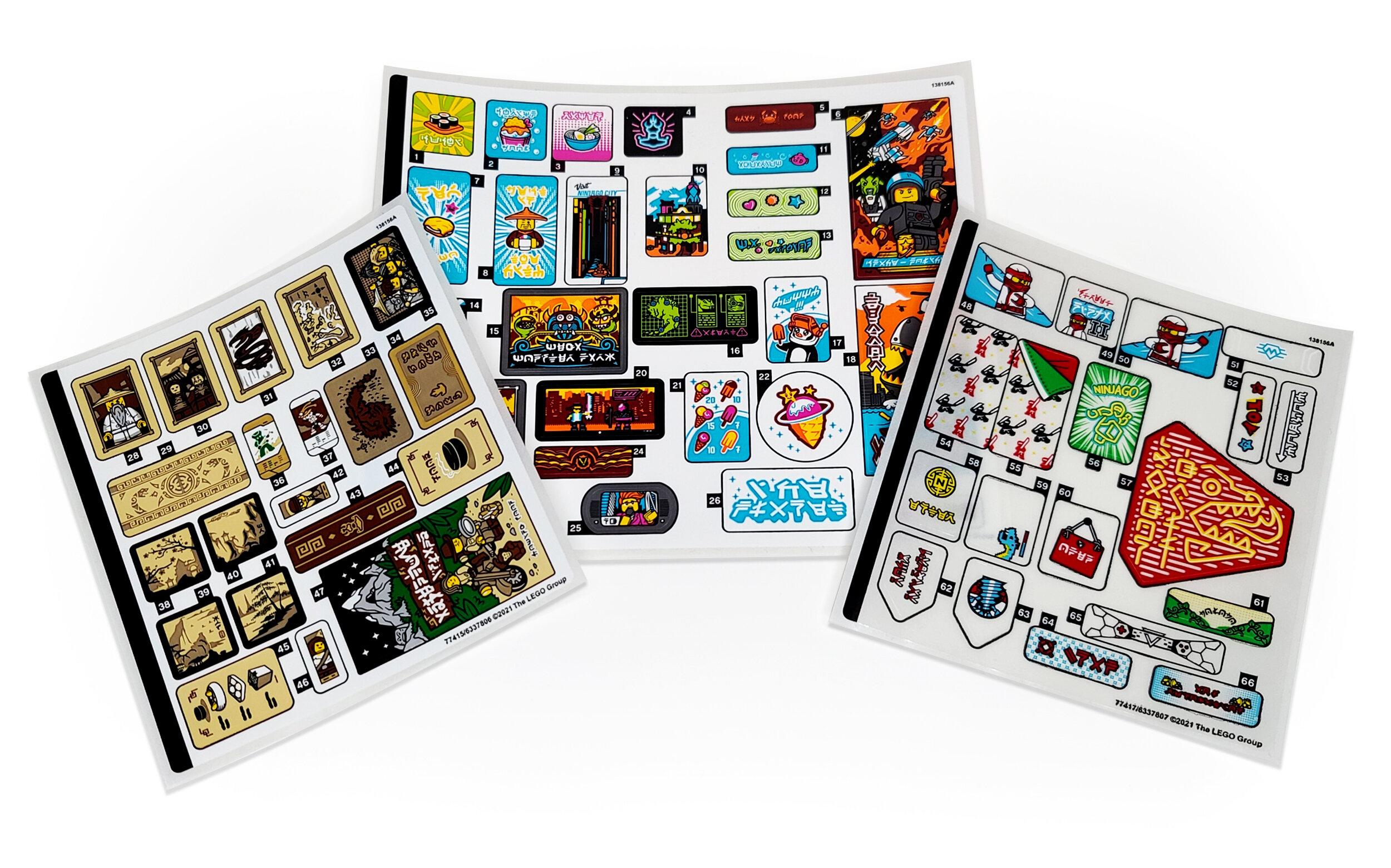
Looking at all 66 numbered stickers together, you might miss some subtle Easter eggs if you are not fully aware of the LEGO Universe and don’t take the time to look at and apply them one by one. When building the set, you have until step 48 in the instructions before you are faced with the decision to place your first sticker—but don’t be scared because they are really easy to apply since most of them are meant for wide tiles rather than smaller elements. You’ve got this!
Inspecting the sheets from a printer’s point of view, it’s notable that the graphic designers have been mindful to maximize space and minimize ink waste. By using a specific pattern and a select swath of colors for each sheet, they can concentrate on a visual style and color vocabulary that compliments the physical design of the set. This also allows for the grouping of similar stickers and utilizing the clear sticker sheet to allow the color of a LEGO element it is applied to act as a “free” color that does not need to be printed.
Here are the colors that popped out to me as I looked at the sheets. I couldn’t help but notice that some of the stickers are so colorful and detailed, that having that same design printed on a LEGO element itself would be nigh impossible.
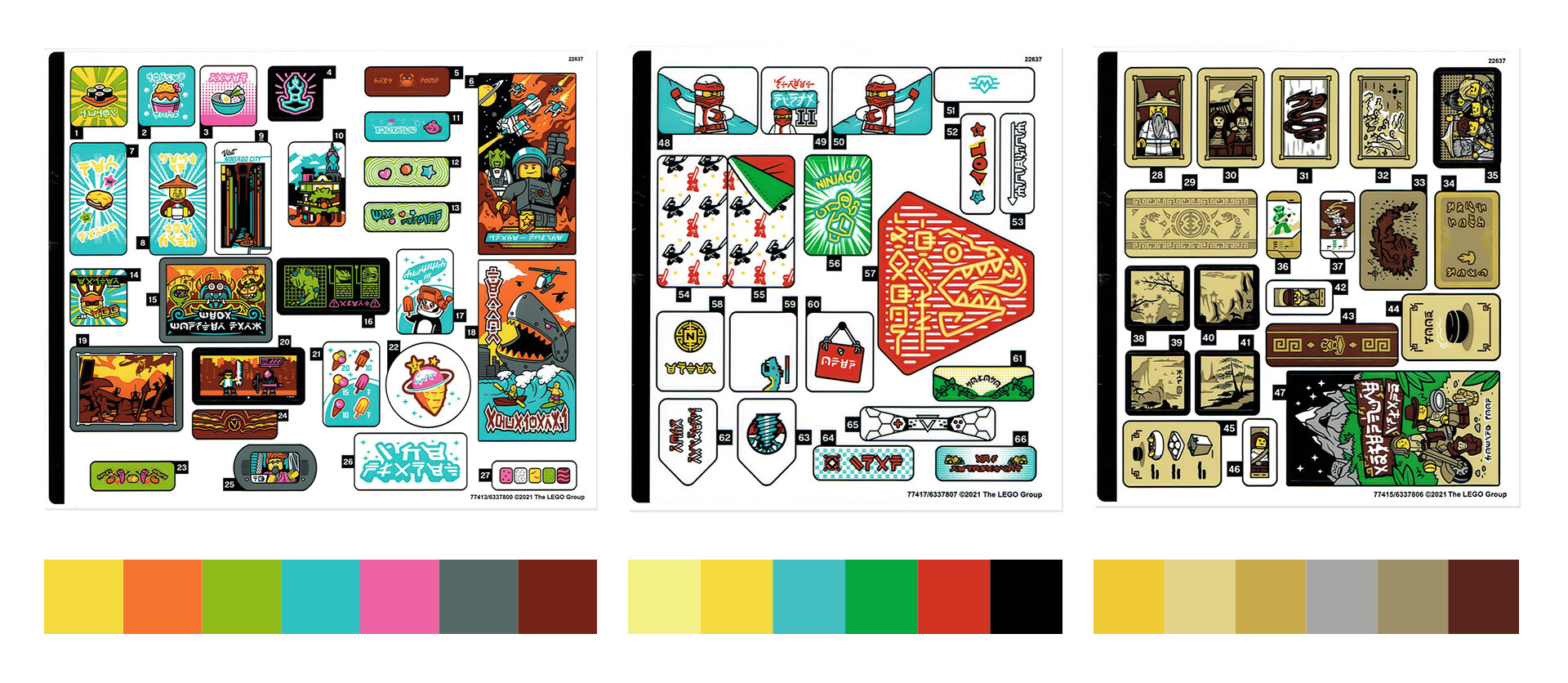
Color palette of each sticker sheet from Ninjago City Gardens
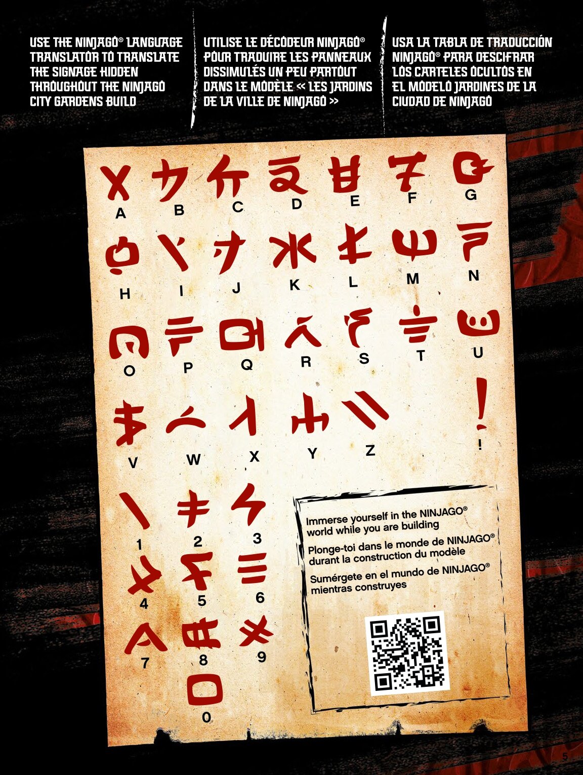
The rest of this stickers analysis will follow the order in the instructions and will be indicated by location in the build in the diagram below. Translations from the Ninjago characters were facilitated by the Ninjago alphabet key, also provided in the instruction book by LEGO.

And finally, before we dive into the actual stickers, we need to give credit where credit is due. Just as the design and production of LEGO sets are a team effort, so too is the graphic design. According to set designer Markus Rollbühler on his Brickset list, the graphic design team was comprised of Michael Patton, Angel Grau, Kjeld Sørensen, Madison O’Neil and Andre Sang-Tae Stenbryggen.
The Pawn Shop: 7 Stickers
For each of these building sections, I will isolate the numbered stickers used in that section, provide graphical translations via gifs, list out the subject of the sticker and what element it is placed on, and then call out a few stand-outs that caught my eye.
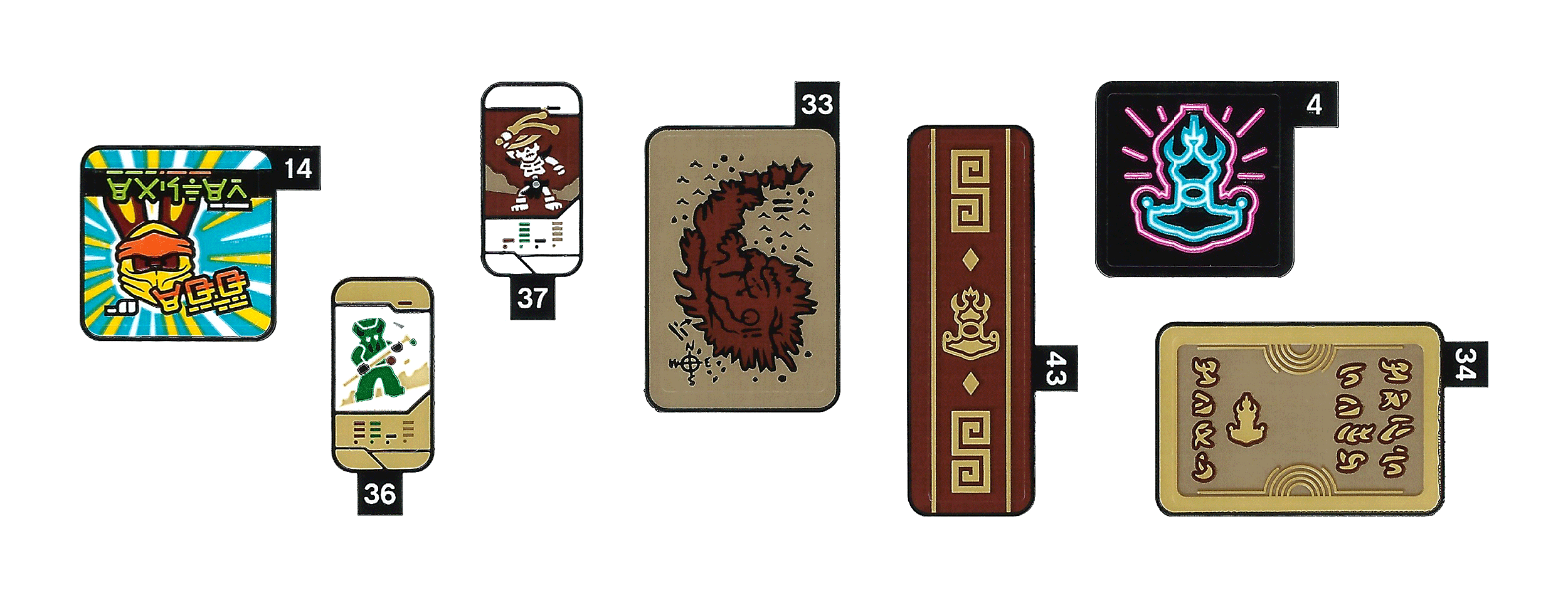
14 - “Easter Egg” / Teal tile 2x2
36 - Ninjago Card 12 (2012) Spitta / Pearl Gold tile 1x2
37 - Ninjago Card 11 (2011) Wyplash / Pearl Gold tile 1x2
33 - Dark Island’s Map / Dark Tan Tile 2x3
43 - Gold Geometric Scrollwork and Ronin’s Pawn Shop Logo / Reddish Brown Panel 1x4x1
4 - Medium Azure and Bright Pink Ronin’s Pawn Shop Logo / Black Road Sign 2x2
34 - “Sale Pawn Shop” + Pawn Shop Logo / Dark Tan Tile 2x3
It is fitting that the first sticker placed translates to a literal “Easter egg.” It becomes the top of a box that hides a treasure you can read about in this Brickset review that I would highly recommend.

The stickers that I choose to highlight in the Pawn Shop are two perfectly detailed replicas of the character cards that were released back in 2011 and 2012 (n36 and n37) along with Ninjago Spinners. In comparison to the real thing as you can see, the stickers even include the little bars and graphics from the originals. I’d like to imagine they are vintage trading cards in Ninjago City.
Sticker n33 is a map of the Dark Island applied on a 2x3 tile. The Dark Island is the sister island of Ninjago City and split off during the Spinjitzu era. Older versions of the map came in the sets 70732 City of Stiix and 70594 The Lighthouse Siege.
Restaurant: 2 Stickers
I could write a whole article on menu design within the LEGO Universe. It is interesting to see that the stickers applied in the older and lower sections of Ninjago City feel older with more subdued tones and more ornate detailing. As we rise into the present, you’ll start to see stickers get a bit more creative and wild.

44 - “Food” + Black Bowl with Lid and Steam / Tan Tile 2 x 3
45 - Menu: Bowl of Broth, Dim Sum Dumplings & Takeaway box of Ramen / Tan Tile 2 x 3
There is not much to add here, although as I write this, the food looks pretty yummy, in spite of the small scale. That is an accomplishment for a designer making me hungry for illustrated food only using a few simple colors!
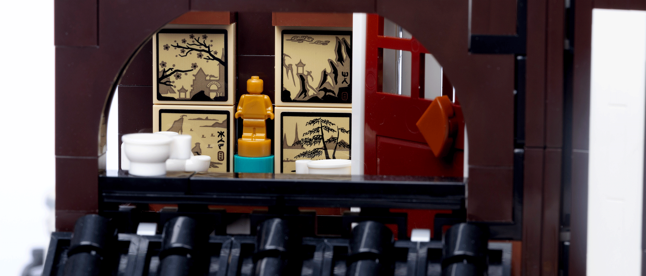
Tea Time Balcony: 4 Stickers
The four stickers here convey the tranquility of traditional hand-drawn paintings which would look stunning in life-size.
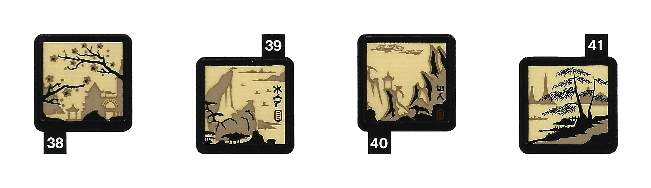
38 - Painting of Temple and Cherry Blossom Trees / Tan Tile 2 x 2 Inverted
39 - Painting of Coastline and Trees + “KWS” / Tan Tile 2 x 2 Inverted
40 - Painting of Temple and Cliffs + “MR” / Tan Tile 2 x 2 Inverted
41 - Painting of Trees, Bridge and Boat / Tan Tile 2 x 2 Inverted

The Tea Time Balcony is the quietest and coziest place in the Ninjago City Gardens, not only because of the hot drinks but also because of the ambiance and the decorative paintings. The four painting stickers (n38 - n41) are applied to the smooth side of inverted on 2x2 tiles in steps 209 and 210 of the instructions. The paintings depict common places within Ninjago like temples, bridges, trees, cliffs, and the coastline, and eagle-eyed fans can even spot Ninjago City Gardens on sticker n38.
As another Easter egg, two of these stickers feature characters that translate into the initials of Kjeld Walther Sørensen (graphic designer) and Markus Rollbühler (model designer) who helmed Ninjago City Gardens. The tea shop wouldn’t be as inviting without them!
Ninjago Fan Apartment: 4 Stickers
If LEGOLAND doesn’t make pajamas or a bedspread with those ninjas on it, that is a missed opportunity for brand cohesion! The stickers are clear, so the bedspread ends up applied to a teal curved slope. Of note in the Ninjago Fan’s Apartment, we find two of only three stickers with English characters.

54 - Bedspread with Red and Black Ninjas / Teal Slope, Curved 2 x 4 x 1 1/3
55 - Bedspread with Red and Black Ninjas, Green and Red Sheets / Teal Tile 2 x 4
9 - “Visit NINJAGO CITY” Poster + Minifigure Paddling on City Canal / White Tile 2 x 4
56 - Yellow Neon “NINJAGO” + Ninja & Green Starburst / Trans-Light Blue Tile, 2 x 3 with 2 Clips
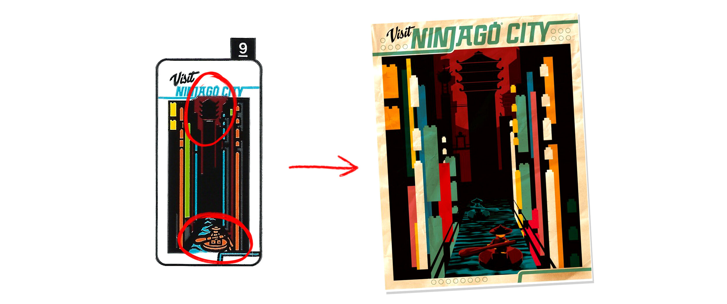
These stickers are definitely the best inspiration you could find if you consider yourself a true LEGO Ninjago fan! Imagine if you could decorate your room with this kind of material. The poster n9 already exists actually, or at least you could get it back in 2017 on LEGO.com with purchases of the original 70620 Ninjago City. For now, I’m happy with a tiny replica on a 2x4 tile (or you could get a similar sticker in 70840 Apocalypseburg). There’s always eBay for the big one. (I wonder if the fan-designed poster included in this set will become a sticker in years to come?)
Balcony Signs - Part One: 10 Stickers
Here’s where we work our way up and into more modern additions to Ninjago City. Many of these stickers have fantastic connections within the LEGO Universe. Here they are as a translated gif before I dive in. [heavy breathing]

62 - Red and White “Rock Raiders” / Teal Tile, Modified 2 x 3 Pentagonal
63 - Rock Raiders Drill Logo / Teal Tile, Modified 2 x 3 Pentagonal
51 - Medium Azure and White Model Team Logo / Bright Light Orange Tile 1 x 3
61 - “Bolobo” (Elemental Master of Nature), Green Leaves and Vines / Bright Green Tile 1 x 3
5 - “Crab Shop” and Orange Crab / Dark Red Tile 1 x 3
64 - “Znap” and Red Znap Connector Element / Bright Light Orange Tile 1 x 3
66 - “A05 Renovation” and Yellow Construction Vehicles / Bright Light Orange Tile 1 x 3
65 - Ninjago Prime Empire Logo + Red Video Game Controller Buttons / Teal Slope, Curved 4 x 1
24 - Time Twins Symbol / Dark Red Tile 1 x 3
52 - “Toy” and Red and Medium Azure Stars Smiling / Bright Green Tile 1 x 3

Going step by step on this platform is like walking through a joyful timeline of both LEGO history and the Ninjago Series. Above I’ve created a visual key explaining some of the best Easter eggs harking back to LEGO themes from years ago.
Sticker n51 features the Model Team logo from 1991 (the year I was born), stickers n62 and n63 call back to 1998 and the Rock Raiders theme, and n64 features both the word ZNAP and its infamous purple connector. The Toy shop logo n52 is also reminiscent of the logo on Timmy’s shirt from Time Cruisers.
We jump to the Ninjago TV Series with the Time Twins featured in sticker n24, the current Elemental Master of Nature, Bolobo in n61, and finally the graphic theme style of the Ninjago Season 12: Prime Empire in n65. Sticker n5 then takes us full circle back to 70620 Ninjago City and its iconic Crab Shop restaurant.
And last up in this batch, the graphic designers also managed to insert an internal joke with sticker n66 - A05 Renovation, which is the code that elements receive when they are about to retire and are unavailable for use in future sets.
Ice Cream Shop: 7 Stickers
It is time to take a break to chill in the ice cream shop themed after the LEGO theme Ice Planet. Again we have more food menus with prices (I wonder what the currency of Ninjago City is…) and delicious treats. The ice cream cone design also appears on a printed minifigure torso in the set showing the harmony that can be achieved when sticker design and printed design work hand-in-hand.

27 - Five Squares w/ Round Corner Ice Cream Flavors / Medium Azure Tile 1 x 3
60 - “Open” Red Sign Hanging / Trans-Clear Door 1 x 4 x 6 with Stud Handle
17 - “Yummy!!!” and Ice Planet Penguin Mascot with Orange Popsicle / White Tile 2 x 3
22 - Ice Cream Shop Logo / White Tile, Round 3 x 3
26 - “Ice Planet” + Sparkles / White Tile 2 x 4
21 - Menu: Price List of Ice Cream Cones and Popsicles / White Tile 2 x 3
53 - “Museum” + White Arrow / Bright Light Orange Tile 1 x 3

At this moment, I bow to the design team geniuses who took the elements and graphics from the Ice Planet 2002 theme back in 1993 and somehow turned it into an Ice Cream Shop franchise in a city full of ninjas. There is so much more than what meets the eye, and you can understand it all by just looking at the picture, from quoting the stars to using ice as a topping. It is a shame that sticker n22 on a new round 3x3 white tile is somewhat obscured in the final build.
Chen’s Noodle House: 6 Stickers
Next up we have more food and now I’m hungry for real! We have a delightful assortment of offerings including parmo, a chicken and cheese dish invented by an American and popularized in the UK which seems to have taken hold in Billund! (I mean Apocalypseburg! No, I mean Ninjago City!)

7 - “New Parmo” + Sandwich + Bright Pink and Lime Stars Smiling / Tan Tile 2 x 4
29 - Geometric Scrollwork, Round Symbol and 2 Anacondrai Serpents / Tan Tile 2 x 4
1 - “Sushi” + Orange Plate with Four Sushi Maki Rolls / Yellow Slope, Curved 2 x 2
2 - “Shrimp Bowl” + Dark Pink Bowl / Medium Azure Slope, Curved 2 x 2
3 - “Ramen” + Bowl with Ramen, Onions, Egg and Narutomaki / Dark Pink Slope, Curved 2 x 2
8 - “Best in the City” + Chen Figure holding White Bowl / Tan Tile 2 x 4

It’s so interesting to me how these stickers follow the process of designing something for a real restaurant. The graphics, the ads, and having all the stickers with the same aesthetic almost makes it seem like a real business. It’s also nice to see some of the famous dishes from the series make an appearance, like the Shrimp Bowl and the Sushi Plate. If you want to open the best noodle shop in Town, just open a Chen’s franchise!
Ninjago Museum of History: 10 Stickers
Now we are getting to some deep lore included in sticker form throughout the Ninjago Museum of History. Here are the translations before I dive into their meanings.
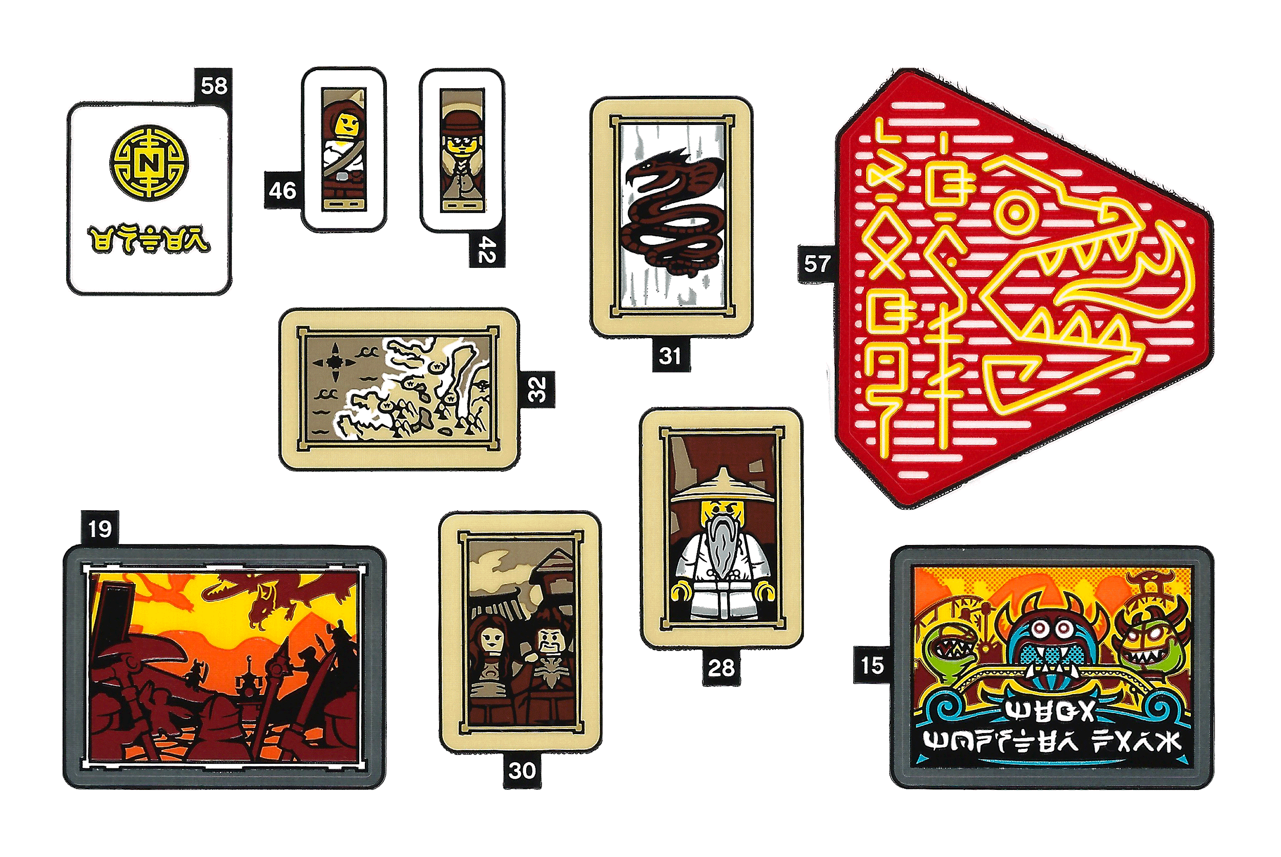
58 - “Enter” + Gold Maze Symbol with “N” / Trans-Clear Door 1 x 4 x 6 with Stud Handle
46 - Portrait of Female Minifigure with White Shirt, Strap and Belt / White Tile 1 x 2
42 - Portrait of Male Minifigure with Bowler Hat and Glasses / White Tile 1 x 2
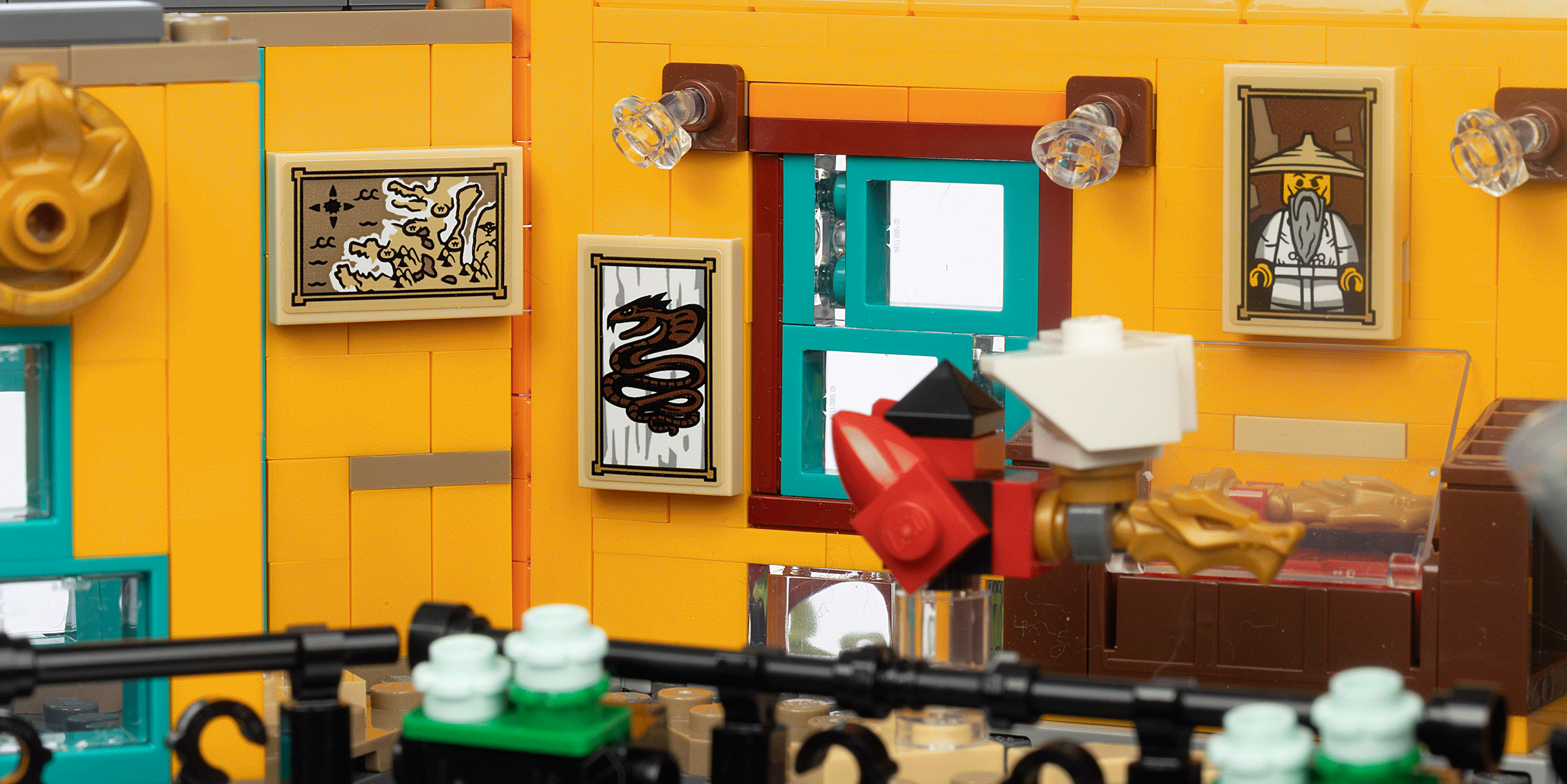
32 - Antique Map with Compass Rose, Temples and Waves / Tan Tile 2 x 3
57 - Yellow Neon “Dragon Grill” + Dragon Breathing Fire / Trans-Dark Pink Flag 5 x 6 Hexagonal
19 - Painting of the “Battle of All of Time” / Dark Bluish Gray Tile, 4 x 4 with Studs
15 - “Mega Monster Park” w/ Monsters & Rides / Dark Bluish Gray Tile, Modified 4 x 4 with Studs
31 - Framed Picture of The Great Devourer / Tan Tile 2 x 3
28 - Framed Picture of Yang / Tan Tile 2 x 3
30 - Framed Picture of Ray and Maya / Tan Tile 2 x 3

Being “not quite a Ninjago Fan” (I know… guilty as charged!), I must say that this section awoke in me some interest in the series. Jumping to the framed artwork, I feel like both Ray and Maya in n30 (former Elemental Masters of Fire and Water) and the Battle of All of Time in n19 are very similar to the ones in the “real” Ninjago Museum of History shown in the series. However, I think that n19 could have been better depicted by using a sticker placed on a new 2x6 tile—this would be more in proportion to the size and shape of the painting on the TV series.
In the same area we get also the framed portraits of the Creator of Airjitzu - Yang (n28), the Great Devourer (n31), and two small portraits of mysterious figures. The minifigure with a bowler hat and glasses (n42) is based on LEGO Element Designer Niels Milan Pedersen and the female minifigure (n46) is based on Helena Tova Skvalling who can be exclusively found in 7325 Pharaoh’s Quest Cursed Cobra Statue (Cursed cobra!? No coincidences, right?). Finally, the framed picture of the Mega Monster Park (n15) is a very common battle scene location during Season 1 and 7.
Ah… I almost felt like Doctor Sanders walking you through the Museum which just wouldn’t be the same without stickers. Onto the next room!
Student’s Apartment: 2 Stickers
In the Student’s Apartment, we have perhaps two of the simplest, yet most beautiful stickers in the set.
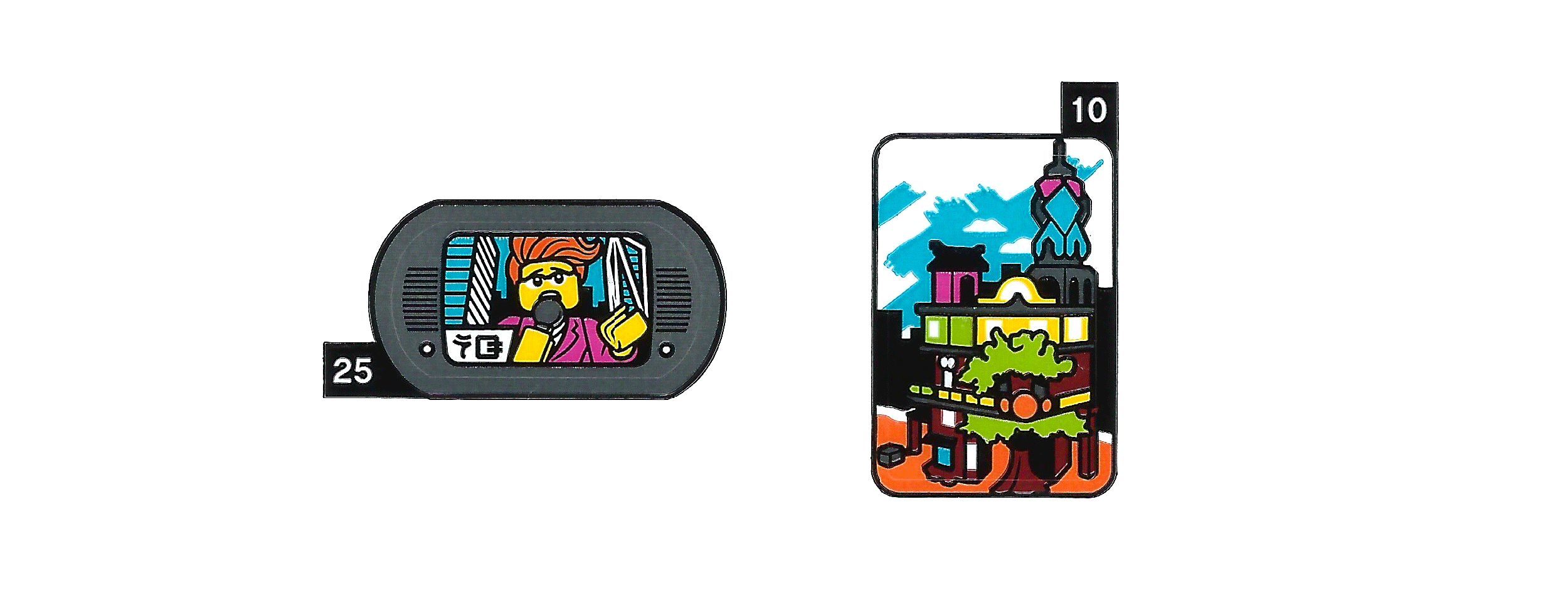
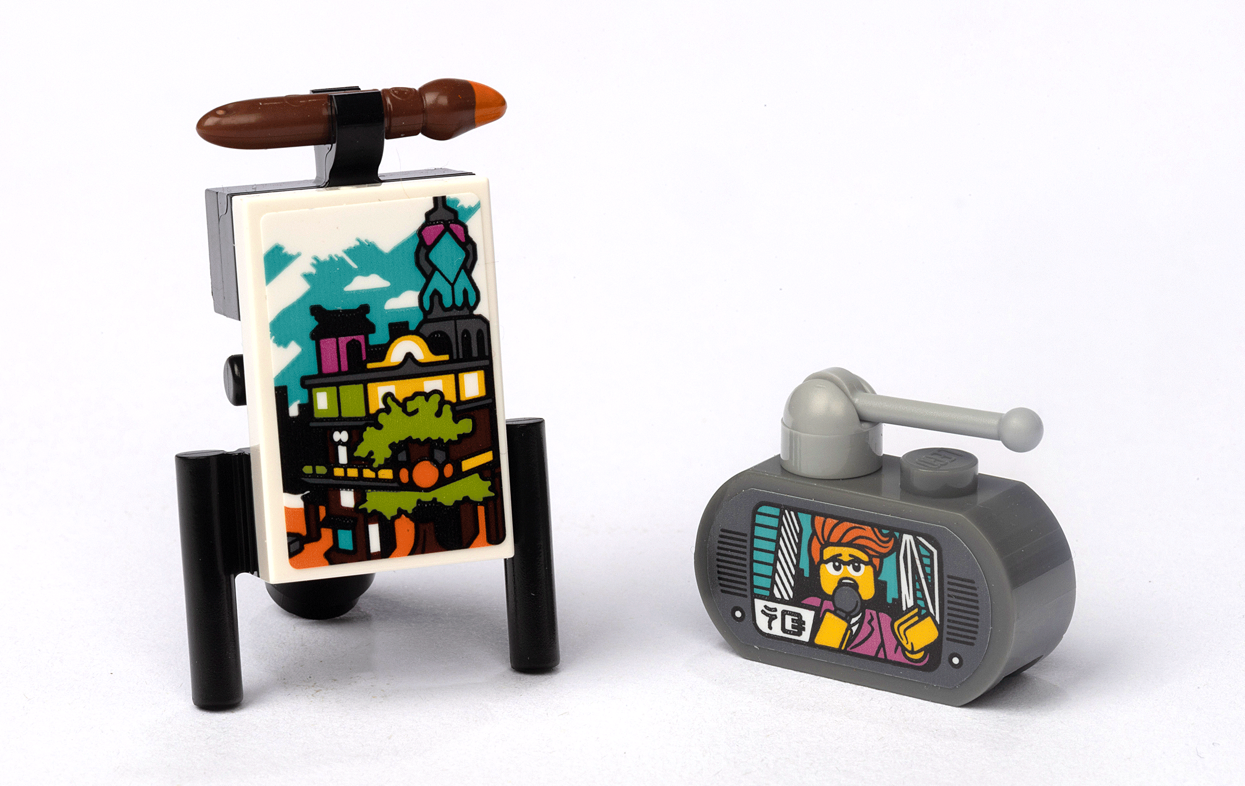
25 - TV Display “NG” + Female Reporter with Microphone / Dark Bluish Gray Brick, Modified 1 x 3 with Round Ends
10 - Ninjago City Gardens Painting / White Tile 2 x 3

It’s nice to see that Gayle Gossip (the main reporter from NGTV - Ninjago TV) got a chance to be included on a sticker depicted the same way she first appeared on the series in the Season 2 episode “The Day Ninjago Stood Still.” Her scared face, pose and outfit while reporting on an earthquake are all faithfully recreated.
In this section, we also get a minimalist painting of Ninjago City Gardens (n10) in step 625, prompting the question, which came first, the painting or the set!? (It is also nice to see that a paintbrush is included with a paint color on the tip that matches what is supposed to have been painted for once!)
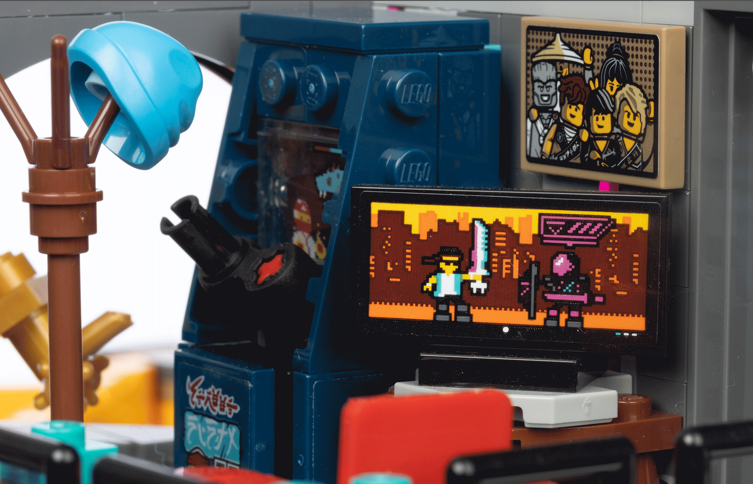
The Ninja Zone: 7 Stickers
An arcade-like ninja room is the perfect place for Easter eggs! The designer in me wants to see these on a T-shirt!

6 - Movie Poster + “Space Police” from Space Police 3 Theme/ Trans-Clear Glass for Window 1 x 4 x 6
35 - Picture of Ninjago Characters Wu, Nya, Zane, Jay, Cole and Lloyd / Dark Tan Tile 2 x 3
20 - TV Display Video Game (Prime Empire) / Black Tile 2 x 4
50 - White and Red Ninja Video Arcade Game Sign / Dark Blue Tile 2 x 3
59 - Medium Azure Video Game Dragon and Health Bar / Trans-Clear Panel 1 x 2 x 2
48 - White and Red Ninja Video Arcade Game Sign / Dark Blue Tile 2 x 3
49 - “Street Ninja II” and White and Red Ninja Video Game / Dark Blue Tile, Modified 2 x 2 Inverted

Included are a movie poster sticker (n6) of Space Police 3 complete with references to the 5981 Raid VPR and 5983 Undercover Cruser sets along with a few key characters. Ninjago Season 12 “Prime Empire” is also depicted (n20). In the Ninja Zone, we also get an awesome sticker (n35) of a framed picture of the Ninjas and the Master.
Hidden Room & Ninja Control Room: 3 Stickers
Our last rooms to explore feature three stickers including two more movie posters. These are found in the rooms at the top of Ninjago City Gardens as we complete the build.
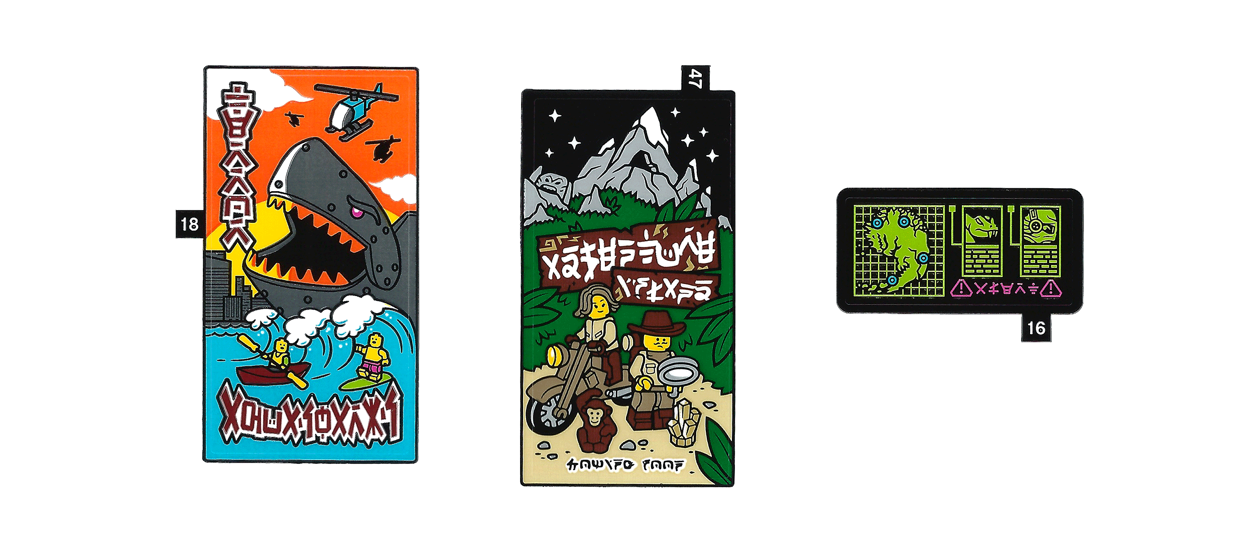
18 - Movie Poster “Terror Aquasharks” / Trans-Clear Glass for Window 1 x 4 x 6
47 - Movie Poster “Adventure Island - Coming Soon” / Trans-Clear Glass for Window 1 x 4 x 6
16 - Map of Ninjago, Pythor, General Cryptor + “ALERT” / Black Tile 2 x 4

In both movie posters, there are some connections to the past, present and future of both Ninjago and other LEGO themes. On sticker n18, the shark poster reminds me of the mecha-shark in Ultra Agents set 70172 AntiMatter’s Portal Hideout from 2015—the color of the helicopter gives us a clue—(though it could also be from The Ninjago Movie when the Garmadon attacks Ninjago City on the beach with this HUGE mechanical shark!)
The n47 sticker looks like Johnny Thunder aka the “Jungle Explorer” from the Collectible Minifigure Series 19 and a recurring character from the Adventurer’s theme. But be careful! Johnny thunder is only a decoy for an even more hidden Easter egg! If you take a look at the snowy mountains behind him, you’ll find some suspiciously detailed crags that look like the tribal statues from the current season and Ninjago sub-theme “The Island.” So sneaky!
Balcony Signs - Part 2: 4 Stickers
To literally wrap up the build, the final balconies are put into place. Weep with me as we place the last sticker in step 868 celebrating the graphic design of a truly amazing set.
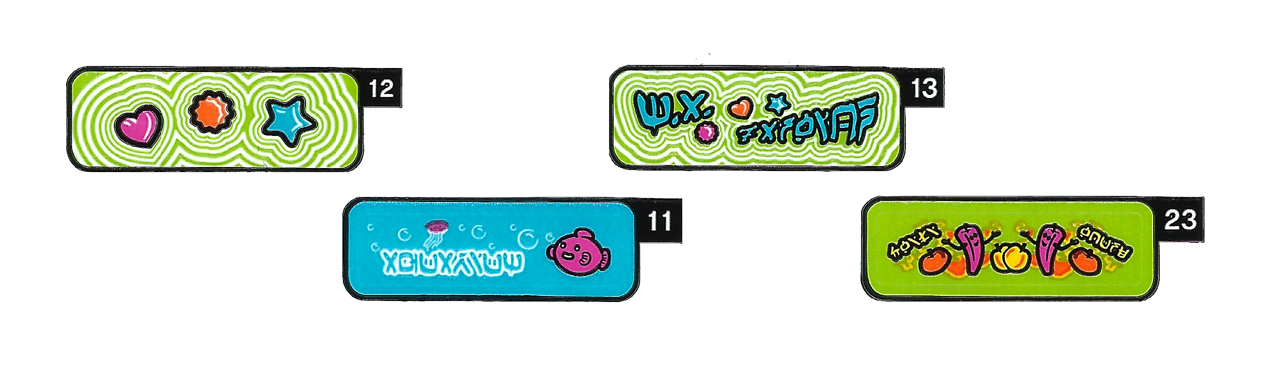
12 - Dark Pink Heart, Orange Flower, and Medium Azure Star Clikits Shapes / Lime Tile 1 x 3
13 - “M.A. Fashion” + Coloured Clikits Shapes / Lime Tile 1 x 3
23 - “Chili House” + Magenta Peppers, Yellow and Orange Fruit, and Flames / Lime Tile 1 x 3
11 - “Aquarium” + Dark Pink Fish and Jellyfish / Medium Azure Tile 1 x 3

Back to the balcony for the last time (but not the least), you will get the chance to apply an awesome tribute to Matthew Ashton (n13), LEGO’s vice president of design, and a nod to the classic LEGO pre-DOTS fashion theme Clikits in n12. The theme is instantly recognizable because of the three shapes of the heart, flower and star in their respective colors from the logo.
Other billboards (n23) advertise the “Chili House” (possibly a reference Cole’s not-so-good chili) and an aquarium in n11. An aquarium appears for the first time in Season 3, Episode 4: “The Curse of the Golden Master”… and hey, we also get a “Golden Master” in this set… coincidence? I think not!
Final Thoughts
I think the evidence is clear. The LEGO graphic designers for Ninjago City Gardens had a blast creating the visuals and illustrations for the stickers in the set. This could possibly be one of the best sets ever to take a deep dive into the stickers—not only for the sweet graphics but also for the Easter eggs and references to the Ninjago and LEGO Universes. I’m sure I missed some, so if you see any details that I didn’t talk about, let me know in the comments below.
Overall, I honestly think any LEGO builder is missing out by not applying them. You are missing in-jokes, Easter eggs, references to the past and future and just some exceptional graphic design. I also hope that I have changed the minds of any anti-sticker LEGO enthusiasts out there—even just a little bit—who typically toss the sheets right back in the box or into a sticker morgue (ahem, I mean archive). I hope this deep dive helps all of us appreciate the work that goes into designing not only the set but the stickers too.
[I also need to give an epic shoutout to Dave Schefcik who helped with the details, photos and text of this article, Teresa Elsmore who took some awesome photos for me to edit, and to Markus Rollbühler who offered us some exclusive tips about the stickers that made this deep analysis so special.]
Did you apply the stickers to your Ninjago City Gardens set? What do you think about stickers on LEGO? What LEGO sets would you like us to analyze the stickers sheets for next? Leave your thoughts in the comments below.
Do you want to help BrickNerd continue publishing quality articles like this one? Become a patron to show your support, get early access, exclusive swag and more.