Beatlemania: LEGO Album Cover Edition
/I may officially be a “BrickNerd” but there is no subject about which I am historically nerdier than The Beatles. I apologize to everyone I’ve known since middle school who had to endure the brunt of my Beatlemania. I understand now how uncool The Beatles and I both were back then. "I’m much better now.”
Yes, OK. I may still listen regularly to “Breakfast with The Beatles”. I also totally non-stop binged the recent McCartney series on Hulu, and I am counting the days until the Peter Jackson documentary (11/26) — but these days, my much smaller shrine to the Fab Four barely merits a mention.

You may, however, notice the plastic wreath bins in the room, stacked neatly in a corner, clashing with the chaos.

These bins contain my most meaningful MOCs, “The Thirteen British Beatles Album Covers”. They have been frozen in time since February 2020 when they were invited to travel to the LEGO House’s Masterpiece Gallery in Billund — the most wonderful honor ever — to travel in September 2020… then delayed to 2021… then 2022? Fingers crossed it will still happen!
Today, I will dust off this time capsule to share their LEGO journey with you.
The Thirteen British Beatles Album Covers
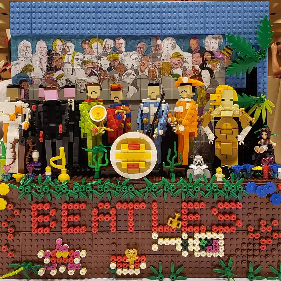
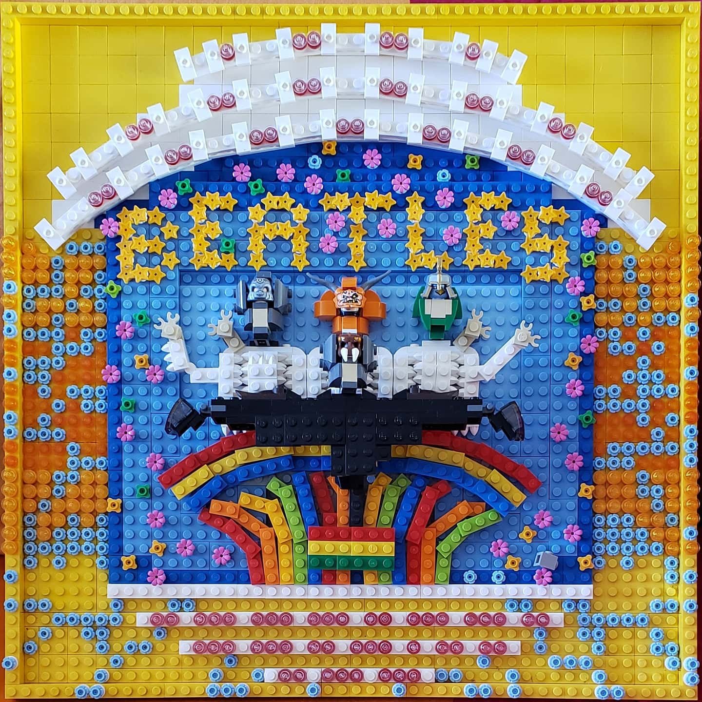
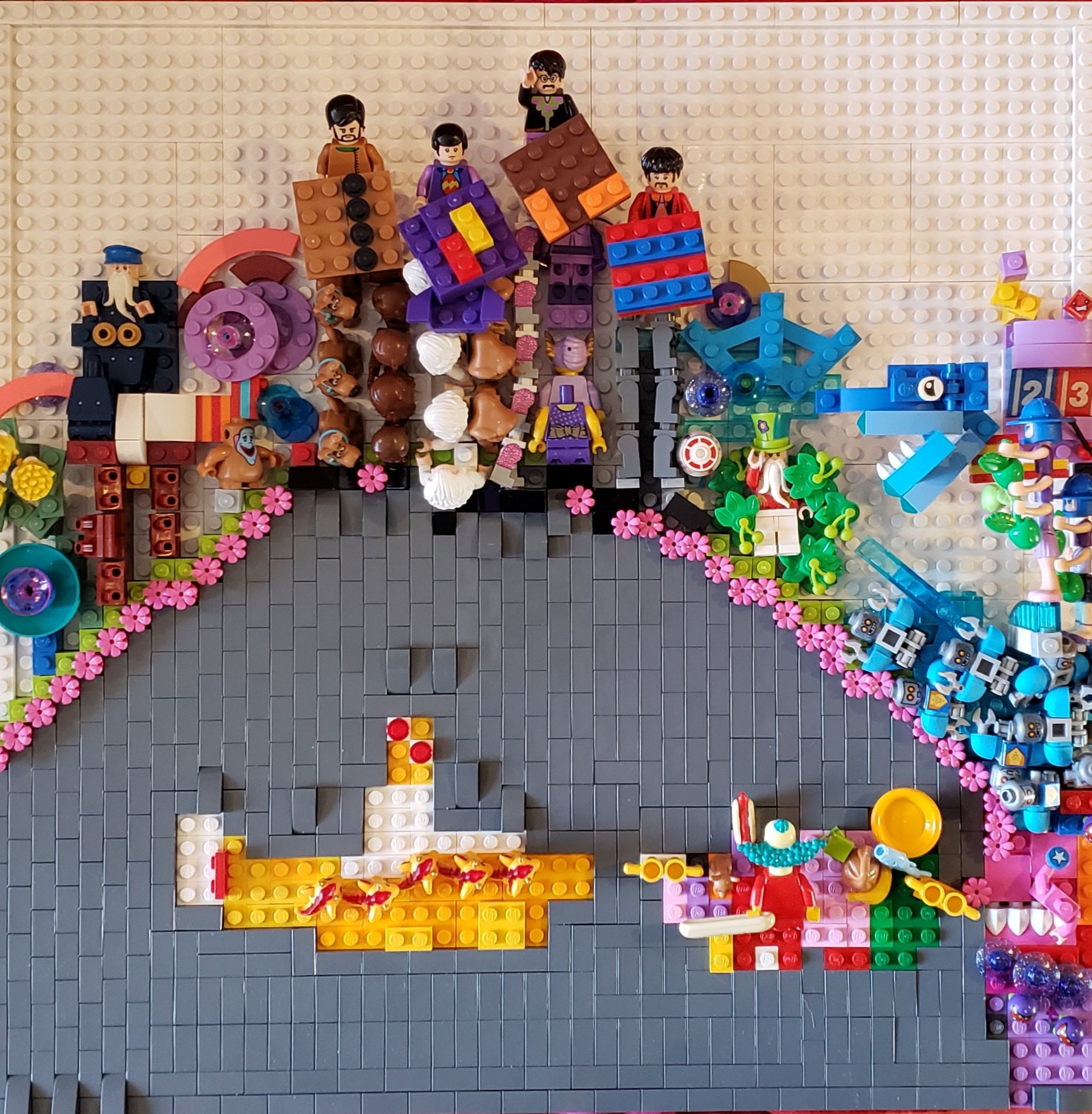
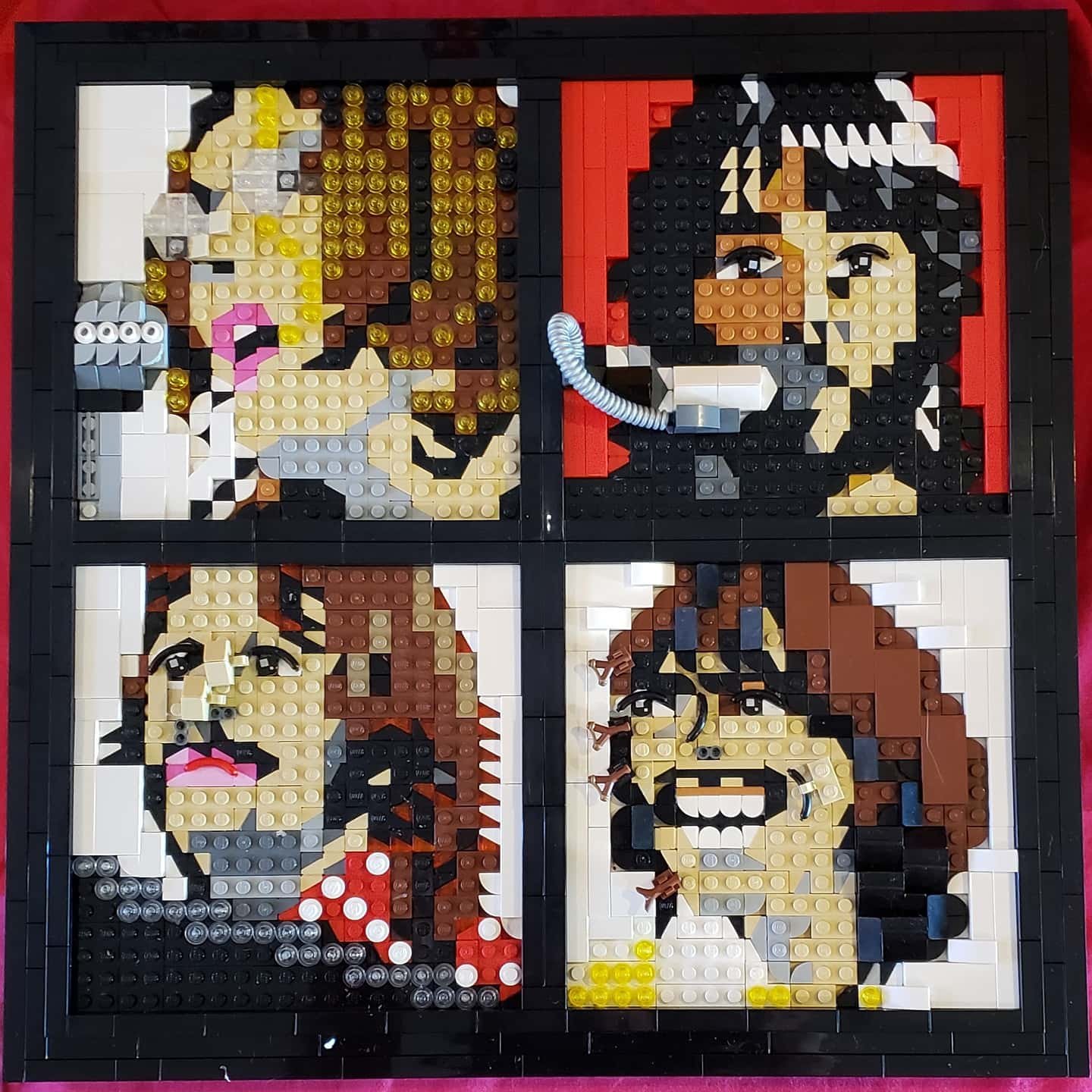
The photos above show my LEGO interpretations of the Beatles’ British studio albums in chronological order. I will describe the creative process, however, in the order in which they were built. Each album cover is created on a 48x48 (large grey) baseplate. This is more or less (in LEGO terms) the size of an LP. They may not look like much in pixels, but the set takes twenty linear feet (6.09 meters) of table space to display!
The main purpose of this project was not to create perfect pixellated pieces, but to capture the image and feelings, incorporating both the visual style of each individual album and also the zeitgeist of the Beatles’ world at the time of its creation. The Beatles pushed the envelope with each album, and I strove for this, too. Each cover uses unique techniques to achieve unique goals.
You can tell from the quality of the photos that I never expected to show them to anybody. I don’t generally share WIP pics, and to this day I believe that my Beatles covers really only look good in person. I took the occasional snapshot merely to prove to myself that I was making progress on a personal goal.
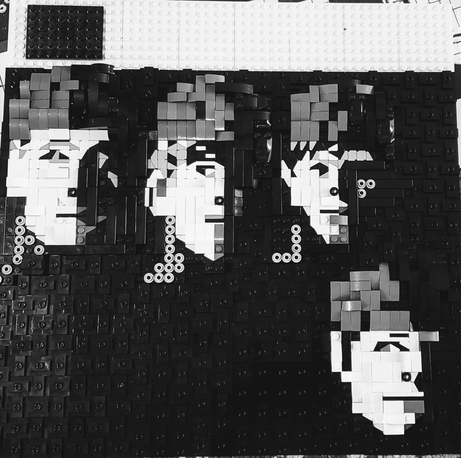
Revolver

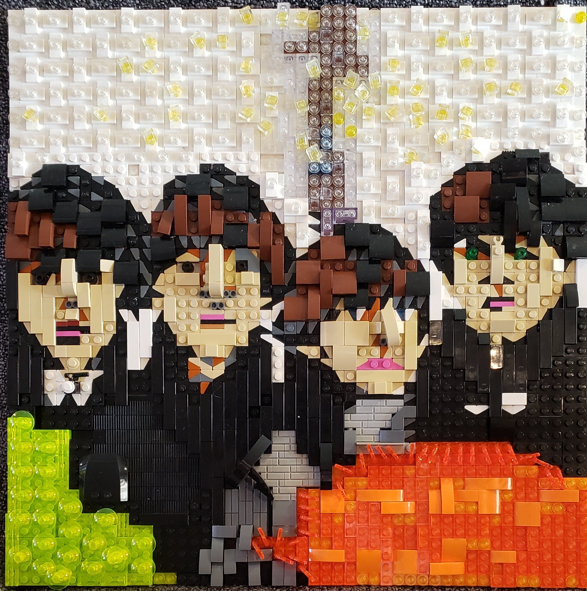
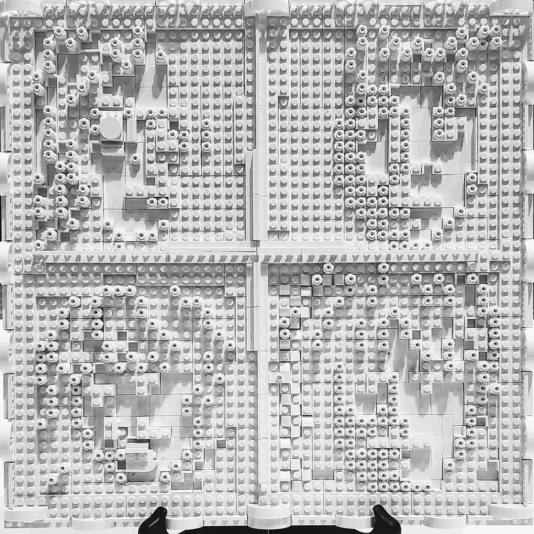
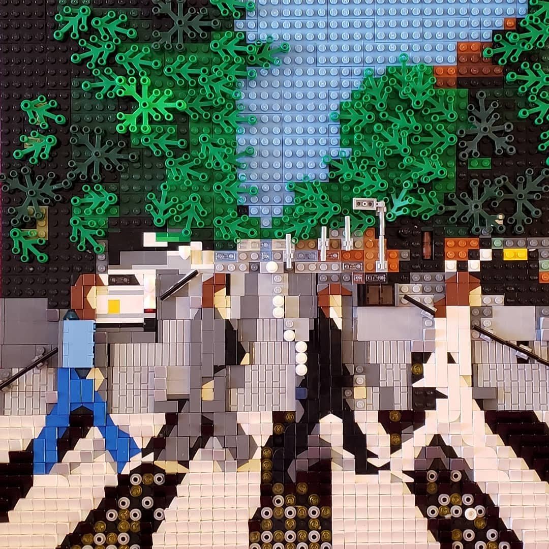
The best way for me to find inspiration is to get the notion that something would be amazing, but also impossible… then try to prove myself wrong. This is how I started building “Revolver”. The 1965 album cover, designed by Klaus Voorman, is an intricate, detailed, intertwined assemblage of sketches and photo mosaics. The fine lines and photos seem way too intricate to build in LEGO.
As far as I could tell, nobody had tried. This made me want to give it a go… Also, I had never built a LEGO mosaic before.
I pulled out every kind of element I owned in black, white, and gray, and I experimented until I created each section and vignette and combined them to my satisfaction. I had surely spent hours of my life staring at the image heretofore but never anywhere near so deeply. It helps to start off with a subject about which you could never tire.
A book of Beatles Album Cover art helped me on this journey. I designed this first album cover freehand, glancing back and forth and back and forth, between the book and the baseplate, without any guide. (After I had finished all thirteen covers, I went back and graphed it out, only to find that my eyes had been surprisingly spot on. Yay, me! I didn’t make any changes.)
I’m not great with “illegal” techniques, but there is one cheat on this piece, where I altered an element. Can you find it?

I displayed “Revolver” at Bricks LA in January 2019. It sat perched against a column in an awkward corner… and was completely ignored. The public seemed to walk on by. Oof. Tough crowd. I only had two alternatives. Give up or carry on. I went home deflated, but I thought, “Well, The Beatles still inspire me... And if everyone will ignore one Beatles album, they will ignore a complete series thirteen times as much!” And so I decided to keep building.
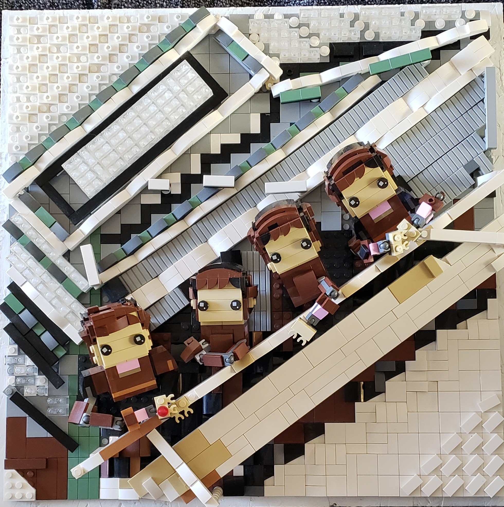
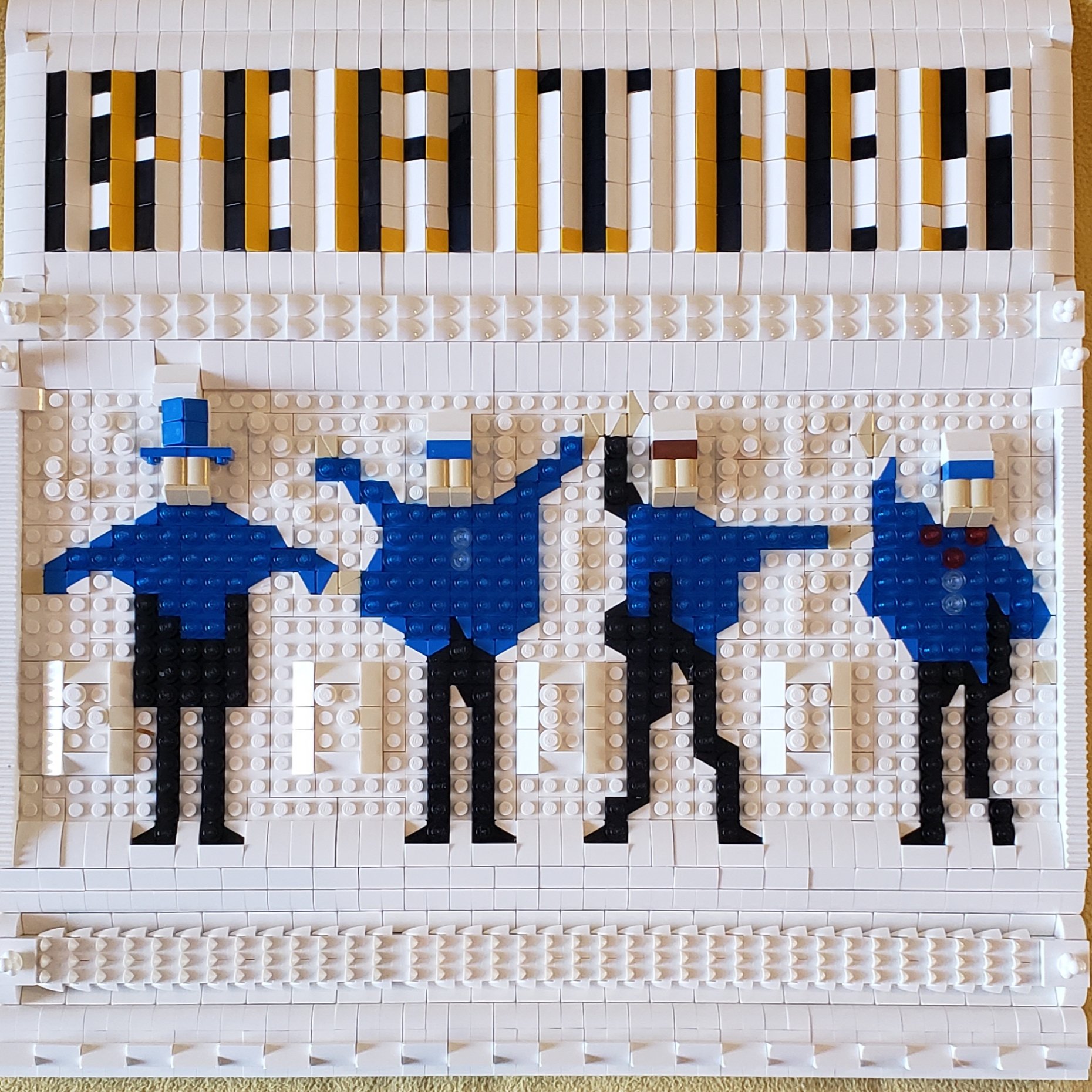
A Hard Day’s Night

Because I knew nothing about mosaics, and because I didn’t want to copy styles from anybody else, I started with “A Hard Day’s Night”. In college, I had knit a cardigan paying homage to the soundtrack albums by graphing out the film cells. (And this was long after my Beatle nerdiness had peaked.)

I came across a LEGO mosaic technique using sideways cheeses and double cheeses sideways stacked using friction to hold them together. I felt that technique would capture the same effect as the cover. Unfortunately, I quickly learned that that technique buckles/explodes when it’s an area more than 8x8 studs. I reformatted the baseplate several times to establish structural stability. I decided to have every other cell built on a separate plate and floated above.


In the end, I feel like this worked even better than the original plan. It gives a true 3D feel, especially in person. It’s like one of those paintings where the eyes follow you around the room. Richard Lester would approve.

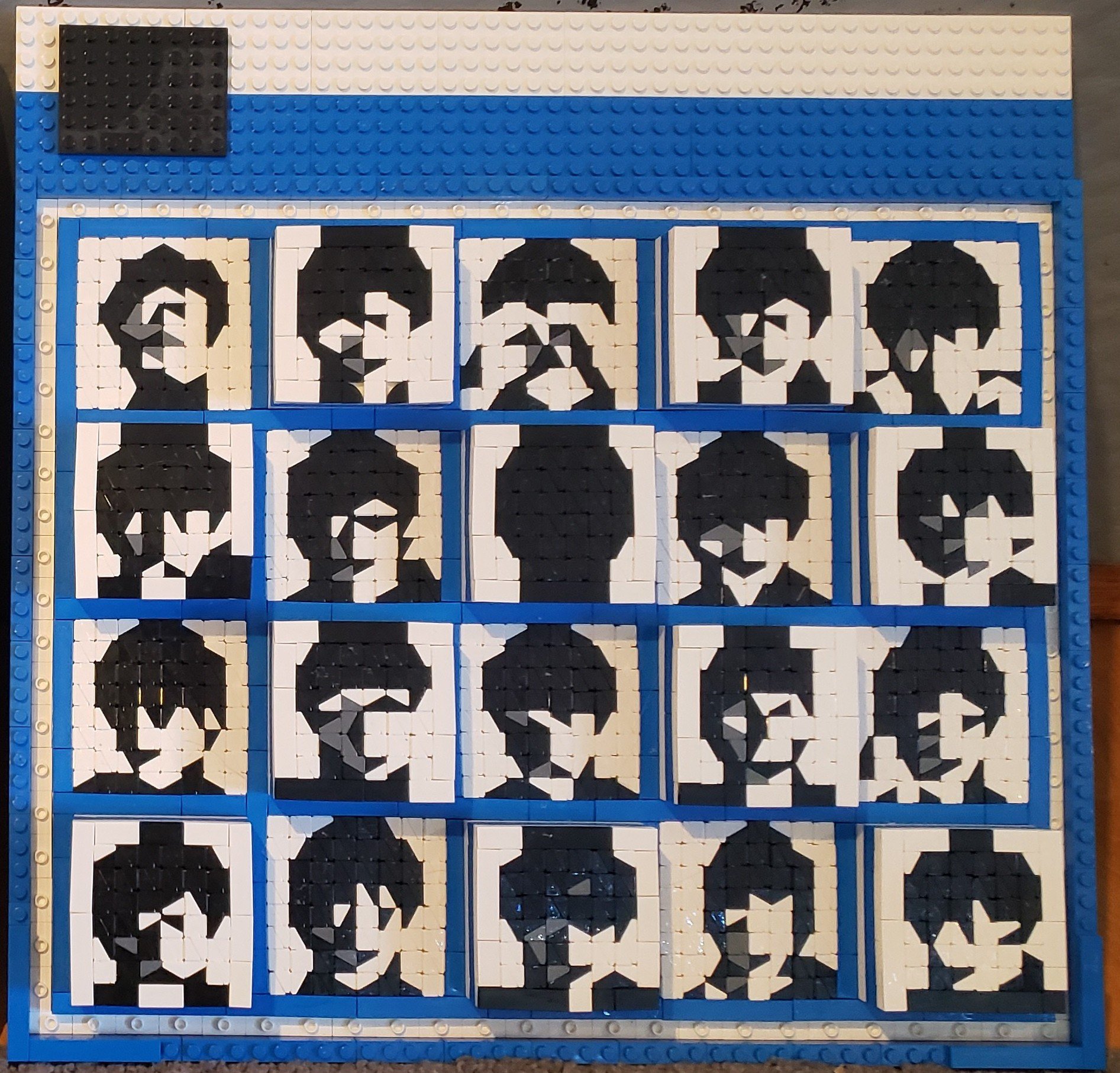
With The Beatles
Next, I decided to build “With The Beatles”. (In the United States, this cover is known as “Meet the Beatles”, but UK audiences already knew the Fabs from “Please Please Me”, followed by… whoops... I went off again, didn't I?)
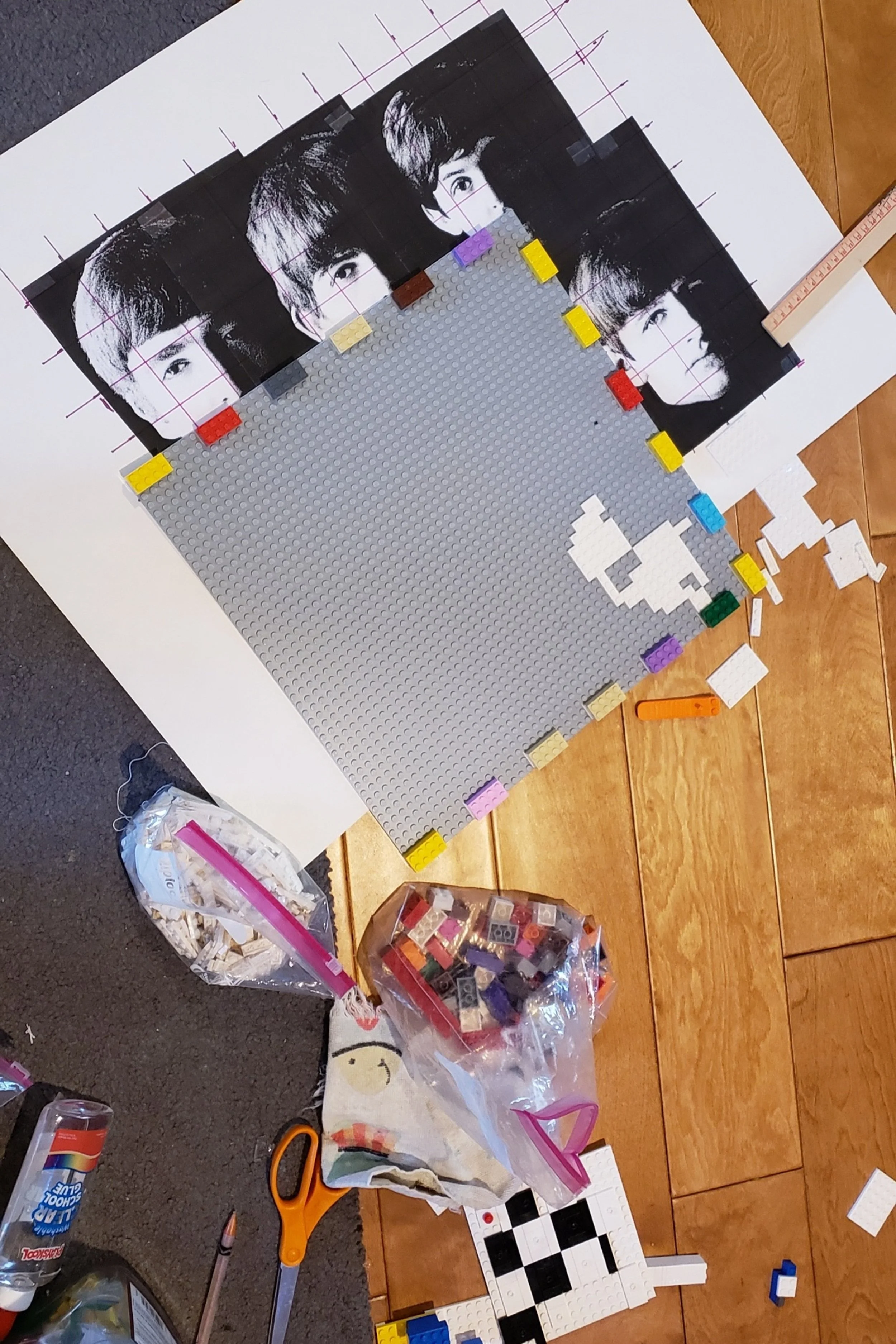
To get a feel of how this should be laid out, I devised the formula I stuck with: Print out an image 48cm square to coordinate with the 48 stud plate, then graph it manually into 4x4 squares. I didn't want to be mechanical, but I wanted to keep on track.
I once saw an exhibition of Robert Freeman’s photography at a gallery, where these photos were printed at a very large scale. I saught to capture the impressions I felt with those hyper-real images. I wanted the viewer to feel like they, too, were standing in a hallway with the lads, with a curtain as a background and natural bright sidelight casting deep shadows. I wanted the boys to feel alive, but in LEGO, and not oversized.
This is easier said than done. Especially when you’re trying to build only with the bricks you have (i.e. no BrickLink orders).

This piece is designed to be seen in real life. The brain pieces together the fragments of light, reflecting in various ways on the differently shaped pieces as you walk around it, so that you feel the 3D intimacy.
When I “finished” an album cover, I would leave the baseplate set up on display, until I could “convince myself” that it looked ok. (Even if it were publicly ignored.)

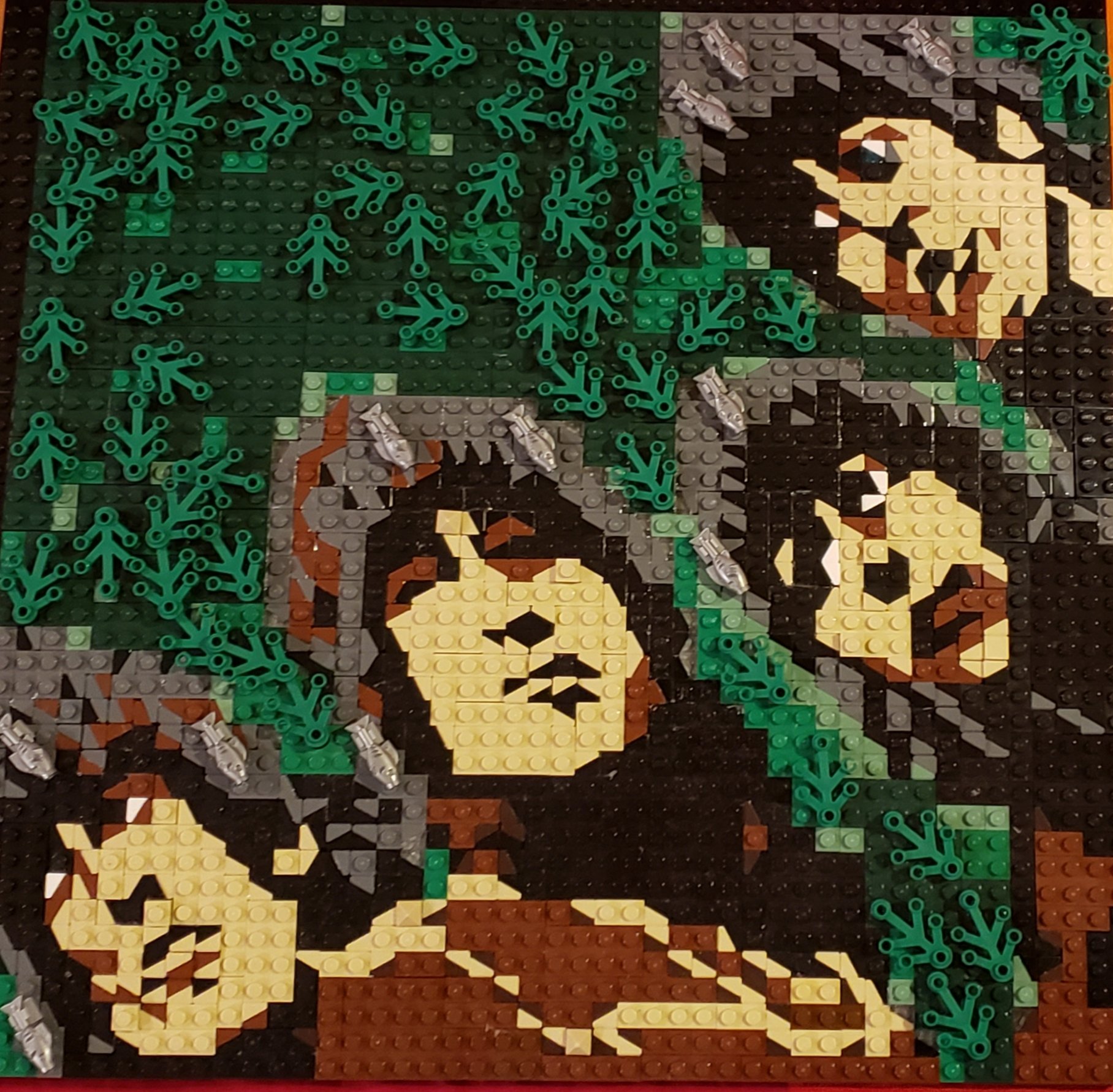
Rubber Soul
Next up, “Rubber Soul”. I felt that I could move away from black/white and into color. I didn’t have a color printer, which was all the better. LEGO doesn’t have all the colors! I printed out the black/white 48cm images and compared them with the book of album art until my brain could decide on the colors I might use. (Lucky for me, Earth Green was on the Pick-a-Brick wall at a nearby LEGO Store that month!)
I decided on a realistic technique that suited this particular warped photo. The Beatles were, at this time, between the two worlds.


I put fish in their hair as a finishing touch to represent their soupçon of psychedelia.

“Rubber Soul” is usually my favorite Beatles album. This may also be my favorite LEGO cover… but my favorite techniques and Easter eggs are yet to come!
Give It Time and It Will Grow
Those are the first four LEGO covers I made of the Fab Four, though I must end this episode of Nerdy LEGO Beatle fandom for today. I still have nine albums left, but part two should go faster. I promise: “I'm much better now.”
Which is your favorite Beatles album cover? Leave your thoughts in the comments below.
Do you want to help BrickNerd continue publishing articles like this one? Become a top patron like Charlie Stephens, Marc & Liz Puleo, Paige Mueller, Rob Klingberg from Brickstuff, John & Joshua Hanlon from Beyond the Brick, and Megan Lum to show your support, get early access, exclusive swag and more.