Beatlemania: LEGO Album Cover Edition, Part 2
/Are you ready for more LEGO Beatles nerdity? Roll up! Roll up! Part two of the magical mystery tour starts now. Step right this way!
For those unfamiliar with the beginning of this series in part one, this is the behind-the-scenes of my LEGO interpretations of the 13 Beatles’ British studio albums in chronological order. Each album cover is created on a 48x48 grey baseplate which is about the size of an LP. They may not look like much in pixels, but the set takes twenty linear feet (6.09 meters) of table space to display!
The main purpose of this project was not to create perfect pixellated pieces, but to capture the image and feelings, incorporating both the visual style of each individual album and also the zeitgeist of the Beatles’ world at the time of its creation. The Beatles pushed the envelope with each album, and I strove for this, too. Each cover uses unique techniques to achieve unique goals. So let’s pick up where we left off with a fire sale!
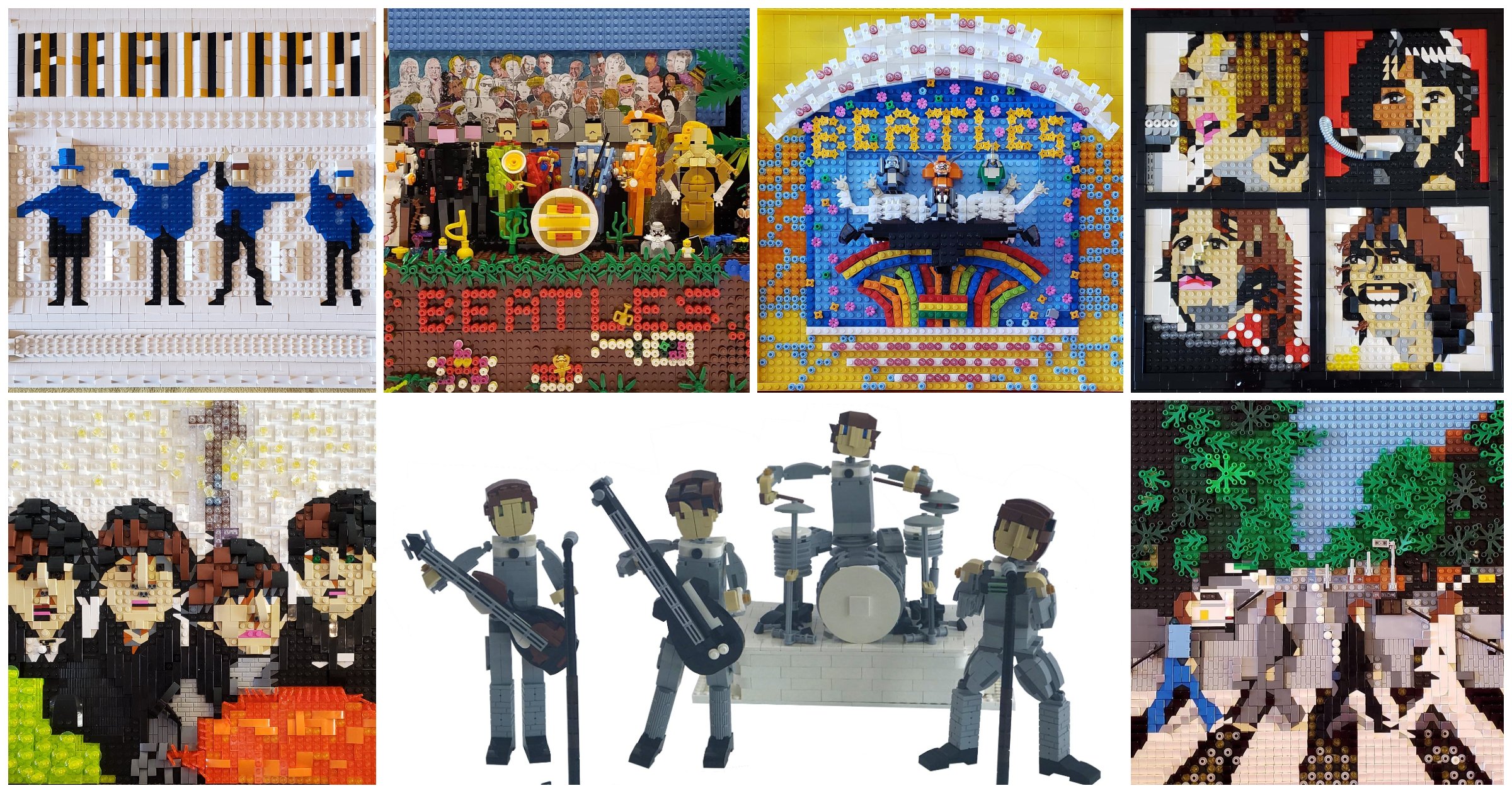
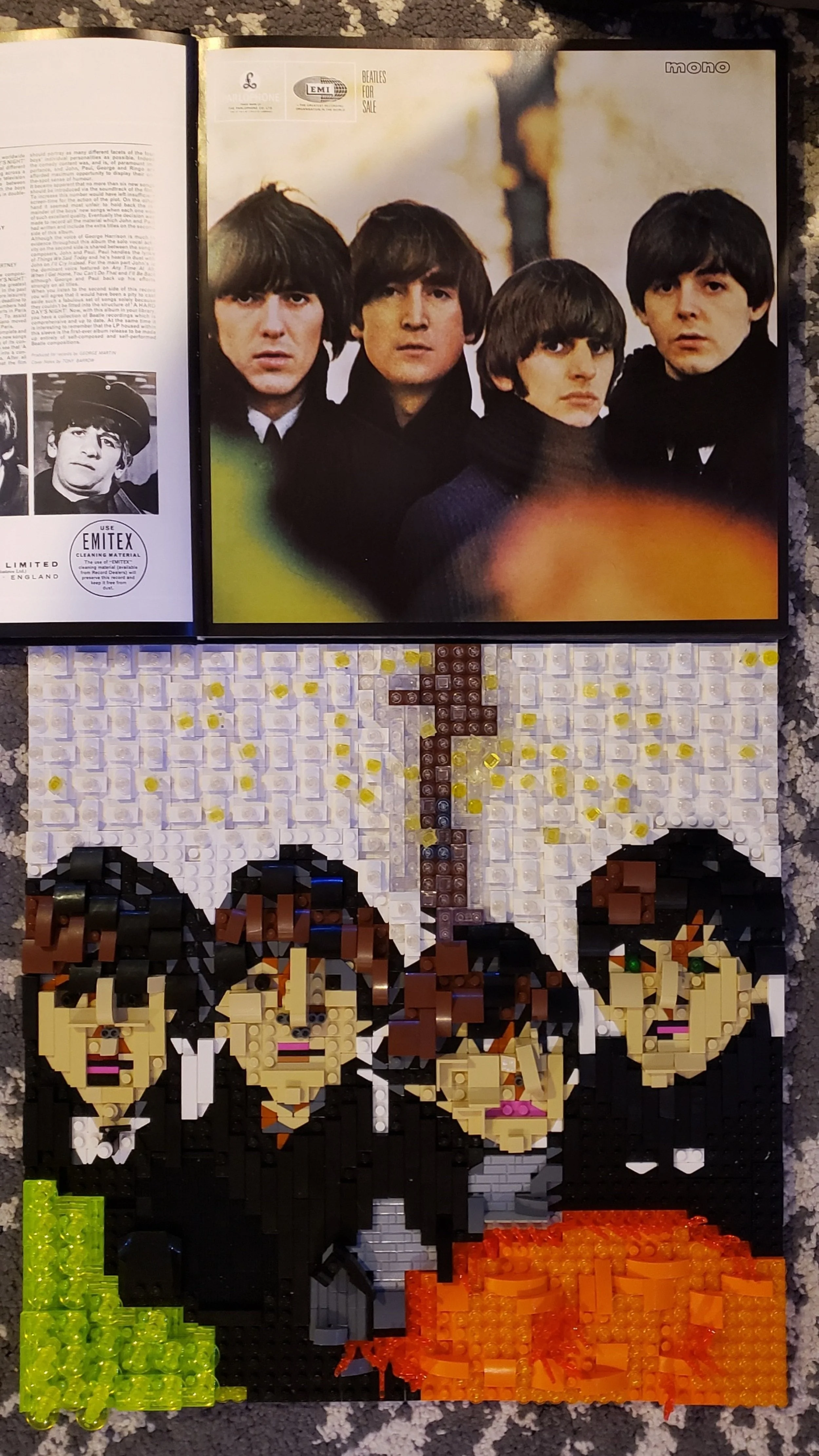
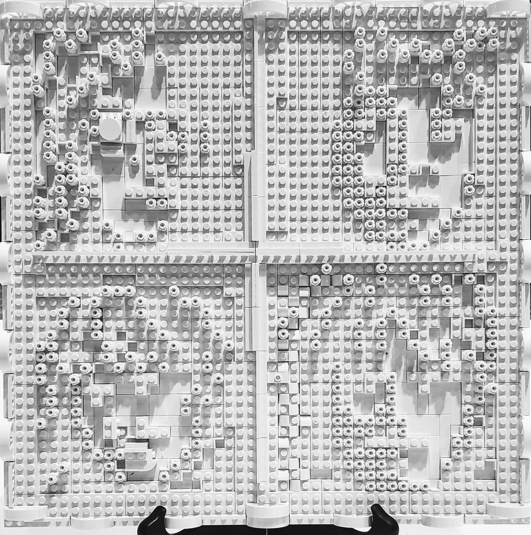
Beatles for Sale
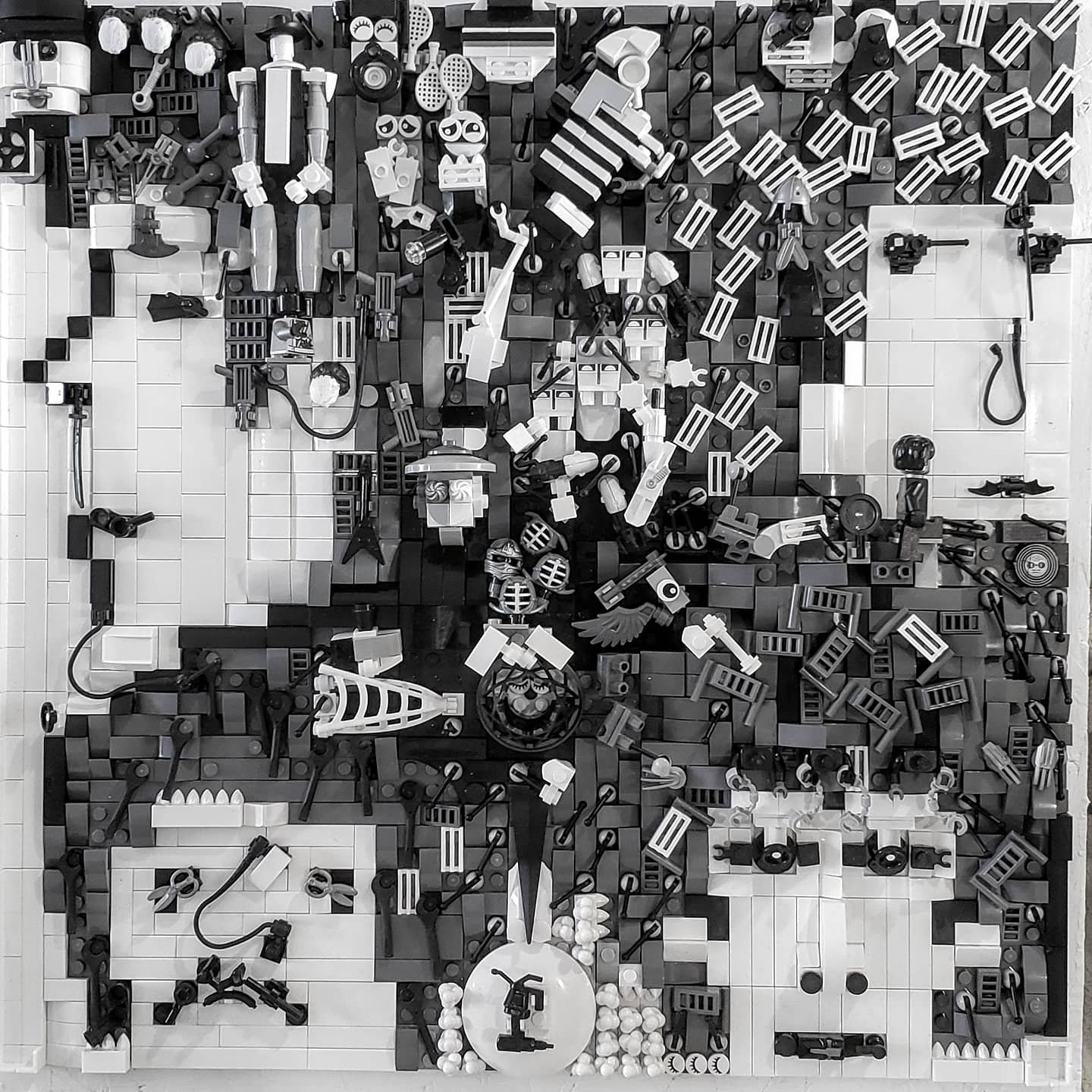
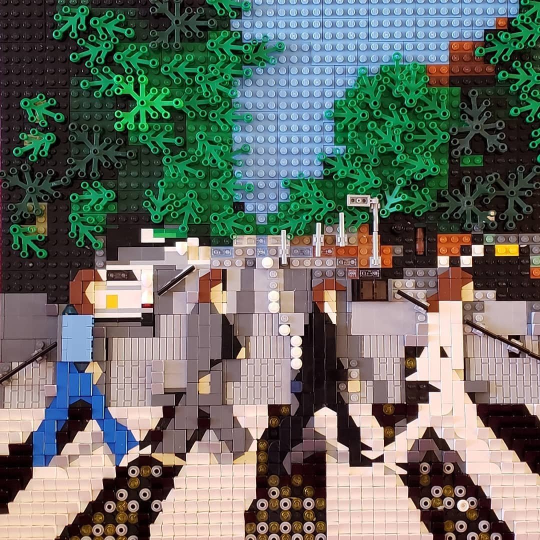
After I had broken the black and white barrier like Dorothy into Oz with “Rubber Soul”, I felt ready to attack what I foresaw to be a particularly challenging album cover. I became aware of Beatles albums with American LPs. I wasn’t aware of “Beatles for Sale” until compact discs came along because this album was split up into fragments of other albums for the US market. CDs are smaller than LPs, so I hadn’t looked much at the photo in all these years, and it’s a tricky one! How should I attack a challenge like that? From all angles, it turns out.
It may look from the photo like I graphed out the image and followed directions, but this is not the case. Some sections were simply studs up, but other sections are built sideways. Every stud needed individual attention. Many areas required constant reworking, then assessing from many angles, changing layers, curves, colors, bricks with different textures, and assessing from many angles again.


“Haziness” figures in my mind as the most important element in this image. At this point, the lads were exhausted by fame. This image was captured at Hyde Park in London, in a whirlwind photography session. Everything they did in this time was in a gauzy, dreamy, overworked haze.
I used texture and transparent pieces to relay the exhaustion of the album’s style and the diffuse qualities of the image. Again, the light reflecting off the LEGO is meant to be absorbed from many angles, and it’s hard to capture in a photo.
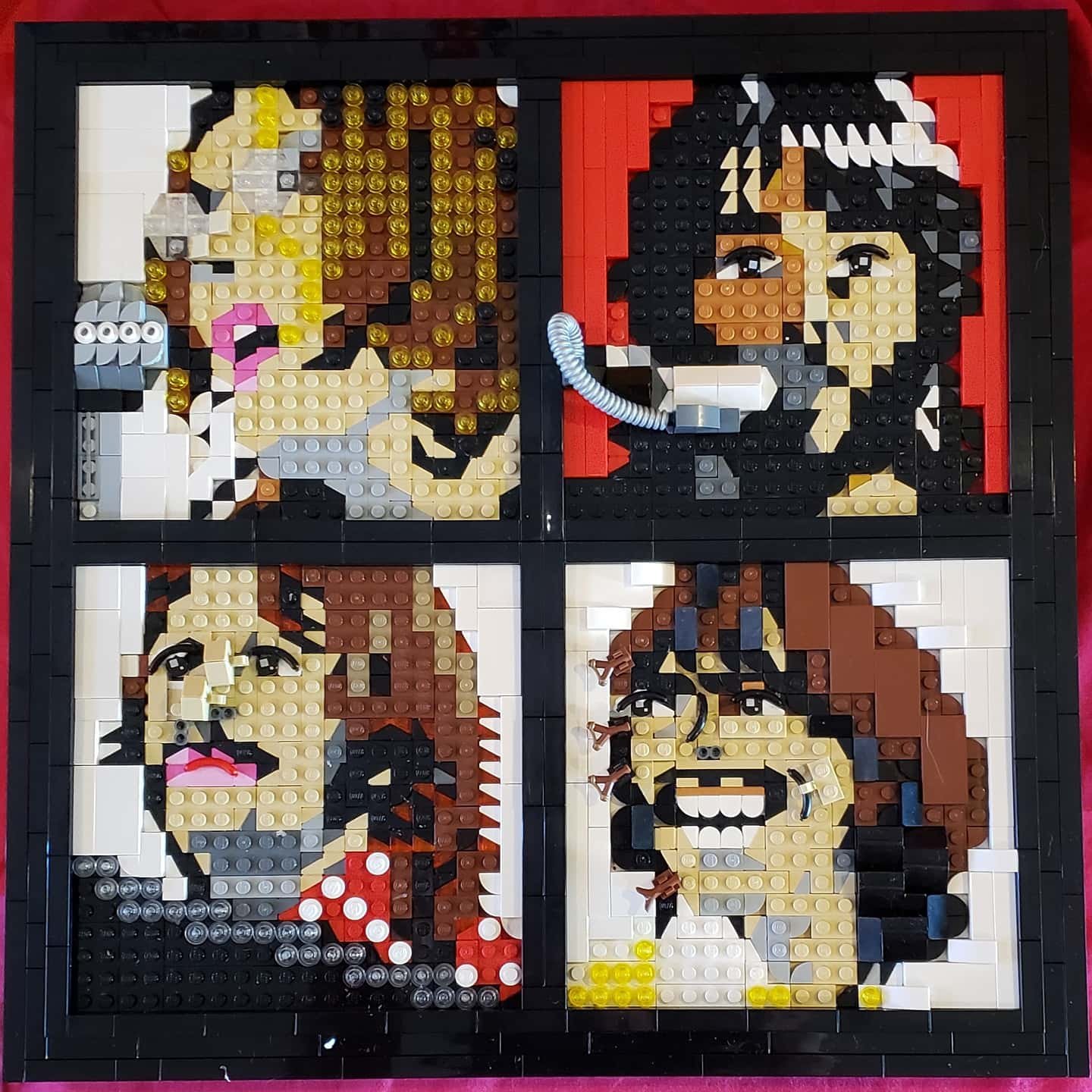
Please, Please Me
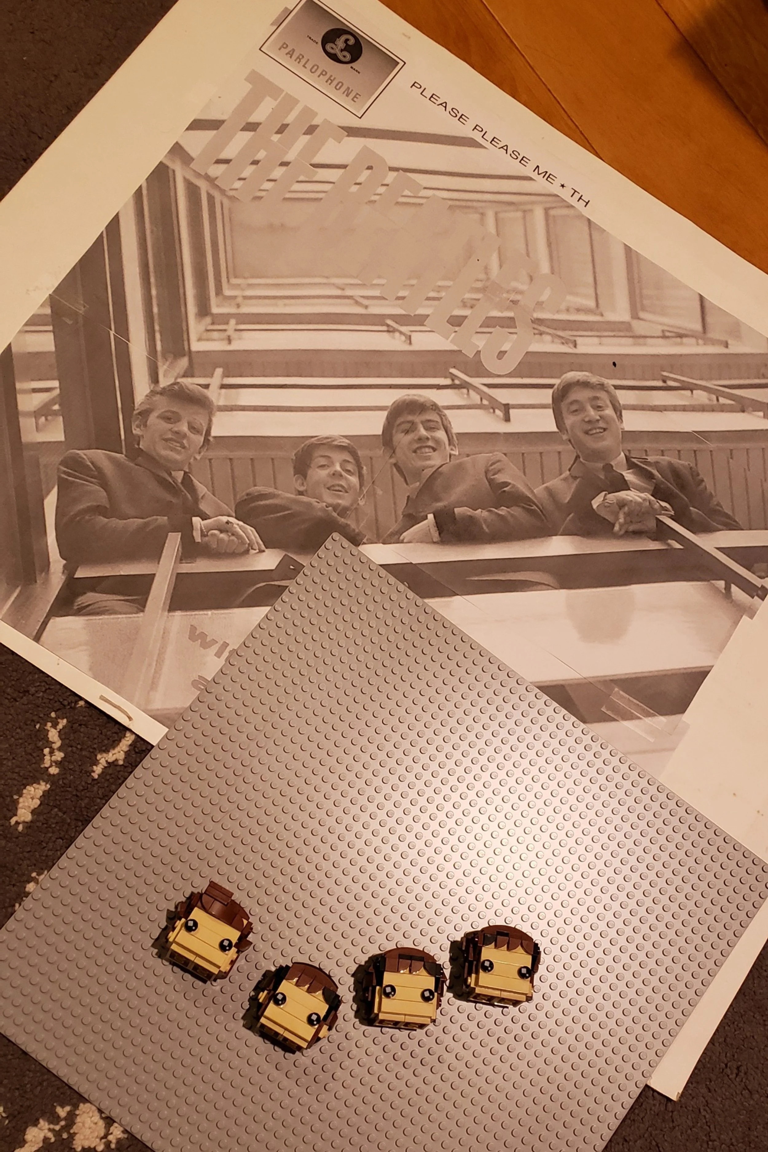
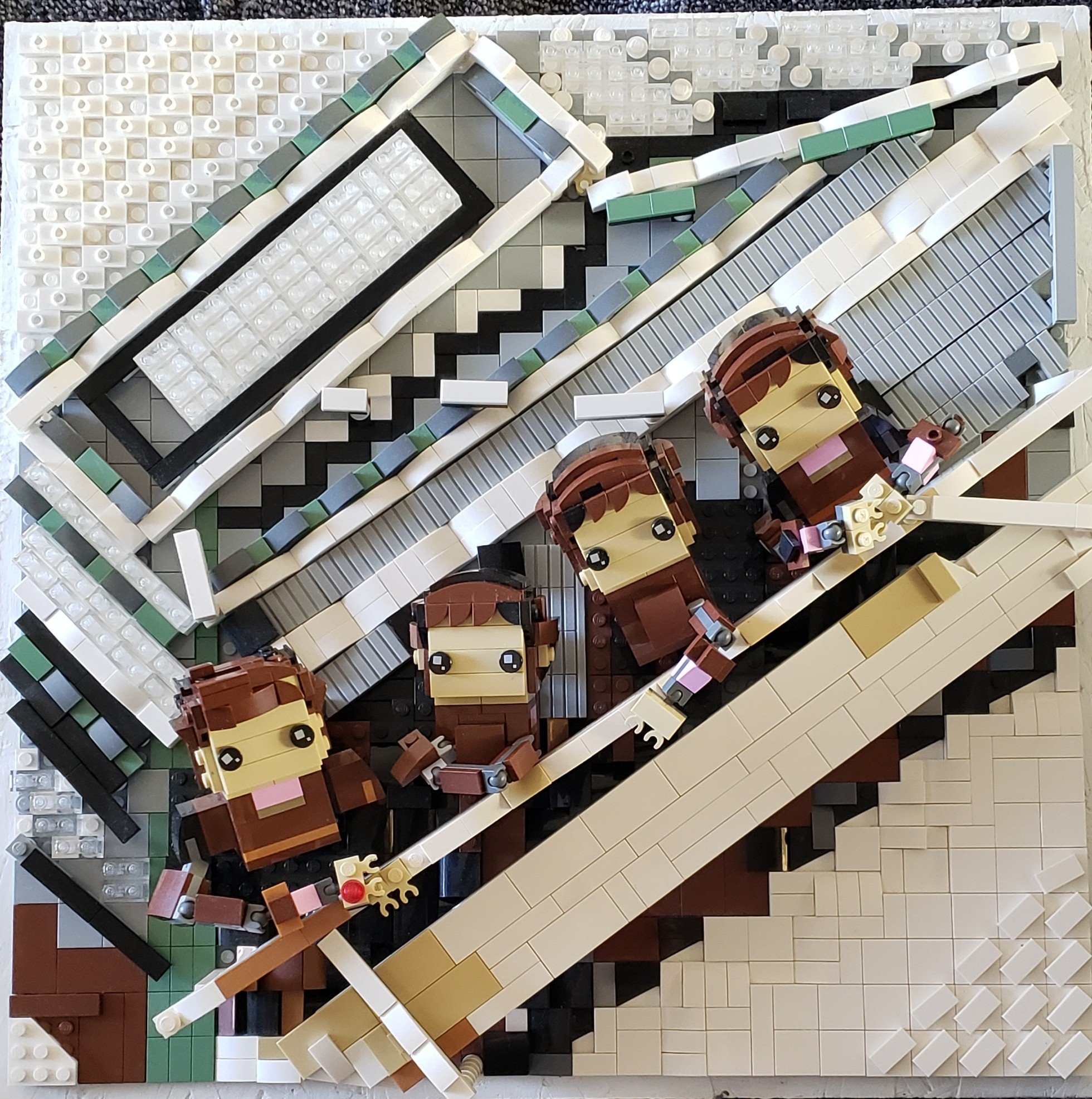
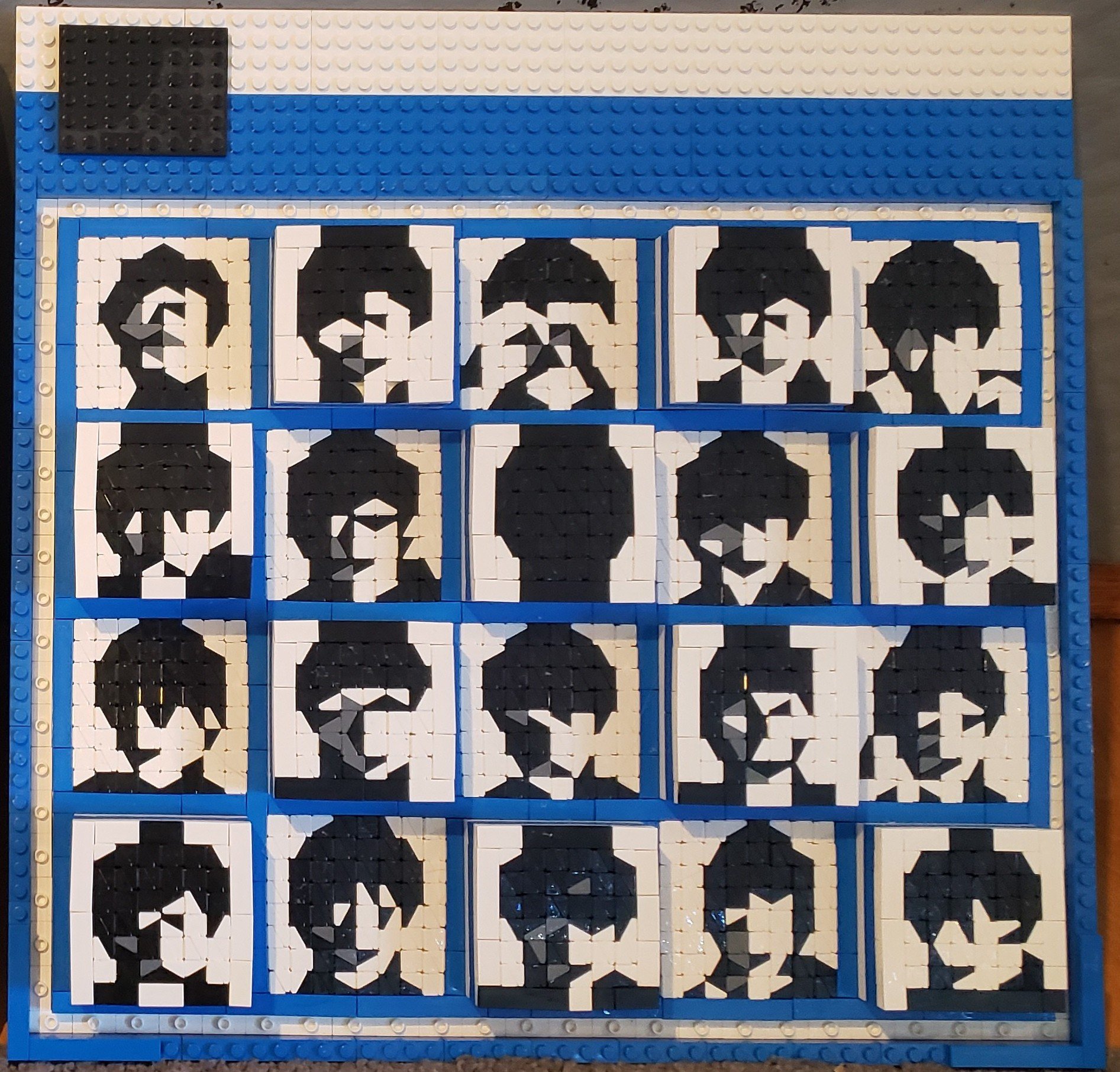
After “Beatles for Sale”, the exhaustion rubbed off on me, and I was ready for something more playful. I went straight for the poppiest pop—their debut album, “Please, Please Me”.
The notion came right away that the Mop Tops would work well as BrickHeadz, but I was taken aback when the scale fit so perfectly on the baseplate.
At this stage in their career, John, Paul, George, and Ringo were interchangeable lads. BrickHeadz fit the bill for that wholesome anonymity.
This LEGO album cover is one of the most fragile of the set. And it took longer than usual to build. The bodies went through many iterations before my son stopped notifying me that “they look like gorillas”.

It was tricky for me to capture the perspective - to build in the angles - looking up, into the many stories of staircase. The perspective required a specific angle, but the studs couldn't necessarily connect at that angle. It took some doing.

After all this time and brick spent, would these albums be noticed? Tomorrow would never know. But I couldn’t get hung up on such details. It was time to “Let it Be”.
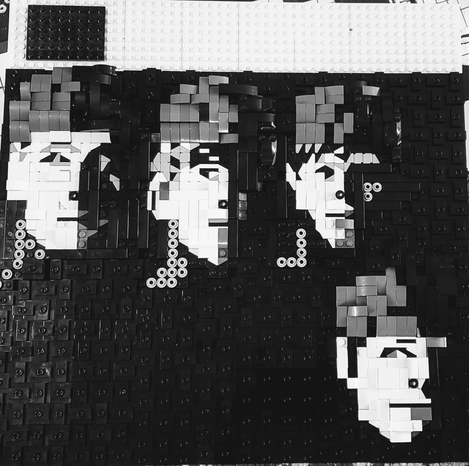
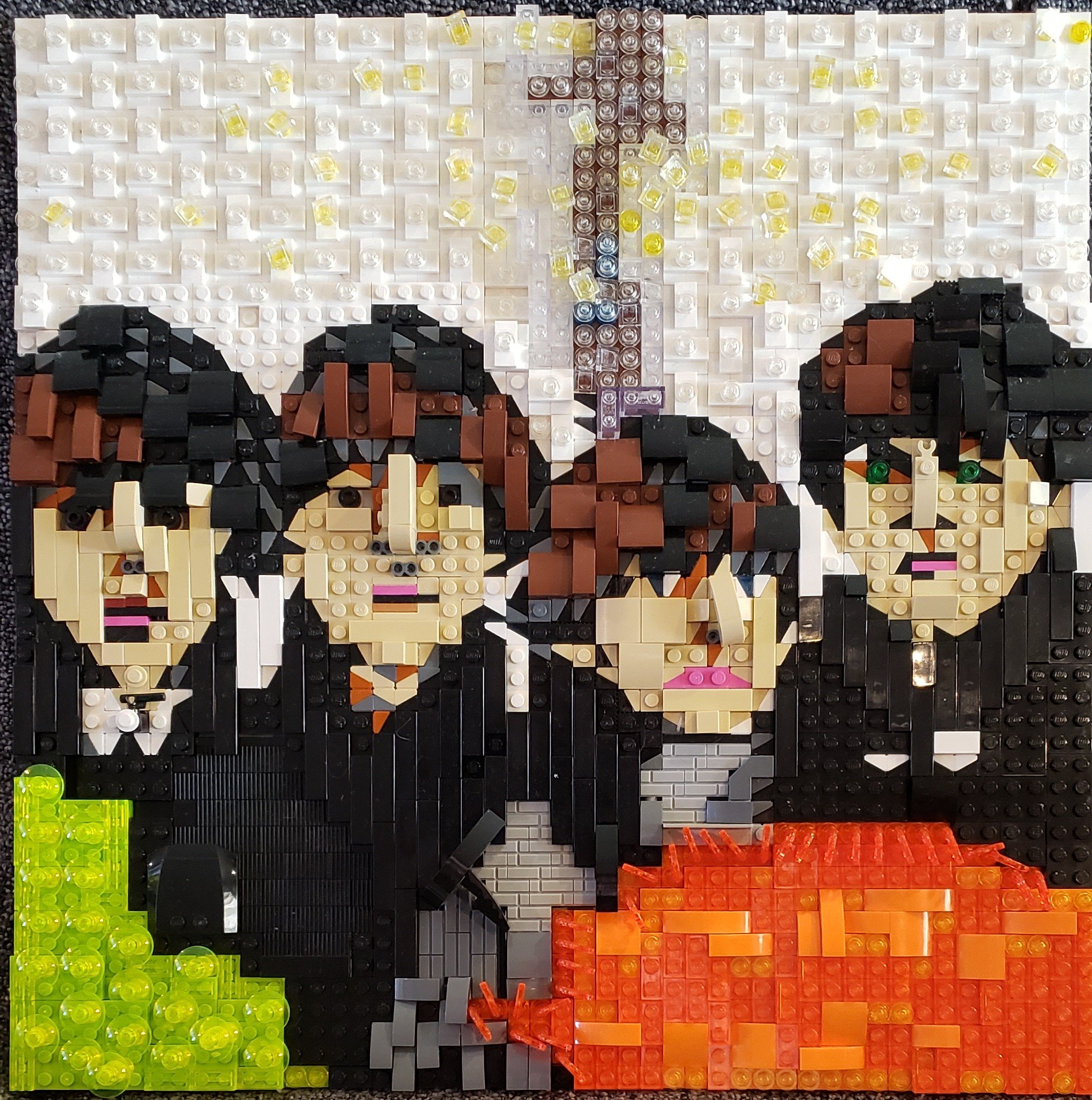
Let it Be
With this album, often referred to as their “swansong”, The Beatles - at the end of their time together as a band - tried to get back to their basic roots. The album cover shows them happy to perform, even though they were falling apart as a group.


I went back to the basic “realistic” mosaic style i had used in “Rubber Soul”, but I added other techniques to the mix. I layered colored and trans pieces to get the colors I needed, and I experimented with dozens of iterations to get George’s teeth up to code. (My favorite part is the tube element I found for Paul’s microphone.)
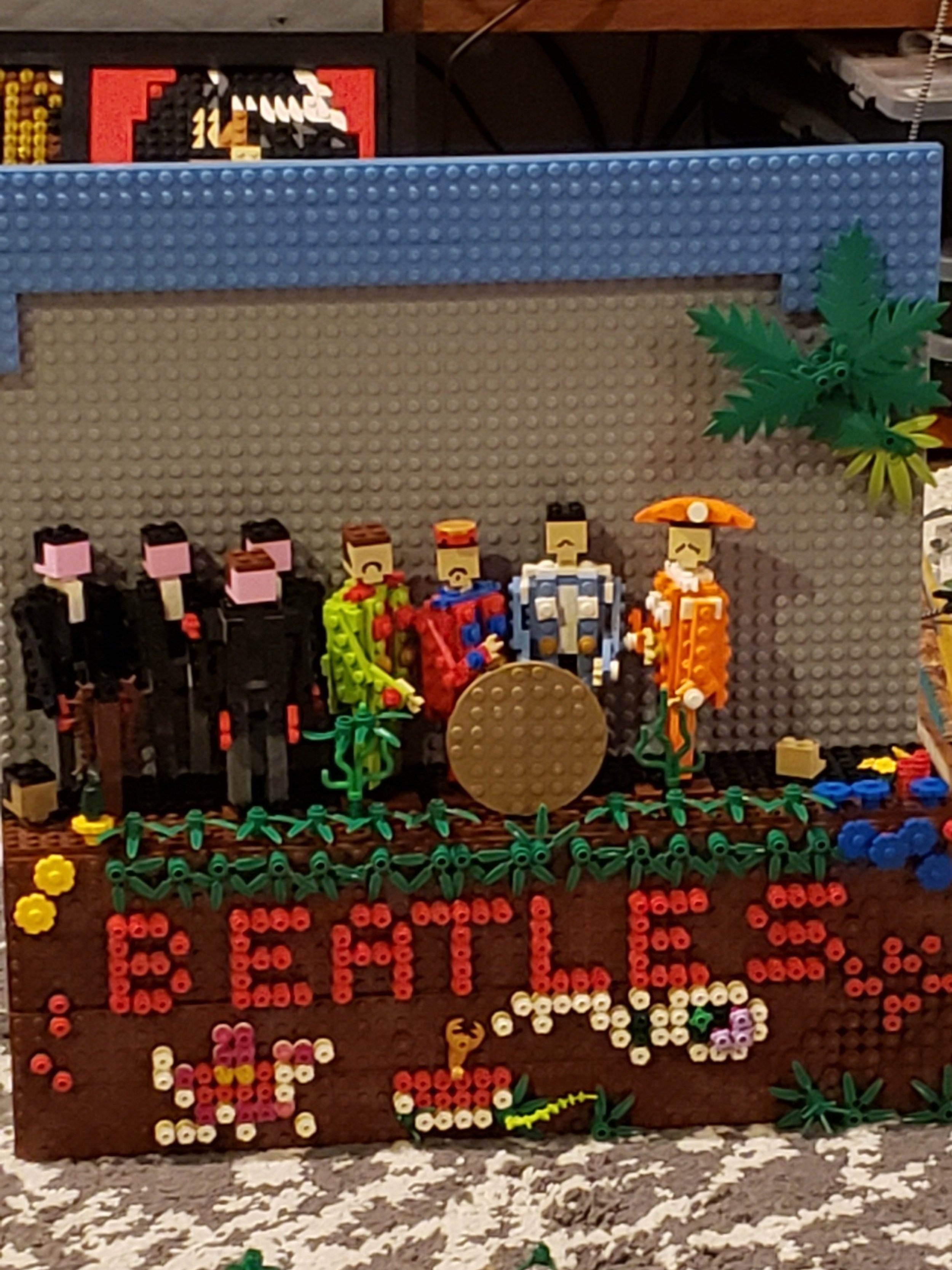
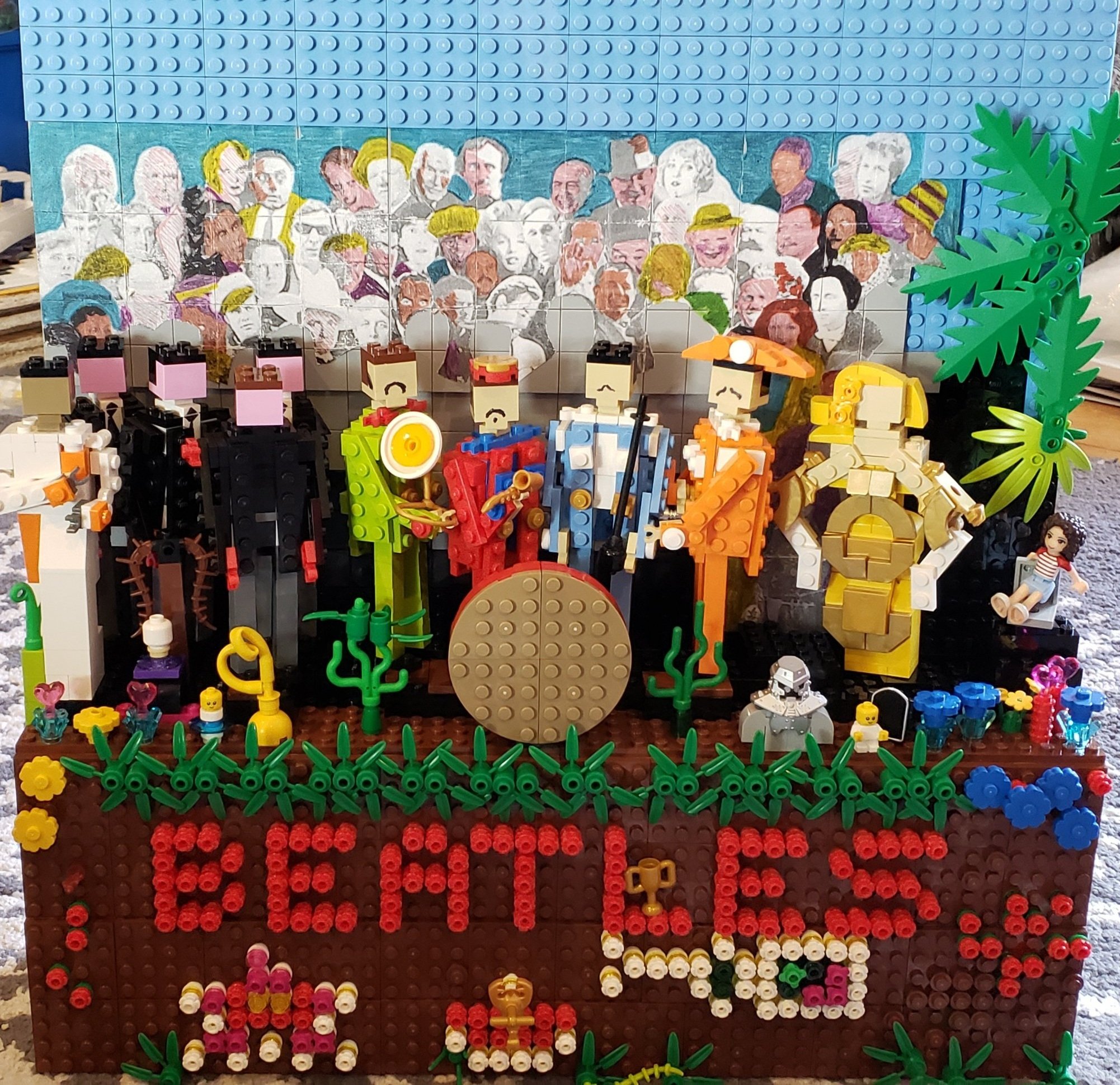
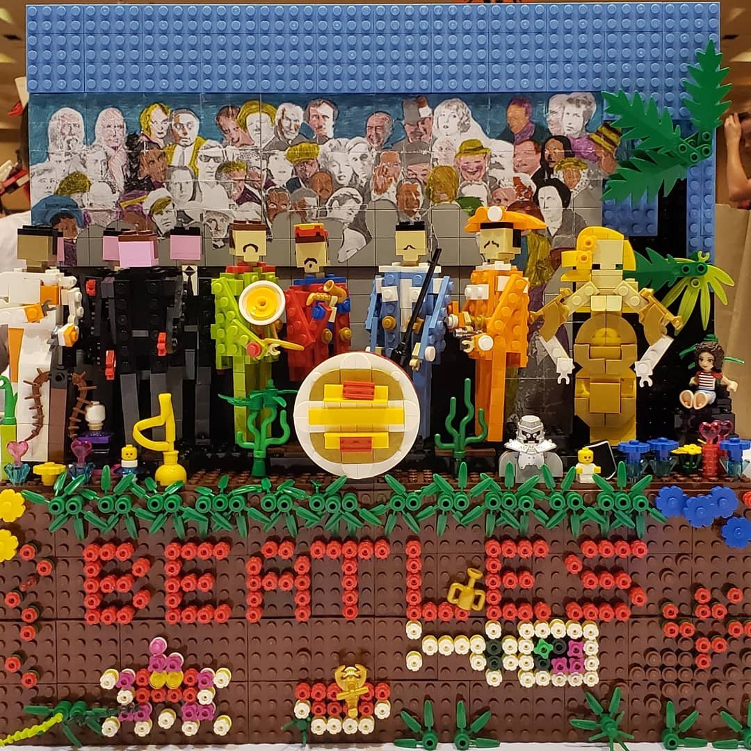
Sgt. Pepper’s Lonely Hearts Club Band
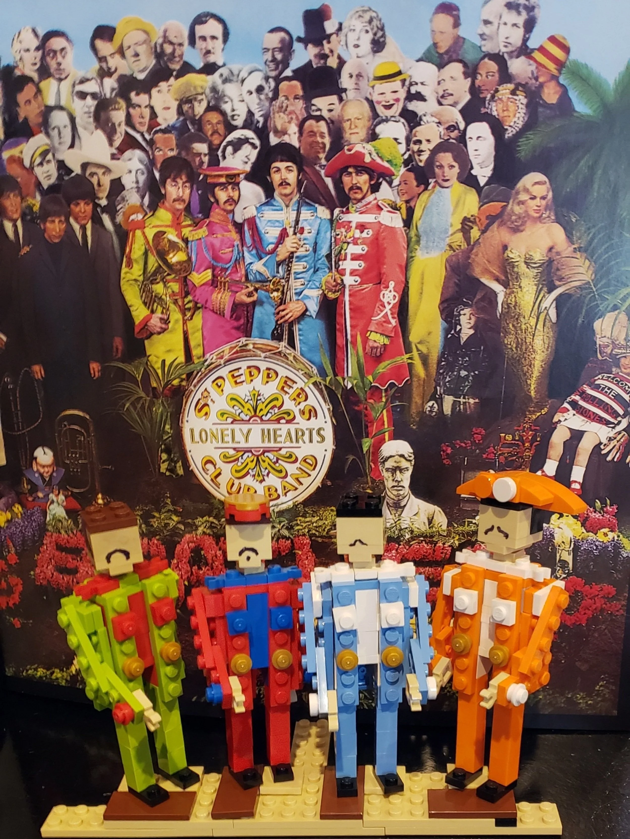
And now I was ready for something completely different. Miniland scale! Here is the other instance where I cheated, but it’s an obvious one: the facial hair is drawn on with Sharpie.
Using brick built dolls to represent the menagerie of real and wax figures on the Sgt. Pepper cover seemed like a good fit. Also, I had scored a bunch of bargain brick that fit the bill at a LUG meeting which enabled me to think big. (“One man’s trash is another man’s treasure,” indeed!) This cover stands up by itself (i.e. does not require a display stand.)
Again, I found myself staring very deeply into the details… and there are so many details! It was kind of cheating to print the cardboard cutout faces on a sticker, but I didn’t want to reprise the collage technique I had already used with “Revolver”.
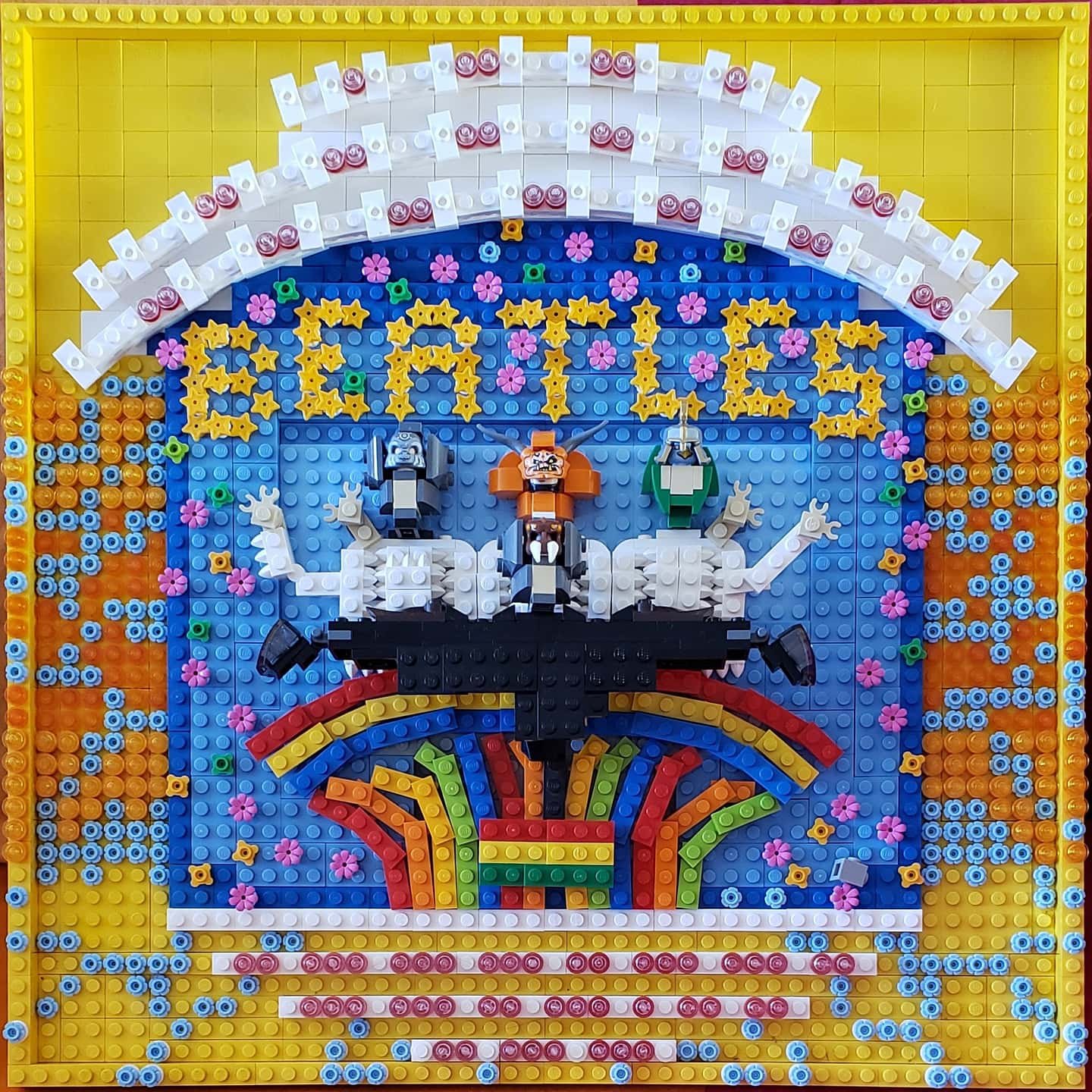
Magical Mystery Tour
I had been really excited a few years previous when I found stars on a PAB wall. Did I know what I would do with them? No, but I needed a cup. Same with the flowers. And the studs. And there went my cup of yellow plates - poof! - in an instant!
This album cover series was “piece intensive” but it's what my collection of elements all had been waiting for.
Finding the right tone for the figures, however, was a real problem. Miniland had already been done. Homemaker dolls were the right size, but too straight-laced for this acid trip. Eventually, I found minifig accessories that made for suitable departure points to build on. Paul is the Chima Spider. Goo goo g’joob!


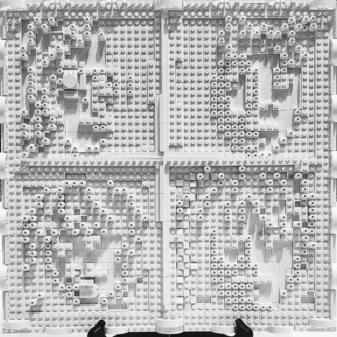
The Beatles (The White Album)
My original plan was to finish ten covers for Bricks by the Bay’s tenth anniversary (and finish the series off in time for Bricks LA). I saved “The Beatles” (aka “The White Album”) for last. I needed time to contemplate the style. I could have simply tiled a baseplate in white, perhaps even with a stickered tile with the serial number on it… but that felt like a cheap joke, and it involved no technique for this double album defined by its variety.
The Beatles included a bunch of posters inside the original album, and I decided to use these as a visual. I collected different textures of white elements to create the image in high contrast black/white, only without the black. It seems that I have no WIP photos of that process. Oops.
(You can imagine my surprise a year later to see these images included - in color! - in an official Beatles set in the new LEGO Art product line.)
I still had time before the first convention, so I adjusted my expectations and decided to debut the entire series. I couldn’t, however, even display the original ten altogether (now) on the dining room table. There wasn’t enough room!

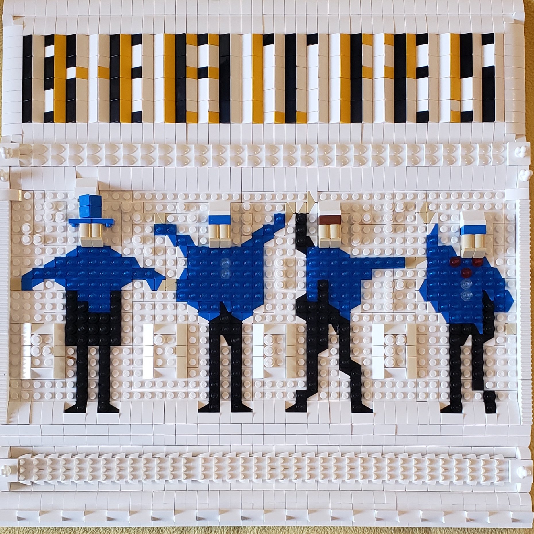
Yellow Submarine
Plodding onward, the next elephant in the room was “Yellow Submarine” which had already been released as a proper LEGO set. I wouldn't dare to compete with LEGO itself. It had to be different.
The cat and I pondered this conundrum for hours, eventually realizing that the answer was staring us in the face: “Yellow Submarine” is an animated movie. Minifigures are the medium!

I don’t “collect” CMFs, per se, (collectible minifigures) and I don’t build vignettes often, but I do own many minifigs and minifig pieces, especially from that time LEGO Dimensions showed up at the 99 cent store. I strew them on the floor, like so much paint.
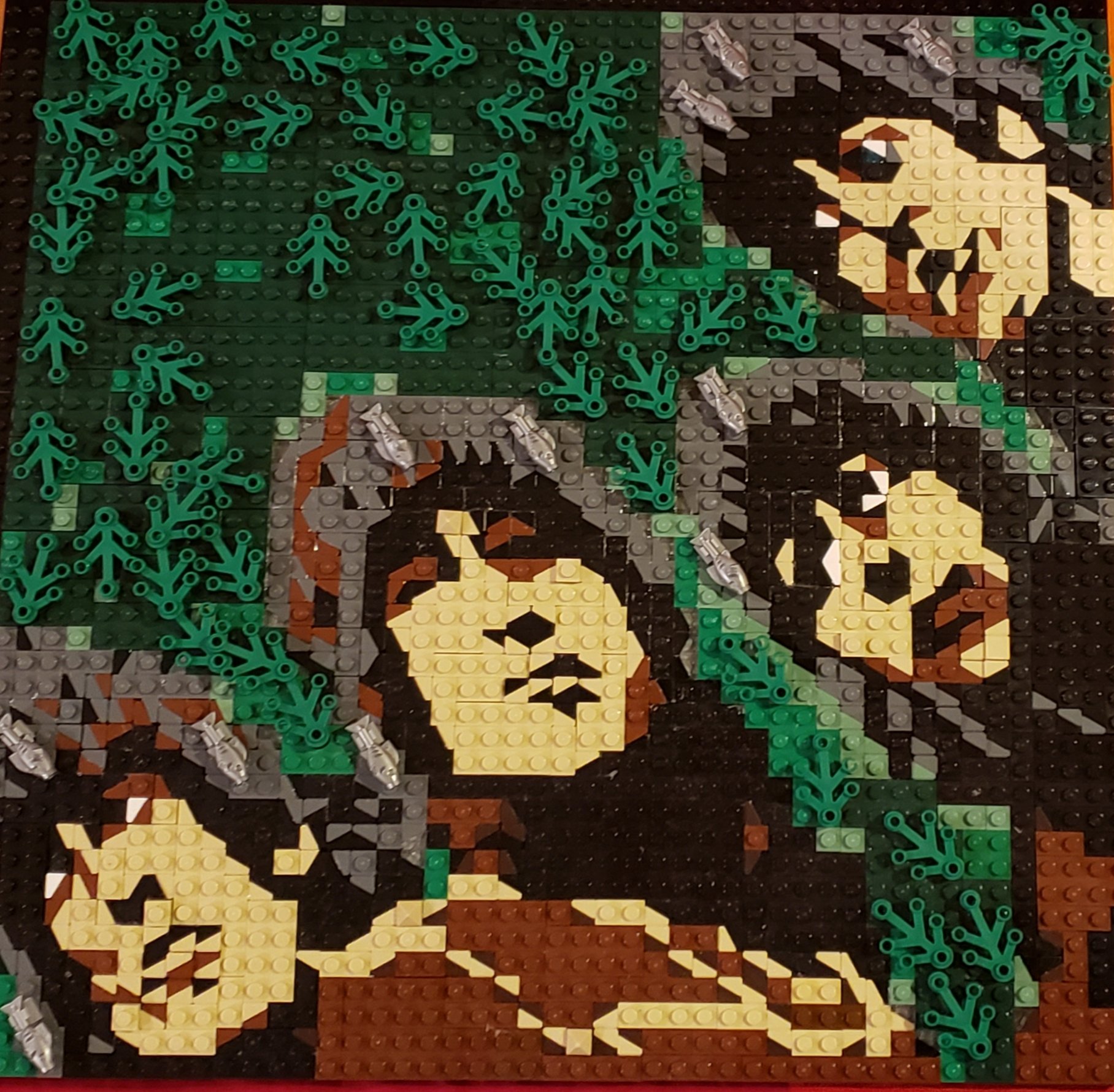
My favorite Easter egg in this series is the yellow submarine. See that curving line of red running through it? It’s a handful of LEGO Elves dragons, which camouflage perfectly into the scene, showing only the red ridge on their backs. (I’m also fond of the “band” scene next to it which is also a LEGO picnic.)


Help!
It was about this time that I heard about The LEGO Group’s pilot program involving Braille Bricks. I had the notion to build a tactile experience with the album “Help”. (Which was itself an audible cry for help.)

Building the boys in their ski gear was fairly straightforward, but I added layers so that the image could be felt as easily as it could be seen.

To complicate matters, I employed a technique that would be inaccessible to the blind, but it also involves a trick to be seen visually: lenticular letters. From one angle, the cover reads “Beatles”, from the other “Help!”. From the front, it’s just a mess.


In Braille (my own version, not the official bricks, which can only be obtained through the LEGO Foundation), a blind person can at least read “Help” with their fingers. (I decided against using the semaphore “NUJV”, the letters acted out on the cover, which were chosen because they were judged to be the most visually appealing.)
Much of LEGO Art built to impress is off-limits to tiny fingers, but this album cover is designed to be fondled - not just seen, or felt, but literally felt.

Abbey Road
Last but not least, I sat down to confront “Abbey Road”. I hadn’t wanted to build it, because there’s an absolutely wonderful MOC on display in a case in a restaurant at the back of LEGOLAND California that I had admired for years. In my opinion, as “Abbey Road” goes, it cannot be improved on. (I remembered the name on the MOC, and it turns out that this model was built by fellow BrickNerd John Cooper! I tip my hat and bow.)


I “have creative issues” with doing something that has already been done before (especially when it was already done to perfection). Ultimately, however, I decided that my project was a different enough style, and it was part of a different goal. And I’d be using a different enough technique. Building these covers had been a long and winding road (you saw that coming), and I was eager to cross those zebra stripes.
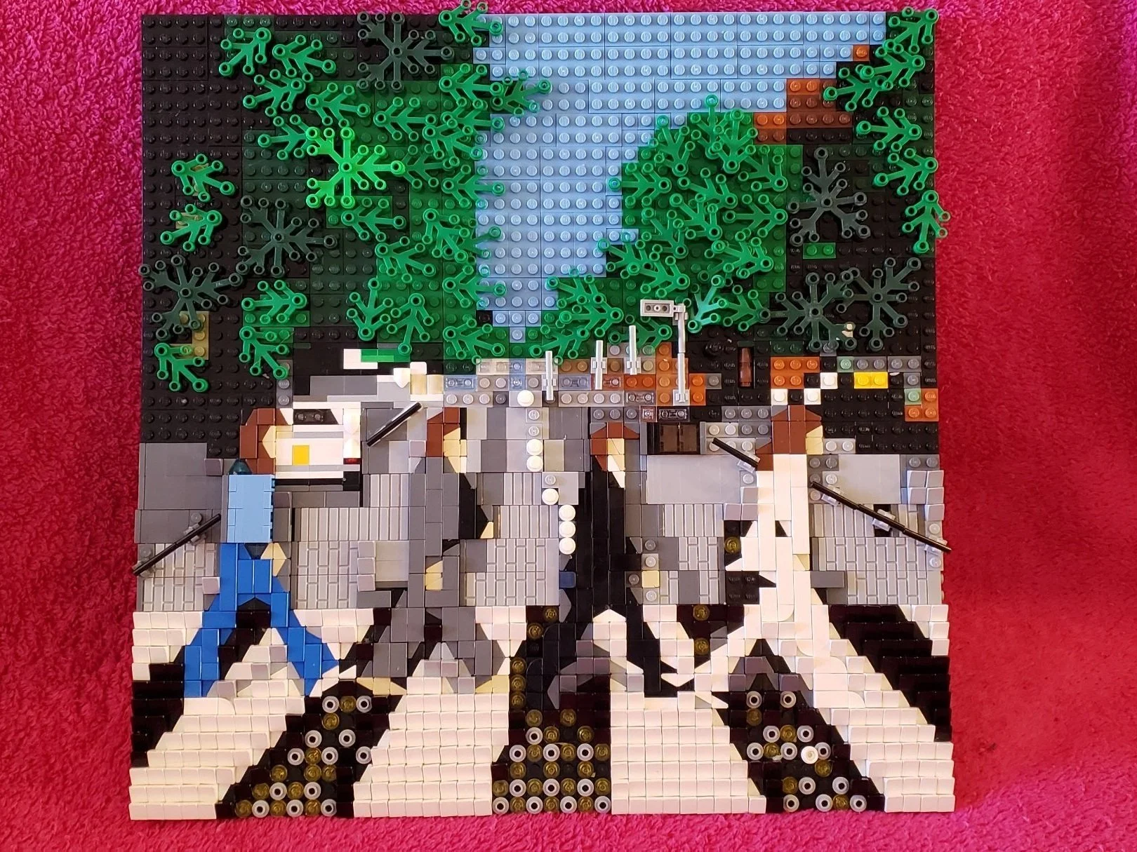
The main issue with building “Abbey Road” is that there is a lot of black/white/grey, and LEGO only has so many variations. (I did not use old grey.) Things would get mushy if I weren't careful. Again, I turned to texture for definition. I used masonry bricks (both sides) and cheese slopes to create different shadows for different gradations of grey. Some sections pop out purposely to create the outline of a shadow. And I used hollow studs and trans pieces for the eyes to blend into still other shades.
Collection Completed
I was relieved when the series was finally seen by a wider audience than me and cats (and children with high critical standards) and was actually appreciated! (Even though I had poured a lot into them and they met my personal standards, I really did think that the thirteen British Beatles album covers would be ignored thirteen times as much as the original “Revolver”. I was pleasantly surprised.) Here is the entire collection in all its glory.

Over the course of two articles, I’ve shared with you my journey building these LEGO album covers. From being ignored at a convention to one day being displayed in the grandest gallery of them all, it has been a wild ride. In response to myself, I leave with these figures I built “in the style of Miro Dudas” (another BrickNerd!) singing “I Should Have Known Better”.

What other album covers would you like to see built out of LEGO? Leave your thoughts in the comments below.
Do you want to help BrickNerd continue publishing articles like this one? Become a top patron like Charlie Stephens, Marc & Liz Puleo, Paige Mueller, Rob Klingberg from Brickstuff, John & Joshua Hanlon from Beyond the Brick, and Megan Lum to show your support, get early access, exclusive swag and more.