From Noise to Narrative: Detail Distribution in LEGO MOCs
/MOCs are often more than playful constructions. They’re miniature canvases for storytelling, engineering, and artistic expression. Whether you’re crafting a medieval castle, a mech, or a bustling cityscape, one principle could be the one that separates a good build from a great one: the thoughtful distribution of detail.
In today’s article, I’m continuing my exploration of design theories and how they can be applied to our hobby. Here is a list of other articles in the series before we get started talking about the dos and don’ts of detail:
What is “Detail Distribution”?
Detail distribution refers to how visual complexity is spread across a build. It’s not just about how many elements you use, it’s about where and why you use them. A build with evenly distributed detail can feel flat or overwhelming, while one with strategic variation can guide the viewer’s eye, tell a story, and evoke emotion.
To understand this better, it helps to distinguish between detail and information:
Detail is visual complexity — texture, shapes, greebles, color accents.
Information is what that detail communicates — function, story, structure, purpose.
Two builds can have the same amount of detail, but the one that conveys more information will always feel clearer and more intentional. Good detail distribution is ultimately about placing meaning, not just decoration.
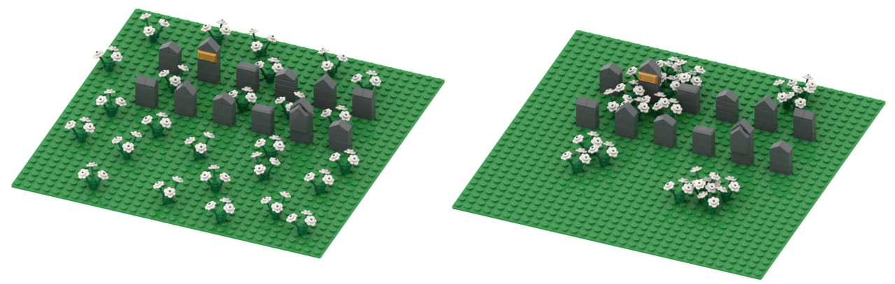
The two MOCs in the images above are identical, except for the distribution of the flowers. In the left image, the flowers are just placed evenly spaced on the baseplate. In the image on the right side, the flowers are clustered in groups. The largest group is clustered around the tombstone with the golden plaque. Which one looks more interesting to you?
Design Theory Foundations
Visual Hierarchy
The purpose of visual hierarchy is to help viewers know where to look first. Designers use contrast, scale, and placement to create this hierarchy. A great example is an image like the one below, where text in different sizes and colors guides your eye, and it feels almost like magic when you realize you are reading everything in the exact order the creator intended.

In LEGO, this might mean using ornate detailing on a tower while keeping the surrounding walls simple. The eye is drawn upward, where the story unfolds. The trick with visual hierarchy is to lure the observer into looking at your MOC in the first place — and once they do, there should be a narrative for their eyes to follow.
Focal Points
Every build benefits from one or more focal points: areas of concentrated information that anchor the viewer’s attention. These can be narrative (a character), architectural (a unique structure), or mechanical (a moving part).
Focal points work best when they contain the highest concentration of information, not just the most detail. A brightly colored tile or a cluster of greebles only becomes an effective focal point if it tells the viewer something important.
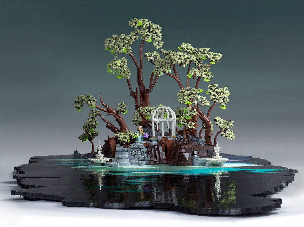
The scene above (by Ralf Langer) contains many details, but there is a character with a purple flower in the middle that I think you noticed right away. The purple color is a high-contrast focal point that immediately draws your attention to the center. From there, you start noticing other details.
Balance and Symmetry
Symmetry creates harmony; asymmetry creates tension. Both are useful, depending on your goal. Detail distribution plays a key role in maintaining balance—whether through mirrored ornamentation or offset clusters.
Image by Jonas Wide
Image by Stefan Formentano
A symmetrical temple feels serene and sacred. An asymmetrical cyberpunk building with uneven detail clusters feels chaotic and alive.
Proximity
Clustering similar details can make them more readable and natural. As shown in the first image in the article, a field of evenly spaced flowers appears like noise, but a group of flowers looks intentional and organic. Proximity can also be used to draw attention toward a focal point.

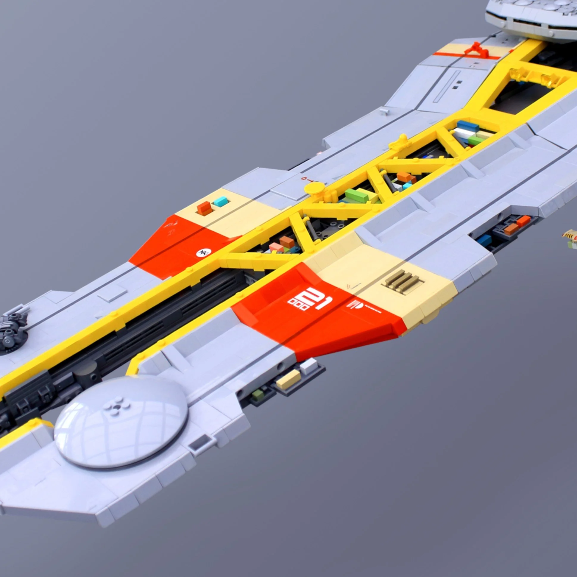
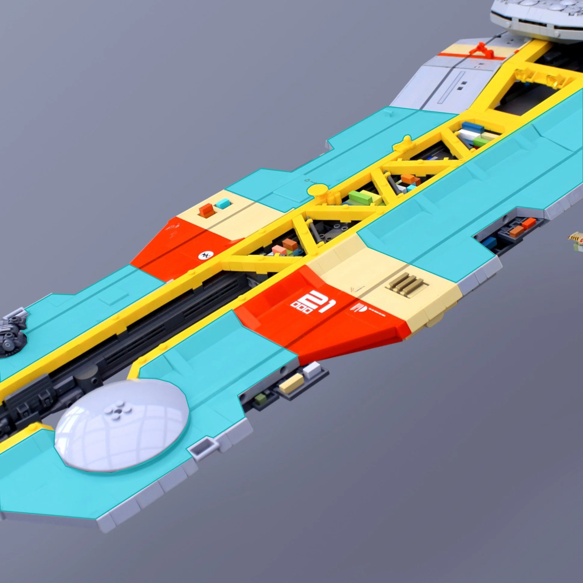
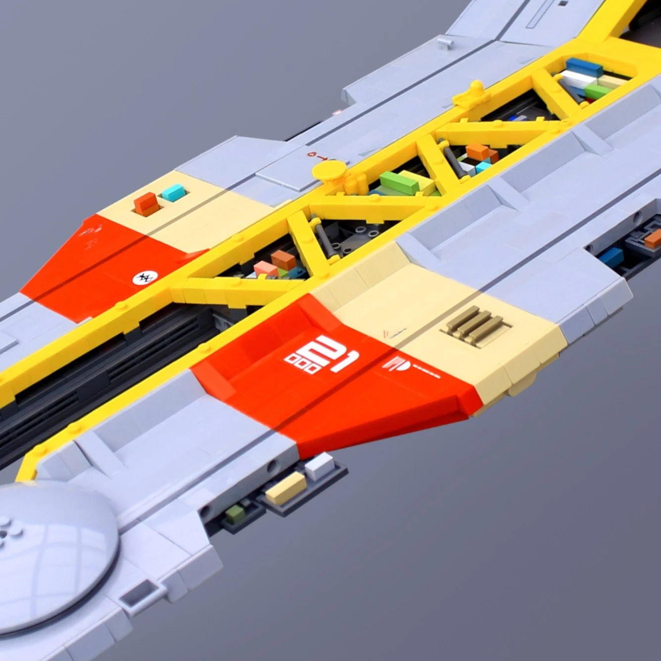
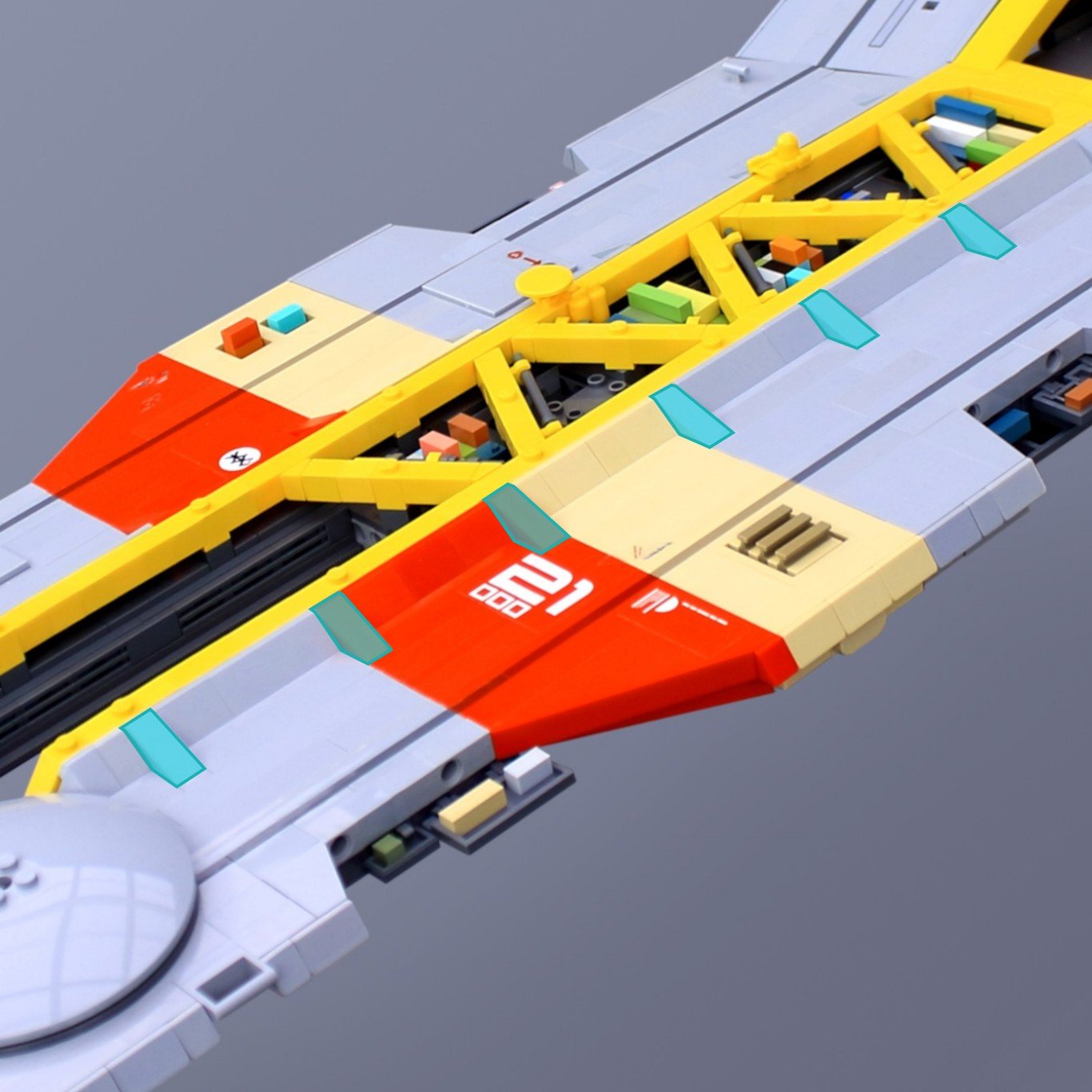
The images show container details from one of my MOCS. I’ve clustered the containers in groups (highlighted in the right image). Those details would not have been as effective if I had placed them evenly on the ship.
Negative Space
Negative space (the intentional use of empty or uncluttered areas) is essential for giving a LEGO model clarity and impact. Smooth surfaces and calm regions create contrast that makes nearby details feel sharper and more deliberate. Without these quiet zones, even well‑crafted greebling can collapse into visual noise.
This emptiness gives the eye room to rest, preventing the viewer from feeling overwhelmed. It also heightens contrast, making intricate sections appear richer when framed by simplicity. Large uninterrupted surfaces can even suggest scale, evoking the vast hull of a Star Destroyer or the imposing walls of a sci‑fi hangar. Most importantly, negative space strengthens focal points: by reducing competition around key details, it naturally guides attention to the areas that matter.
The empty areas (highlighted in the right image) make the details stand out more in this spaceship design.
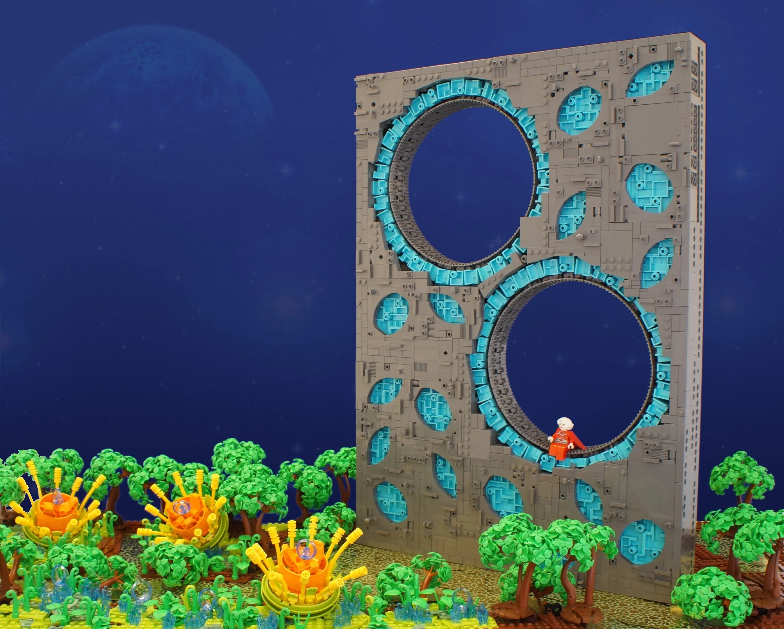
Negative space can also be achieved by leaving parts of your builds empty, like a hole. As demonstrated in the MOC below by Bart de Dobbelaer, the empty hole becomes the focal point which draws the eye towards the structure.
Techniques for Distributing Detail
Now that you have a better idea about some useful design principles, let’s talk about how to use detail distribution and how to apply these principles when building MOCs. I will use spaceship designs as my example, because that’s one of the themes I like to build most.
I realize that many of the ideas I’m talking about here are not easy fixes. Many of these techniques demand a lot from you as a builder and may even mean you have to consider them before you start building. Like, color blocking, for instance, is not easy to do when the design is already done. Making a line run all the way around the fuselage of your spaceship takes a lot of planning and might compromise the structural integrity.
Don’t let this discourage you, though! Redesigning parts of your model might not be what you wish for, but it could be the choice that takes your design to the next level.
I encourage you to look at this short clip, where the artist Sparth (Nicolas Bouvier) gives a great example of how he distributes colors, detail and structure in his creations. He uses his own terminology when describing the different techniques, but I think you can easily translate them into the concepts I describe in this article.
Layering
When designing a spaceship, one way to add visual interest is to place details in different layers. One idea I use a lot myself is to have smooth sections of armor paneling as an outer layer, with more detailed industrial bits underneath. The innermost layer could be the superstructure. Make sections of the ship uncovered by panels to make bits of the other layers shine through.
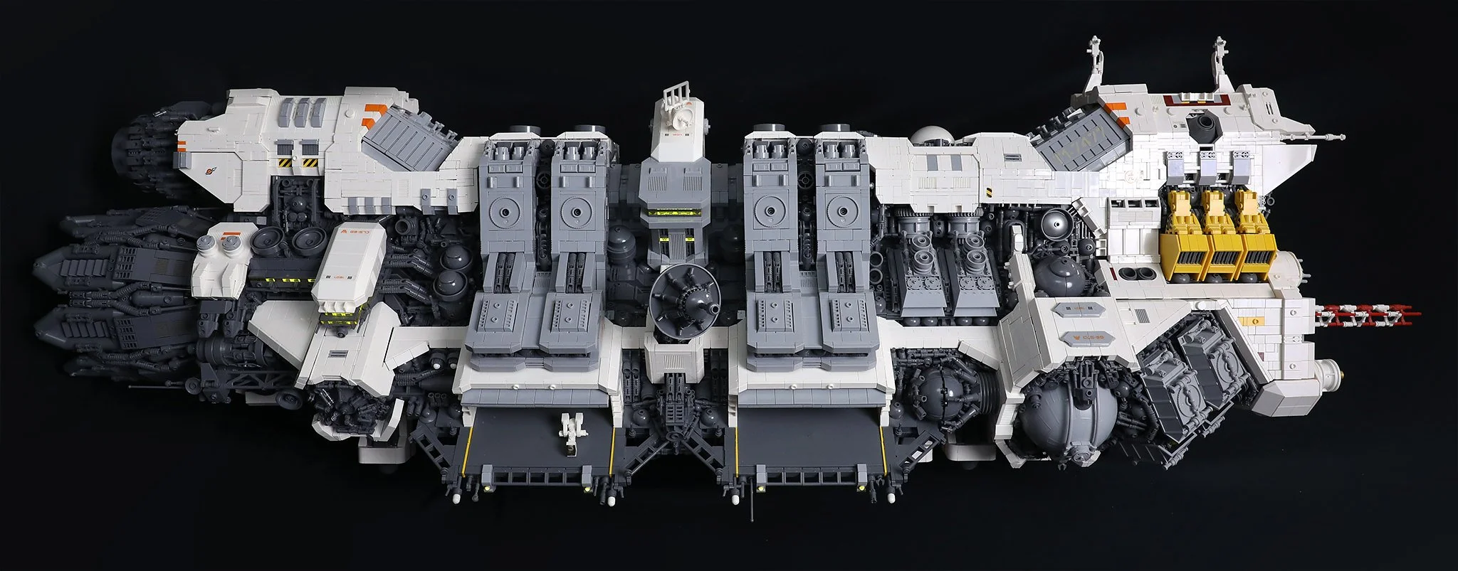
In the above build (by Blake Foster), you can see an example of layering. The white, outermost layer defines the ship's shape; it is relatively smooth and lacks much detail. The light gray layer pops out under the white layer and contains a bit more structure and pattern. The innermost layer is the dark gray layer, which also contains the highest level of detail.
Color Blocking
I’ve covered this technique in depth in another article. I will attempt to summarize it here as well: Color blocking is a way to use colors to create an interesting design. By using complementary and/or contrasting colors, you can highlight parts of your design.
In a spaceship design, as with layering, I often use colors to represent various functions. Like using one color for weapon systems and another color for emergency hatches and so on. It is effective to add small splashes of color here and there. It makes the build a bit more exciting to look at.
Another idea is to use colors to represent the ship’s different functions on the paneling. One example could be using a base color for the ship, a contrasting color for the rear (engine section), and another color for the nozzles.
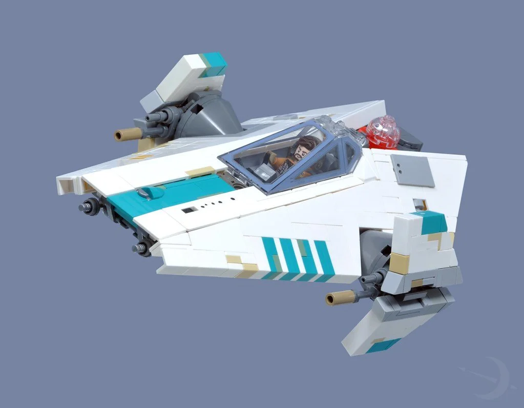
Above is a nice example of color blocking (by Inthert). White is the base color of the ship. There are some teal highlights that might be markings indicating call signs or the squadron the ship belongs to. Grey areas show us mechanical stuff, such as weapons, sensors, hatches, and so on. Then there are some slightly “discolored” highlights here and there that hint at weathering.
Texture Variation
Mix smooth and studded surfaces to create rhythm. Texture can imply material, age, or function. The classic example in the LEGO world is greebling, which is a way of seemingly randomly adding implied functional details to break up mundane, flat surfaces. However, if you distribute greebling uniformly, that might not achieve the effect you are looking for. Try using greebling sparingly, and let the eye rest between patches. Also, let the distance between greebling vary, otherwise there is a risk that the brain will just register your detailing as noise. (Greebling techniques have been covered in detail in this article by Simon.)
Here is where the difference between detail and information becomes crucial. Greebling for its own sake adds detail, but not necessarily information. A random pipe or grille might look interesting, but unless it suggests a function, like ventilation, power routing, structural or reinforcement, it risks becoming noise. Purposeful greebling, on the other hand, conveys to the viewer something about how the ship or structure works. When texture variation supports implied function, detail transforms into information.
I want to give you an example of good vs. bad textures from movie models created for science fiction movies in the 70s. The first example is the original model for the Millennium Falcon built for Star Wars Episode IV: A New Hope.
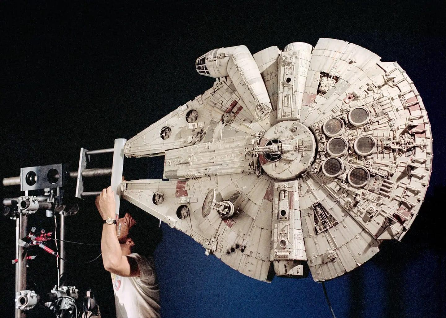
Image from GQ Magazine
All of the details and greebling were made by “kitbashing,” a method in which you buy large quantities of plastic model kits and salvage them for parts. In the image above, you can see how ILM treated greebling, colors, and detailing. Greebling is applied at different levels: on the ship’s surface, small pipes and bolts are used. But in the rear section, the greebling is heavier, suggesting more modifications by the owner there. There are also splashes of heavy details here and there, mostly applied symmetrically to create a sense of function or design. The model is then carefully airbrushed. Some parts are highlighted with color. Weathering effects are also added with color.
The other example is a model from the movie Star Crash from 1978.
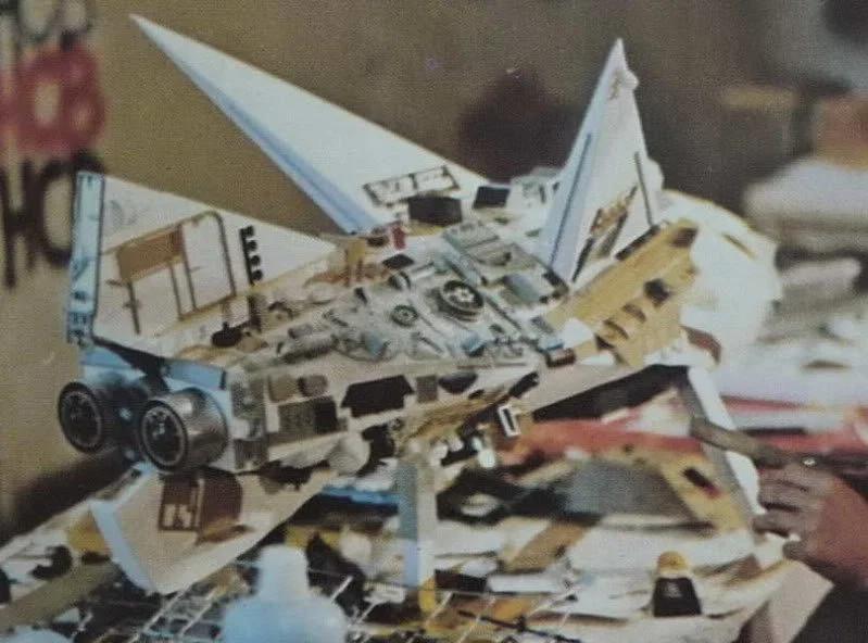
Image from ken-mcconnell.com
The greebling was made with the same kitbashing method. However, it was done completely without a sense of purpose or flow. Random bits of plastic were just glued, haphazardly to the ship. Once the greebling was complete, the entire ship was spray-painted a uniform gray color. The model above is not the main ship of the movie and it is not complete, but it serves as a good example of how senseless greebling can totally ruin a design.
Repetition
Repetition is a core technique for establishing a clear design language in a MOC. When shapes, colors, or structural motifs appear more than once, the viewer intuitively reads them as intentional choices rather than decoration. This creates unity, reduces visual noise, and helps the model feel like it belongs to a coherent world, faction, or manufacturer.
It works because repeated elements build familiarity and imply function: similar silhouettes suggest related components, recurring colors signal systems or conduits, and echoed structural forms tie distant parts of a model together. Repetition can happen at multiple scales — a large intake mirrored by smaller versions elsewhere, or a wing profile echoed in engines or greebling — creating rhythm without monotony.
Above you see a repeating pattern in one of my MOCs. Some of the slopes are longer (highlighted in the image on the right), which makes them look like supporting gussets. The pattern is repeated throughout the entire length of the ship, which gives the detail a sense of purpose and structure.
In practice, this makes spaceships and other builds easier to read. Matching exhaust ports feel like one propulsion system, repeated antenna shapes imply a communication network, consistent panel patterns reinforce construction logic, and shared thruster designs unify the propulsion aesthetic. Ultimately, repetition gives the viewer a visual vocabulary, helping them understand the model’s internal logic and making even complex builds feel deliberate and believable.
Common Pitfalls
Over-detailing
The most common mistake, especially in bigger MOCs, is to have too much detail. It can be hard to stop yourself from adding details once you’ve started. But too many details can actually make people lose interest in your build. It leads to visual fatigue and the viewer becomes overwhelmed. Over-detailing often occurs when builders focus on adding detail rather than adding information. When every surface is covered in texture, the viewer can no longer tell which details matter. The model becomes visually dense but narratively empty.
Builders often add detail when what the model actually needs is information.
Too much detail without information becomes noise.
Information is what the viewer remembers; detail is what they forget.
Ignoring Focal Points
Building your MOC might trigger your imagination and you start making up possible stories that are happening in the build. The sad thing about this, however, is that the observer might never be able to discover all those stories if they are lost in noise.
Focal points should contain the highest concentration of information, not just texture. Supporting areas should be calmer so the focal point stands out. You should choose a few stories that you wish to tell and add focal points that draw the eye to them. Supporting areas should be calmer so the focal point stands out.
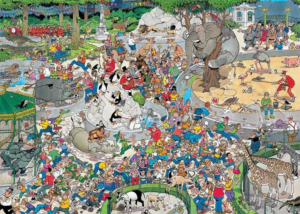
Image from jvh-puzzles.com
Exception: In some cases, you might actually want to create a chaotic experience for the viewer. A comparison might be the very detailed images like the ones my dentist had in the ceiling of their treatment rooms (Like the Jan Van Haasteren image above). Their goal was to bombard my young brain with visual impressions so I would not focus too much on what was happening in my mouth. If this is what you are looking for, I suggest you write down a list of stories or scenes for the viewer to discover. For example, how many pigs are hiding in this scene? Or, can you find out who stole the umbrella? This is a way of making the observer focus on your build, even without any visual focal points.
Uniform Textures
Too much of the same thing will also make the brain lose interest. Consider breaking off a surface with colored lines or openings that reveal a different structure. Also, if your details are too evenly distributed, it might be perceived as monotonous.
Building Tips
If you are intrigued by the things I’ve mentioned above and want to try it on your next build, here are some tips that you can try to make it easier for you:
Sketch your build first: Mark focal zones and detail gradients.
Use photography: Test visual flow by viewing your build through a camera.
Ask yourself: “Where do I want the viewer’s eye to go first?”
Kill your darlings: Try removing details that don’t add information.
Experimentation: Vary texture, color and details intentionally.
Detail Distribution Checklist
Visual Hierarchy
Is there a clear “first thing” the viewer notices?
Do the details support a narrative flow from one area to another?
Focal Points
Have I chosen one or two areas that deserve extra attention?
Do color, contrast, or texture guide the eye toward them?
Negative Space
Are there calm areas where the eye can rest?
Do these empty zones enhance the nearby details?
Scale & Proportion
Are the details appropriate for the model’s intended scale?
Is the density of detail consistent across the build?
Color & Material Contrast
Do color choices help separate functions or highlight features?
Is there a good mix of smooth, studded, and textured surfaces?
Rhythm & Repetition
Are there repeated shapes or motifs that create a design language?
Is the repetition varied enough to avoid monotony?
Purposeful Detailing
Does each detail communicate something (function, story, structure)?
Could removing a detail improve clarity?
Final Check
Does the MOC read clearly when photographed from a distance?
Does the eye naturally follow the path you intended?
Detailed Conclusion
Detail distribution isn’t just a technical choice—it’s a storytelling tool. By applying design theory, you can guide your viewer’s experience, evoke emotion, and elevate your builds from good to unforgettable. Whether you’re building a quiet village or a chaotic battlefield, remember: every brick tells a story. Make sure the details know where to go.
Have you ever removed details from a build and found that it actually made the story clearer? Let us know in the comments below.
Do you want to help BrickNerd continue publishing articles like this one? Become a top patron like Marc & Liz Puleo, Paige Mueller, Rob Klingberg from Brickstuff, John & Joshua Hanlon from Beyond the Brick, Megan Lum, Andy Price, Lukas Kurth from StoneWars, Wayne Tyler, Dan Church, and Roxanne Baxter to show your support, get early access, exclusive swag and more.