Castles and Color: Using Color In Fantasy and Castle Builds
/Castle… If you’re like me, your first thought upon hearing that word is a giant gray structure with maybe the occasional bit of green for terrain. Castle and gray have become synonymous terms, which is a shame as the castle genre really has so much more to offer. Now, I’m not saying that giant gray castles are bad — far from it. However, it is nice to get some variety and see some more unique and vibrant colors incorporated.
Last year, I modified set 10316 Rivendell in the style of LEGO Elves (which you can read here). I barely changed anything besides the colors, and yet the difference between the original set and my modified version is drastic. It really got me thinking about just how big of a difference color can make and the tone it sets. I thought it would be worth diving deeper into the use of color in castle and fantasy MOCs and the difference that it can make.

Besides looking at some of my own work and discussing how I tend to use color, we’ll also talk to the talented Anthony Wilson about his thoughts on using color and look at the colorful work of Jaap Bijl.

Before we dive into all that, though, I’d like to highlight this article by my fellow BrickNerd contributor Oscar that covers color theory and composition and serves as a great introduction to the subject of color. Certainly worth a read!
I Only Work in Light Gray. And Sometimes Very, Very Dark Gray.
Now, if there’s one thing I’m not trying to say, it is that gray is bad. Far from it; at the very least, it can work great alongside color to serve as a contrast, but even on its own, it can be used to great effect.
“Into the Ruins” by Carter Witz is a great example of this. Almost the entire build is built in grayscale, and yet it’s a captivating model. A large part of this is due to the strong concept that serves as the foundation for the MOC. He’s created a fascinating world that instantly pulls the viewer in. He’s also made great use of shading, using both light and dark gray to create contrast.

Another great example of a largely gray castle MOC is “Dovern Castle” by Joel Tyler. This MOC incorporates tons of unusual angles to create an interesting shape, and Joel also masterfully uses texture and weathering to add visual interest to what could easily be a bland gray wall. Finally, while the build is predominantly gray, he does use color for details like the minifigures and flags to make these elements pop.

So clearly, using gray isn’t inherently bad. However, while builds like these can make phenomenal use of gray, something interesting happens when we add in a little bit of color…
Let There Be Color!
Just to be clear, color is a broad topic. It can be used in a variety of ways, from using small amounts of color to draw attention to a certain part of a MOC to coating it in every color of the rainbow. Below are some of the ways that I’ve used color in my castle and fantasy MOCs, although this is by no means an extensive list of every way that color can be used.
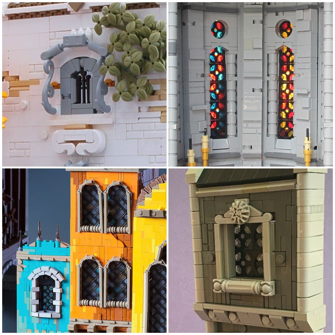
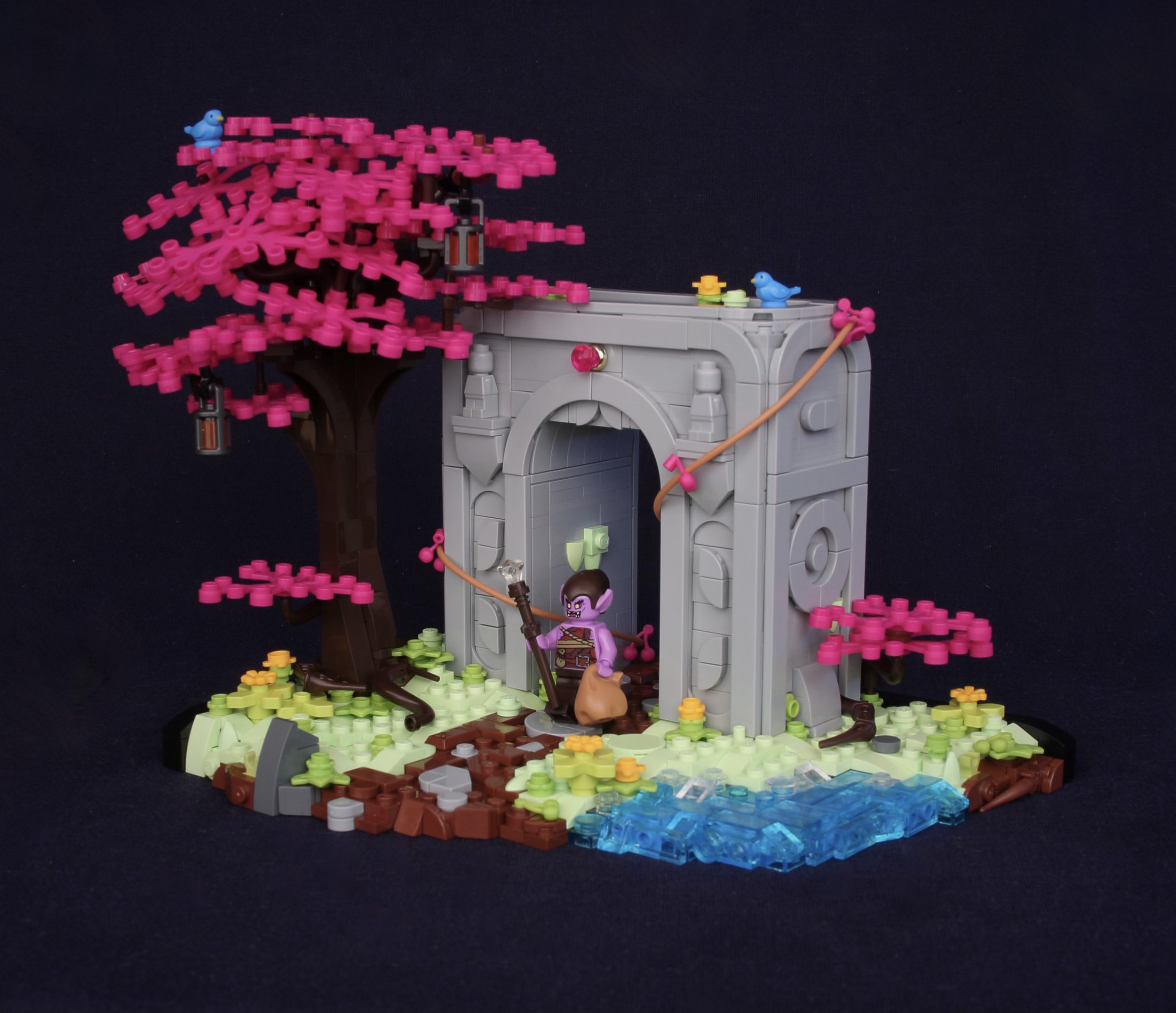
One of the easiest ways to add interest to your MOCs is by adding bits of color to make them pop. This color can be added through any number of details, like foliage, roofs on buildings, or minifigures. A great example of this is my MOC “The Door in the Mountain.” While predominantly gray, the blue on the trees and the figure makes the whole build a lot more interesting.

You can also use color more strongly to create contrast between dull sections and segments of color. My MOC “Stealing the Amulet” uses a lot of gray for the platform and rockwork, but there are also large chunks of azure, lavender, and dark blue. It’s still distinctly a castle build, but it comes across as a lot more fantastical.

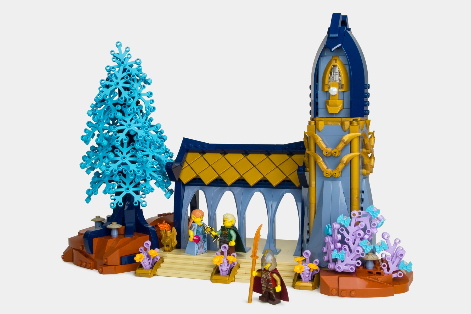
In Stealing the Amulet, I used medium azure for the terrain, but you don’t even have to go that fantastical. The Shire, as demonstrated by my recreation of Bag End, is a great example of a location that is vibrant and colorful without relying on any unrealistic colors.

Of course, you can also just make your castles a different color than gray. In my “Hall of Wizardry” MOC, the floor is gray but the walls are tan, which makes it stand out a bit more. You don’t have to stick with realistic colors either, though; there’s nothing stopping you from making a castle in vibrant coral or dark blue!

However, if you do want to use gray, you can always use another color to compliment or tint the gray, as shown in “Summoning.” While the majority of this build is gray, the green ooze and lighting keep it from being a boring and generic gray room.

Finally, and possibly most fun, you can just go crazy with your colors! Some of the MOCs I’ve had the most fun on are the ones where I’ve abandoned logic and just experimented with as crazy of color schemes as I could come up with.


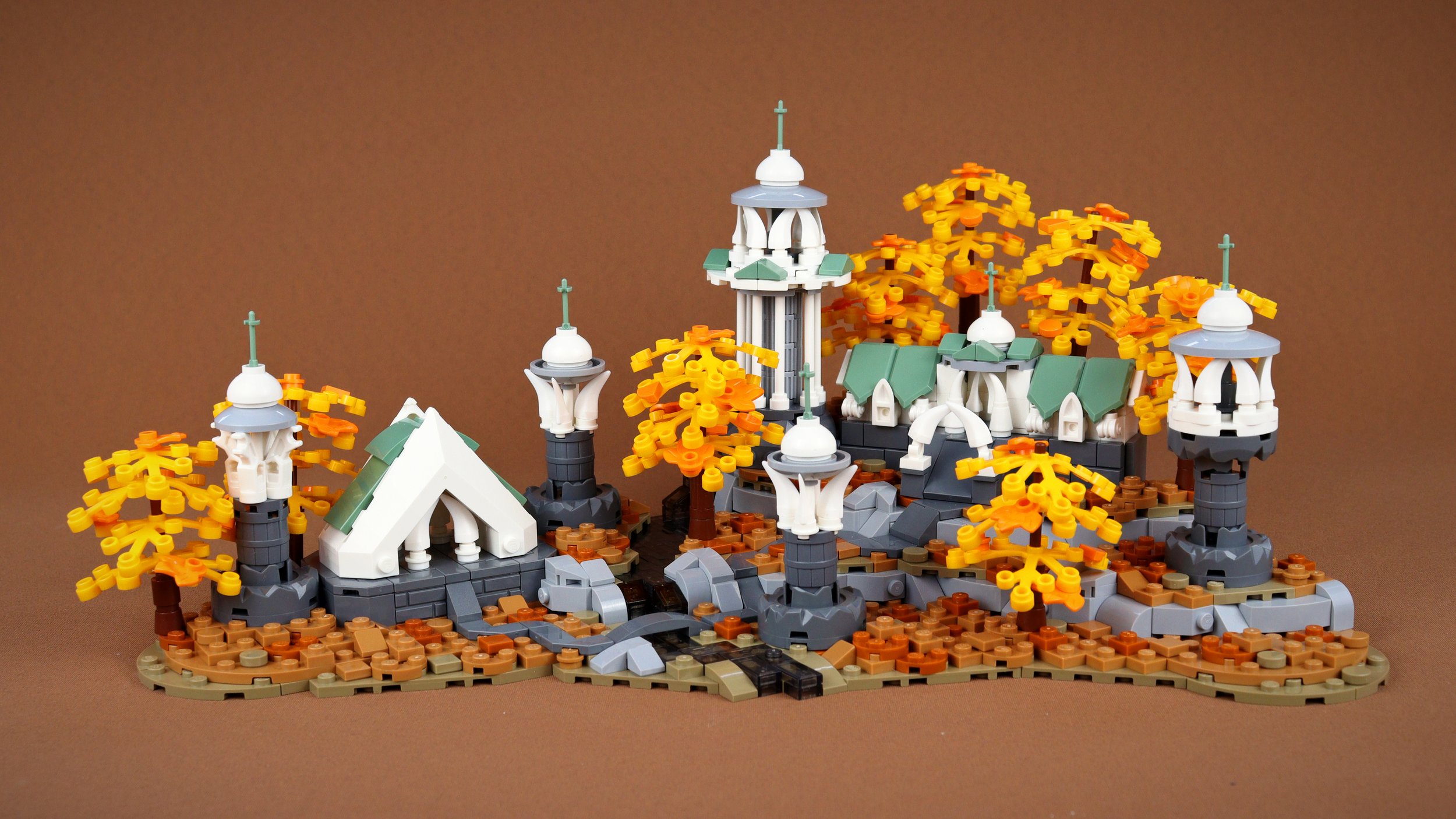
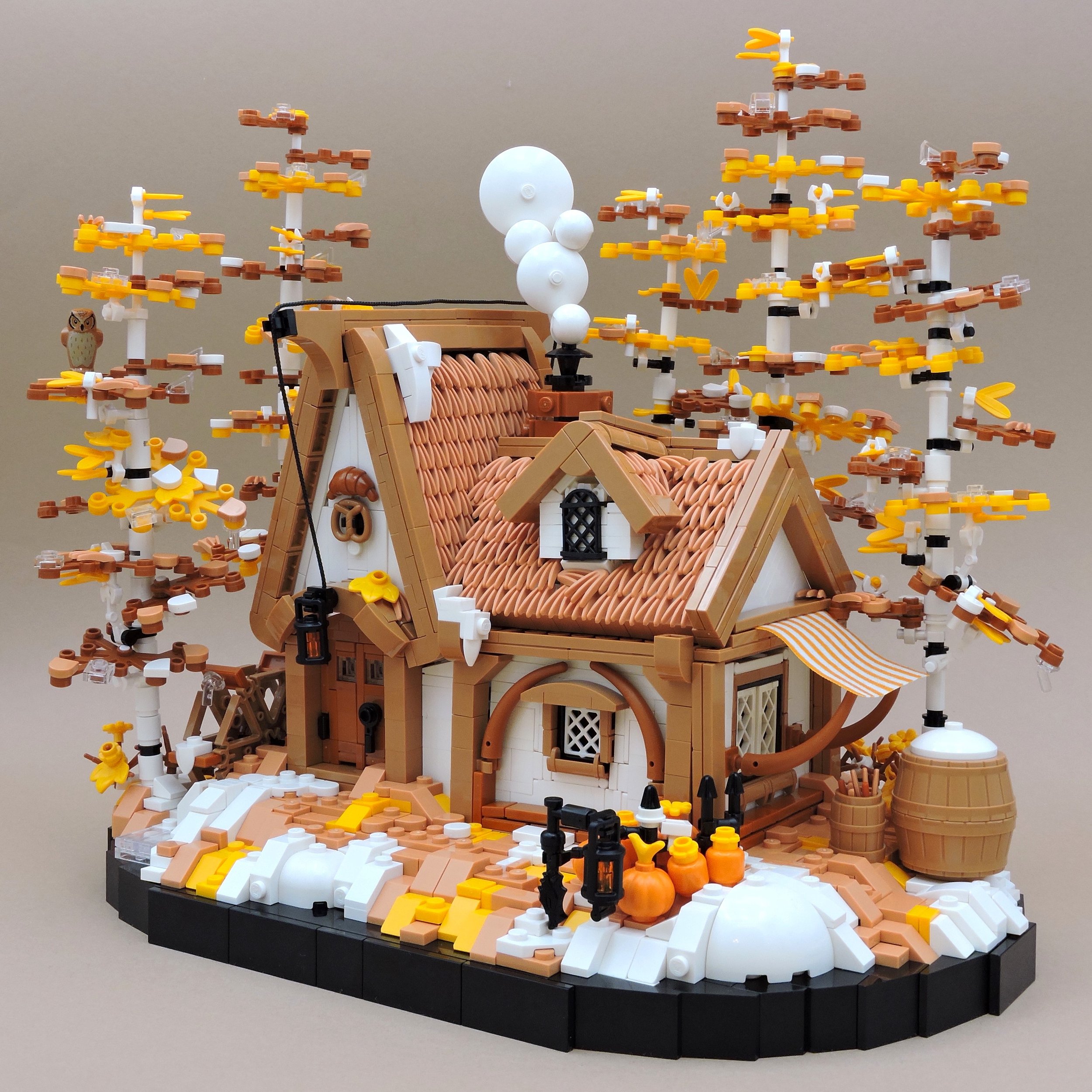
Here are just a few other examples of some of my favorite castle MOCs by other builders that use color in an interesting or unexpected way that really elevates the build:
Color In Action: An Interview with Anthony Wilson
While it’s all well and good for me to rant about color and how I like to use it, I thought I would talk to a real master of color and get their perspective on the topic. As such, it’s my honor to introduce Anthony Wilson, one of my favorite builders in the community who consistently knocks it out of the park with his expectation-defying use of color in his fantasy builds. I got ahold of Anthony and picked his brain on how he approaches color (and building in general).

Caleb: Hey Anthony! It’s great to have you here on BrickNerd. I’m always amazed by the bold concepts and color usage present in your MOCs. Before we dive into that, though, can you introduce yourself to our readers?
Anthony: Hi, I’m Anthony! I’ve not been building much recently but I’ve made lots of LEGO MOCs online—mostly creature/character builds, but I try my hand at lots of different themes and styles.

Caleb: Where do you draw inspiration for your builds from?
Anthony: That’s always a hard question to answer because I just draw inspiration from whatever I happen to be watching, playing, reading, etc. I guess I tend to like “video-gamey” aesthetics, but I’m definitely not limited to that. Sometimes it’s other LEGO builders or sets, and sometimes just quirks of the medium might inspire something.

Caleb: You’ve built in a whole array of different genres, including castle and fantasy. These builds often make use of vibrant colors in unconventional ways. What inspires such bold use of color?
Anthony: Besides my general influences, I think to some extent, LEGO itself inspires the use of colors. You’ll have a hard time building stuff with duller color palettes because LEGO just doesn’t offer a high enough resolution on saturation, hue, and lightness. For any given hue, you might have a standard bright tone, a dark tone, and maybe a light tone… and that’s about it. As a result, I leaned into that when building because otherwise, I’m just fighting the medium.
To some extent, I think I just like that aesthetic anyway, whether it’s because I grew up building LEGO or because I just like that look on a more base level which maybe drew me towards LEGO. It’'s really similar to early pixel art in that way—take a look at something like the original Castlevania and you’ll find bright blues and greens and reds being used for brickwork because that’s just what they had to work with.

Caleb: You’ve got tons of fantastic MOCs, but one of my favorites is Western Woods. How did that build and its unique selection of colors come about?
Anthony: I’d had a bit of an idea before to make a castle MOC that had some funky colours in it. When Summer Joust came around one year, the category was to build something with no visual grey in it, so I jumped on it. I think most builders just went with tan or white or something to replace the usual grey for castle structures but I wanted to go as extreme as possible with the colour scheme. The nice thing about LEGO in this case is that you have a limited colour palette of extremely bold and bright colours, which is something you can lean into.
Western Woods was specifically inspired by the artist Moebius and pixel art games like Hyper Light Drifter (specifically inspired by the western segment of the game’s map, which I think is where the name might have come from).
As for the specific colors I used, it’s pretty much a complimentary set of yellows with purples/blues. I don’t remember exactly why I chose that set of colors, but I definitely chose them to be opposites on the color wheel. It’s fairly basic color theory—you see it all the time in visual media where opposite colors complement each other and make each other pop visually. The color scheme is technically a three-way color split of yellow, blue, and purple; blue and purple are both really close but still distinct while being complementary to the main contrasting color (yellow).
Aside from Skylor (the ninja) and her cat, everything yellow in the build is just the grass and nothing else. Similarly, all the blue is dedicated to rocks or stonework, and the purple is for the leaves. It makes it really easy to tell what’s going on at a glance. If anyone reading feels like they’re struggling with keeping their colors coherent and organized in their builds, give technique this a shot! It’s unreasonably effective for how simple it is. I think most people do this without really thinking about it when they’re dealing with pretty standard color schemes like green for grass, blue for water, light-bley for stonework, and so on, but if your color schemes are starting to get more complex and out there then this is something really good to keep in mind.

Caleb, Do you have any advice on how to create a color scheme and effectively use color in a MOC?
Anthony: My first instinct is to say use your gut, but that’s not exactly helpful. A good place to start if you have no idea what to do would be to look up some of the basics of colour theory and go from there. Most of my color schemes are based on basic but solid color combinations, which is also why they work. Generally though, look at what you like and copy it, or try to figure out why and what bits of it you like. And taking inspiration from sources outside the area or medium you’re working in is a good way to look like you’re being more original than you actually are!

Caleb: Do you have any last thoughts you want to share with our BrickNerd readers?
Anthony: That’s it from me, thanks for having me!
Caleb: Thanks for taking the time to chat with us. It’s been great getting to learn more about you and your work!
PUURRRPPPPLLLLLEEEEEEE: Highlighting the Work of Jaap Bijl
Before I wrap this article up, I’d also like to highlight the work of builder Jaap Bijl. He’s a very busy person, so unfortunately I wasn’t able to interview him, but his work serves as another great example of how to incorporate vibrant colors into a castle/fantasy setting. I’ve highlighted a few of my favorite builds from him below, and I highly recommend checking out the rest of his work on either Flickr or Instagram!


Conclusion
I always love seeing castle builds that use color in fresh ways and manage to differentiate themselves from the myriad of other castle models out there. I know that I, myself, have definitely started to think more about color in my work over the last couple of years and tried to be more intentional in my use of color. Who knows, maybe some of you will be inspired to play with color more in your own work!
Best of BrickNerd - Article originally published July 23, 2024.
How do you use color in your Castle MOCs? Let us know in the comments below!
Do you want to help BrickNerd continue publishing articles like this one? Become a top patron like Charlie Stephens, Marc & Liz Puleo, Paige Mueller, Rob Klingberg from Brickstuff, John & Joshua Hanlon from Beyond the Brick, Megan Lum, Andy Price, Lukas Kurth from StoneWars, Wayne Tyler, Monica Innis, Dan Church, and Roxanne Baxter to show your support, get early access, exclusive swag and more.