A Wave of Color: Exploring the Palette of LEGO Friends
/There’s something special about original LEGO themes and the way they can build a shared narrative while still roaming freely through the vast potential of the LEGO brick. You never know what’s coming next for an in-house theme.
Over the years, LEGO Friends has established itself as a perennial and increasingly polished original theme, and arguably the most versatile of all. City and Ninjago, to cite the other prime examples, generally tie each wave cohesively to one single subtheme, with maybe a couple of outliers, but the variety in this year’s wave of Friends sets is off the charts. We’ve got everything from mobile pet vans to indoor playgrounds to residential housing.
Another way Friends stands out is its innovative use of color. Many colors have debuted in the Friends theme, and Friends sets consistently prefer newer shades to the basic red, blue, yellow, and green that were (with white) LEGO’s original colors. Effective use of LEGO colors is an area where I’m always looking to improve as a builder, and so I couldn’t pass up the opportunity to analyze and learn from the color choices of this constantly improving theme.
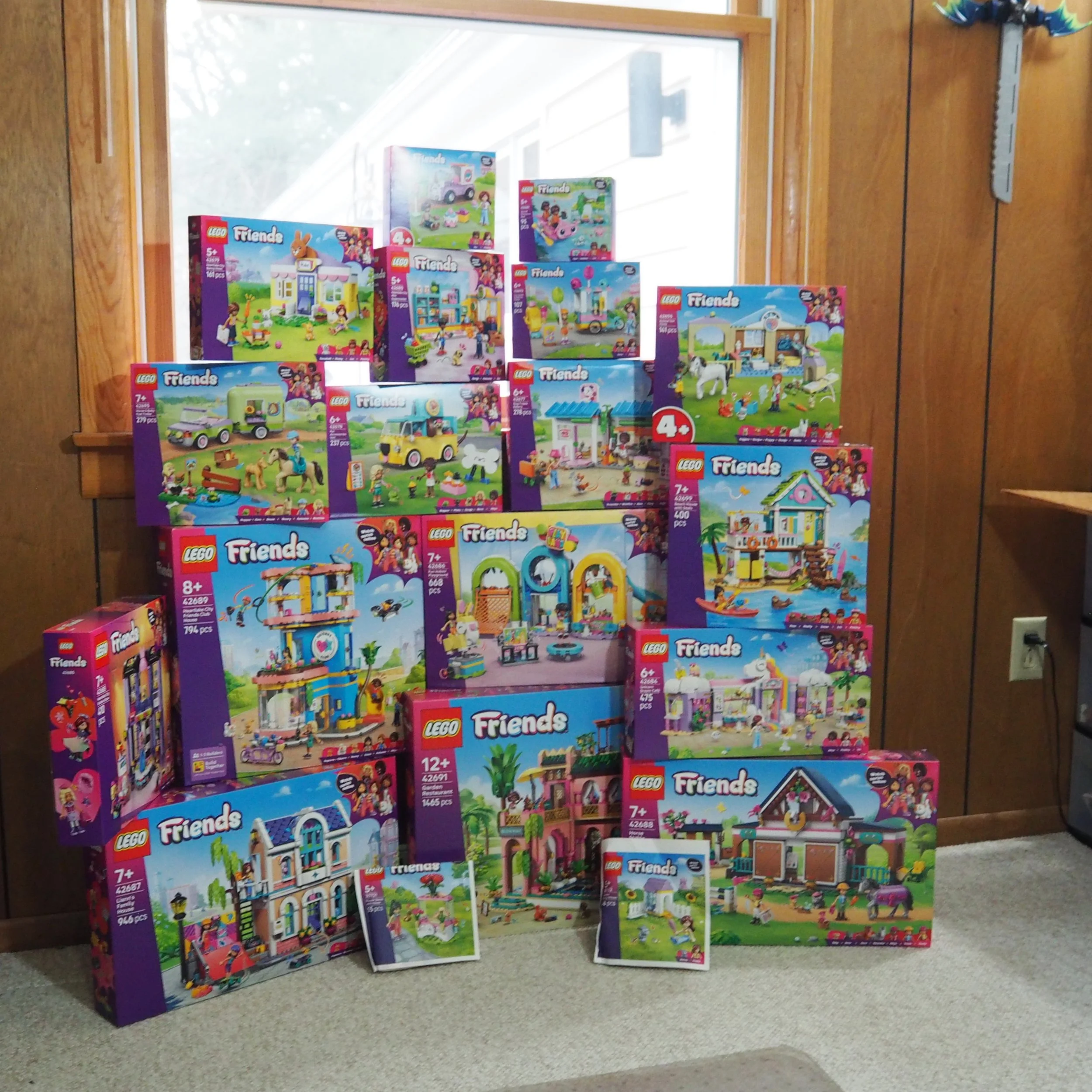
I’ve grouped these nineteen new 2026 wave of LEGO Friends sets as best I could by their color palette, which often, unsurprisingly, brings sets with similar micro themes together in pairs or triplets. Let’s see what we can learn about the way these sets use color to delight and inform the eye—and maybe I’ll treat you to a few rants along the way.
Playful City
What I’m calling the “Playful City” color scheme features bright saturated colors like azure/medium azure, lime green, and yellow/bright light orange. (And with that, we have gotten to Rant #1 already. It’s a short one, I promise.)
Rant #1: Bright light orange should be called dark yellow. Obviously. That’s all.
Back to our playful city, these are the kind of colors you would expect on a toddler’s toy, and hopefully not the kind of colors you see as you go about your actual city. They scream for attention, which is great on occasion, but would be overwhelming on a large scale.
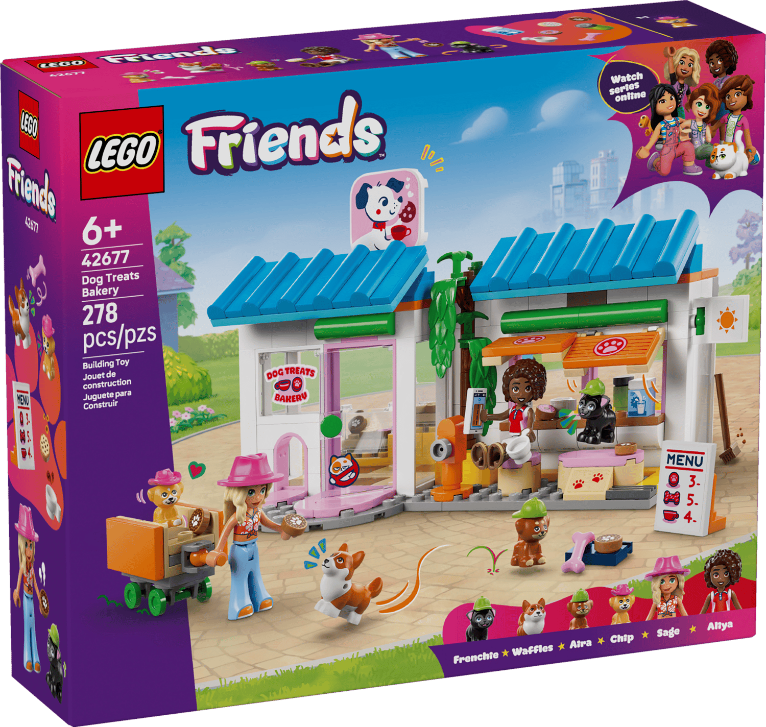
The first of three sets that I think fits this category is 42677 Dog Treats Bakery. I confess to a bit of confusion regarding this set. Is it a bakery for people food or for dogs? There certainly seems to be a lot of dog treats, but also a coffee machine. I don’t know much about dogs or coffee, but I didn’t think dogs drank coffee.
I also admit that I thought that it was proper to put your cup under the spout of the machine, but apparently the right place for it is on top. Maybe I am on the wrong track altogether, and it’s a bakery run by dogs where they serve coffee and cookies to humans, but, being dogs, they don’t know how a coffee machine works.
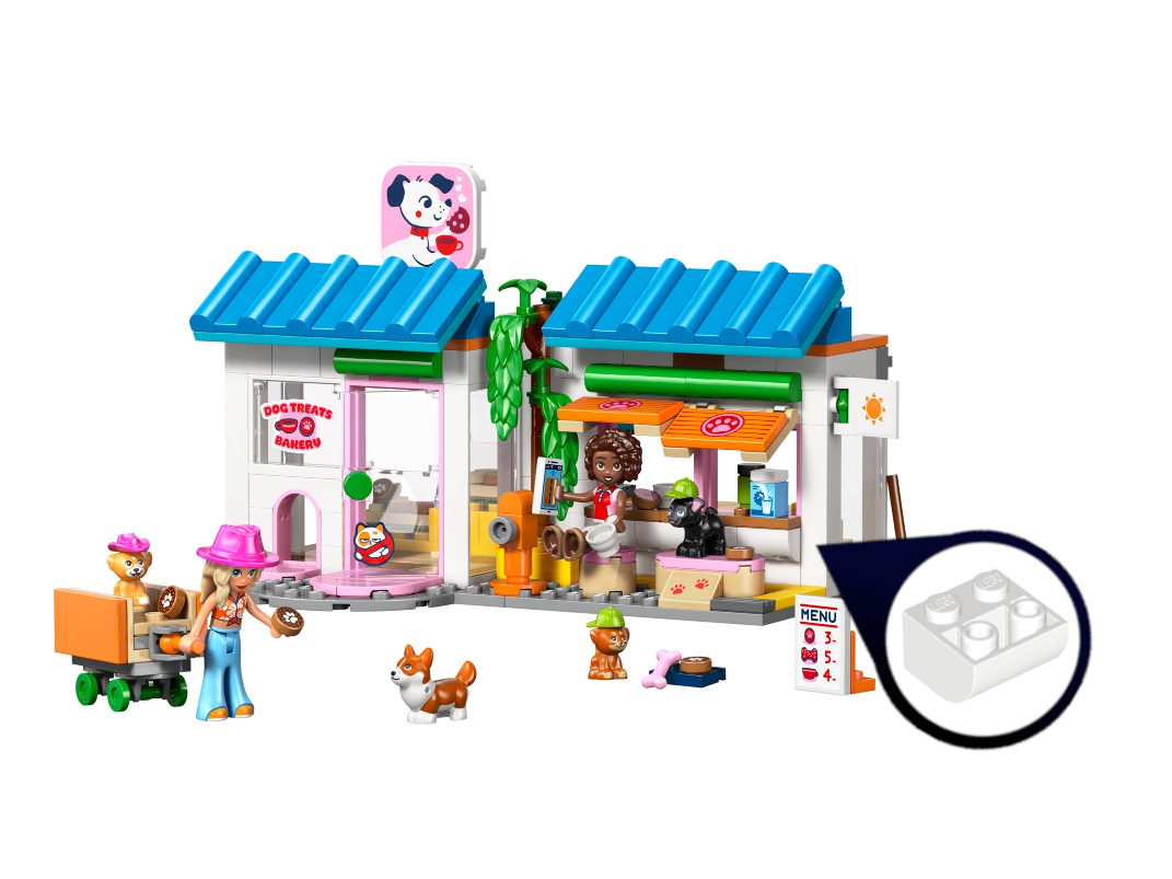
In the case of this set, the playful city colors are balanced by a large amount of white, which would really help it fit into a city. The hat/hair combo is great, as are the super cute mini hats for the dogs. There’s not a whole lot going on with the building techniques, but the set does make use of a new inverted curved slope, a very logical piece that I’m surprised we hadn’t gotten years before.
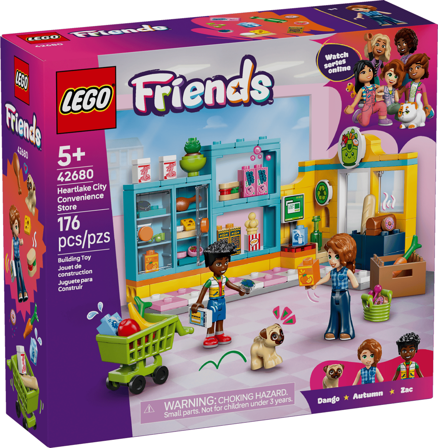
Next, we have the 42680 Heartlake City Mini Supermarket. Mini Supermarket is what my box said, but evidently someone noticed that absurdity in time to correct it for launch and you will now find the Heartlake City Convenience Store listed at the LEGO online shop.
The color scheme of this set is absurd. Just imagine walking into a supermarket where all the shelving was bright blue, the walls were deep yellow, and the floor was pink and white! Though it works okay as a small-scale model. Another really interesting thing about this set is the fact that it is interior-only. I’m not used to that in a LEGO set, so it almost felt incomplete to me once it was built, but it is really great for a play set, and it would have fit in very well with my playing style as a kid.

There are lots of great prints here, notably the pretzels, but also blueberries (which somehow do not seem to have made it into the official product image).

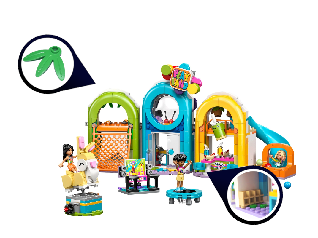
42686 Fun Indoor Playground is a sneaky great set. This is exactly the place where these playfully vibrant colors shine, and with some nice sideways building and a load of sweet little functions to keep you entertained, it instantly made me want to build a full playground MOC.
Each of the three sections is themed and cohesive, and built next to each other, they just look delightful. If you are looking for one Friends set from this wave to build or give away and don’t want to break the bank with the Garden Restaurant, this is the set to get.
Shout out to the clever little shoe rack inside, complete with someone’s green shoes on the ground. Also, although the new triple-leaf part will show up in other sets in this wave as well, here is where I’ll give it a mention as a much-needed durable replacement for the old bamboo leaves. It’s great to see LEGO feeling comfortable with their design language for leaves now and treating us to some more shapes.
To sum up, the Playful City color scheme can look amazing when used carefully, but it’s not something you want to overdo.
Waterslide Colors
This “Waterslide Colors” subgroup of LEGO Friends sets is a little tricky to define; these are still very bright colors, but the contrast has been toned down a little. This makes things feel a little more peaceful compared to the high-energy Playful City. We’re talking azure, lime green, pink, and a dash of light yellow.
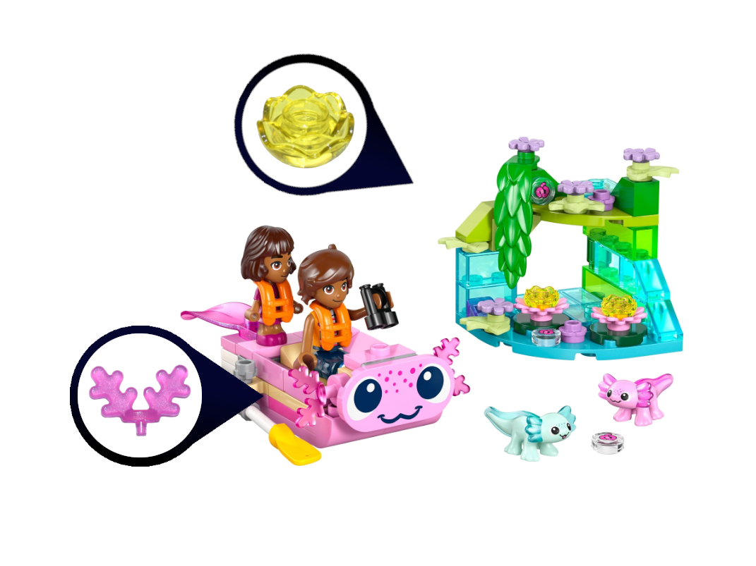
As a small set, 42681 Axolotl Adventure Boat can’t really explore a color scheme much, but the green and blue corner of a physics-defying river that we get here sets a peaceful tone. I don’t really get the Axolotl craze myself, but if you do, you can’t beat two of them in a small set like this. There’s also a transparent yellow flower which I find very intriguing. I really want to see a flower this color in the wild now.
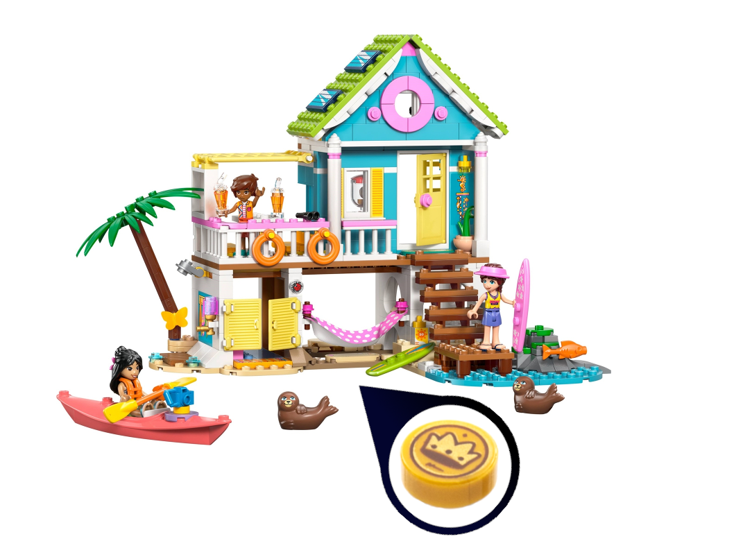
42699 Beach House with Seals brings me to my next rant.
Rant #2: Who names these sets? I mean, I guess it’s nice to know what we’re getting, but was “with seals” really that important? What about the fish and the butterfly? Why don’t they get a mention? It’s true that no one really cares what a set is named, but all I can say is, if I named my stories like LEGO names their sets, no one would ever read them.
Back to the beach house (with seals), it’s got good, calm colors. Not quite charming, but nice. The palm tree feels a little meager, and the coral boat is a bit of an eyesore. But I absolutely love the few crown coins hidden under a sand tile—a great bit of storytelling. It also includes a fun blender design (which you can see through the window), and it shows up again in another set, where we’ll take a closer look.
Fun and Frolic
Speaking of naming things, I do have to point a finger back at myself and admit that it’s hard to name these color schemes. “Playful City” would have done about as well here too, but “Fun and Frolic” has a more feminine overtone with pink playing the part of orange. Also, with one of these sets sporting the new Warm Pink while the other is stuck with the older bright pink, grouping them together is a bit arbitrary.
42689 Heartlake City Friends Club House is not as garish in real life as in photos. Also, to be fair, growing up, we did paint our playhouse azure and yellow. The new warm pink adds a mature note, and as I look down at the product image here, I find myself repeating to myself that, in real life, it really wasn’t that bad. In pictures, though, those blocks of azure with random stripes of yellow are a little hard to get past.
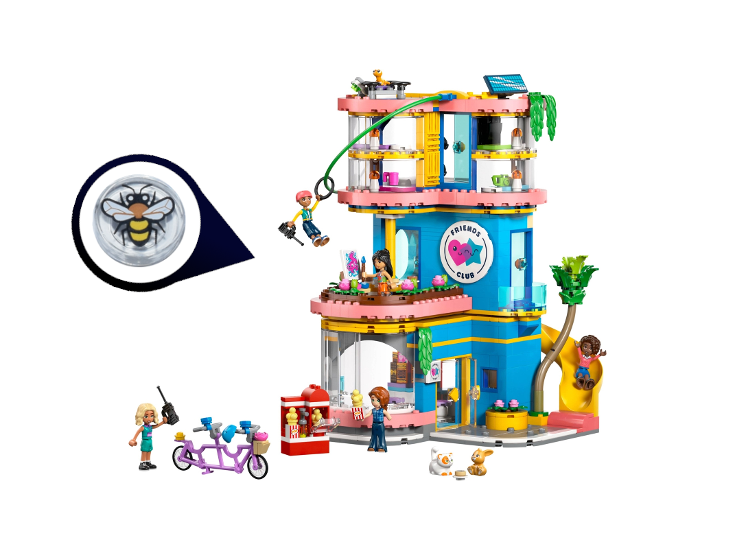
The group of Friends characters does well by way of snacks with loads of chocolate and gum on the snack bar inside. There are a few blueberries and strawberries in the fridge for anyone who doesn’t need quite so much sugar. There’s also a cute bee tile hanging out on the flowers.
The interior has lots of great stuff going on with a gaming space, the previously mentioned snack bar, and cots upstairs. On the whole, it’s a fun set, and I have no doubt my little sister would drool over it.
Moving on to the small 42692 Ice Cream & Balloon Stand, this small set once again caters to the sweet tooth. I’d like to live in a city that sells popsicles the size of my head… And why have we not been doing transparent domes for balloons all this time? They look great!

My personal preference certainly leans toward the “Playful City” color scheme we started this article with, over this “Fun and Frolic” scheme, but that’s because I have never been a fan of pink, and I like high-energy colors.
Pastels and Pets
Most of the pet-focused sets in this wave emphasize pastel colors, maybe because they have a soft, caring vibe. Light yellow is a standout, but light purple, spring yellowish green, and bright pink also fit the scheme, with the occasional appearance of a bolder color like azure.
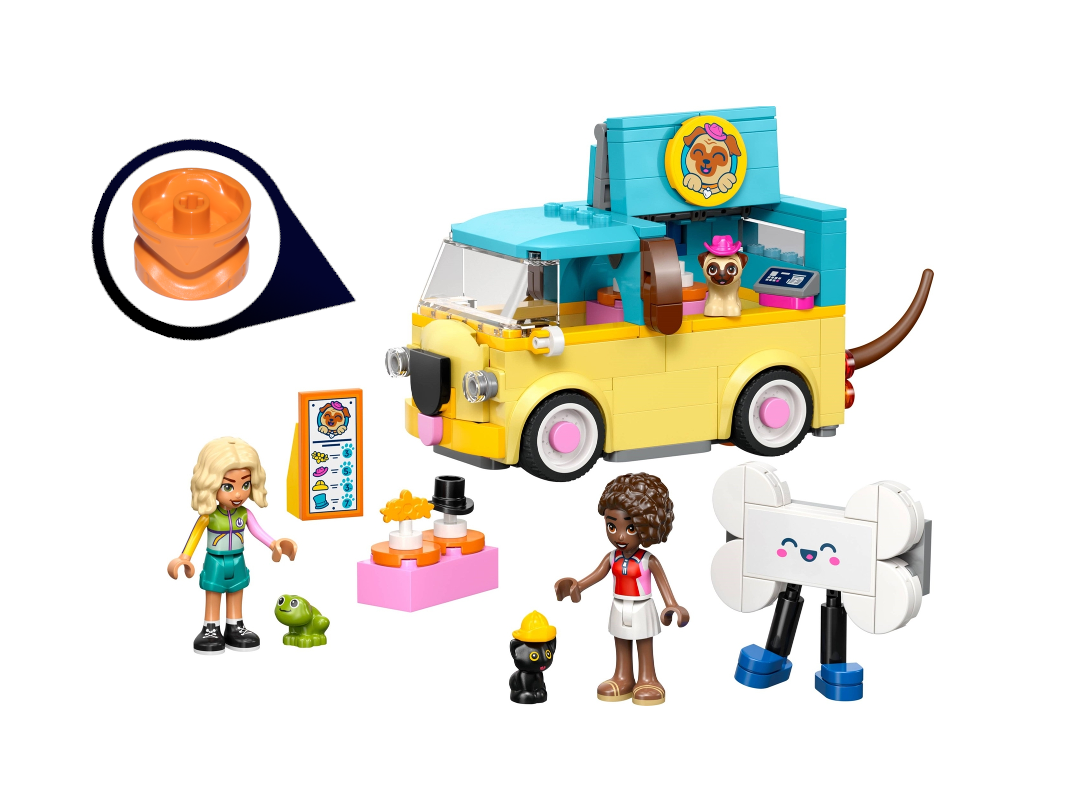
42678 Pet Accessories Van is presumably meant to be a mode of transport to get your dogs from show to show, and it certainly puts on a show with its fun ears, nose, and wagging tail. That function makes use of a piece I hadn’t seen before, a Technic gear shifter that transfers the motion of the wheels to the tail, creating a very satisfying wag when the van rolls. Plus look at that cute frog!
Next, the 42679 Heartlake City Bunny Hotel returns to light yellow but crowns it with light purple instead of azure, playing into the soft, cuddly nature of bunnies, in contrast to the more energetic azure for the dogs. The rabbit mascot up top is very clever, and there’s a fun carrot-shaped rug inside, too. This is a pretty basic set, feels like just barely a step above junior. It’s fun to see the new blue violet color make an appearance, although not a very useful one—just a door with a doggie door to it.

Moving on to one of my favorite sets of this wave, 42695 Horse & Baby Foal Trailer really taps into the potential of pastel colors with a lovely apple green horse trailer. Just enough lime is used for the body of both vehicles to add the right amount of contrast. It is a peaceful color scheme but at the same time has some energy that is lacking in the light purple and yellow above.
The elements of interest here are transparent orange versions of the new shorter 2x1 curve slopes with cutout, and an earthworm tile.
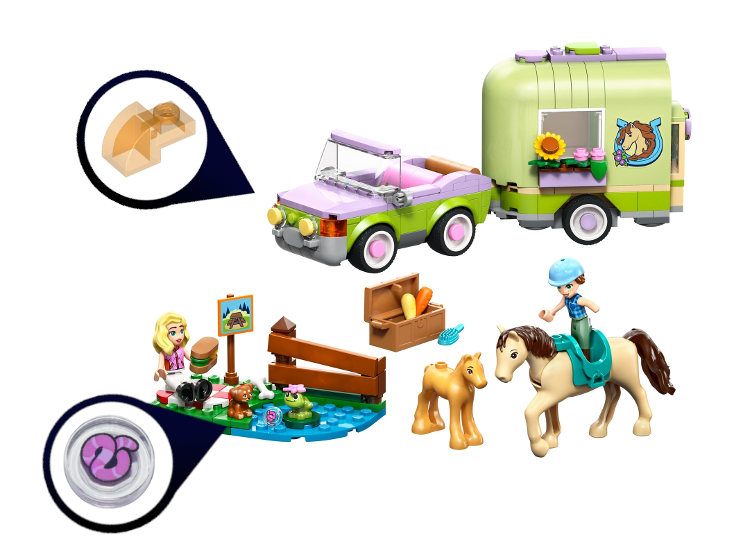
The build process for this set was fairly straightforward. It’s a pretty basic car and trailer, but the final build is great except for one thing…
Rant #3: I don’t know why Friends decided it needed to rewrite the book on LEGO animals, but I grudgingly admit that it has produced a few cute animals (offset by many silly ones). For the most part, I can just pass Friends animals by on the other side and keep calm. But there is one Friends animal that just doesn’t even feel like LEGO to me—the large horse. There was a real opportunity to make an actually nice horse, and instead we got a constantly trotting thing with a gigantic saddle gap (check out how silly a minidoll looks riding it!) and weird rubbery tail.
But that aside, I really like this set.


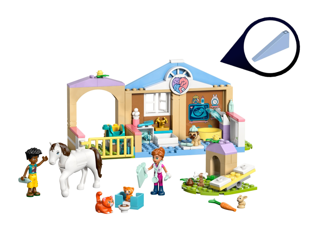
42696 Animal Vet Clinic is a 4+ set, so it has large, chunky pieces and extremely simple instructions. It also has a pretty ambiguous title (is it a clinic for animal vets?) and perhaps too wide a variety of pastel colors to really look great. However, there are a few of the new warm pink pieces. And the large slope pieces were new to me; I could definitely see them coming in handy, especially in that lovely baby blue color.
Like the Mini Supermarket set, the clinic is focused on an interior which makes for a clunky looking product, but terrific play value.
For the most part, the color schemes of these four “Pastels & Pets” sets are comfortable, but not amazing. The exception to that would have to be the horse trailer, which is genuinely lovely.
Emphasis on Purple
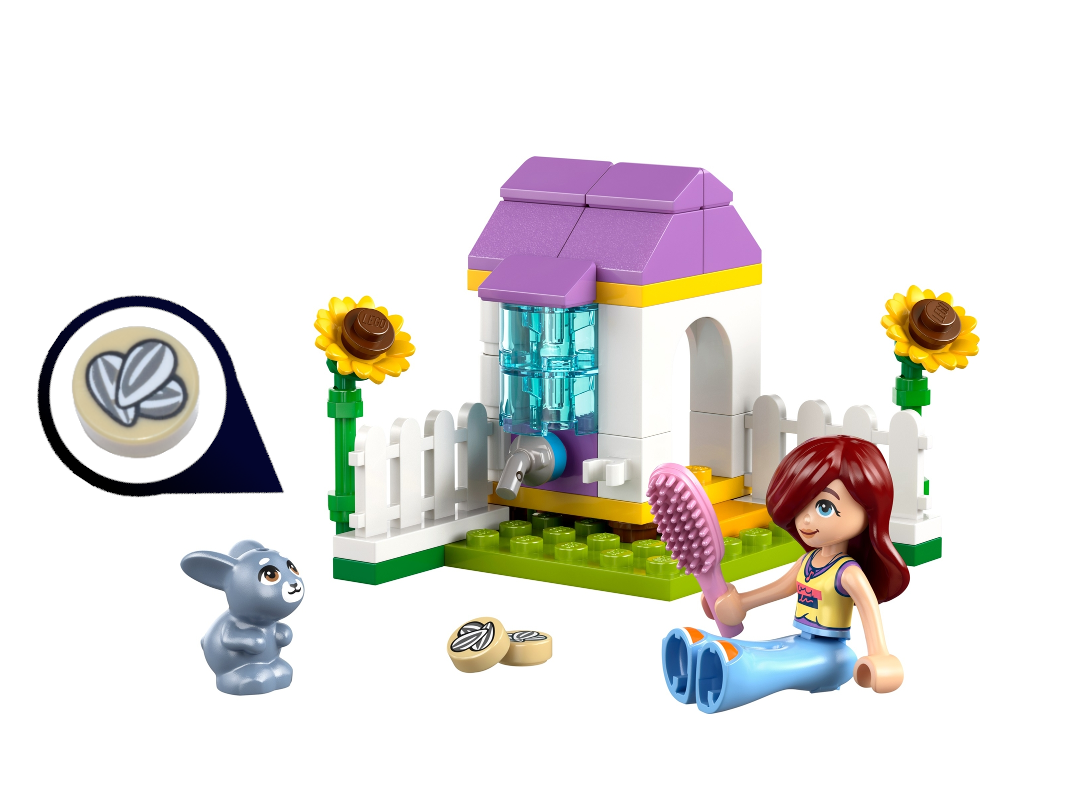
Moving on to the purple sets, 30722 Garden Bunny House is a polybag-sized set (I’m not sure we can keep calling them polybags now that they come in paper bags) with nothing very notable except maybe the sunflowers and sunflower seeds. Presumably, our minidoll friend here brought the brush for her bunny, but she could use it herself a bit too.
Another 4+ set, 42675 Unicorn Cake Delivery Car is again a simple build with a single piece doing duty for the whole base of the car. It’s got some nice stuff going on with the colors though; I like the stripes over the roof.

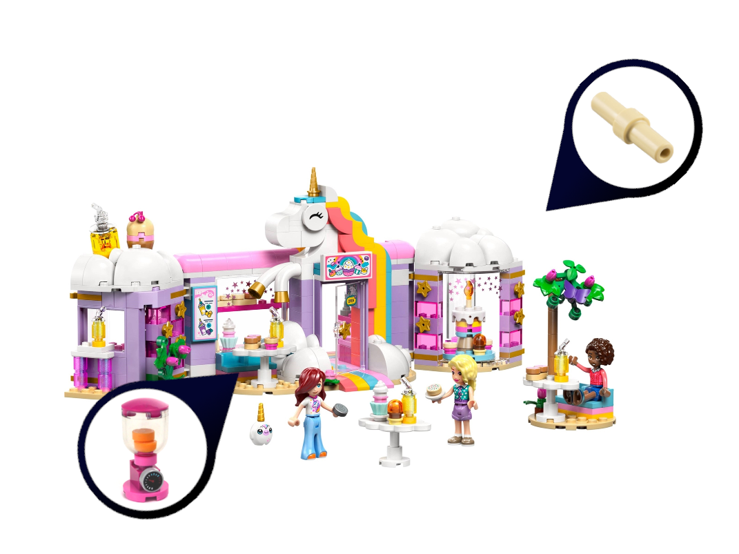
The 42684 Unicorn Dream Cafe matches the delivery car’s colors, but things are a little more chaotic here. (What did you expect? It’s a unicorn dream!) Some newish slopes are used on the cloud-like roofs, but there were two sub-assemblies that stood out to me: the cake with a 2L bar that worked perfectly as a candlestick, and the little blender for all your smoothie needs.
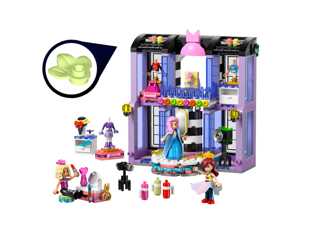
42685 Heartlake City Fashion Show’s color scheme is a bit of an outlier. It certainly does have an emphasis on purple, so that’s why I slid it into this category, but with the black and white stripes inside and the black roof (if you can call that a roof), it completely changes the tone away from light, airy unicorn dreams to a glitzier fashion show. I prefer the darker tones myself, although otherwise the set does not interest me, especially as all the extra torsos and accessories are for minidolls. It’s especially a shame when it comes to the capes.
But really, the minidolls and minidoll-specific accessories have been a shame in every single one of the fourteen sets I’ve looked at so far, and I’m not going to try to hold back any longer.
Rant #4: In the grand scheme of things, minidolls exist so Sweet Mayhem could exist. But otherwise, they are a waste of plastic. I really don’t hate minidolls; I am very indifferent on the subject. But I do think it’s a colossal shame that the one in-house LEGO theme with flesh tone figures does not use minifigures. An in-house minifigure flesh-toned theme would have blown the lid off the selection of heads in a wide variety of colors years ago, without all the minifigures looking like celebrities. I hated “fleshies” for a long time, genuinely because the selection was so small, and so predominantly the lightest nougat, that using them felt less realistic than going for a common denominator of yellow.
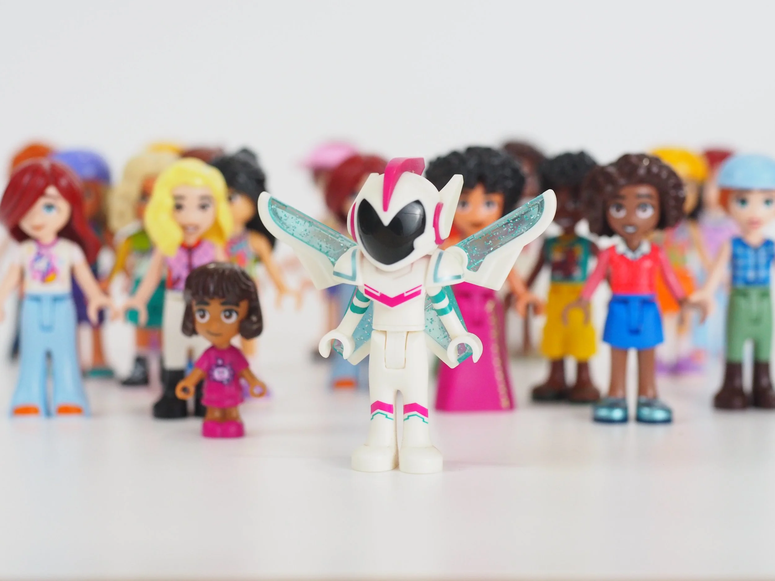
Sweet Mayhem—the justification (in my opinion) for minidolls
But imagine if, for the past decade and a half, LEGO Friends had been churning out minifigures! What a glorious selection we’d have. Not only that, we’d have a load of female faces, which are notoriously underrepresented, partly because for some reason, LEGO decided that the theme that was going to cater especially to girls couldn’t use the classic minifigure. It’s a huge missed opportunity.
In other news, I am rather amused by the use of spring green leaves on the roof. Somehow they work. The upside-down pink bow/cat ears symbol, on the other hand (I have no idea what it is), doesn’t work so well.
Wrapping up our emphasis on purple, I must confess that purple is my favorite color—yet I only find it kind of nice in the unicorn sets. With everything else that’s going on, it feels like the unicorns are here to drown us all helplessly in clouds of glitter. On the other hand, paired with black for the fashion show, these purple shades are far bolder and more exciting.
Warm Colors
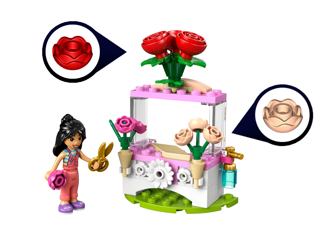
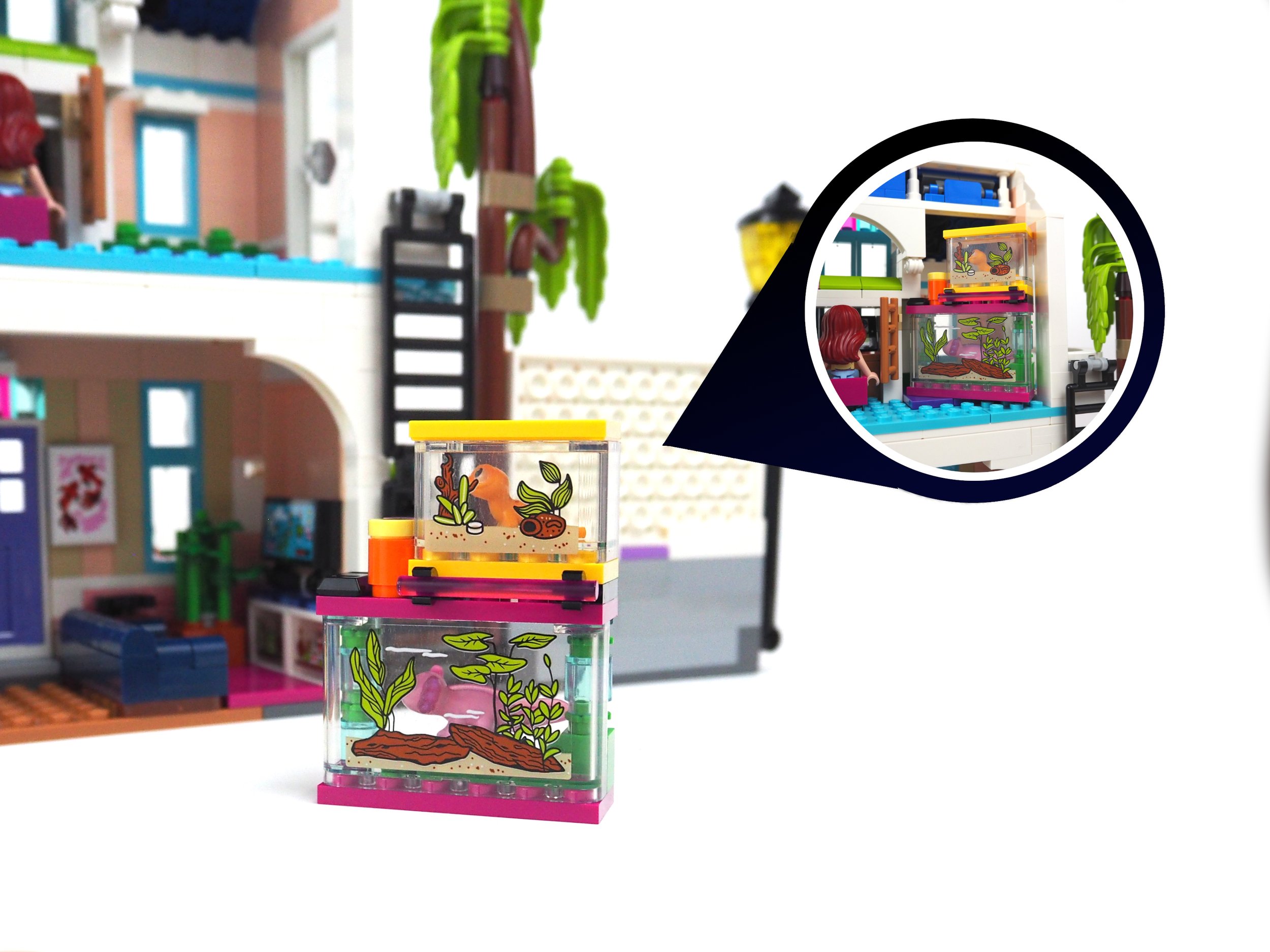
At last, we have reached the cozy, comfortable sets I categorize under the “Warm Colors” theme. As it turns out, this color group includes two of this wave’s standouts—42687 Liann’s Family House and 42691 Garden Restaurant. But the group kicks off with a second polybag set (in a paper bag), 30721 Flower Stand with Roses (see Rant #2). These roses in light nougat have only appeared elsewhere in 75685 Emerald City Wall Art. The red rose inside an inverted dome makes for a clever extra-large rose.
The warm color scheme of these sets is still evident in 42687 Liann’s Family House, but this set does balance that with azure window frames and a blue roof, as well as a wild bit of decor behind the skate ramp. The coral ramp itself, however, plays into the warm color scheme really well, drawing out the warm pink and light nougat.
Blue violet on the roof is also a great choice, as it feels somewhat like the cool grey you might see on a modern roof, but still has some color to make it more attractive in a toy. Overall, I love the colors on this set; it feels very well-balanced.
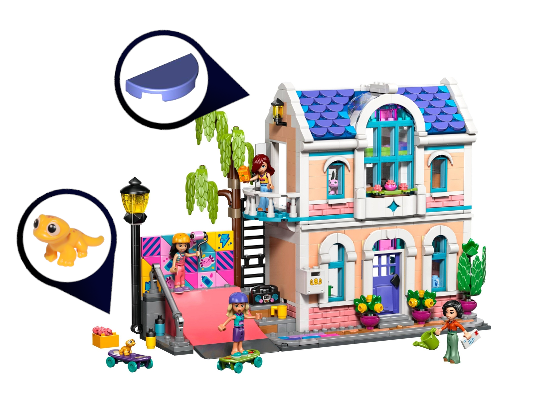
I also have to mention the adorable lizard, which is definitely one of the super-cute Friends-style animals I am glad we have.
Liann’s Home is the only set that includes both new colors, blue violet and warm pink. We will take a closer look at these in a future article, but for now, here’s how they compare to other colors included in these sets.
As you would expect, the house has a full interior. Inside, the colors are a little more questionable, with a chaos of blue, azure, dark pink, purple, and lavender. There are a couple of terrariums that can be slid out for easy access or locked in place by turning the small ladder that gives access to the house’s single bed (so much for being a family home).
The mural behind the skate ramp can also be slid in and out, allowing for easy customization, a fun feature. Or if the whole skating area is too much for you, it detaches easily from the rest of the house. In fact, the house has Technic holes on either side, so it should connect to 42670 Heartlake City Apartments and Stores. It’s great to see a well-designed residential building as a set, though. As a kid, houses were some of my favorite things to build; after all, I lived in a house, not a police station or vet clinic.
I have mixed feelings about the half-cylinder over the large central window. It’s ingenious and very cool itself, but the way it merges into the roof right at the ridge feels a little unnatural. If the roof came to a peak higher up, I think that might look better, although it’d be a lot of extra parts.


It’s a bit of a stretch to bring 42688 Horse Stable and Riding Academy under the “Warm Color” umbrella, since it does have a lot of blue, but the medium nougat and eye-catching dark pink fit the bill. It’s a really nice color scheme; wooden and rustic, with enough teal and pink to liven things up without being overpowering.

This set relies pretty heavily on stickers, and the doors look very plain without them. But the wooden frame above looks magnificent, and the mini horse heads used on the logo, and one of the hurdles, are super cool. It’s also great to see the fried egg piece recolored in transparent light blue for a water spill.
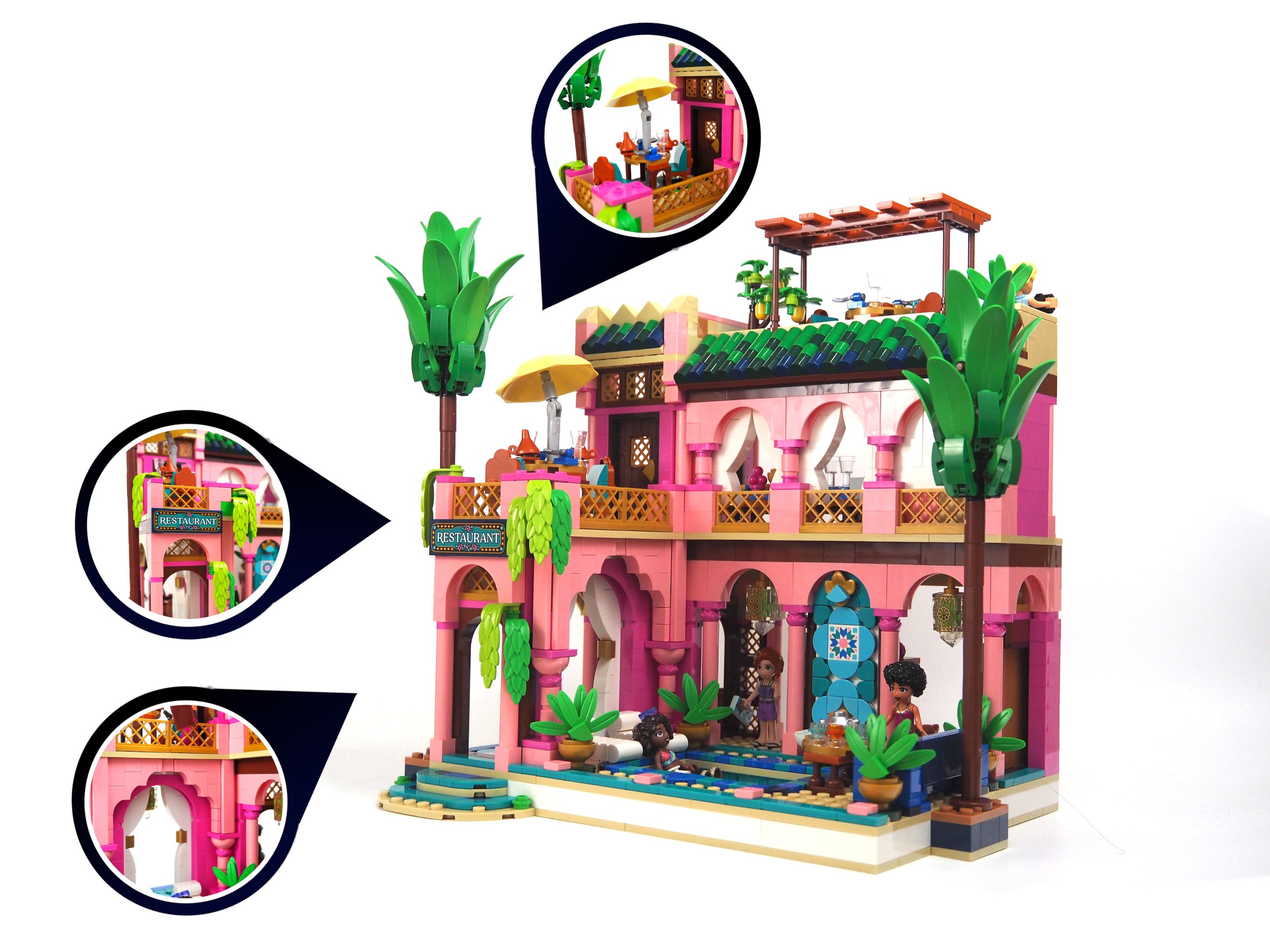
42691 Garden Restaurant is the worthy flagship of this line, and makes a great case for the new warm pink color. In the past, my favorite LEGO Friends set was 2019’s 40379 Heartlake City Restaurant, which had kind of an Italian flair. It’s great to see the theme revisiting the exotic restaurant idea, although this one feels almost more like a hotel, complete with a pool and palm trees. It’s got some great printed tiles as well.
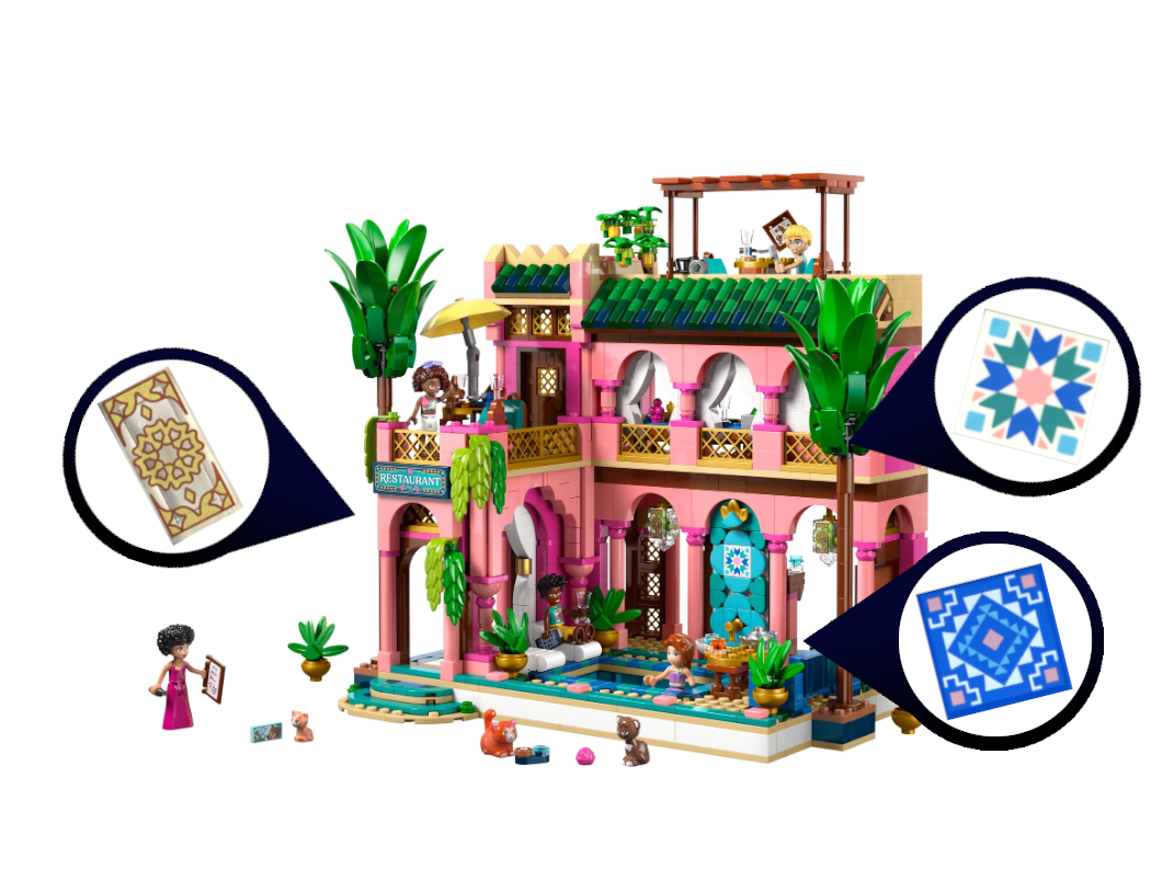
As you would expect from a set of this size, there are lots of ingenious techniques and great detail. Possibly my favorite thing is the large arch on the lower left, with some great sideways building going on. It’s a beautiful set that shows that colors can be vibrant and bold without being overpowering.


The “Warm Colors” group is a bit of a catch-all, but these four sets have at least one thing in common: they all look really nice. While sticking predominantly to warm colors such as nougat or pink, shades of blue or green can be worked in without clashing. White also proves to be a good accent color, as all four of these sets use it significantly.
To Conclude, For Now
Looking at all these sets—many of them thoroughly well-designed—with an eye to their color schemes, it’s clear that the choice of color palette creates an atmosphere and even a mood. Whether you’re interested in LEGO Friends as a theme or not, there’s something to be learned from these sets—something that we’ll try to exemplify and expand on in the next article.
Stay tuned for more Friends colors, but this time going places where Friends colors have never been before…
Have you thought about how you choose a color scheme when building with LEGO bricks? What colors do you tend to gravitate towards?
Do you want to help BrickNerd continue publishing articles like this one? Become a top patron like Paige Mueller, Rob Klingberg from Brickstuff, John & Joshua Hanlon from Beyond the Brick, Megan Lum, Andy Price, Lukas Kurth from StoneWars, Wayne Tyler, Dan Church, and Roxanne Baxter to show your support, get early access, exclusive swag and more.