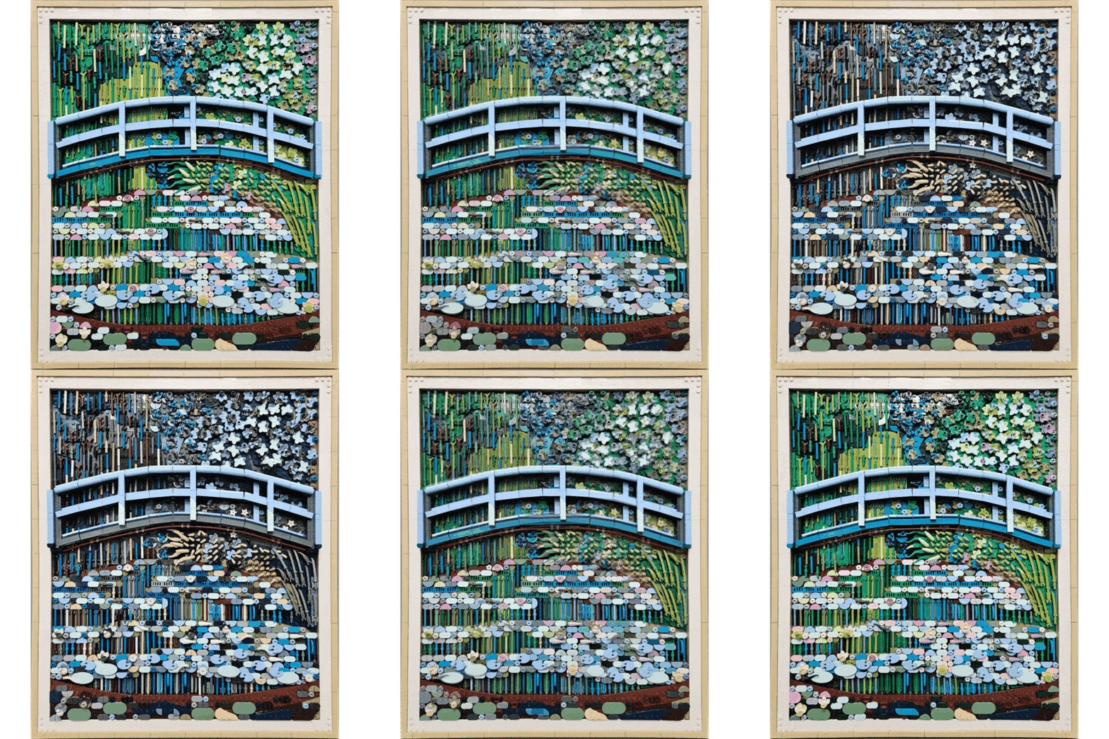
Monet in Dark Mode: Recoloring the LEGO Art Water Lilies
/Guest contributor Meredith Najewicz, aka pinkwheels, explores how a different palette can transform LEGO Art’s Monet water garden, with additional insights from LEGO designer Stijn Oom.
Ask AFOLs what they love about building with LEGO, and you might get as many answers as there are elements. For some, it’s creating mechs or collecting minifigures. For me, it’s color. I love how it can bring fun, whimsy, or emotion to a build, and colorful creations are always the ones that catch my eye.
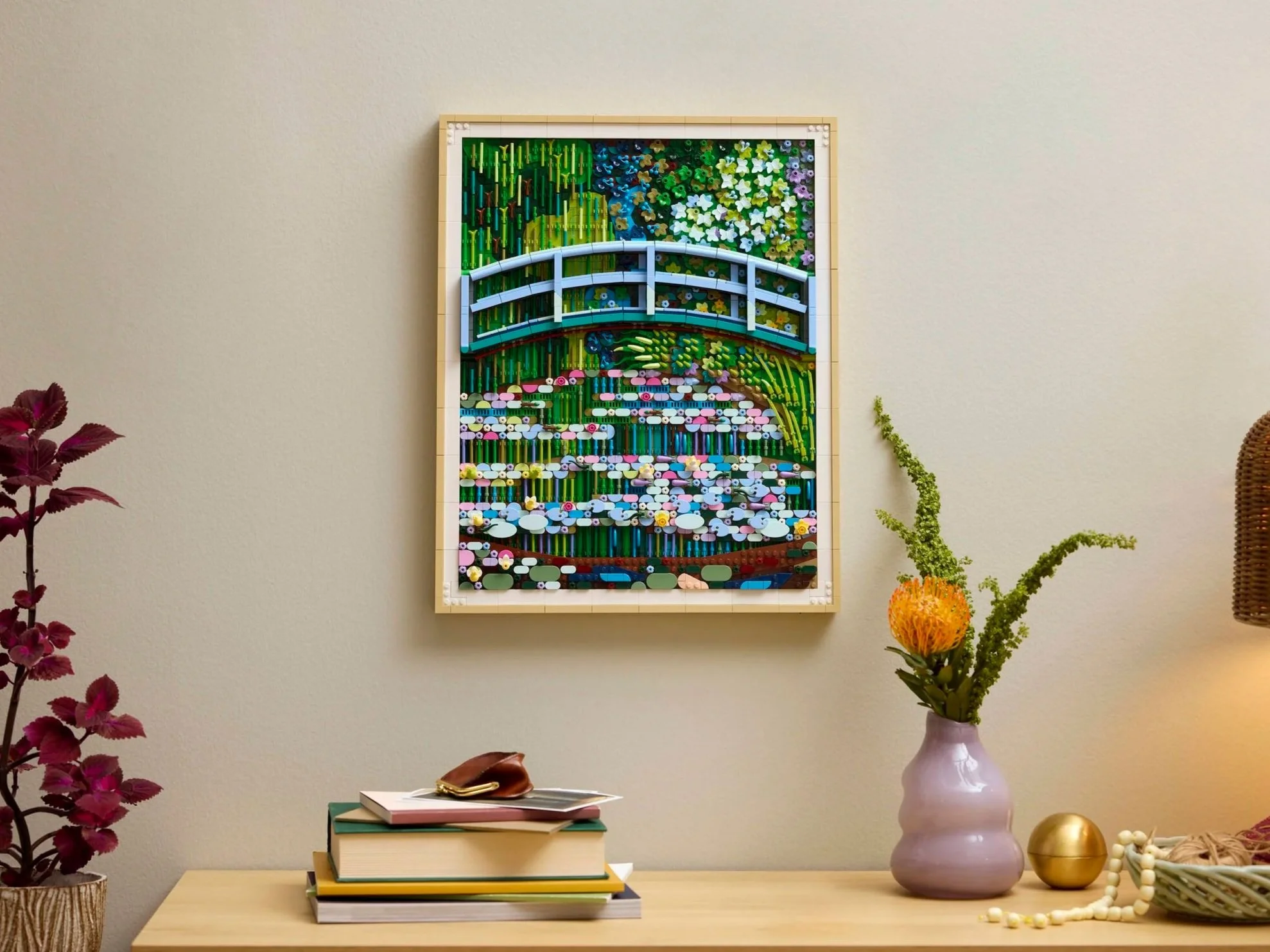
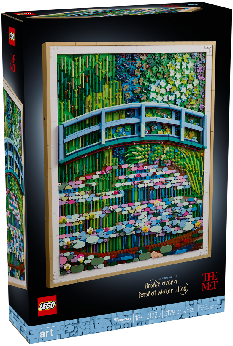
The LEGO Art range has been putting that color palette to good use. Thanks to BrickNerd, I had the opportunity to build 31220 Claude Monet – Bridge over a Pond of Water Lilies. While putting it together, I started wondering whether I could use the set to recreate another of Monet’s paintings of the same pond. How much could I change its mood by changing its colors?
Another View of the Pond
Monet painted his water garden at Giverny repeatedly, exploring changes in light, color, and reflections. In the set’s companion podcast, Met curator Alison Hokanson explains that the group of paintings containing the LEGO set’s inspiration consists of eighteen works: twelve painted in the summer of 1899 and six more the following summer. Their viewpoints and perspectives vary, but so do their colors.
That brought back memories of discussing Monet in my ninth-grade art class. The LEGO set represented one version of a scene he had returned to again and again. There were other palettes to explore, so off to Wikipedia I went.
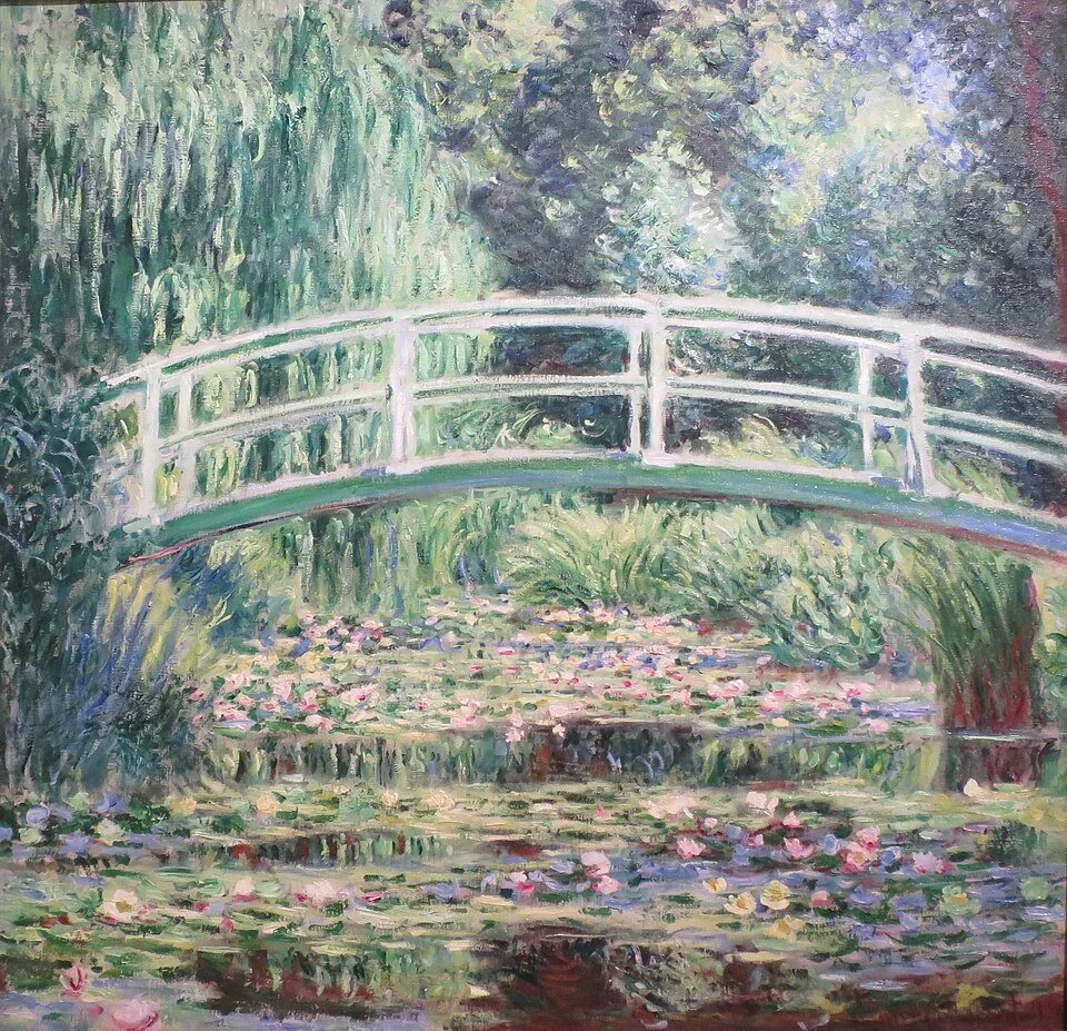
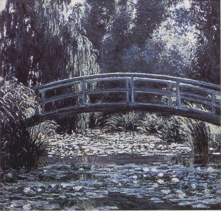
I settled on a painting titled The Water-Lily Pond. Its darker blues and grays, alongside whites, tans, and hints of green, offered a different direction from the official set. I started calling my project the “dark mode” lily pond. Now I needed to find out whether the LEGO parts existed to make it work.
Building the Brushstrokes
The official model provided plenty of techniques to work with. Bars suggest individual brushstrokes, with colors repeated below the bridge to form reflections in the pond. Oval and half-circle tiles become lily pads and foliage, while paintbrushes, butterflies, and other familiar elements help recreate the painted surface.
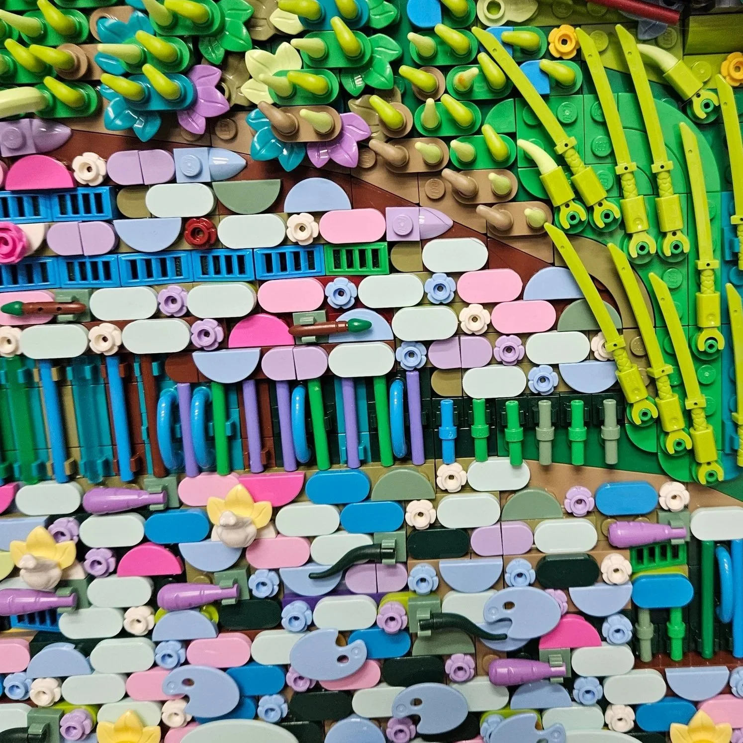
Those layers are an important part of the translation. In the podcast, Hokanson describes how Monet built up the painting with different shapes and textures of brushstroke, leaving earlier layers visible beneath later ones. Designer Stijn Oom explains that the LEGO model follows a similar approach: blocking out larger patches of color, then adding layers that capture the different textures.
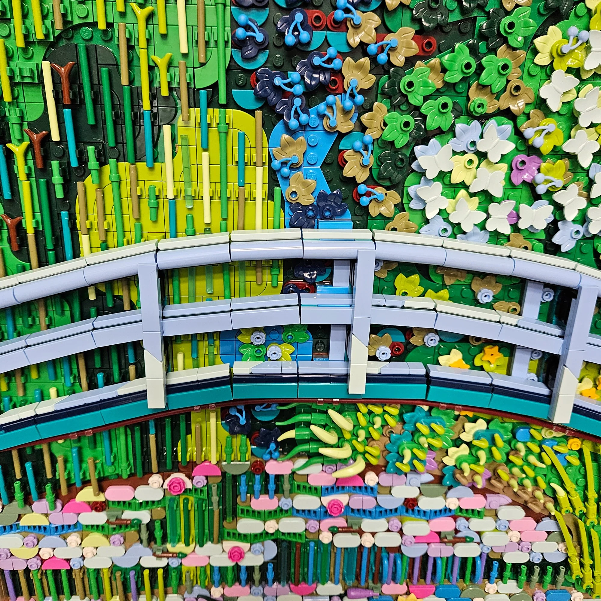
The bridge uses clips to form its gentle arch and anchor it into the scene, although it can shift slightly if the model gets bumped. The finished artwork sits inside a frame secured with Technic axles. It was that removable frame that first got me thinking: could I put another LEGO artwork in it?
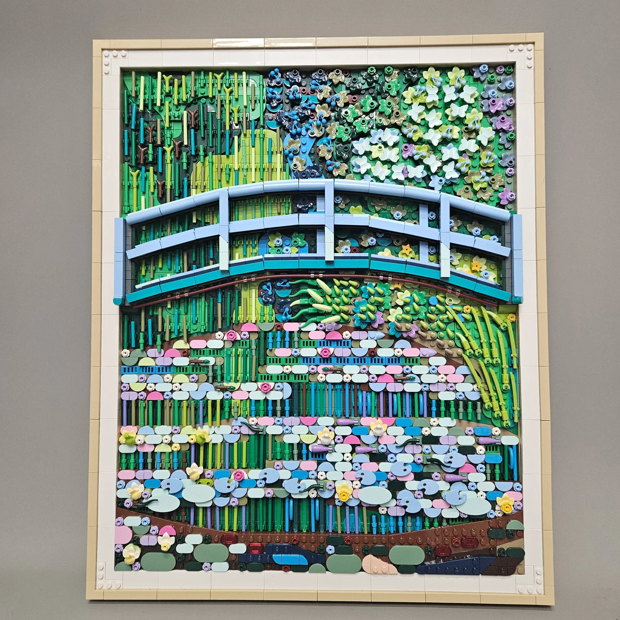
Reworking the Monet seemed like a good place to start. I already had the composition and building techniques in front of me. The question was how much of that construction could stay the same once I changed the palette.
Choosing the Colors
I chose Dark Blue, Dark Bluish Gray, and Black as my primary colors, then began digging through my collection, BrickLink, and LEGO’s online Pick a Brick service. Some substitutions were straightforward. Others needed a different shape to do a similar job.
Like many AFOLs, I have a substantial supply of Light Bluish Gray parts, and LEGO has made a wide range of elements in that color. But when I placed them next to Dark Bluish Gray, Dark Blue, and Black, they looked almost white. That contrast could be useful, but it also made matching the painting more difficult.
The original designer faced similar decisions. In his interview with BrickNerd, Stijn explained that the team tried about ten different colors for the bridge, as well as different combinations, considering how they worked with the rest of the painting. Warm Pink was also tested elsewhere in the model but proved too warm for the palette.
Even with access to new recolors, the choices required experimentation. As Stijn points out in the podcast, Monet could mix paint to create new shades; LEGO designers have a fixed palette to work with. For my version, that limitation also extended to whichever parts I could actually find.
Working from the Background Forward
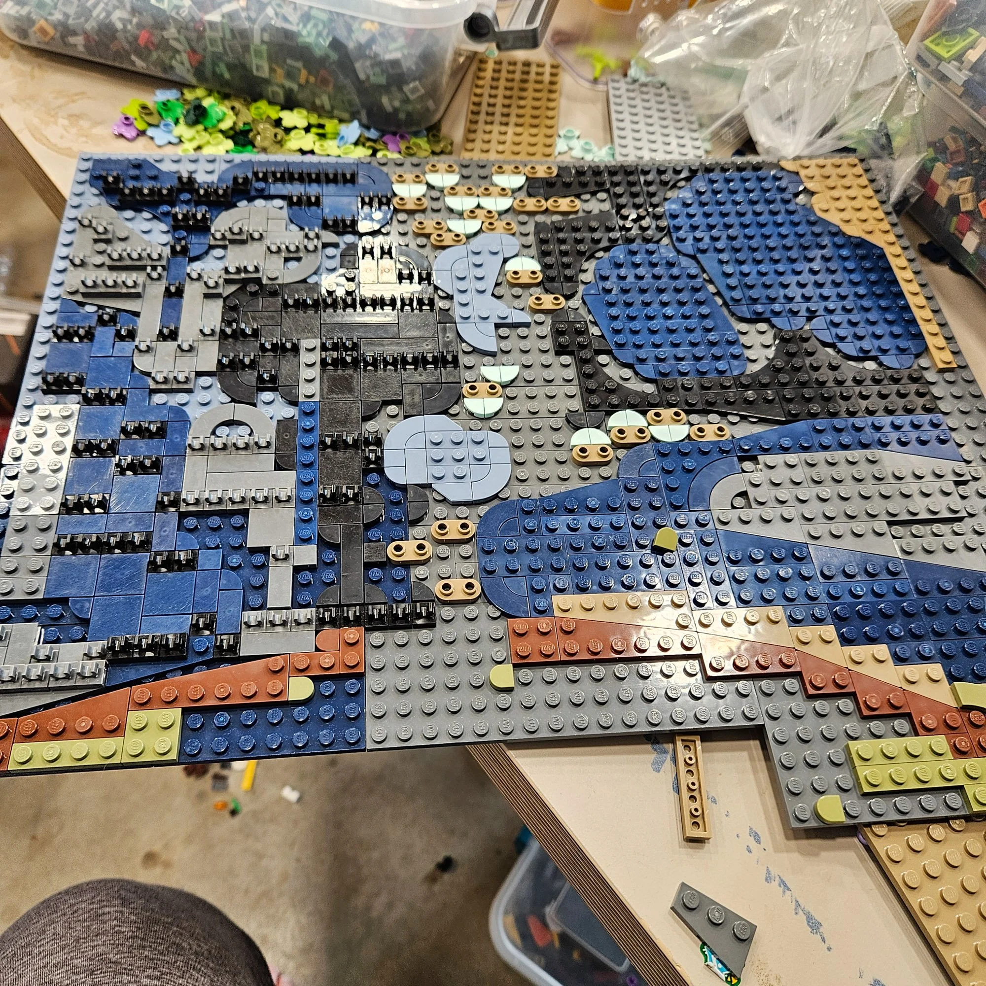
The background was one of the first places where I needed to change more than color. The official set uses modified 4×4 plates with a 3×3 cutout to create sweeping shapes in the trees. I could find those in Black and Dark Blue, but for the Dark Bluish Gray areas, I used 45-degree wedge plates instead.
The Bright Green 3×3 heart plates presented another challenge. I replaced them with Dark Blue quarter-round tiles and 2×2 plates. A color change that looked simple in the painting could require several pieces in the build.
The background also mattered more than its position might suggest. Stijn told BrickNerd that an early concept model used a lighter background in one section. As the team studied the painting, they recognized the importance of darker colors showing through from underneath. Olive Green and Dark Tan helped create that effect in the finished set.
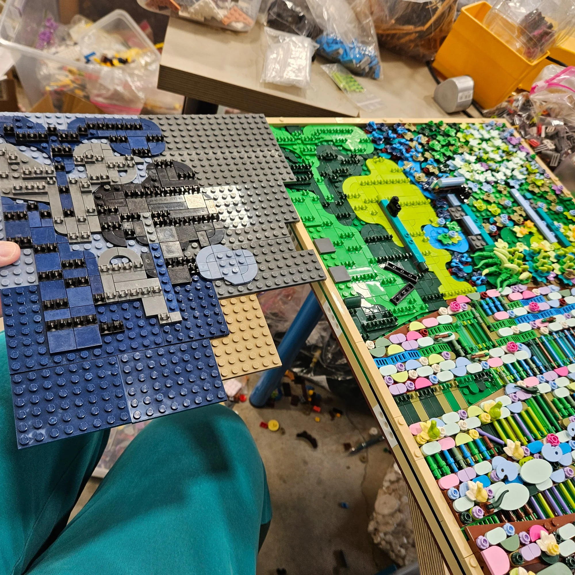
That relationship between layers was also at work in my darker version. Changing the background affected how the pieces above it looked, just as placing Light Bluish Gray against Black made it appear almost white. Finding a substitute meant considering the surrounding colors as well as the individual part.
Bars, Leaves and Butterflies
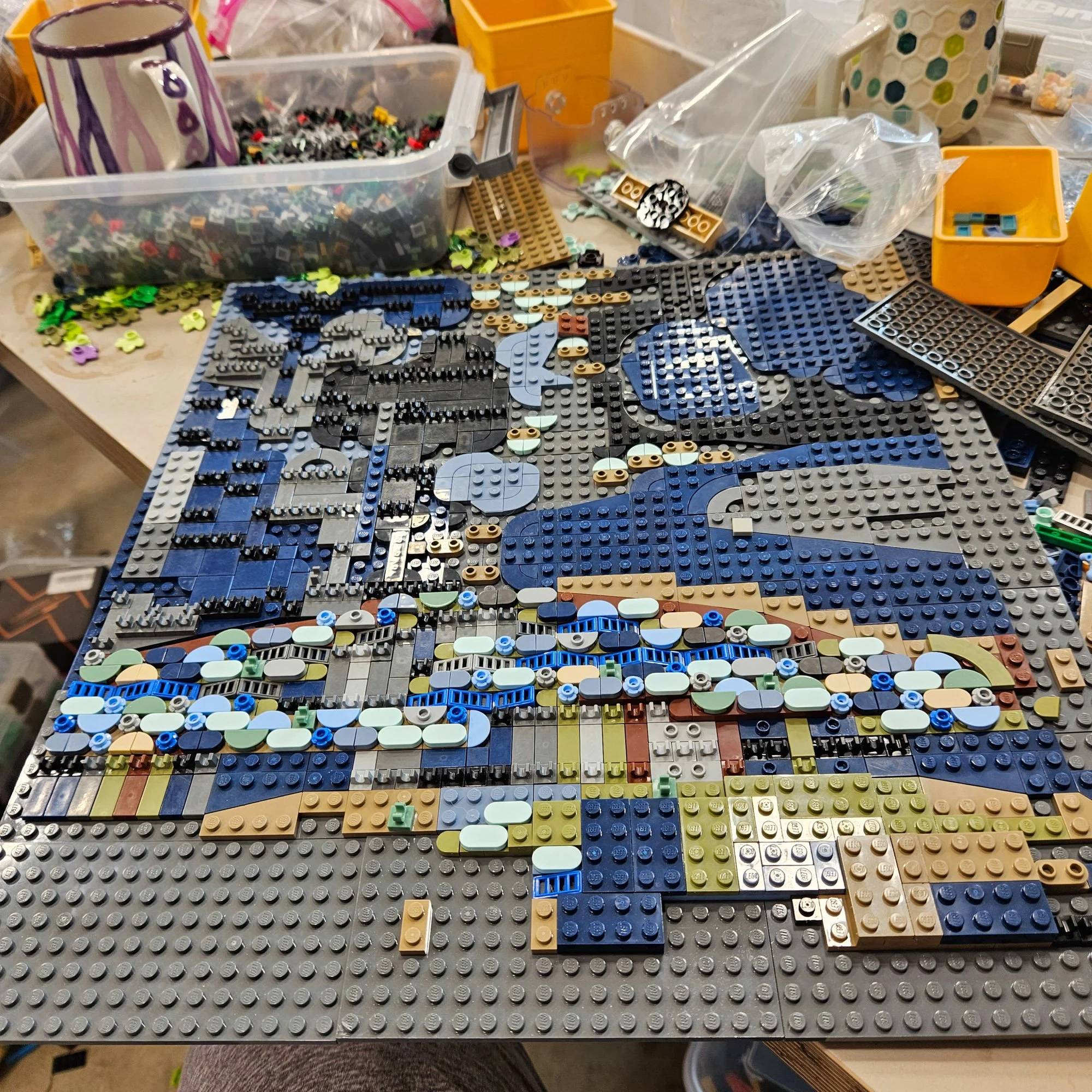
The brushstroke effect in the tree on the left was easier to translate. Standard Blue bars came in several useful lengths and provided contrast against the dark background. Dark Brown, Reddish Brown, Black, Tan, White, and both grays also gave me options.
The clips holding those bars were less cooperative. The original set uses matching modified tiles with clips, but I couldn’t get the element I needed in Dark Blue. Black became my substitute in those areas. Even when a bar was available in the right color, the part holding it in place could force another compromise.
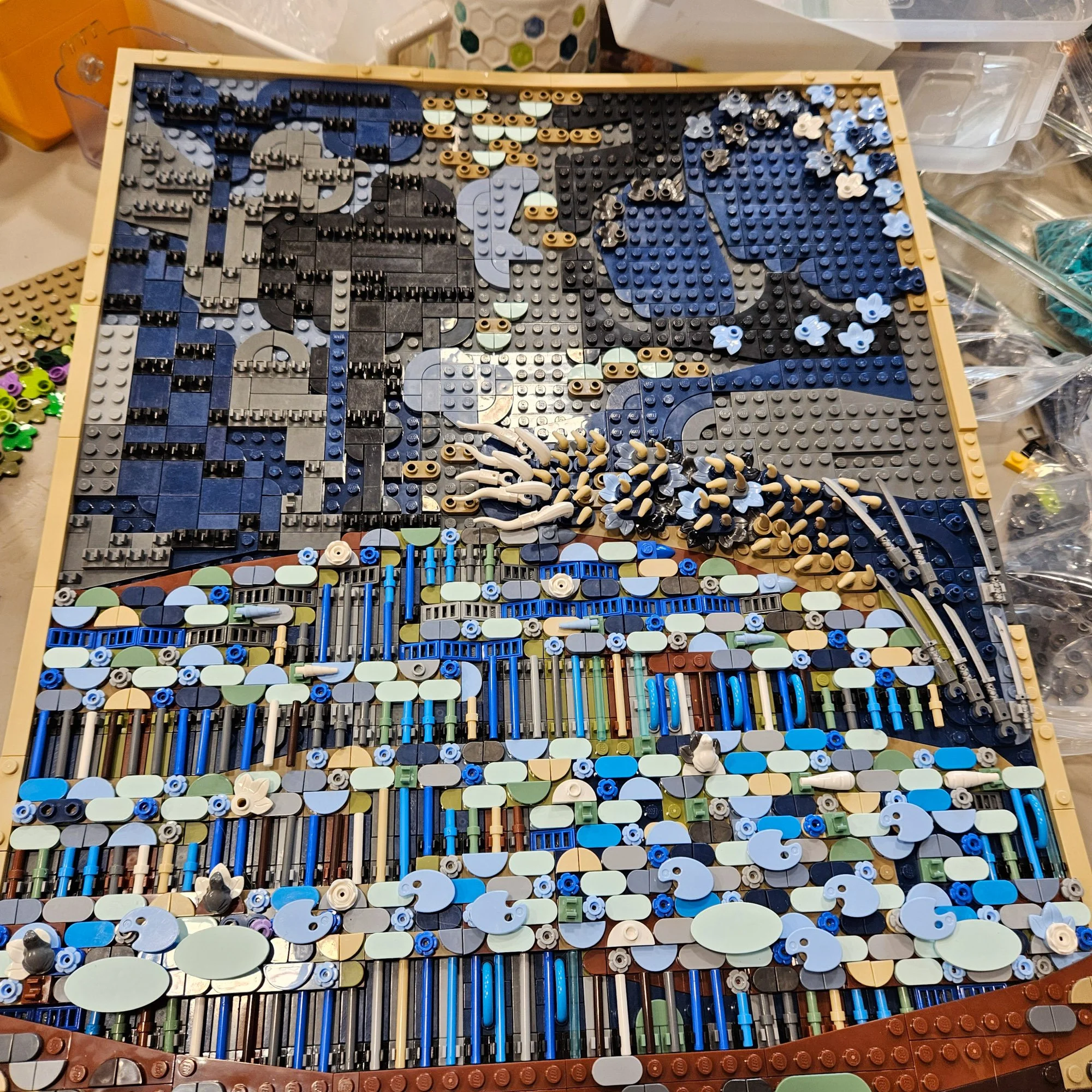
The tree on the right uses leaf elements and unprinted butterflies, with colors in the original ranging from Medium Purple to Light Yellowish Green. Those brighter shades didn’t fit the version I was making, but Dark Blue, Bright Light Blue, and Sand Blue leaves suited the darker palette. I also mixed in some Pearl Dark Grey leaves.
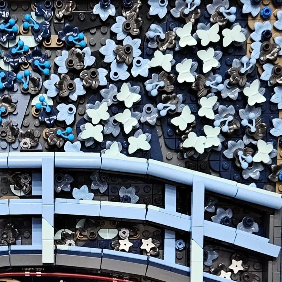
Not everything needed replacing. The Dark Azure and Aqua butterflies from the official set still worked against the darker foliage, so those could stay. Finding places to reuse the original pieces was welcome after all the searching for substitutes.
A Different Reflection
The pond was easier to translate than the trees above it. I kept the Aqua and Dark Azure oval tiles from the set and used pairs of 1×1 half-circle tiles to make oval shapes in Sand Blue and Pearl Dark Grey. Olive Green and Sand Green elements could also stay, with Tan, Dark Blue, and Light Bluish Gray added to the mix.
The Bright Light Blue artist’s palettes and Aqua shields were particularly fun pieces to reuse. They also have a purpose beyond their shapes. In the podcast, Stijn explains that the pond’s elements increase in size toward the foreground: smaller pieces suggest distant water lilies, while larger palettes and shields bring the nearest ones forward. Those changing sizes help create depth in the scene.
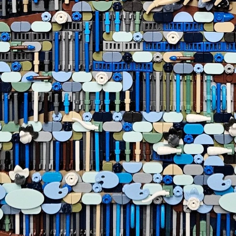
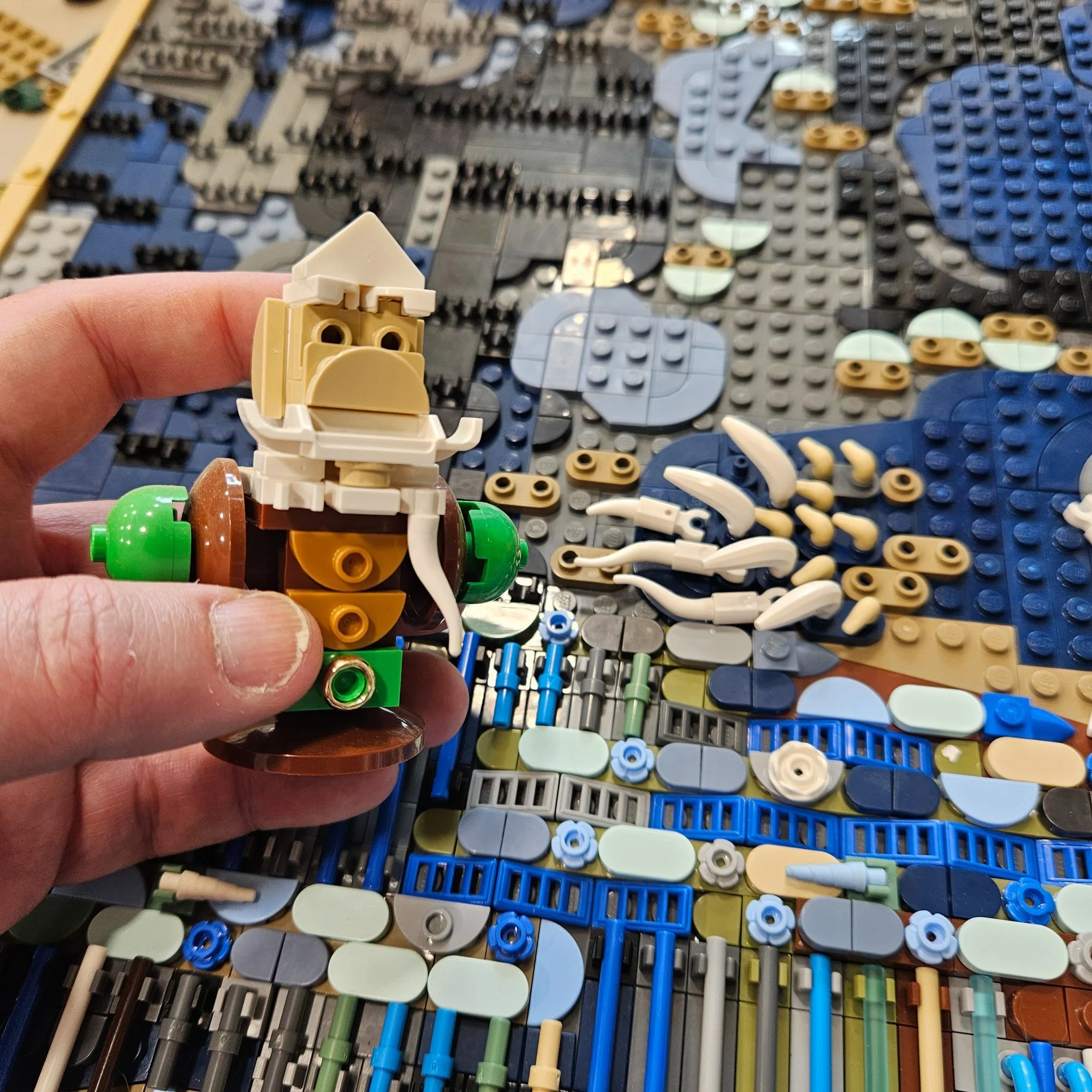
Other pond details in the set use paintbrushes, carrots, frogs, and cattle horns. Luckily, I had some blue-tipped paintbrushes and white carrots that could provide a similar effect in the new palette. White cattle horns were another matter: I only had a few.
To test them, I borrowed a couple from one of my favorite AFOL tokens, a miniature version of Steven Howard’s dwarven bust. Sometimes the part you need is already in your collection, just attached to something you’d rather leave alone! A BrickLink order later, everything was back where it belonged on my token shelf.
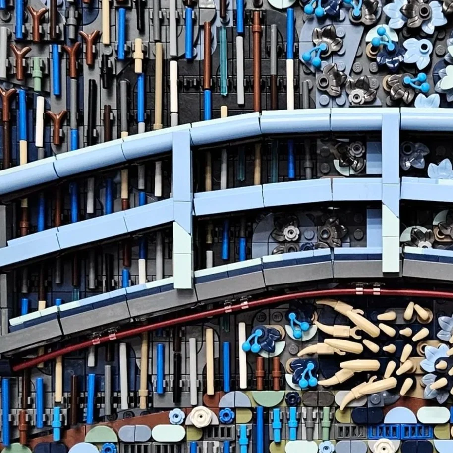
I kept the bridge itself unchanged but darkened the shadow beneath it to fit the new palette. That let me preserve its construction while changing the surrounding colors. The shadow on the water also received attention during the official set’s development. In the companion podcast, Stijn recalls feedback from the Met asking for changes to the darker area beneath the bridge. It was only then that he recognized it as the bridge’s shadow, a detail that became one of his favorite parts of the model.
Finding the Right Balance
There was plenty of back and forth before I was satisfied with the result. Tan ended up working better than White for some of the highlights, at least to my eye, and I completely exhausted my supply of Sand Blue along the way.
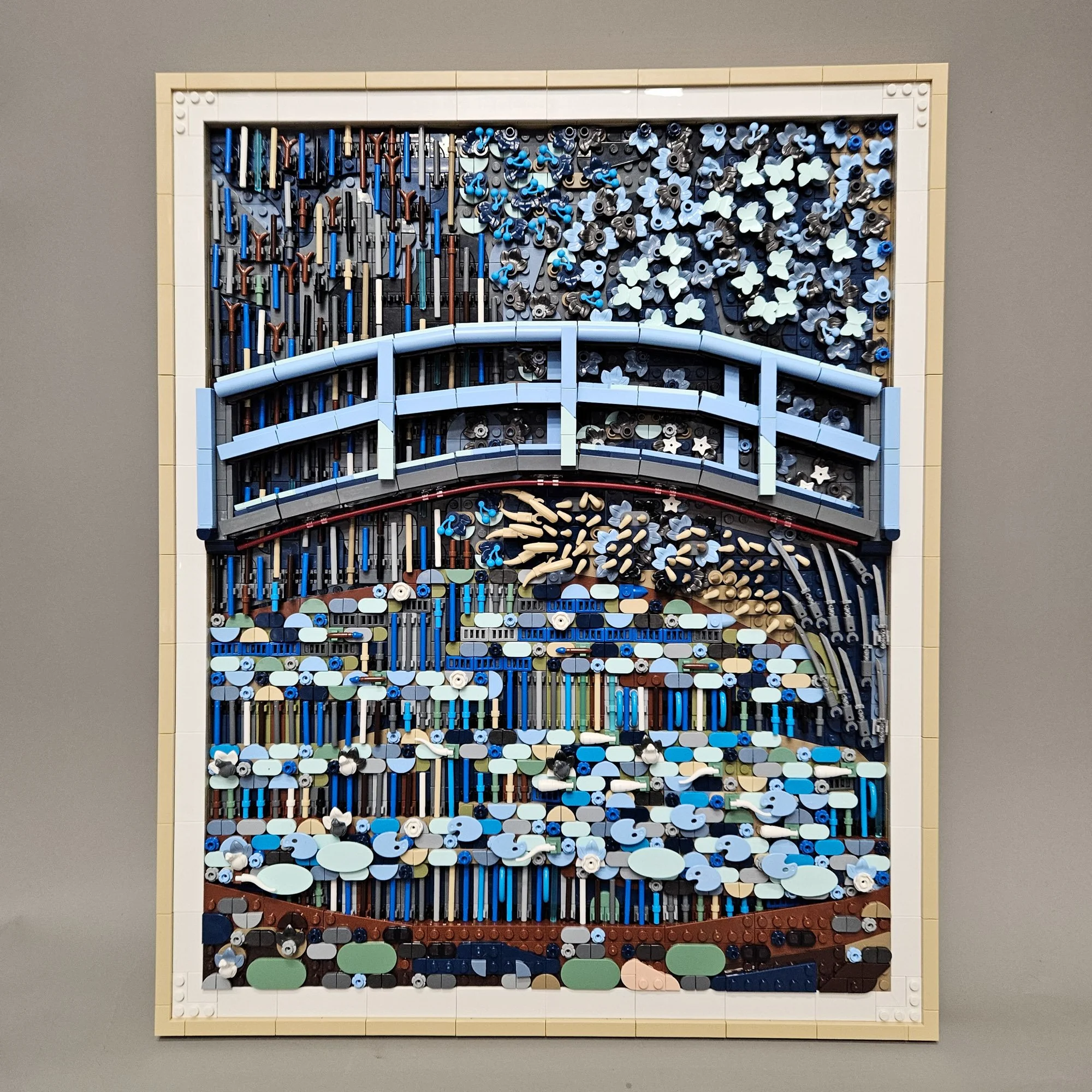
That trial and error also has a parallel in the official set’s development. Stijn described building physical versions, taking pictures, and looking at the model from a distance before realizing that certain colors needed to change. Digital renders helped the team get feedback from the Met, particularly when elements in new colors weren’t yet available for physical building.
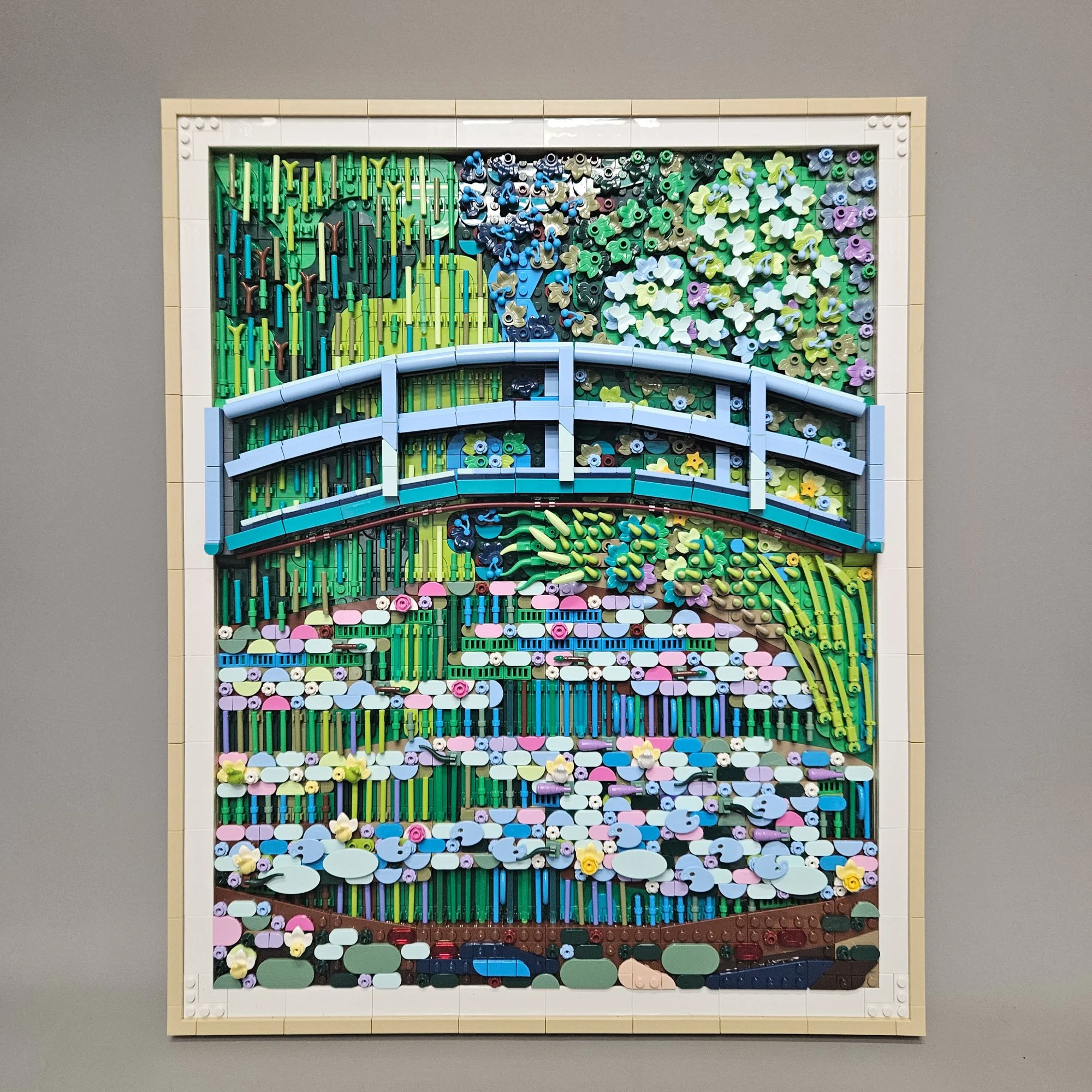
For my version, the challenge was making those decisions with the parts I could source. Sometimes I could swap a color and keep the technique. Sometimes I needed another shape, or a compromise on the color of a clip. And sometimes a piece from the original set worked just as well in its new surroundings.
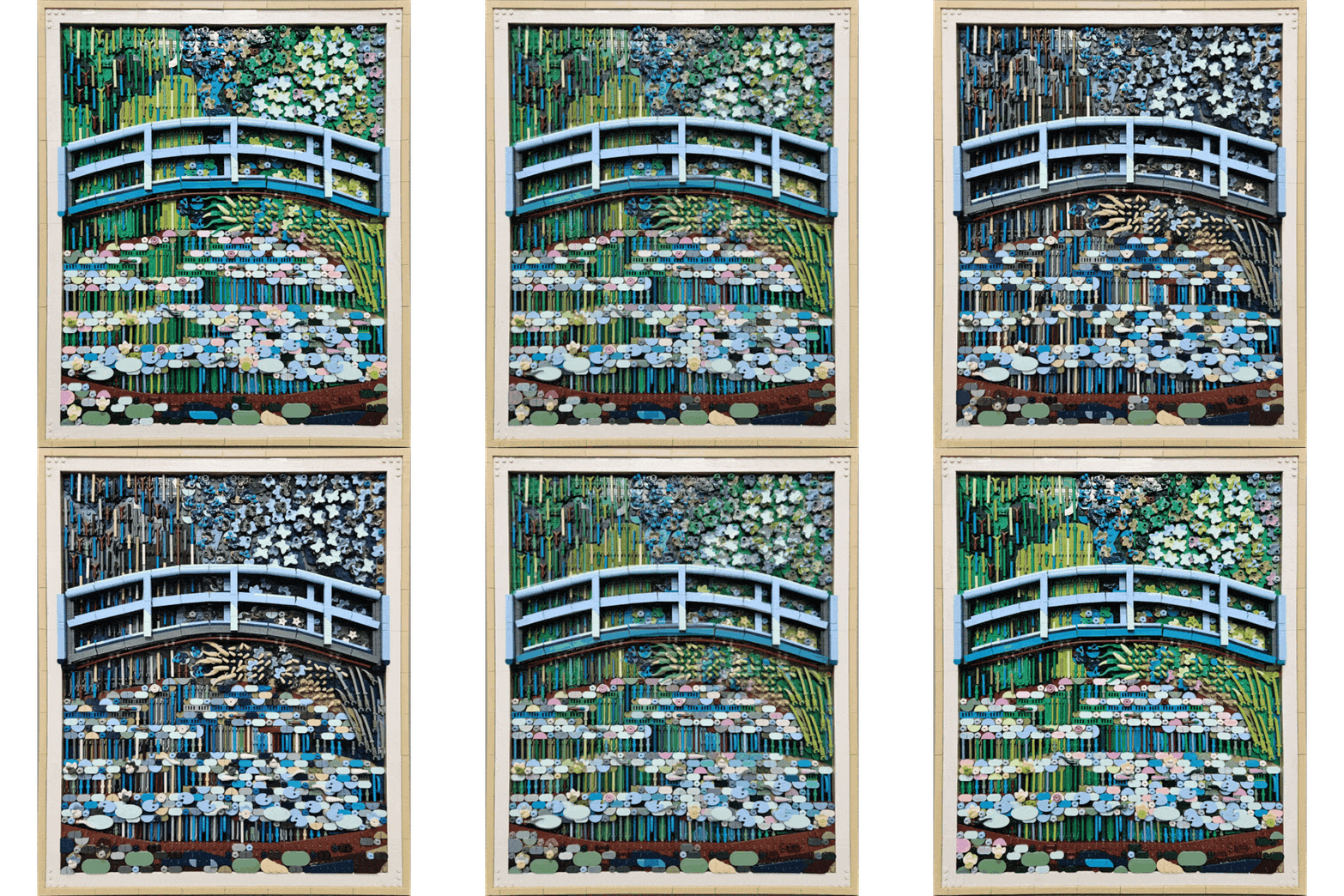
The finished “dark mode” pond reminded me why color is my favorite part of building with LEGO. With much of the same construction, I could create a different feeling simply by changing the palette. It took some digging through parts bins, a few orders, and a temporary raid on the token shelf, but I was happy with where those experiments led.
Which LEGO Art set would you like to reinterpret with a different color palette? Let us know in the comments!
Do you want to help BrickNerd continue publishing articles like this one? Become a top patron like Paige Mueller, Rob Klingberg from Brickstuff, John & Joshua Hanlon from Beyond the Brick, Megan Lum, Andy Price, Lukas Kurth from StoneWars, Wayne Tyler, Dan Church, Roxanne Baxter, and Marci Hollingsworth to show your support, get early access, exclusive swag and more.