The Colorful Cube Crew
/Best of BrickNerd - Article originally published July 18, 2022.
To me, “Titolian” (Flickr / Instagram) – also known in real life as Theo Bonner – has always been a hallmark name in the LEGO sci-fi community. He’d most likely laugh and call me crazy, but his distinct style stuck with me so much that I immediately recognised it when he showed up in Billund for a hiring workshop, despite a few years of university-induced dark ages. A few months later he moved to Denmark, having been hired onto the LEGO Ninjago team as a product designer.
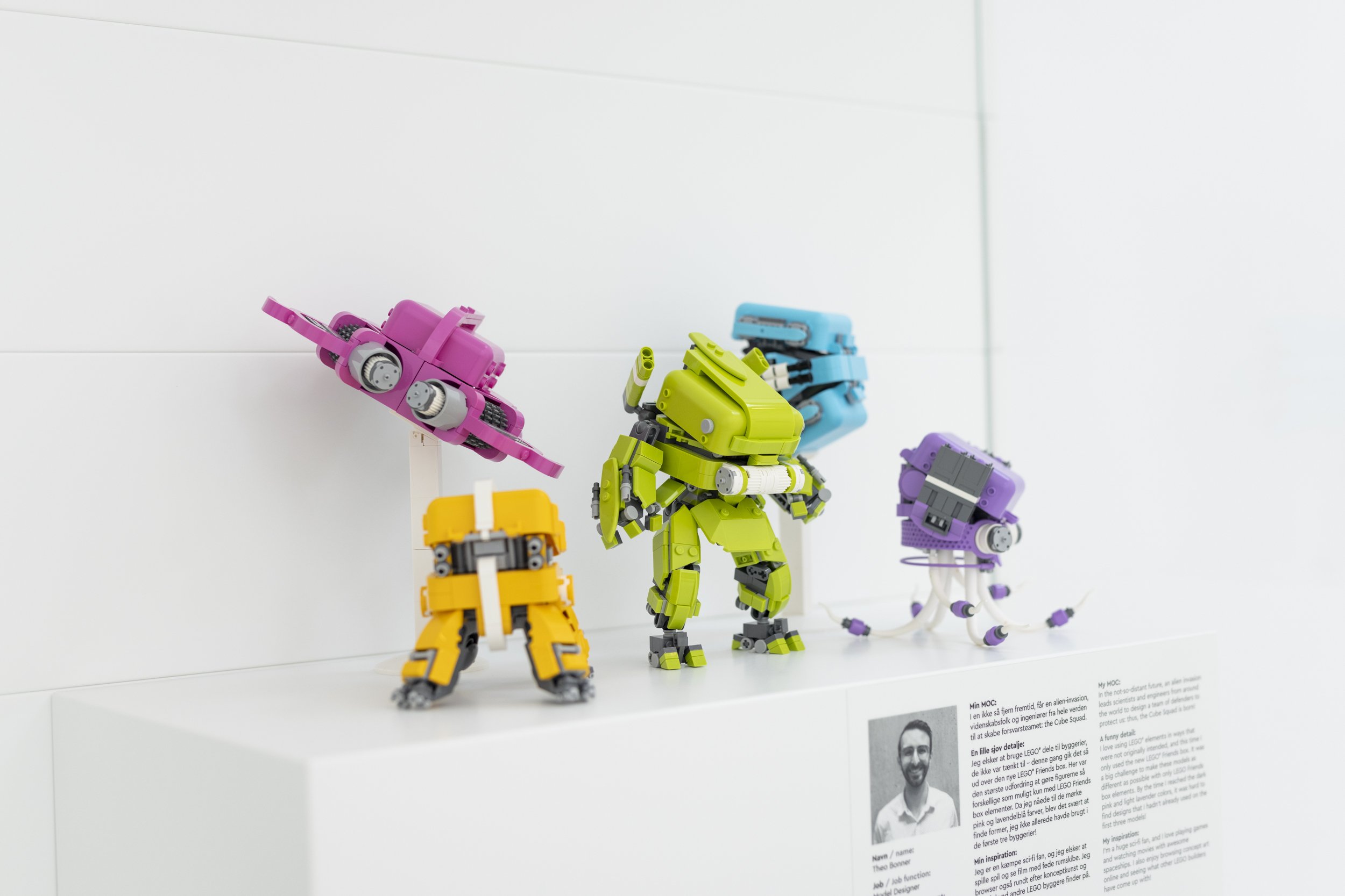
Soon he’d build MOCs with the bricks at work, his talent inspiring many of his colleagues and future products. And naturally, it also got noticed by the curators of the LEGO House Masterpiece Gallery where his wonderful collection of Friends cube creations is currently residing. Join us for a deep dive into what went into these colorful creations, and maybe learn a thing or two yourself!
Colorful and creative, Theo had built a whole series of intriguing sci-fi designs. A rainbow of bold tones, each of them offers something different—and you can find anything from a lime green mech to an alien-like drone in medium lavender. The “LEGO Friends colours” really do their magic in creating distinct and popping creations, only supplemented with neutral colors such as grey and white. And clearly, all of them had been built around LEGO Friends cubes, a rather intriguing seed part choice considering their size. To Theo however it seemed rather obvious:
“I can trace back my love for using large hollow LEGO pieces to a build by Jerac on Flickr using green dumptruck beds on a micro space build. I was blown away by the use of such a large element in such a clever way and it changed how I thought about the big, single-purpose elements LEGO sometimes creates. When I saw those Friends cubes, I knew I had to create a series using them in different ways. They came in a variety of interesting colors, they had several interesting connectors, and the radius of the edges of the piece matched a 2x2 round brick which meant I could mimic the shape of the seed part in other areas of the builds.”
Naturally they didn’t only bring joy. The cube elements are asymmetric as they have to fit a counterpart to create an openable… well… cube. One side has hollow studs, the other one has a tube side. Theo found ways to work around that, of course, but he also isn’t ashamed to admit that “there are at least a few of the builds that benefit from the camera angle,” something a lot of builders can likely relate to.
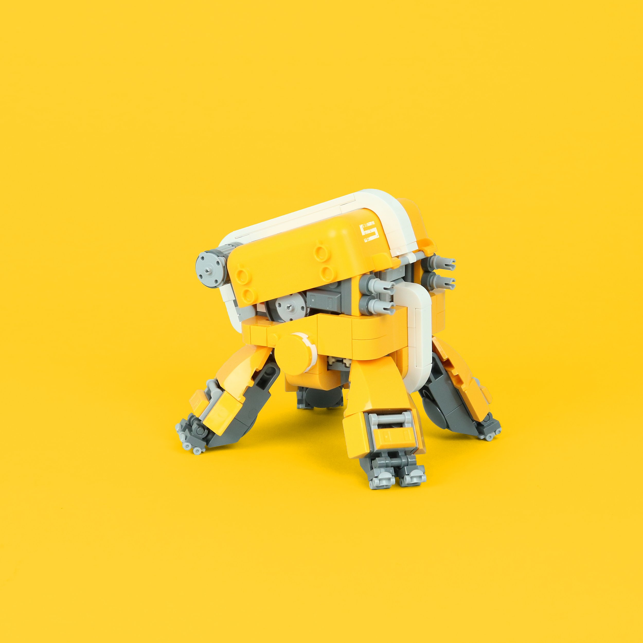
His design philosophy changed a bit over the course of the project, too. The more limited colors available required weirder elements to be incorporated, but before that, it all started with this bright light orange four-legged walker:
“I built that one before even considering doing the whole series, but after having so much fun finding a way to integrate the cube piece I knew I had to do more. The challenge I gave myself was each model had to feel distinct compared to the others, which proved challenging by the end.”
They definitely feel distinct, also largely due to the variety in sci-fi subject matter. Theo knew he had to lean into the flexibility that theme naturally offers, and it did help that mechs, spaceships and “strange tentacled things” are some of his favourite subjects to build – case in point the latest spaceship that he just recently published. He also appreciated how the smooth shapes of the cube element contrasted so nicely with the technical details of spaceships or mechs. In this inherently greebly subject matter the big surfaces and curves made for a wonderful counterpoint.
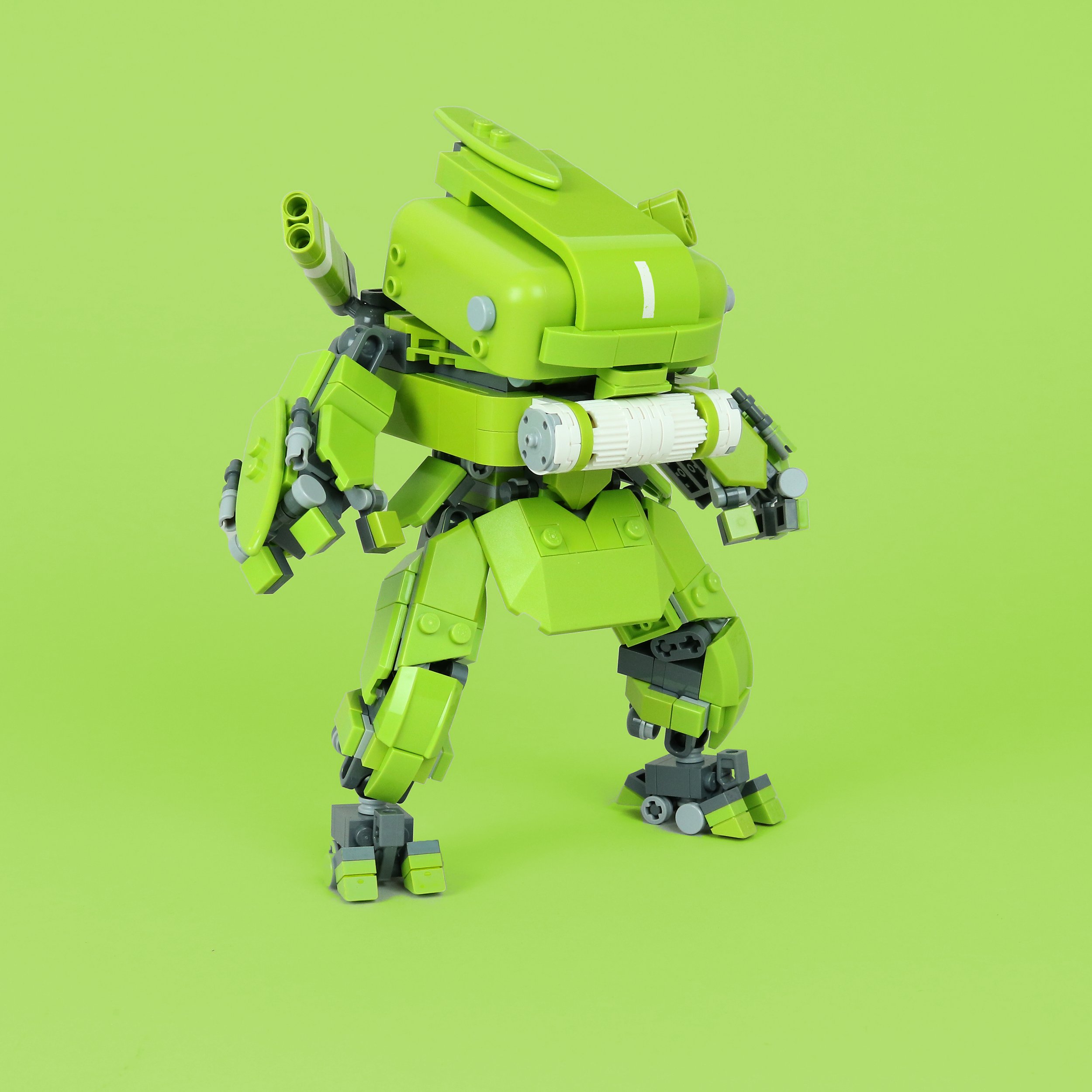
This lime green mech is a great example of that. Surfboards and a large curved panel command the design, but there’s an interesting combination of curved surfaces and an edgier design language, largely coming from the use of wedge plates and Nexo tiles. Yet by keeping the cube front and center and continuing the already established use of white and gray, it still feels like a natural progression in the series.
The biggest challenge according to Theo was his dark pink spaceship. It took several iterations before he found shapes and elements that felt right. The color limitation informed the designs more and more and forced Theo to embrace more interesting element usage:
“I let the weird elements like slides and thicceroni pieces dictate the design of the MOCs more and more over the course of the series, and as a result, I'm most happy with the final two for having the most interesting techniques and elements.”
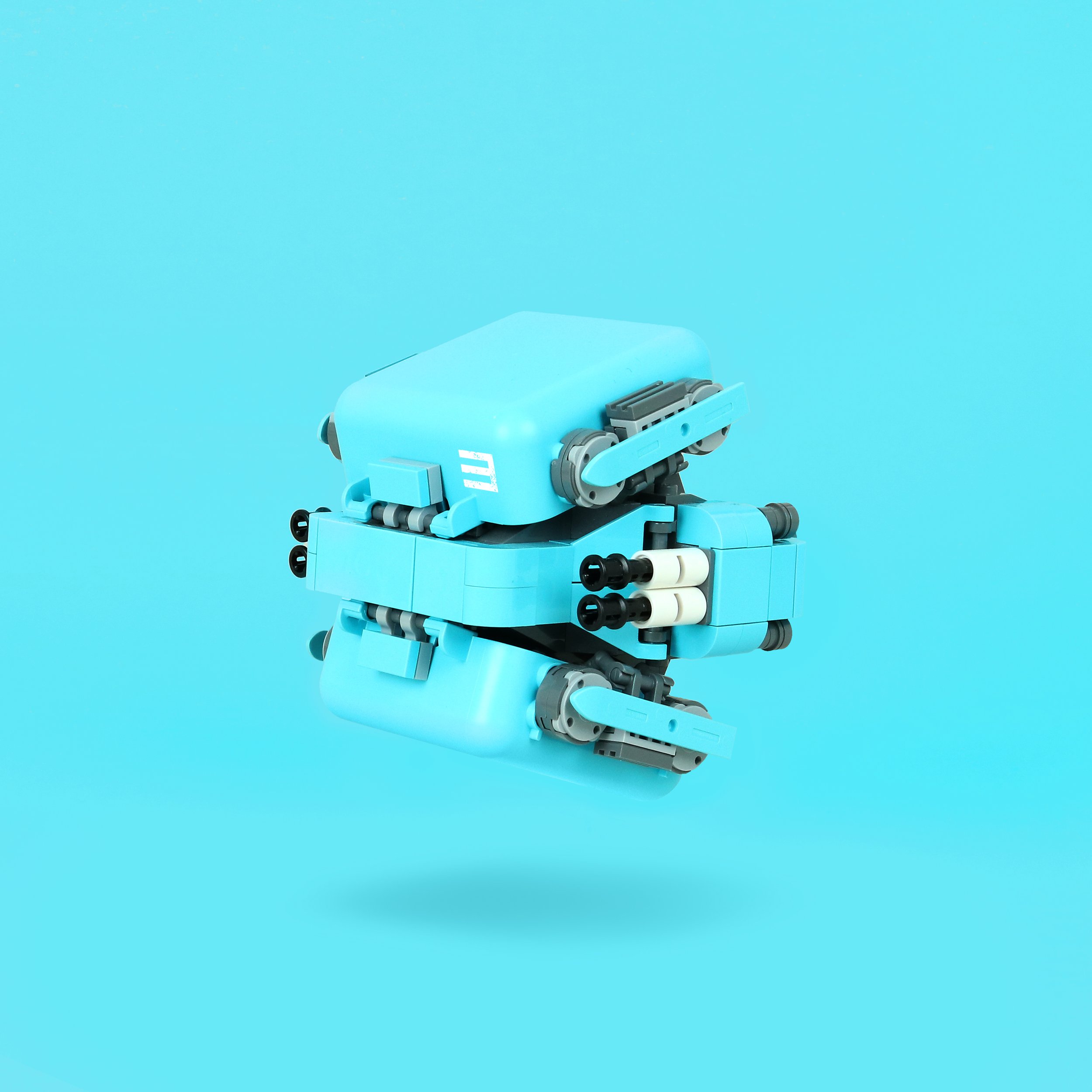
What also made these stand out when Theo initially posted his cube squad was the bold choice in presentation: Each creation was displayed in front of a unicolored backdrop that matched the model. Usually creators try to use contrasting backdrops but Theo obviously felt differently:
“I decided quite quickly that I wanted to break the norm a bit and really highlight the colors of the builds. I grew up watching the old Thunderbirds and I always loved how the different vehicles were color-coded and numbered, yet still felt like a team. Couple that with the unusual and punchy colors of the Friends cubes and I thought it be an eye-catching way to display the models. I knew it would probably be divisive, and so a lot of effort was put into adjusting the tone of the background to maximize contrast and legibility of the model.”
Finally – having displayed such mastery of seed part usage – I just felt like I had to ask Theo for some tips for other builders attempting similar feats:
“A big part of using unusual parts for me is fighting the instinct to look at something as what it’s supposed to be, and instead look at its shapes and use those to figure out what it could be.”
He described messing around with the orientation of the Friends cubes, challenging himself constantly to find different ways of orienting and integrating the part. To Theo, another source of inspiration is a piece’s shape language – the round edges of the Friends cube in this instance matched other elements, allowing him to continue the curves elsewhere on the build or hiding the cube’s silhouette by incorporating brick built sections.
His final sentence in our interview makes for a wonderful summary of why Theo does what he does – and possibly why he does it so well:
“Thinking critically about how a LEGO piece is supposed to be used and finding ways to break that is part of the fun of building for me!”
I will certainly try and incorporate that thinking even more when looking at elements going forward. Even if it doesn’t net me a beautiful array of colorful sci-fi creations, I am sure I will learn a thing or two about elements I’d otherwise never consider using!
What do you think about the colored backgrounds of Theo’s cube squad? What large LEGO piece do you think would make a great seed part for a MOC? Let us know in the comments below.
Do you want to help BrickNerd continue publishing articles like this one? Become a top patron like Charlie Stephens, Marc & Liz Puleo, Paige Mueller, Rob Klingberg from Brickstuff, John & Joshua Hanlon from Beyond the Brick, Megan Lum, Andy Price, John A., Lukas Kurth from StoneWars, Wayne Tyler, LeAnna Taylor, and Monica Innis to show your support, get early access, exclusive swag and more.

