The Lost Themes of LEGO: Sets That Could Have Been
/Best of BrickNerd - Article originally published July 8, 2022.
As creative people, occasionally we have LEGO ideas that just don’t work—no matter how cool they are. Maybe we don’t have the pieces to pull it off (or worse, the pieces don’t exist), the build doesn’t translate from our heads to the brick, or sometimes we just get frustrated and walk away. This happens in product development too. There are several official themes that for whatever reason LEGO did not launch but we know about because they were talked about in some way.
Some of these non-existent themes have reasons they were unreleased that have been expanded upon by LEGO employees —some we simply have a picture of. A few (like Sea-Tron) transformed into another theme that was eventually released publicly. I was reminded of Sea-Tron while working on a recent article that took me down this “Lost Themes” rabbit hole. While I have seen some of these images in the past, I found some new to me as well! Join us as we go on a journey to uncover the Lost Themes of LEGO.

As a preamble of sorts, I found an article written by LEGO designer Mark Stafford (aka Nabii) in BrickJournal (Issue 6 in 2009) that many of the space-related lost themes images come from. Stafford recorded an interview with LEGO designers Niels Milan Pedersen and Jens Nygaard Knudsen. The article is great for the history of the development of early LEGO space product lines. All the photos came from Pedersen’s personal archive. (Stafford posted the article to his Flickr when Knudsen passed away in 2020. Here are direct links for your convenience: Pages 1-2, 3-4, 5-6).
Sea-Tron
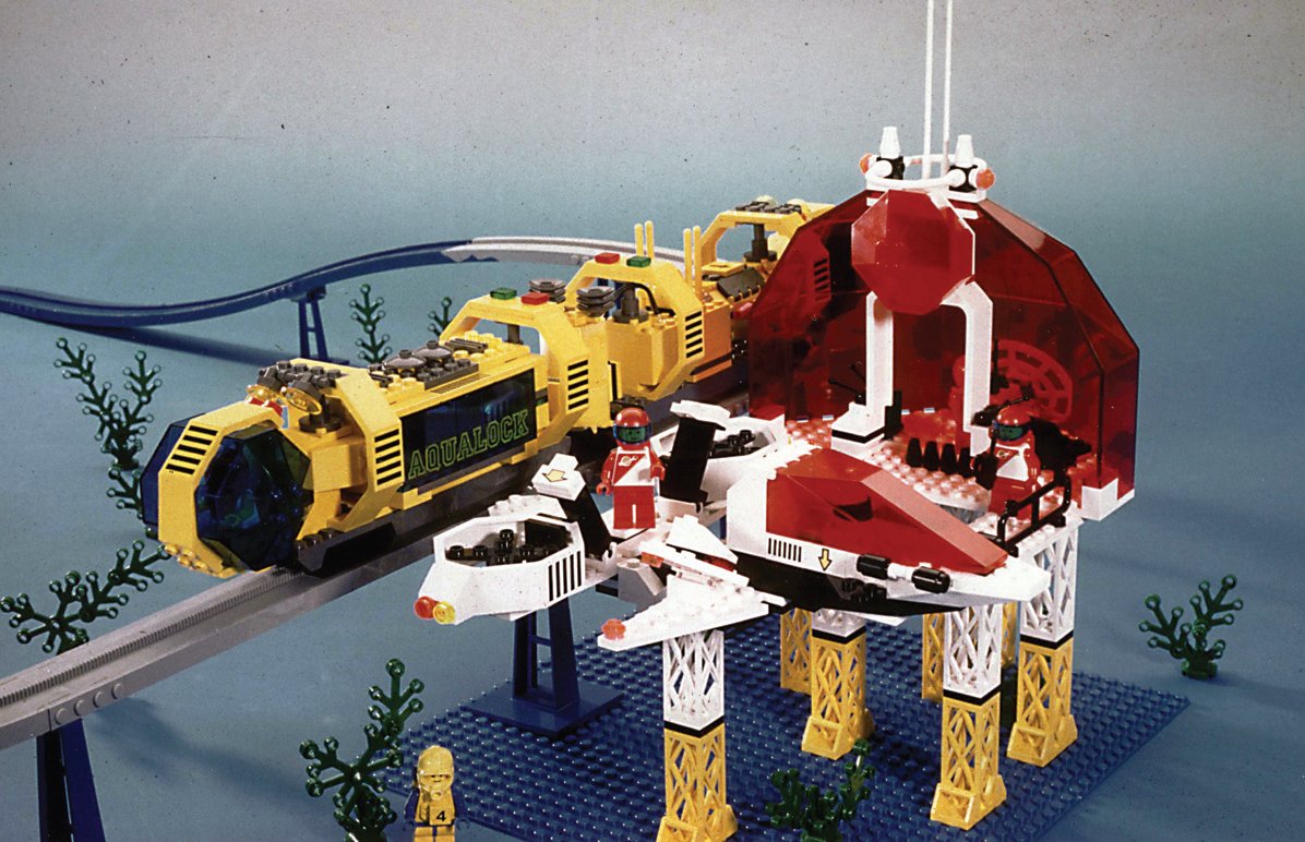
sea-Tron Monorail around 1990 - Photo from Niels Milan Pedersen’s personal LEGO archives - Via BrickJournal
The unreleased Sea-Tron theme has three images in the article including a Futron-like monorail station and a very Auqazone-looking train (1995-1999, yellow body bubble-like trans blue cockpit), and an aquatic alien. When asked about the theme, Knudsen verified that Sea-Tron became Aquazone—while the image is very small, the astronaut in the lower left of the monorail station image has a face plate very similar to the Aquazone face plate piece.

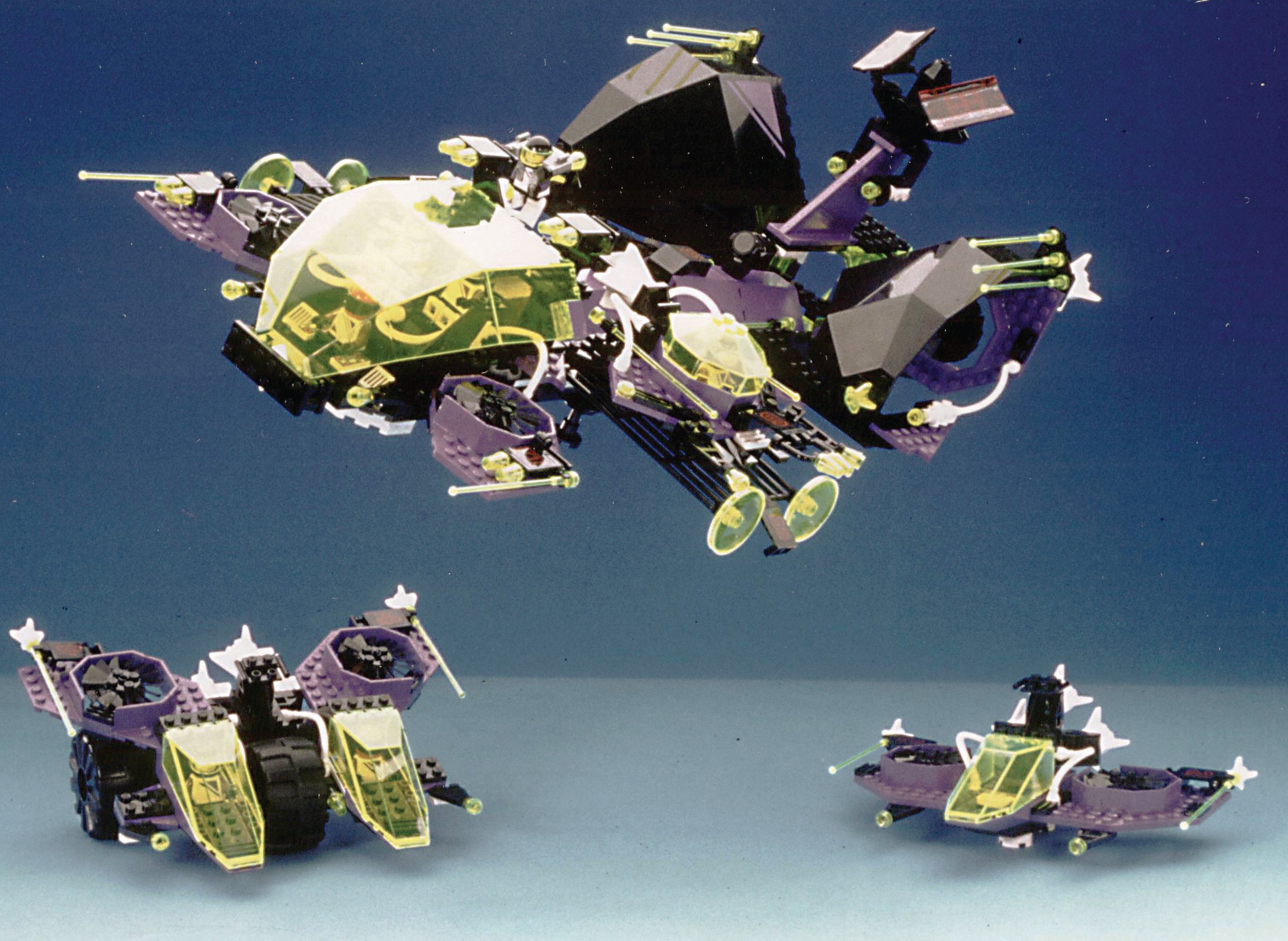
sea People around 1990 - Photo from Niels Milan Pedersen’s personal LEGO archives - Via Brick Journal
The “sea people” image has a lot of resemblance to what became the Stingray faction in Aquazone. I can’t say for certain, but I think the influence extends even into the Atlantis sets released in 2009-10. How cool are those sea creatures, though? They almost look like a weird combination of a hammerhead shark and an eel. (Plus take a look at some recolored raised baseplates that I’m sure Gwyneth would love to get her hands on!)
Multi-Color-Tron

White and Green M-Tron - Photo from Niels Milan Pedersen’s personal LEGO archives - Via BrickJournal
The article contains some radically different images of M-Tron sketch models—some that match the familiar red and black color scheme but with a much more industrial feel than what was produced, and others that are white with trans-dark green canopies with trans-neon on jet packs.

Blacktron concept dated 1985 - Photo from Niels Milan Pedersen’s personal LEGO archives - Via BrickJournal.
What I find most interesting are the Black-Tron 2 sketch models that are almost all black and trans-yellow. I love the cockpits mounted on angles off of the main bodies. I can’t think of anywhere that the insect-like feel of these showed up in other sets. Honestly, they remind me of nnenn’s custom MOC work. (If you don’t know nnenn’s work please go explore his photostream—we lost his talent way too soon!)

Concept dated 1985 - Photo from Niels Milan Pedersen’s personal LEGO archives - Via BrickJournal.
I also find very unique what I’ll call Red-Tron and Purple-Tron. Red-Tron has a very different feel—the red and grey feel both very aggressive and industrial. The sideways building of the towers is something we still see very little of in official sets. It also feels almost Star Wars-like.
Finally, Purple-Tron has a very different feel to it. The purple color scheme is very different (and from 1989, no less). I would love to have those ducted fan pieces and to know what the story was! Were the space figures exploring a planet with a super-dense atmosphere? Are these good guys or bad? Maybe neutral? The purple and black color scheme could be interpreted a lot of ways. I see bits and pieces of Exploriens and Life on Mars in Purple-Tron.
Europa
Another interesting entry on the list of lost sets is the Europa line. The best I can determine is that the Europa sets were initially shown at Comic-Con in 2009. The sets were developed in the 80s/90s and were to be focused on the 18th century. (Stafford is also the source of the few Europa and 1920’s theme photos shown in a presentation at the BrickJournal panel at Comic-Con in 2009. The sources of these images are via BrickJournal’s Editor-in-Chief Joe Meno via Flicker user Bruce n h.)

I’ve seen the “French” lineup a few times in passing, but my exploration of lost themes recently revealed the “Scottish” branch of the line with a winged Loch Ness Monster! How awesome would that have been!? Russia and other European powers as well as some additional fantasy elements are rumored to have been part of this theme too.

Some of these concepts might have worked their way into Pirates and the Fantasy Castle era, but individual connections are hard to pin down other than the Blue Coat and Red Coat soldiers.
1920s
The 1920s is an interesting theme idea, to say the least, especially with the implied heavy drinking on the yacht in the front of the image. I can see why this theme didn’t make it very far. (The Great Gatsby and Al Capone aren’t standard fare for the target audience of kids.) Though it does almost feel like it has some of the DNA of the current Modular Buildings line.

The only thing that really strikes me as familiar is the firehouse. It reminds me a lot of a smaller version of 10197 Fire Brigade. The red and white awning on the shop on the left is really interesting, as are the tall skinny hose and the post office.
Cybots
Cybots is interesting in that there isn’t as much information out there about the theme as some of the other lost themes. Christian Faber's blog is the source of this Galidor-like line. Faber proposed Cybots as a bio-mechanical LEGO mash-up, with an underground setting, likely around 1995. (Check out that brick-built helmet!)
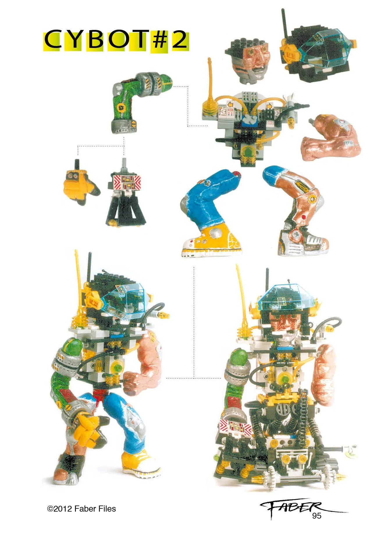
While we never quite saw anything like it, Faber’s work started what would eventually become the Constraction themes at LEGO and got the ball rolling on the ball joint (yes I know what I just said!) Faber was also involved in Bionicle and Hero Factory. Ball joints and their incredible usefulness owe thanks to the legacy of this lost theme!
I’m sure there are dozens of ideas and LEGO themes pitched every year that are passed on that we see come back to life in some form or another eventually. These examples are just a few of the unreleased LEGO product lines that we know about.
I personally think it would be really cool if LEGO pulled back the curtain a little and showed us some more themes that were never produced—may in combination with their 100th anniversary in a decade or the upcoming 50th anniversary of the minifgure. But until then, only time will tell and what’s lost will hopefully not be lost for much longer!
Did we miss any lost LEGO themes? Let us know in the comments below!
Do you want to help BrickNerd continue publishing articles like this one? Become a top patron like Charlie Stephens, Marc & Liz Puleo, Paige Mueller, Rob Klingberg from Brickstuff, John & Joshua Hanlon from Beyond the Brick, Megan Lum, Andy Price, John A., Lukas Kurth from StoneWars, Wayne Tyler, LeAnna Taylor, and Monica Innis to show your support, get early access, exclusive swag and more.