The Novel Builds of Shannon Sproule
/Best of BrickNerd: Weekend Highlight — Article originally published September 3, 2021.
“Dear Sir or Madam, will you read my book? It took me years to write, will you take a look?” – “Paperback Writer” by The Beatles

They say that “you should never judge a book by the cover.” While that might make for great advice in life, book publishers have long known that we still do anyways. Having good cover art and a catchy title can make all the difference between which books get picked up for reading, and which end up collecting dust on the shelves. This was even more true in the days before the internet. While today we have easy access to book recommendations online, back then you largely relied on the information you found on the covers (or your local librarian) to help you make a decision. In the end, you were always left hoping that the book would be as good as the artwork that lured you in the first place.
In the 1980s, “judging things by the cover” also applied to picking out which movies to rent at the video store. As a kid, I remember scanning the rows and rows of VHS tapes until finally arriving at the eye-catching covers of the Science Fiction (Sci-Fi) section. With the movies placed alphabetically on the shelves, safe-bet classics like Logan’s Run, Soylent Green, and Westworld would be sitting side-by-side with equally tempting “B-movie bombs” and their bait-and-switch cover art. It was like playing a game of “rent-at-your-own-risk” roulette. The dire consequences of a pick-gone-wrong was my family wanting the last 90+ minutes of their lives back, and my parents revoking my movie selection privileges. Curse you, Zardoz!
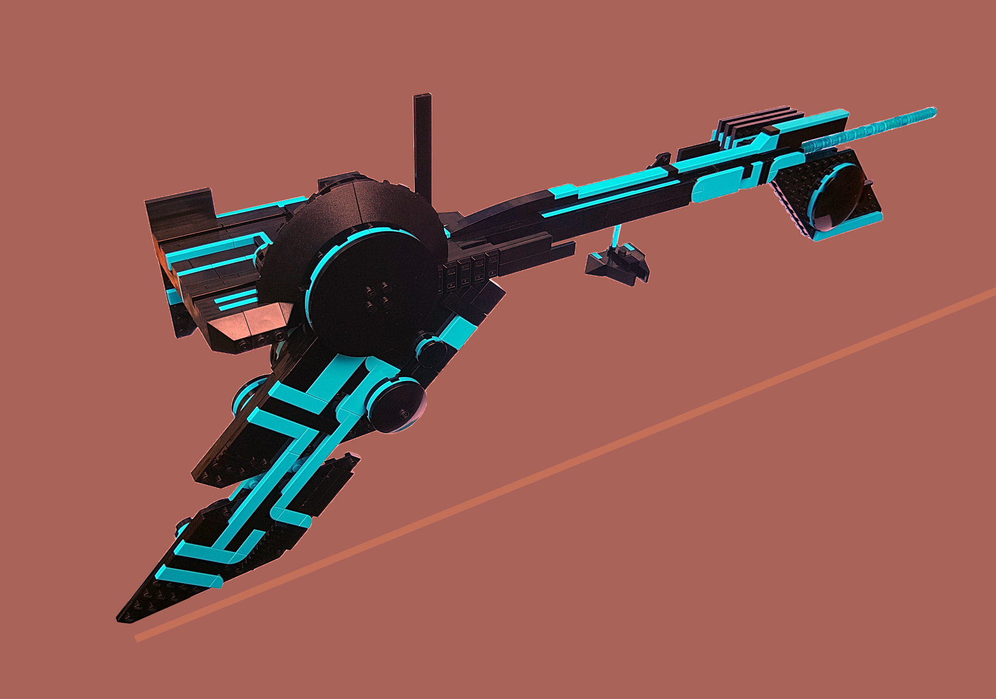
Australian builder Shannon Sproule shares in that appreciation of eye-catching sci-fi cover art, and has created some eye-catching book covers of his own. His should be a familiar name to most AFOL’s following the Sci-Fi MOC building community over the last 10+ years. Or perhaps you are familiar with his alter ego “Shannon Ocean” (but be warned that Shannon Young is actually his ‘evil twin’.)

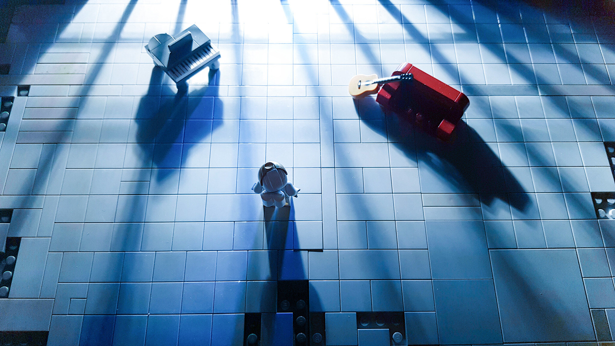
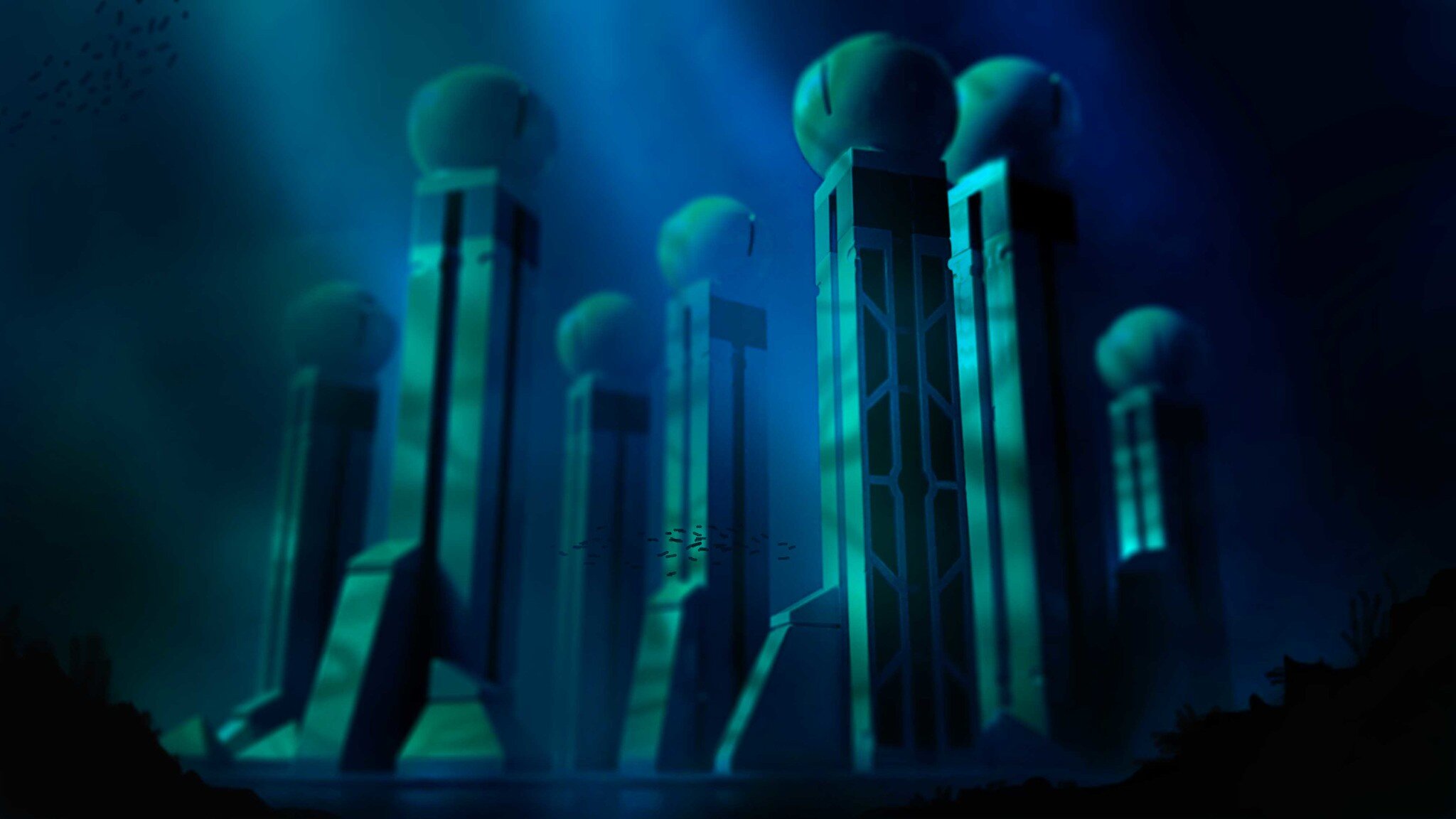
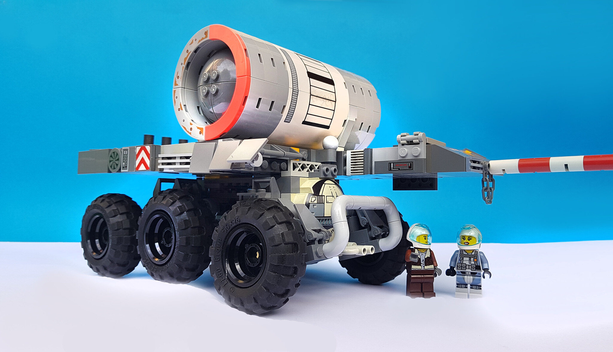
Those living in the southern hemisphere certainly know a thing or two about dystopian sci-fi (Mad Max, The Quiet Earth, etc.), and Shannon is no exception. His recent Xobtaxian guard tower exudes that classic “brutalist on a budget” sci-fi style of the 1970s; the hard lines and angles of LEGO bricks fit perfectly into that aesthetic. It also reminded me of the retro sci-fi book covers that Shannon created some time ago. I reached out to Shannon to learn more about his unique style, the sources of his sci-fi inspirations, and what he has been up to lately.
An Interview with Shannon Sproule
Ted Andes: Hey Shannon! I hope you are doing well. Your recent Xobtaxian guard tower got me thinking about all those 1970s-styled paperback book covers that you created in LEGO a while back. I figured it was about time someone wrote an article about them.
Shannon Sproule: Hi Ted! Thanks for your interest in those paperback cover mockups. They were a lot of fun—especially coming up with the goofy titles!
Ted: The first thing I want to ask is if you have plans for making a few more covers out of your recent builds, like the tower. So many have that “sci-fi cover art aesthetic” already that I didn't want to jump-the-gun if you might be revealing some new ones soon.
Shannon: I hadn’t any plans to revisit the concept, but I’m kinda struggling with build ideas lately… Now that you mentioned the idea of book covers using my recent builds, it has really got me thinking about doing some new ones.
Ted: So how did the idea of creating paperback sci-fi cover art originate?
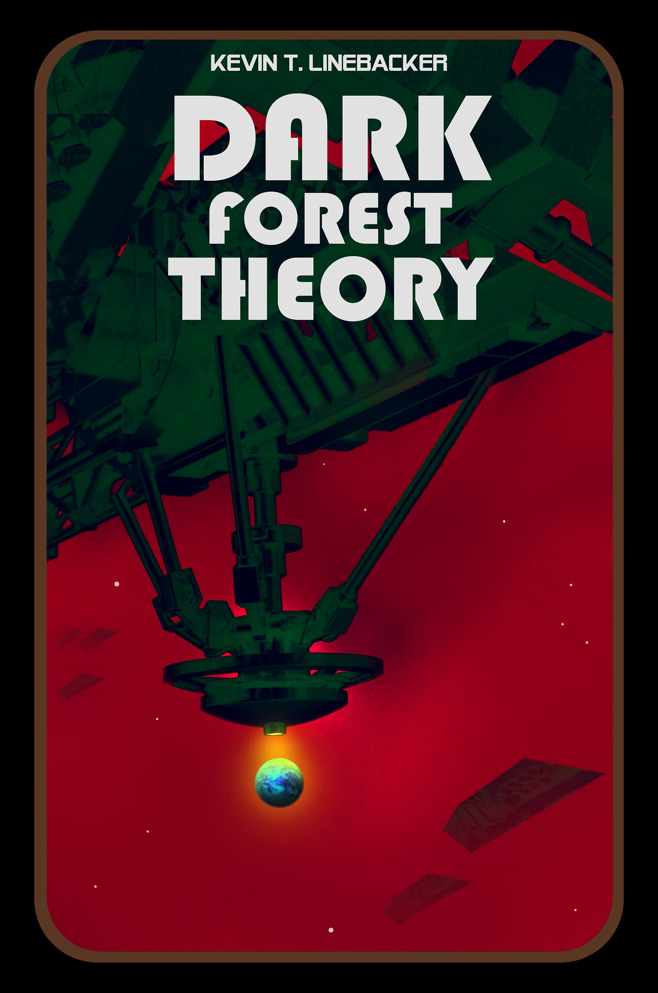
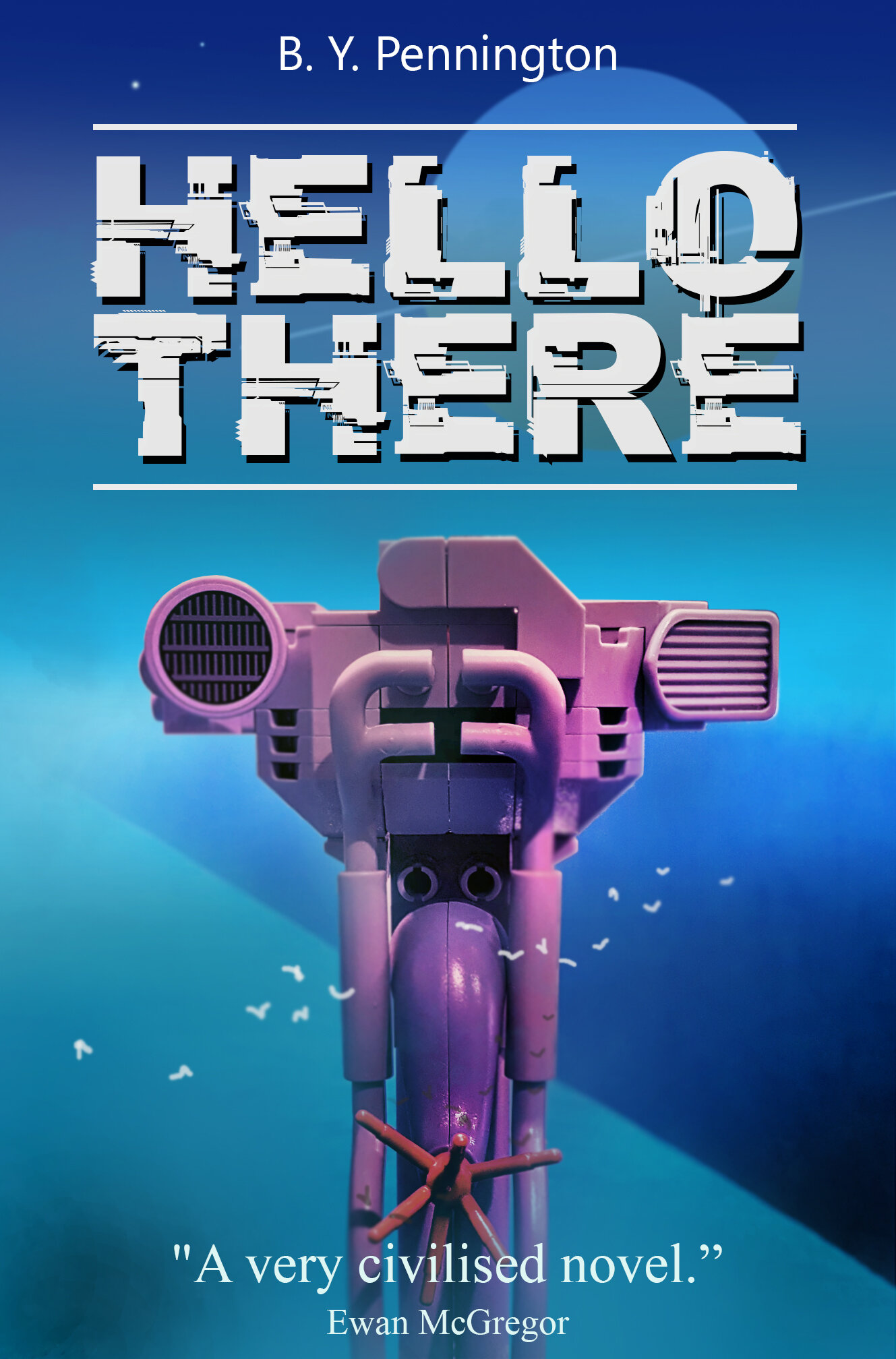
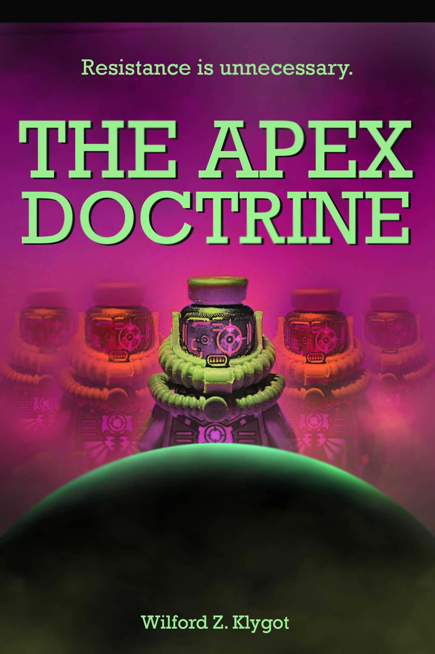
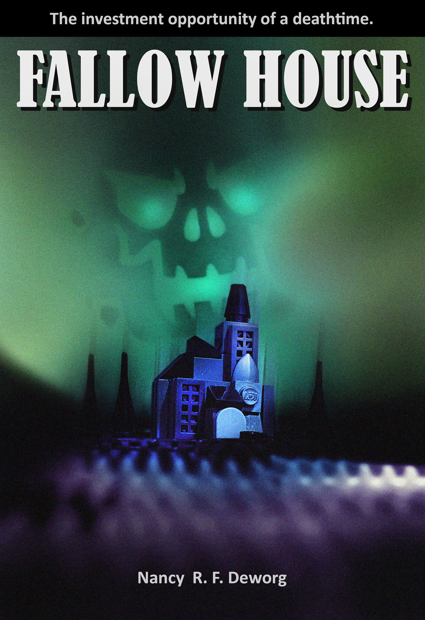
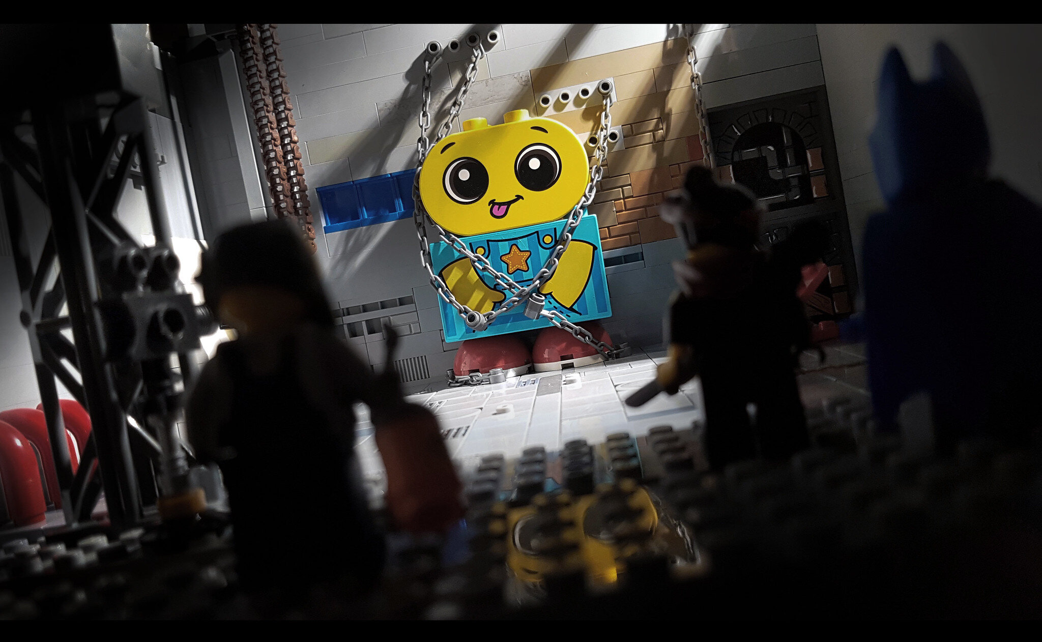
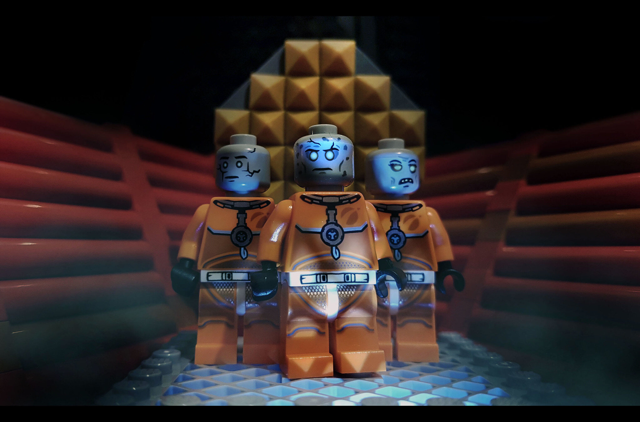
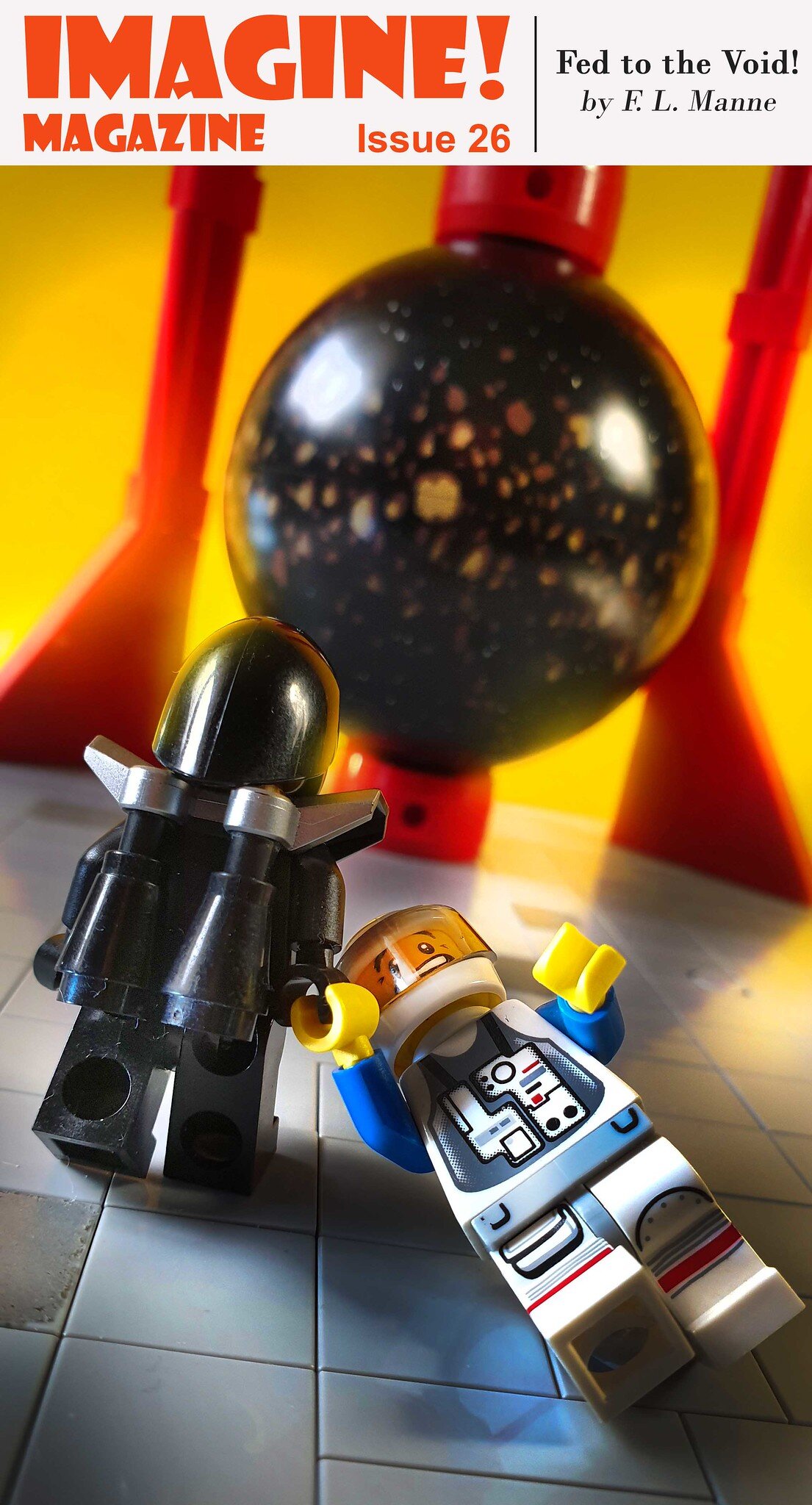
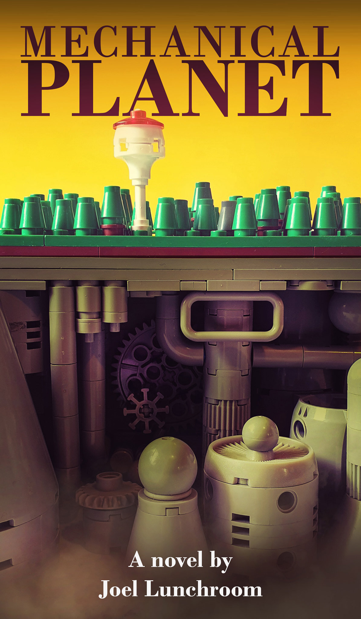
Shannon: The cover art series all started with the one I titled “God Prays to Us”. It was something I was building for my “Battle for the Moon” series, but it ended up having too much of a “1970s sci-fi paperback flavour”… so then I decided to just run with it.

Ted: Good call, as you really nailed the aesthetic! It immediately grabbed my attention when I first saw it, as well as its provocative title. I could imagine myself buying that book, just to figure out who (or what) would be making such an audacious and blasphemous statement. Being a potential science-fiction title from the 1970s, I might have guessed it was about a dystopian world envisioned by Ayn Rand (I shudder at the thought… I mean ‘shrug’).
When coming up with ideas for these mockups, were there any specific artists that you took inspiration from in their style? Or is it just based on the overall Sci-Fi aesthetic of the '70s and early '80s, when we all had to judge books (and video rentals) by their covers?
Shannon: I guess there are no artists that I specifically turned to for inspiration on the sci-fi book covers. I do have a soft spot for Angus McKie and Chris Foss, as I had a second-hand copy of the Terran Trade Authority Spacecraft book when I was a teenager, but I don’t rely on their artwork exclusively for ideas. I also like looking at covers from the early years of pulp (Flash Gordon et. al.), through to the atomic age of the ’50s, and the later angular and brutalist style of the ’70s and ’80s. There is a group on Flickr that's devoted to paperback covers called “SciFi Books” which is a great reference—highly recommended! I would like to attempt covers that are more in the early style of those “Amazing Stories” magazines, but the spacecraft and robots depicted there are usually quite round and curvy which I struggle to achieve in LEGO. My style is more geared towards sharp angular technology, so I gravitate to those types of creations.
Ted: Those are some great references for inspiration! In addition to the use of sharp angles in your builds, the other thing that stands out to me is your adept experimentation and usage of lighting and shadows. Some might be surprised to learn that your main "go-to" lighting technique is simply using a single flexible desk lamp as the primary light source and then adjusting its positioning. Is that still your standard set-up?
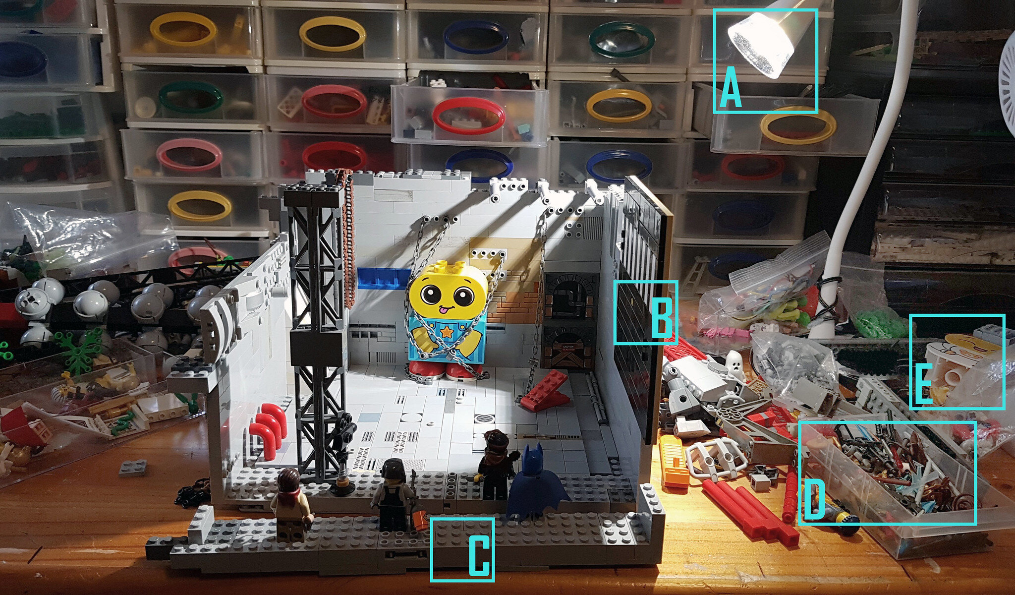
Shannon: Yes. I use that desk lamp for lighting most stuff I've been building (lately I’ve been attaching a piece of paper over the bulb to help diffuse the light a little bit), but I also use the sunlight from my window if I want more natural lighting in my photo. And I’ve got small LED lights I can point at something I want to highlight. That said, the desk lamp and my window are still the main lighting elements that I use.
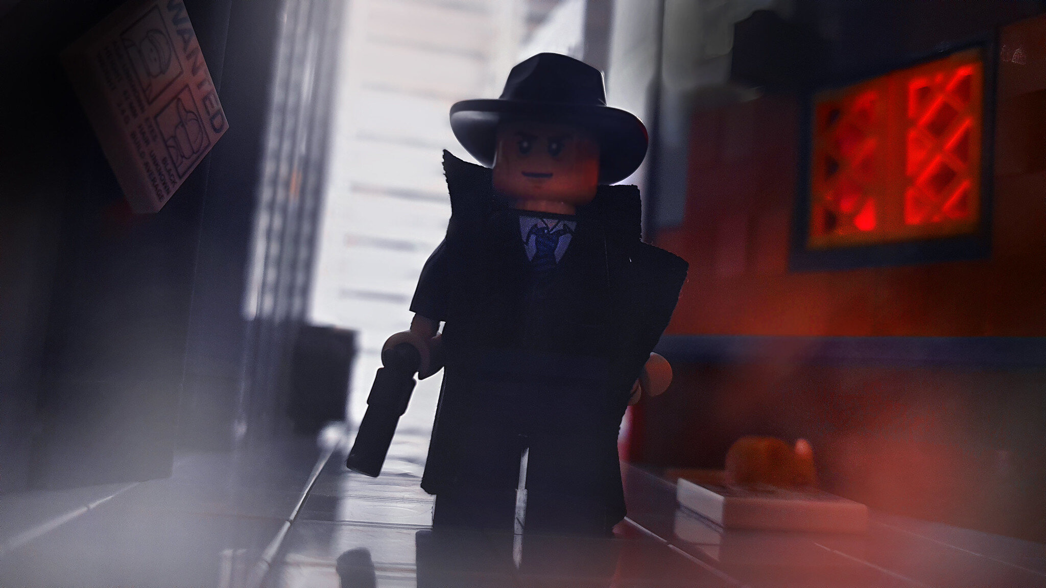
Ted: Ah, yes! Ann just wrote a BrickNerd article about using those small LED lights herself (Rob Klingberg also wrote about some other good MOC lighting options too). So once the photos have been taken, are there any pre-set filters that you use in post-processing (Photoshop/Gimp) that achieve that “washed out” lighting and grainy appearance, like in the example of the "God Prays to Us" cover?
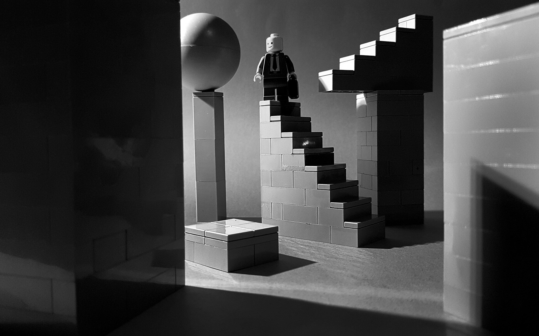
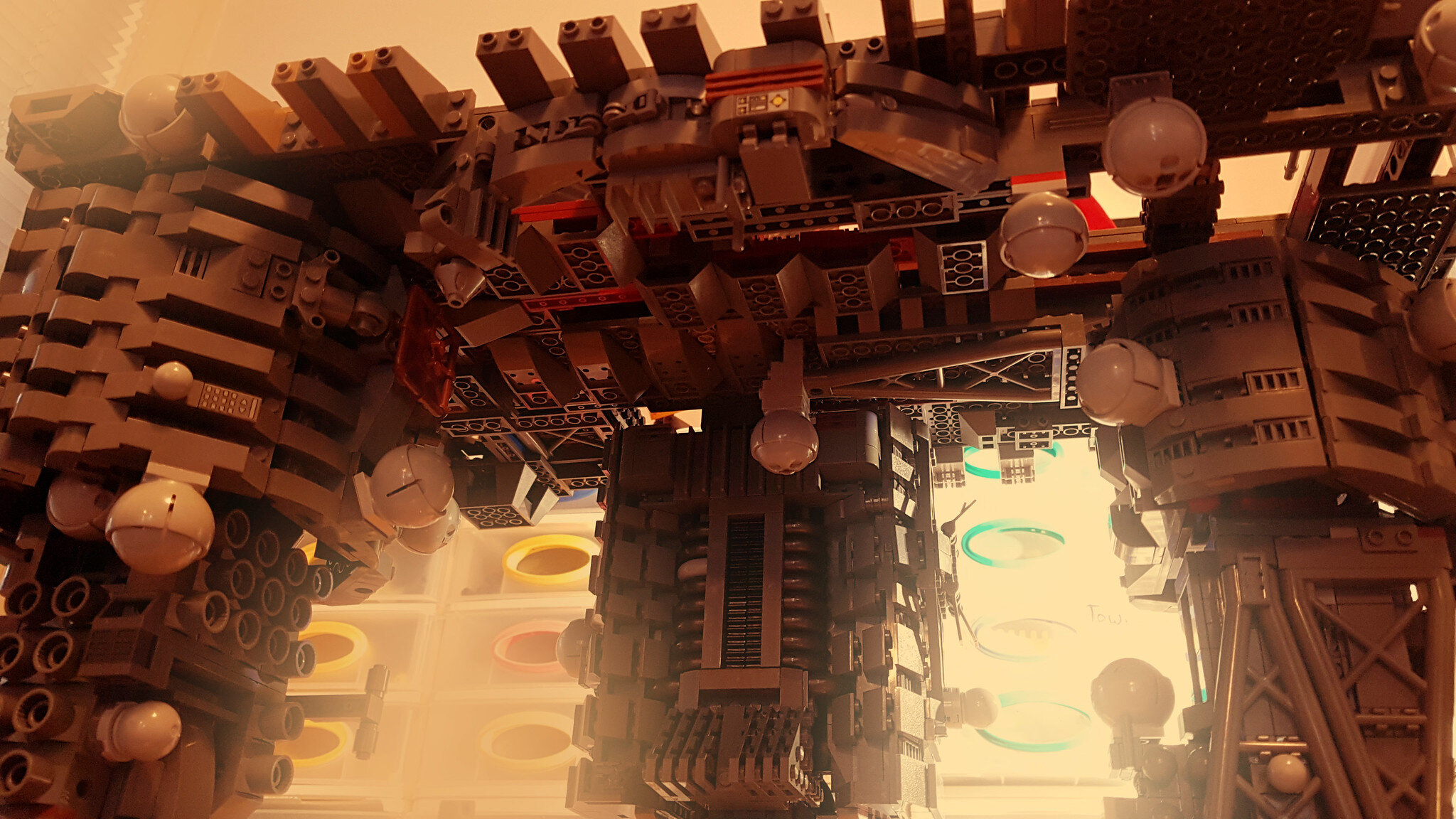
Shannon: I don’t have any specific grainy or retro filters that I use. That grainy effect is mostly by accident, I think. I play around with the levels, saturation, colour filters and I use the burn and dodge tools in Photoshop a lot, to highlight certain areas or darken others. I notice in the process of using these tools that the picture can often become grainy or patchy in its colour gradients. Washing out an image often gives it a more cinematic feeling, in my opinion, especially (as in that “God Prays to Us” example) when there are microscale structures or forced perspective in the build.
Ted: Speaking of microscale, your past SHIPtember builds have that retro ‘70s flair as well. Are you planning on participating in SHIPtember again this year?


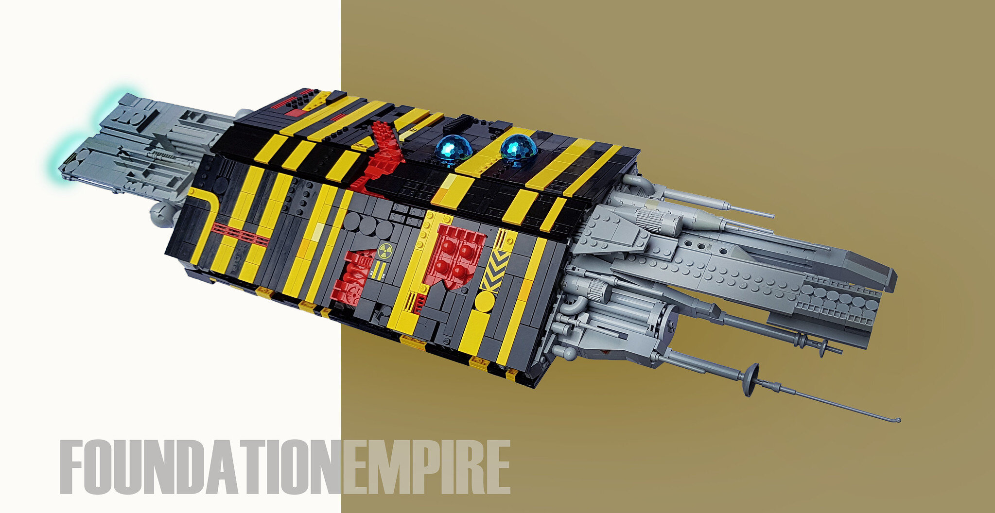
Shannon: At the moment I’m struggling to come up with any ideas for SHIPtember this year, so I may just be spectating from the sidelines. On the other hand, I may be inspired by all of the awesome WIP shots and start frantically building something half way through the month...
Ted: Isn’t that always the way! If you are not inspired at the onset of a contest or building challenge, then sometimes those early entries and WIP photos finally give us that spark of inspiration. For those new to SHIPtember, it is just as much about community building as it is about SHIP building. In addition to building a spaceSHIP that is at least 100 studs long in one month’s time, the other participation requirement is to share WIP photos with the building community to give each other feedback on how to improve… The “swoosh” photo is for extra credit.
On the topic of Sci-Fi building communities, do you have any more builds planned for the ice planet of Hibernia?
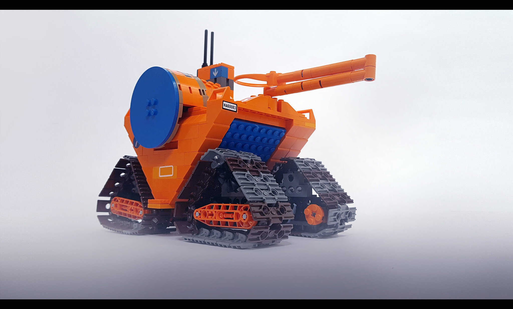
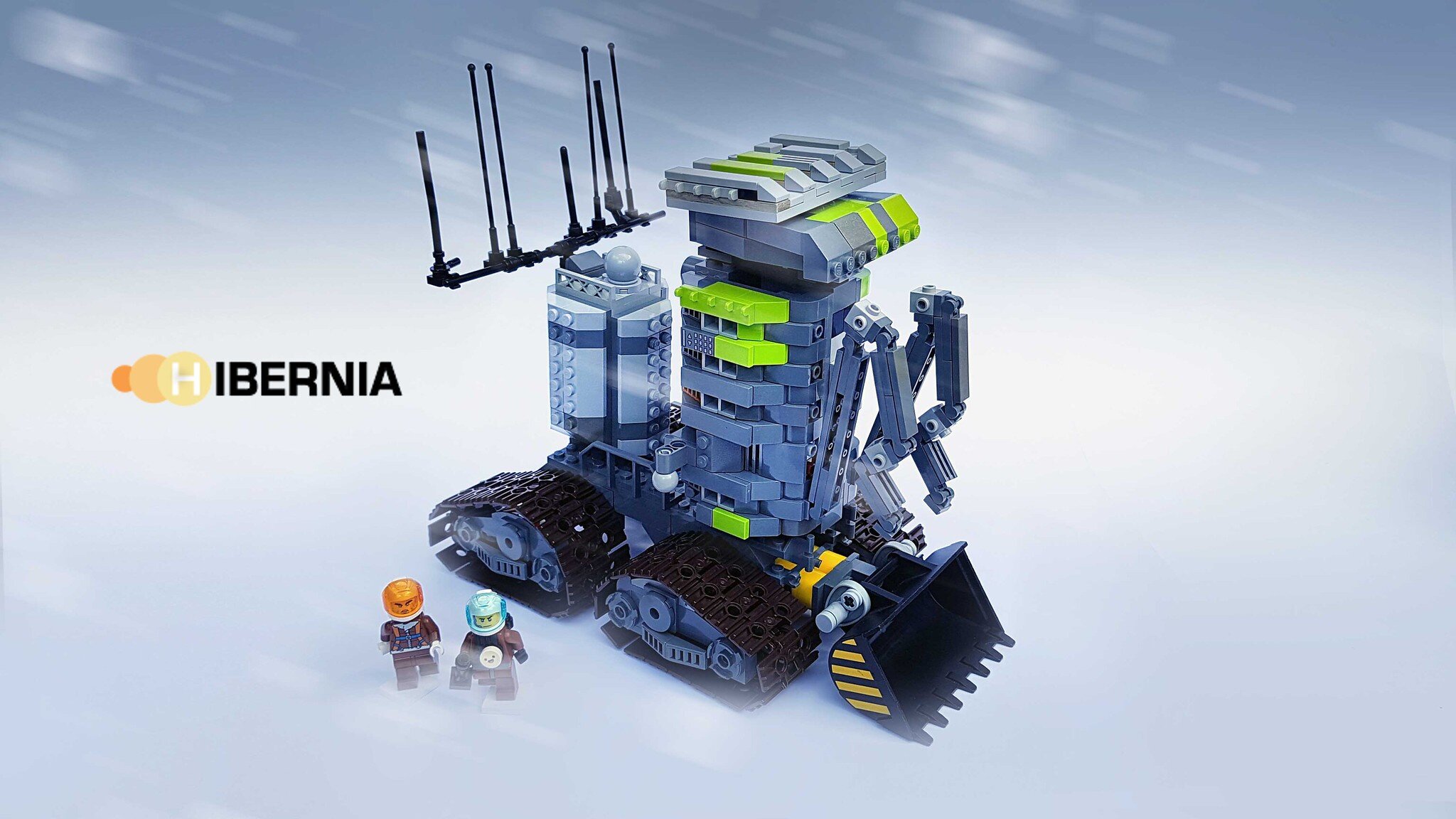
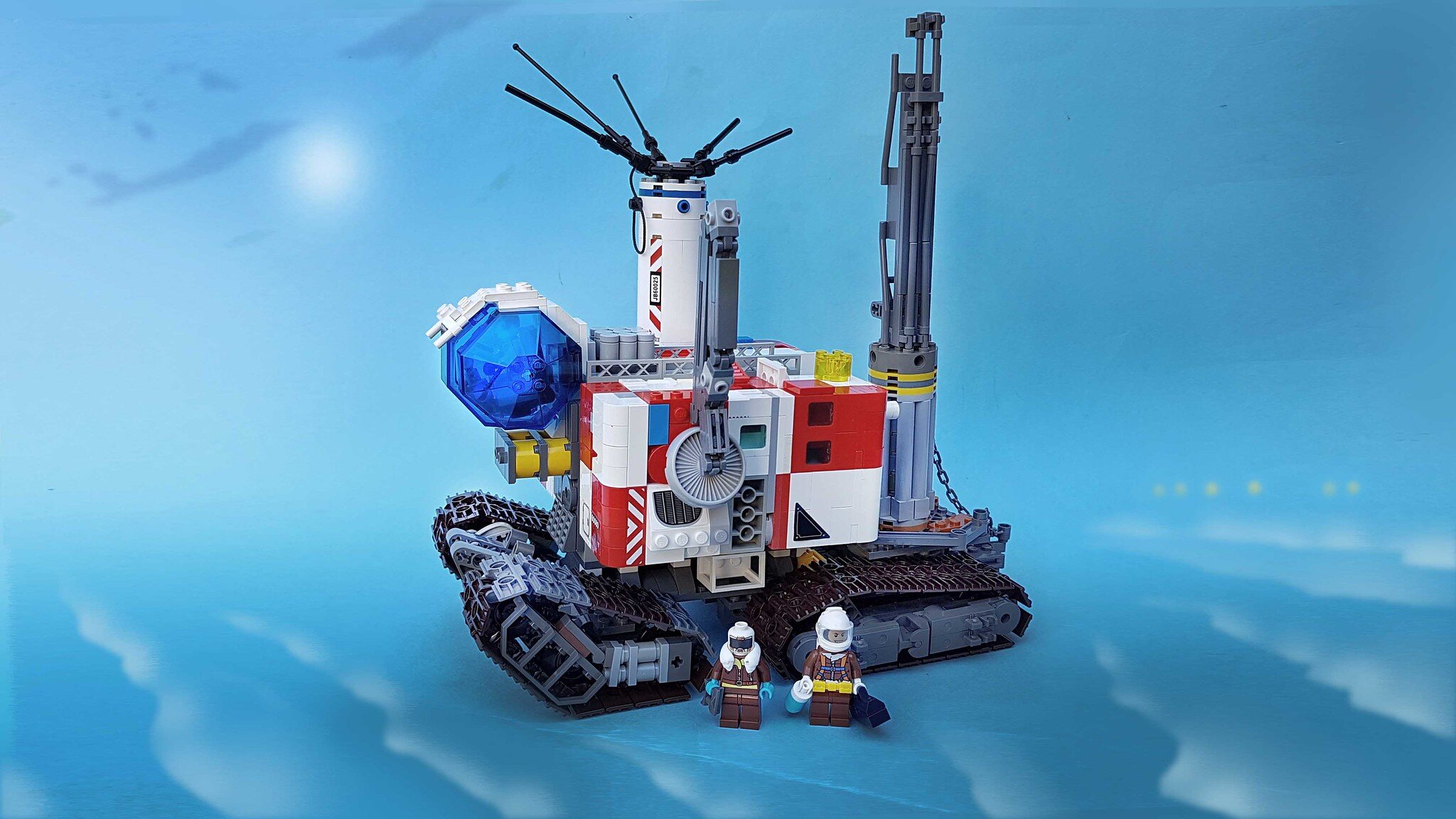

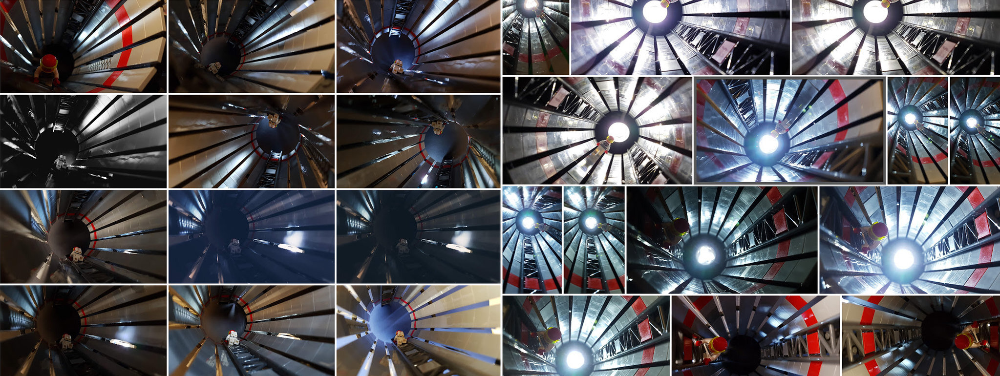
Shannon: Yes. Hibernia is definitely still on my mind; I’ve attempted a couple of further builds in the theme within the last year but they’ve all failed and were scrapped. I tried to build a large man-made tunnel under the ice but I think this idea might be beyond my skill level! I’ll still be trying to do more builds for Hibernia in the future for sure.
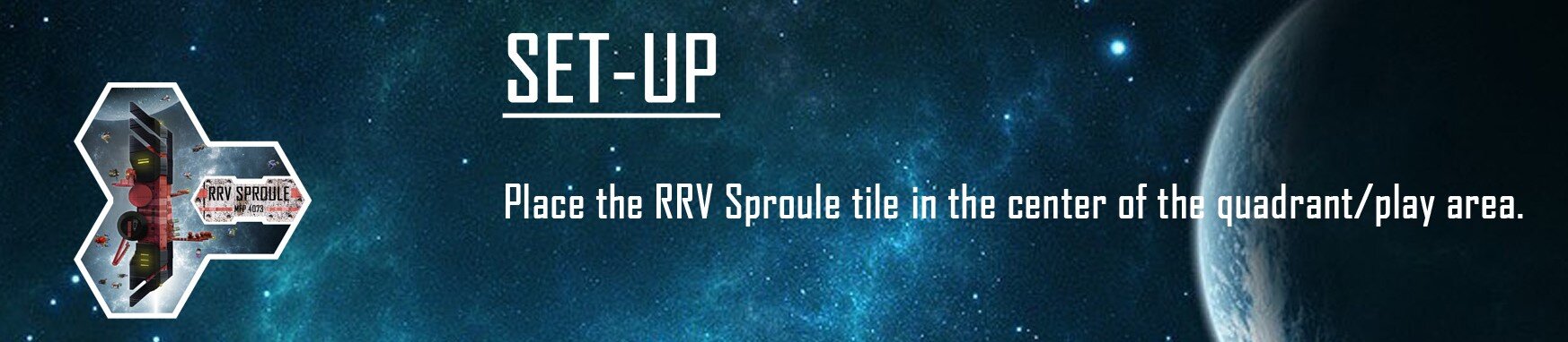
Ted: Before we wrap up, do you have any other projects in the works, LEGO or otherwise, or anything else you'd like to share?... I sure wish the board game "Clunkers" got off the ground [a multi-player space exploration/survival game, conceived by 1x5 Games]. I participated in a demo of it back at Brickworld Chicago 2019 and it was really fun to play. I especially enjoyed seeing all the micro-builds and illustrations that you designed for the game (along with all of Shane’s illustrations too), and bringing back all of my space-mined asteroid ore to the “RRV Sproule Refinery Complex”.
Shannon: Haha, no nothing else going on at the moment. People are advising me to take a break from LEGO if I don’t have any ideas, but I’m stubbornly clinging on and still trying to force ideas to come out. I’m glad you liked the Clunkers game. I’m not much of a board gamer, but I have dipped a toe in the water recently and Clunkers seems like a really cool concept for a game, definitely up my alley. It’s a shame that it is on indefinite hold; makes you wonder how many creative projects get cancelled for one reason or another, irrespective of how good the quality is.
Ted: Well, whenever the inspiration does strike, we’re all looking forward to seeing where it takes you next. Thanks for sharing, Shannon. All the best!
Shannon: Thanks again for your interest, Ted! It inspired me to build a few new paperback covers. I should be ready to share a couple of them by the time the article goes live [see below]. Stay safe out there!


We hope you enjoyed this deeper look into Shannon’s sci-fi builds, and the nostalgic look back at 70’s sci-fi style… and to all you videophiles out there, “Please be kind - Rewind!”
What makes a good book cover stand out to you? Let us know in the comments below!
Do you want to help BrickNerd continue publishing articles like this one? Become a top patron like Charlie Stephens, Marc & Liz Puleo, Paige Mueller, Rob Klingberg from Brickstuff, John & Joshua Hanlon from Beyond the Brick, Megan Lum, and Andy Price to show your support, get early access, exclusive swag and more.