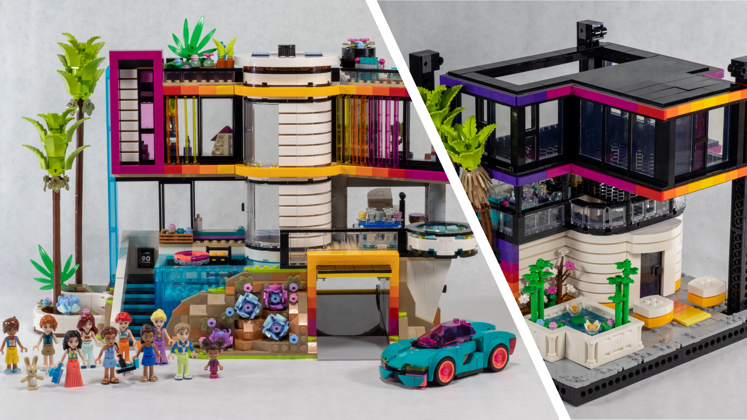
The Past, Present and Cyberpunk Future of LEGO Friends
/Today’s guest article comes from Casey McCoy, an AFOL from the Chicago-land area and an active MOC builder. You can find him online on Flickr and Instagram. BrickNerd sent him 42639 Andrea’s Modern Mansion to review and remix.
Friends of the Past
Friends in High and Low Places
Friends has never been a staple of my LEGO collecting career. Having grown up alongside my sister’s Belville collection and developing a soft spot for Paradisa in my teen years, LEGO Friends has never quite scratched the itch of bizarro parts (Beville) or nostalgia (Paradisa) for me in my later, AFOL years. (No surprise either: I’m not the target demographic).
Whether a combination of serviceable but unremarkable builds or the mini-dolls that I can’t get used to, Friends has been somewhat maligned by AFOLs in my eyes and treated as an interesting novelty to indulge in occasionally without much thought thereafter. Despite this, the theme has maintained solid performance for over a decade now, clearly finding a fanbase and niche within the toy market and LEGO’s portfolio.
That perception has quickly changed on a dime in the broader LEGO community, however. As an active AFOL always looking for new parts, new recolors, and new designs, it was hard not to notice the daring and dazzling output from Friends in the last couple of years that rivaled the technique and parts-intensive MOCs by fans. It seems like everyone in the LEGO-sphere is taking note. What’s changed?
Looking for Friends in All the Right Places
If you’re as ignorant to LEGO Friends lore as I was a few months ago, let me bring you up to speed on the latest changes in Heartlake City. As 2022 came to a close, we saw the main Friends cast of Andrea, Olivia, Stephanie, Mia, and Emma proverbially ride off into the sunset, each pursuing their various careers in art education, space exploration, and the thespian arts, among others.
As these decade-long Friends closed their chapter, grew up, and stepped out of the limelight, LEGO breathed new life into the evergreen theme in 2023 with a new logo, new box art, and a whole new lineup of characters to take center stage: Aliya, Nova, Zac, Liann, Paisley, Leo, Autumn, and Olly.
With this revitalization of the Friends theme beginning in 2023, we’ve seen a similar refresh to the design language, architecture, and color usage of the Friends line. Simply put, the Friends sets are some of the most aesthetically pleasing models LEGO is putting out these days. It’s better than City (no offense to the City designers)! But don’t take my word for it. Take strangers on the internet’s words for it! Let’s take a look at the Brickset comment section when the 2024 sets were revealed in early November:
Wrecknbuild: “These Friends sets are just so gorgeous. If only City were half as good...”
jkb: “Friends is becoming too good! Don't have enough money.”
Reventon: “Really trying to avoid buying Friends stuff but I’m a sucker for a good-looking LEGO house.”
Legoarcher87: “LEGO Friends for the win, yet again. Hey City, pay attention!”
Or on Reddit:
bountybossk: “The whole Friends-design team needs a raise. Last few waves had some incredible builds, now this… Wow!”
pretzemilia: “The Friends fans keep winning, can't wait for these! Quickly becoming my favorite LEGO theme.”
DJfunkyPuddle: “Dammit, Friends, why do you always come out with fire sets?”
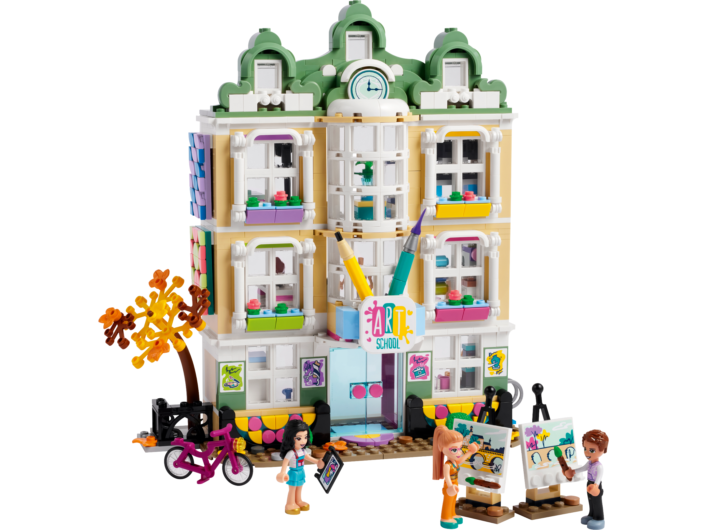
Needless to say, Friends is spittin’ and AFOLs are listening. Let’s compare the jump in visual interest across just one year’s time. Take for example the comparison between 2022’s 41704 Main Street Building and 2023’s 41748 Heartlake City Community Centre.
Both sets are targeted and priced similarly. 8+ vs. 9+ and listed at $160 and $140 MSRP (USD), respectively. (2023’s 41732 Downtown Flower and Design Stores is closer in form and subject matter to 41704 but is 12+). I think it’s pretty clear at first glance that one model stands out against the other. How come?
SPECIFICALLY FRIENDS
LEGO Friends Model Designer Wes Talbott, the designer behind 41748 Heartlake City Community Centre, 42620 Olly and Paisley’s Family Houses, and today’s subject, 42639 Andrea’s Modern Mansion, revealed that the inside-out relaunch to the Friends brand’s design approach can be summed up in two words: “bold” and “specific.” In an interview for BrickNerd with Nerd-in-Chief Chief Dave Schefcik, Wes had this to say about the new approach to designing for Friends:
“[...] I would probably pick bold and specific. I love the word specific, just in general to design. I think that's where a lot of strength comes into play. Especially simplicity, as well. Just going all in on one type of thing and really focusing on it and doing deep research on that one thing. That’s what we have to do with the characters to portray people correctly. We have to be very specific, and it's the same thing with all the models. So, I think we're taking the inspiration from all the research on the characters and then spilling that into the models themselves.”
Fanella Charity, Creative Lead on LEGO Friends, had this to say in response:
“That’s intentional, the choices that we're making. I think I can honestly say, having worked on the Friends brand before, there were times when we would make a set because 'it was cool' or 'yeah, let's just put that character in.' Now, every detail is so intentional that we know there's a bio for every character, we write the story, [and] what should happen in the model. And so that's been really awesome to think every piece we put in is an intentional detail.”
I think this specificity and boldness is best exemplified through one more model:
41757 Botanical Garden is another great example. The model designer clearly had a specific goal and design in mind when tackling the brief and used rich color combinations, simple but effective SNOTing, and some wicked new dome molds to make for another standout model that would look great in any theme. So what’s the next step in this evolution of Friends? Where do you go from here? Well, to go forward, we need to go back. Enter 42639 Andrea’s Modern Mansion.
Ain’t No Time Like the Present
SOMETHING OLD, SOMETHING NEW
In a community roundtable discussion, the LEGO Friends team identified there was a hole in the market for a Friends set geared at the kids of the past who grew up on Friends and were now more “grown-up” themselves. Some interesting or obvious parallels can be drawn in seeing 42639 re-introduce the grown-up, “classic” Friends characters from yesteryear (Andrea, Olivia, Stephanie, Mia, and Emma) with a triumphant and unexpected return.
This latest 2024 Friends offering also boasts the highest part count for any Friends set thus far at 2,275 pieces and stands out by being the first 14+ targeted Friends set, making it a curiosity in the Friends catalog and greater LEGO portfolio. So what does 2024 Friends have to offer us? Without further ado, let’s see what this Modern Mansion has in store.
THE BUILD EXPERIENCE
Bag 12 thinks it’s so special, doesn’t it?
The set is broken up into 17 numbered bags with smaller bags therein. Two instruction manuals at 400+ pages with 500+ steps, and you’ll be done! The set is pretty standard LEGO building fare—a solid building experience that gives you a good variety of things to do and tangents to go on. Even in some instances where you would expect it to be more repetitive, like the SNOT outer wall of the elevator, it doesn’t feel monotonous.
As a set geared towards an older audience, the build employs a lot of SNOT work, detailed subassemblies, and large quantity tile/Dota work. There’s a decent blend of small, medium, and large pieces, but this set has a (unfortunate) total of 27 stickers—a level of pain compounded while constructing the second-floor picture wall with nine back-to-back stickers. Apart from that hiccup, the experience is fairly carefree. So what else?
MALIBU MANSION OR BARBIE DREAMHOUSE?
The design of the house is the biggest standout, accentuating that “bold and specific” design philosophy espoused by the Friends Design Team. Andrea’s Mansion’s somewhat irregular shaping, angles, and warm color palette draw you in immediately—the subtle ombré gradient especially.
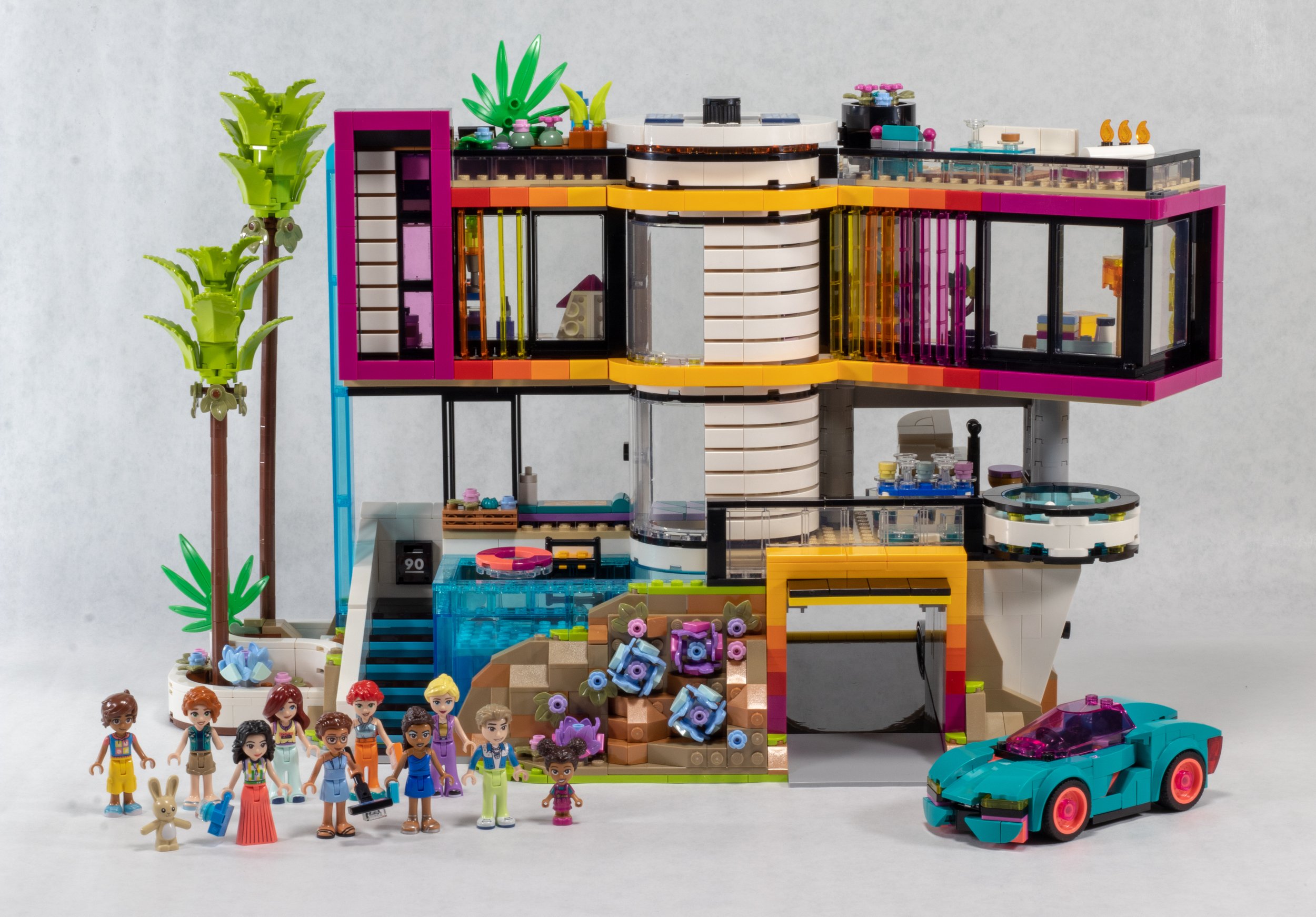
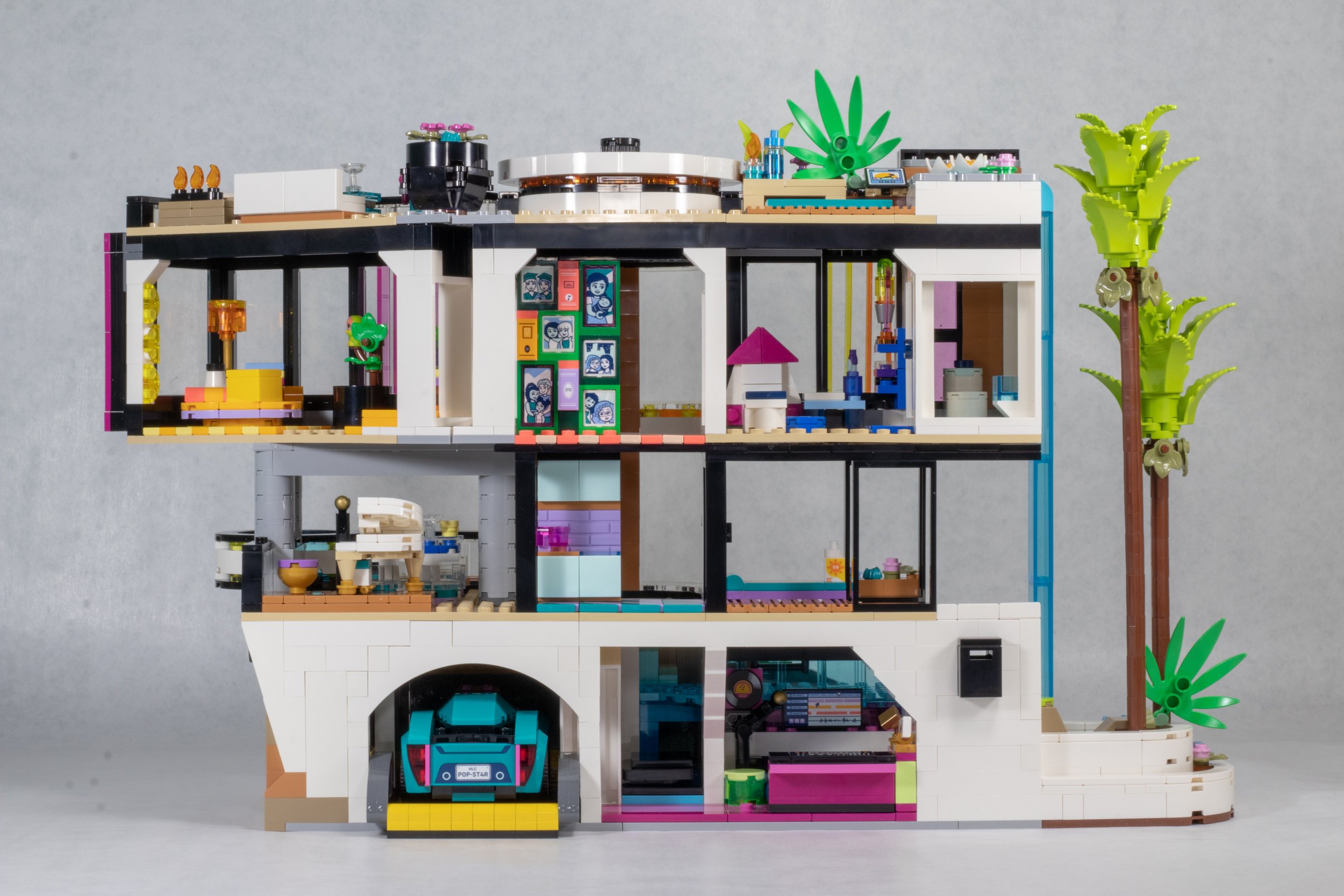
Many in the fan community have been quick to point out that it looks like a “Malibu Mansion,” “Barbie Dreamhouse,” or gives “GTA Vibes.” Wes Tallbot explains that no single region, architect, or building was imitated, but instead, an amalgamation of modernist home styles led to the inspiration and design process. While funny timing, the feeling that it’s a “Barbie Dreamhouse” is just a happy coincidence from The Barbie Movie that’s since been burned into our current, collective cultural consciousness.
NEW? OR NOTABLE?
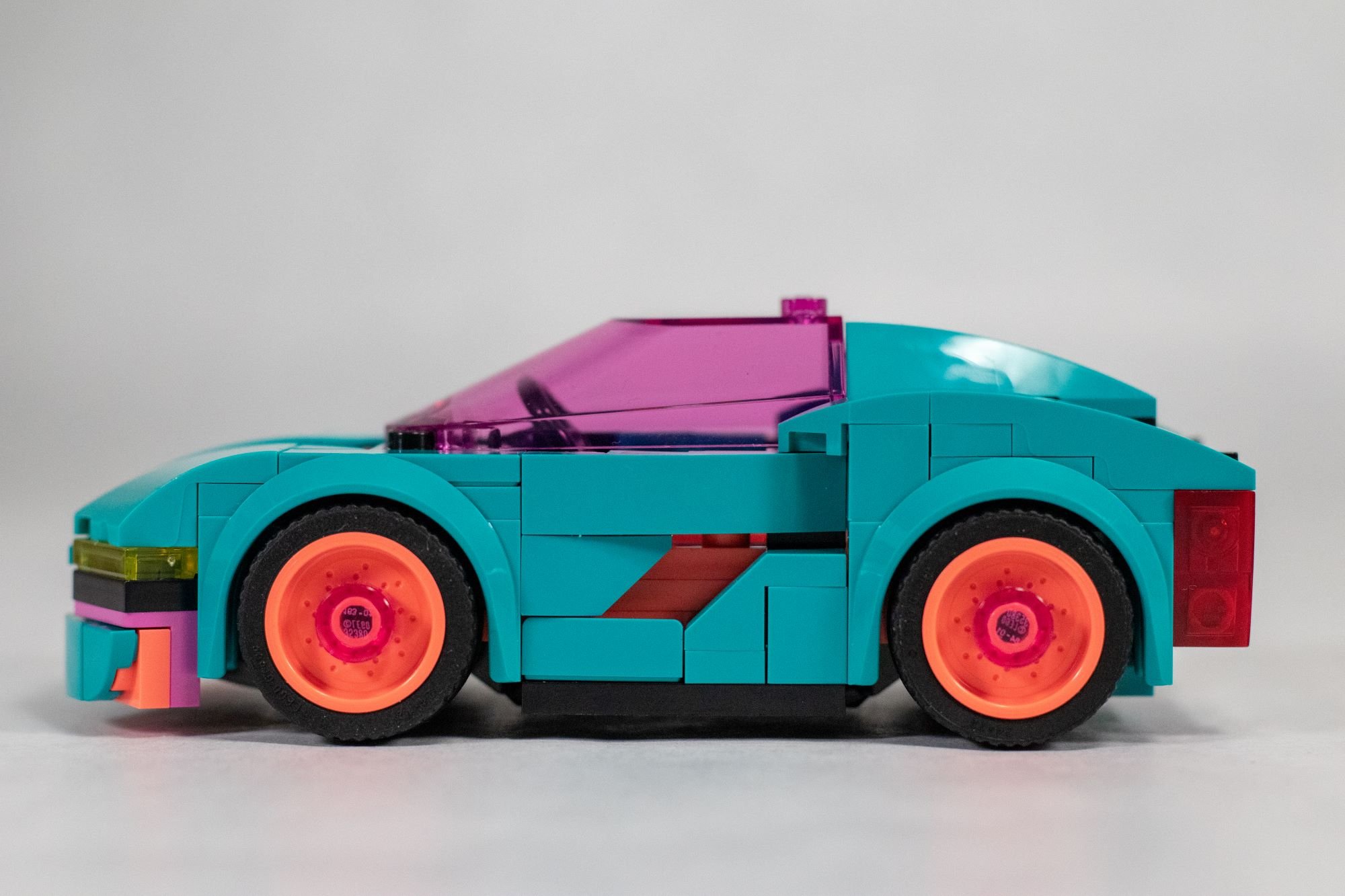
While not an exhaustive summation (I’m sure Tips & Bricks and New Elementary will do a great job drawing up the summary), here are some standout pieces I found for AFOLs: the new visor/dome on the car, 3x3 curved bricks, second appearance of the saucer in trans-clear, tall 1x4 curved slopes in white for the second time, 1x1 round brick in satin trans-purple, the 2x2 cut tile in coral, and of course, the NEW reddish orange, mainly debuting in the 2024 Space mega-theme.
While in very limited quantities for this set (four 1x2 tiles, six 1x2 plates, and one 1x4 tile), reddish orange is employed to great effect with the main visual draw of the set: the gradient on the second-floor windows and garage door. This expansion in the LEGO color palette is a welcome one but it is still throwing me for a loop in getting used to it. I can’t wait to see reddish orange as a 1x1 rounded tile for mosaics!
PLAY FUNCTIONS
A big stand out for the set are two play functions: a working garage door and elevator!
Vroom vroom!
The car doesn’t roll out from the garage perfectly as the front of the car will scrape along the ground briefly and slow down some of the momentum built up by the exit. You also need to have it on a level surface—any kind of unevenness will exacerbate the issue. Nonetheless, it is a very neat and clever function to include. Here’s a window into the technique:
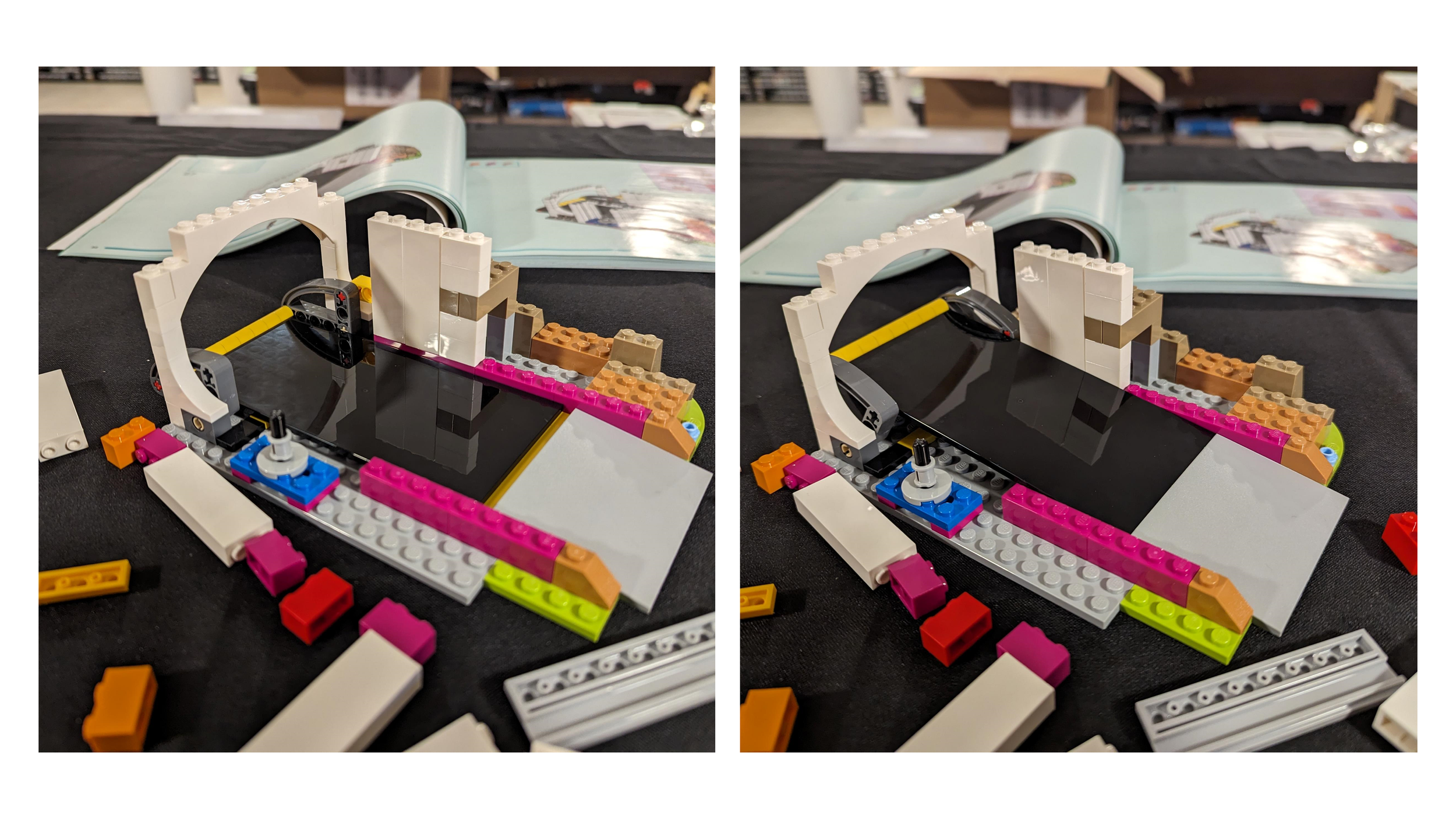
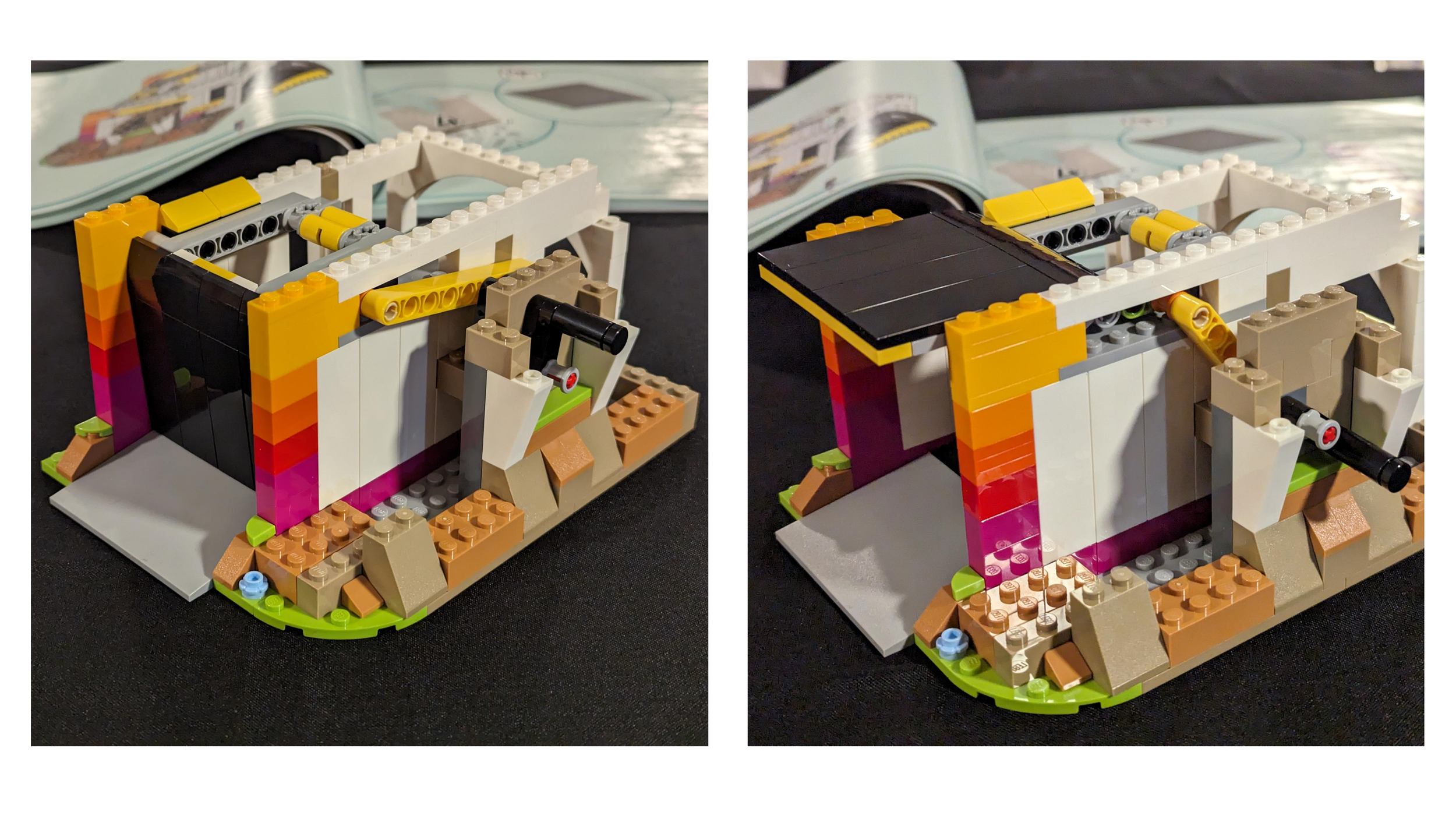
A gentle gap and slope…Simple but effective…
The second play feature is this elevator that runs from the “basement” of the mansion to the second floor. It’s certainly not speedy, but it is stable.
This elevator is accomplished through a still relatively new parts assortment implemented into the LEGO system with these parts: 3417 (Door, Frame 3 x 6 x 6 with Grooves), 73763 (Technic, Gear Worm Screw 6L), and 3863 (Brick, Modified 2 x 4 x 5 with Hole for Gear Worm Screw 6L). These parts have only been seen collectively in less than three sets (mostly LEGO City). This elevator system debuted under the radar in 10788 Gabby's Dollhouse but thankfully comes in neutral tones here:
What, you found a use for the pink, printed version last time?
A FEW GAPS IN THE ARMOR
To offer some nitpicks, there are a few instances where the SNOT techniques are used at the expense of small gaps in the model—ones that certainly don’t break the set, but bother my OCD AFOL tendencies. They are admittedly hard to see at most angles, but they are there. These include:
A small gap on each car door where there’s slight exposure.
The ribbed wall on the outside of the elevator (heating/cooling bill must be ridiculous!)’
The space near the second-floor blinds.
A 1x1 space left near the first floor outside seating’
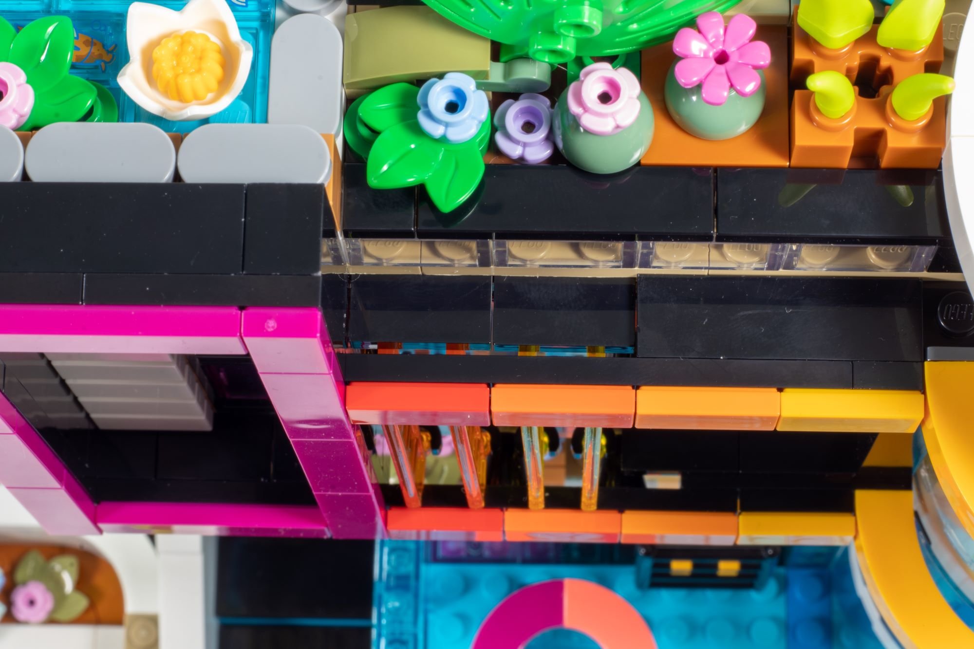
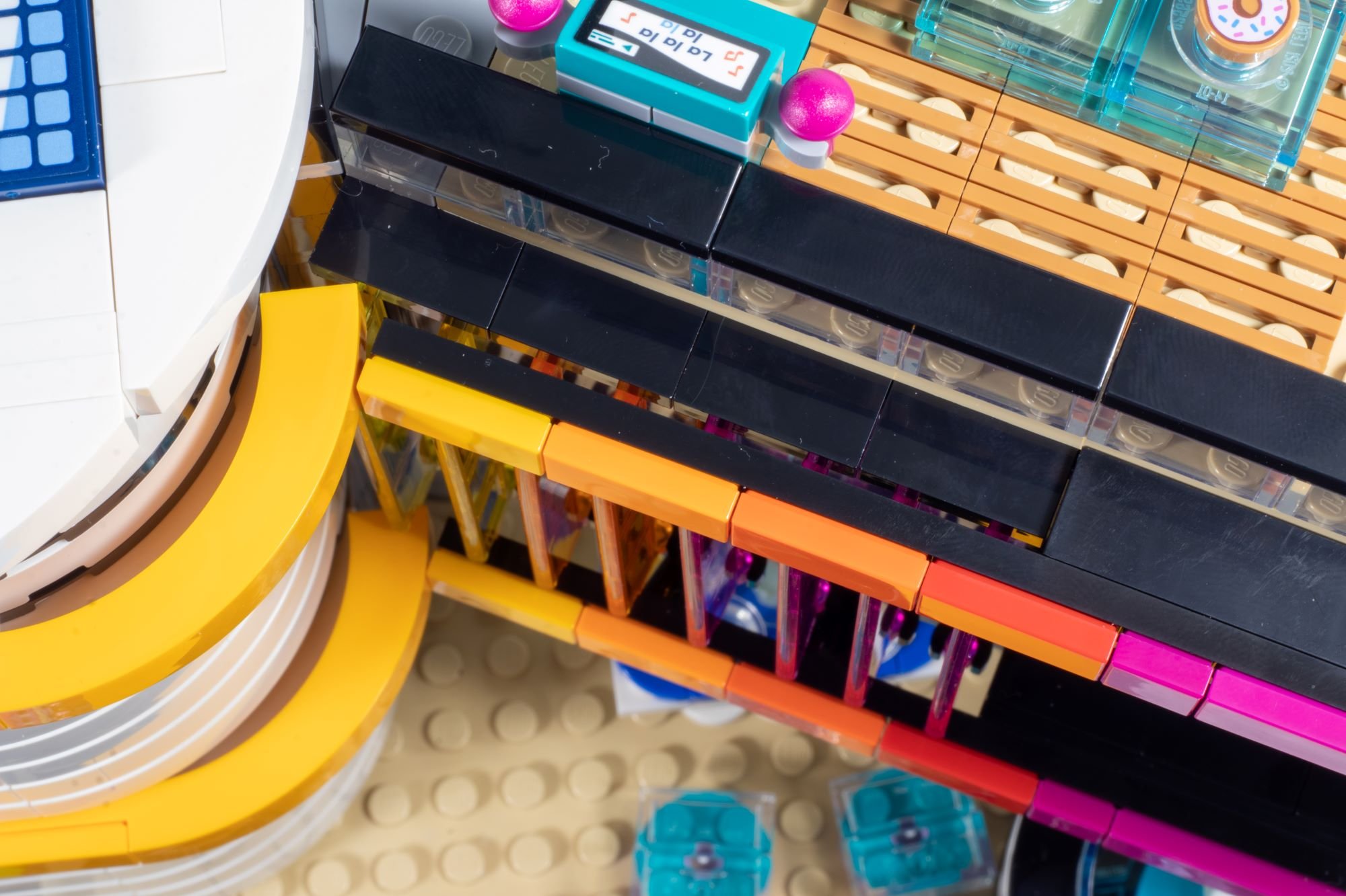
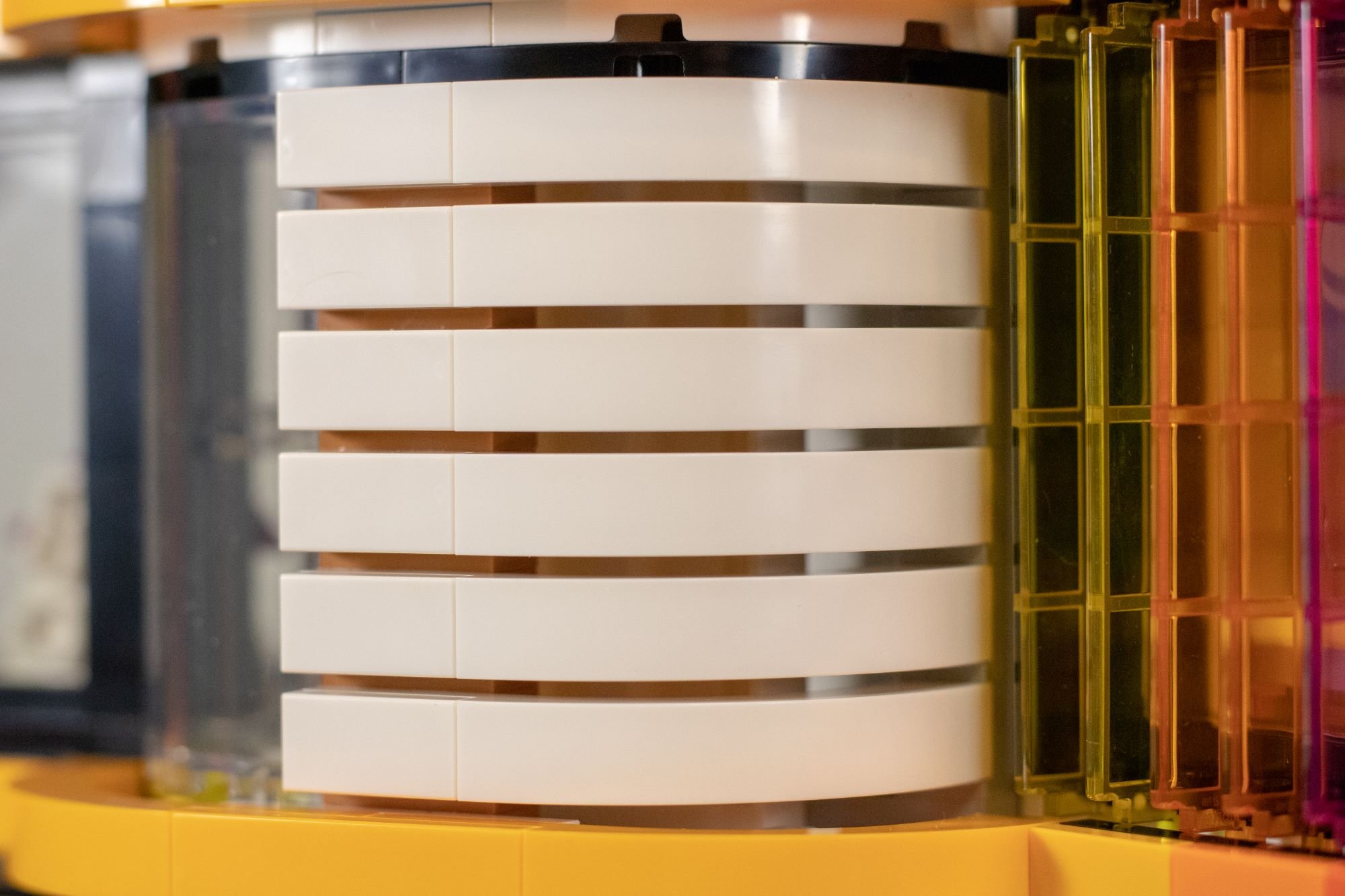
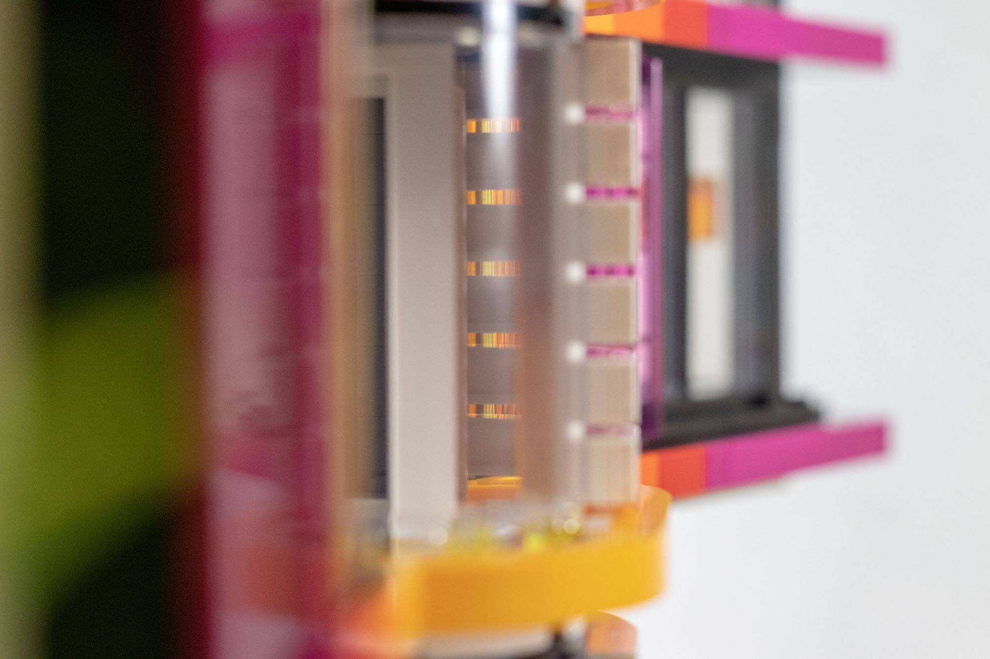
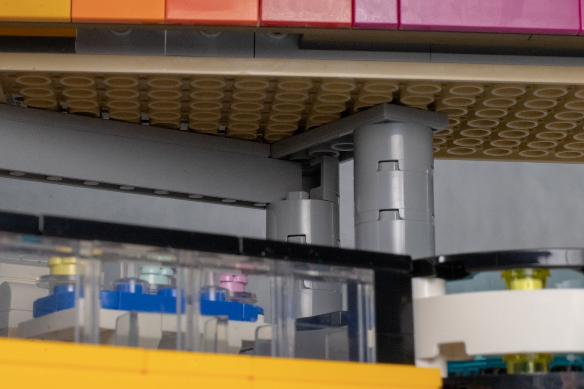
With a lot of these, I can't necessarily think of a way around them as these gaps exist so you can accomplish some of the very selling point features in the set. However, I’m going to point it out either way.
SUMMARY
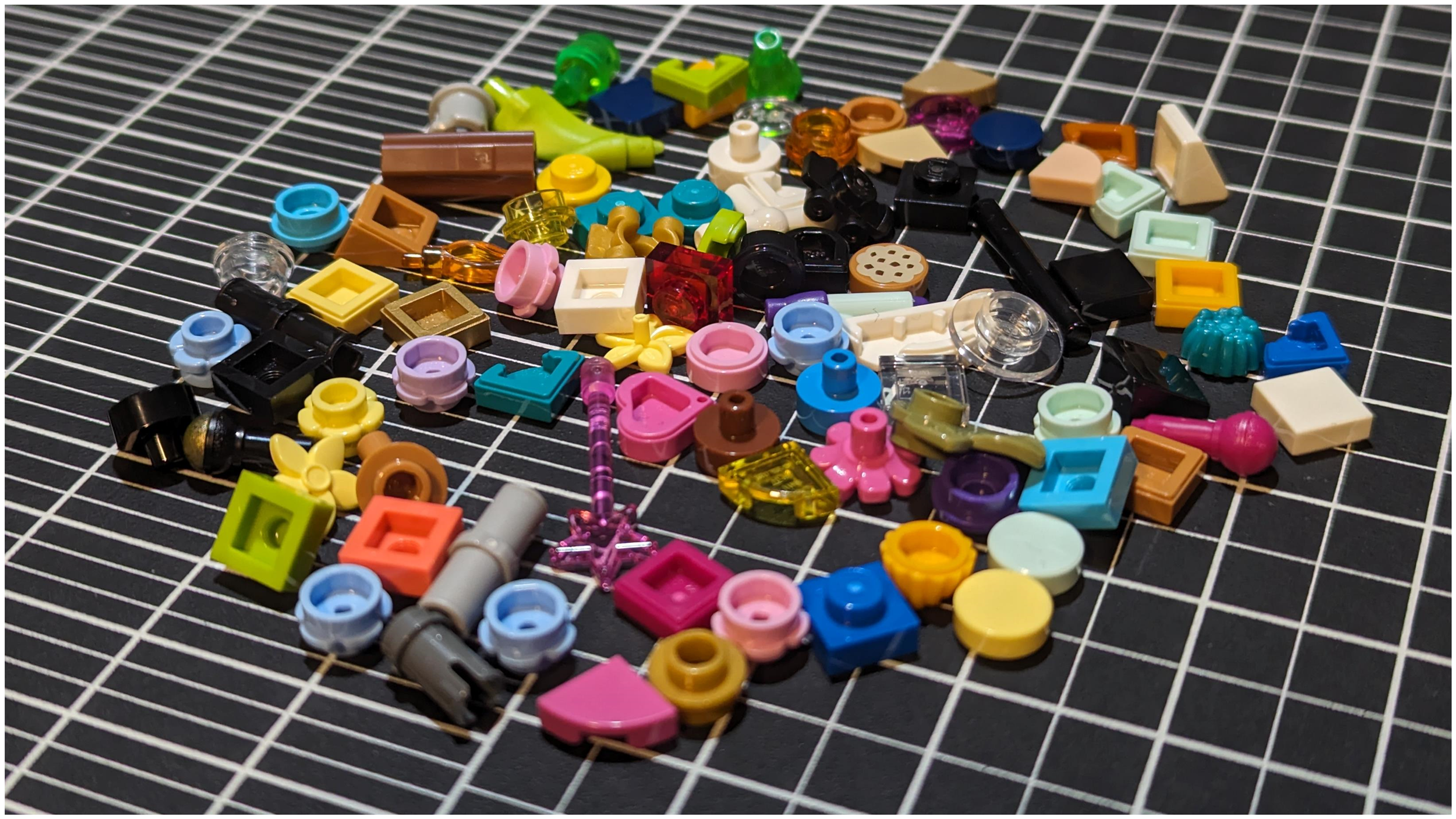
At $200 USD, 2,275 parts (with some tasty new molds and colors), and ten mini-dolls (if you’re into that), the set offers a lot of value and is a big standout in LEGO’s portfolio. It will be actively competing for the dollar of non-Friends fans. Not to mention, all these extra pieces probably push our part count closer to 2,350:
Nothing to scoff at…
If Friends sets are only to progress further in this area with this new design philosophy, architecture, and interesting parts usage, the future is bright for hardcore Friends fans and casual LEGO fans alike. Kudos to the design team—if you’re a Friends fan, you’re eating good these days and probably well into the future. Speaking of the future…
You’ll have to tune in tomorrow! BrickNerd can’t just do a casual history article and thorough review… of course, we have more in store for you from Andrea’s Modern Mansion, so see you in the future!
DISCLAIMER: This set was provided to BrickNerd by The LEGO Group. Any opinions expressed in this article are those of the author.
What do you think of the Friends turnaround? Let us know in the comments below.
Do you want to help BrickNerd continue publishing articles like this one? Become a top patron like Charlie Stephens, Marc & Liz Puleo, Paige Mueller, Rob Klingberg from Brickstuff, John & Joshua Hanlon from Beyond the Brick, Megan Lum, Andy Price, Lukas Kurth from StoneWars, Wayne Tyler, Monica Innis, Dan Church, and Roxanne Baxter to show your support, get early access, exclusive swag and more.

