Behind the Design: Deconstructing the LEGO Octan Logo
/Best of BrickNerd — Article originally published January 13, 2023.
For my inaugural BrickNerd article, I wanted to take a closer look at something I’ve been familiar with for the entirety of my time in the hobby but only had a cursory glance at—the Octan logo. It’s an image that has been etched in our minds almost permanently, not in the least because of its dominating presence in The LEGO Movie, but just from how ubiquitous it has become in City sets nowadays (let alone a gas station in real life). It’s got a really strong brand presence, and I thought it was worth a look.
images via Brickset

Historic Perspective

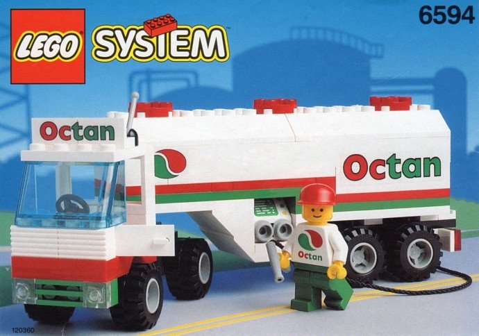
The Octan brand has been around in our world since 1992, designed by Torben Skov, a senior LEGO designer with over a quarter of a century of experience within the company. The trademark white, red and green colours are unmistakable and have been used on gas cans in LEGO City and as Easter eggs in Star Wars, Batman, Marvel and more.
In-universe, however, the brand seems to have been thriving for far longer than just 1992. Let’s take a look at how other designers have envisioned the Octan logo to fit different eras.
The thoughtful progression of style thanks to a range of brilliant in-house designers.
Corner garage fuel pump image via lego
While the Corner Garage from the Modular Building series is officially described as a “50s street corner”, this just dictates when the scene is set. A closer inspection of the fuel pump indicates the garage has been in operation for a number of decades, judging by the very old-school manual petrol pump with its large glass reservoir at the top, typical of the 20s and 30s. The style of the logo fits this era with a likely hand-lettered serif type (though I did find the font used for both Octan and Gas in this case—this is the 21st century after all.)
The often missed reinterpretation of the logo comes from the front entrance to the Tuning Workshop from 2020. Based on some of the vehicles and the rockabilly vibes of the included Tread Octane figure, I’d take this as possibly evoking the 40s or 50s.

Tuning Workshop Image via Brickset
The current logo with a much simpler sans-serif type is fitting for the time it was created in, with the design zeitgeist of the 80s and 90s showing through. Looking at that type though, I couldn’t help but wonder how it was originally designed. The taiji-like symbol is quite generic, resembling droplets of oil? That’s just my guess. The wordmark on the other hand is rather peculiar.
Breaking It Down

I digitized as best I could the original trademark filing of the Octan logo from 1993 as it became apparent that any vector found online wasn’t terribly accurate. There are going to be some minor inconsistencies as I’m dealing with a three decades old scan with some major hinting, but it’s about the best approximation I could make with my typographic understanding.
It appears to be constructed and modified from two typefaces, not just a directly typed font. Gill Sans Extrabold and Futura Extrabold are both extremely popular typefaces and both packaged with different software, so definitely something the designers would have had at their disposal. I did a study some years ago now on different box designs from LEGO over the decades and both of these fonts showed up at various times.
No glyph was untouched, customising the type to suit the scales it would be used at.
Gill Sans has one of those funky double-decker ‘a’ glyphs like most of you would see reading this article. I feel the decision to use/create a single-decker ‘a’ was so the wordmark was more legible for the small scales at which it would be shown, as is likely the case for other modifications. With some minor adjustments I can see the above being the likely basis for the design.
Behind the Scenes
The wonderful designer video for the Corner Garage lends credence to my theory of the constructed type scenario. A small portion of the video is dedicated to the aforementioned redesign of the octan logo for the set detail, and what is shown is a mockup of various Octan logo elements including one previously unseen variant.
It’s unclear whether this was a design for the set in question or is one of likely several renditions of the logo tested over the years, but what is curious is a rather unfinished variant of the current logo. This next bit may benefit from a quick scroll through Anatomy of Type by Stephen Coles.
The ‘c’ is closer to the more squat Futura ‘c’, but more intriguing is the strangely crafted ‘a’ with its incomplete counter (the void within the letter) obscured by the stem which is equal in width to the stem of the ‘n’; not uncommon, but not completely common either, and certainly not in the final logo. What you’re looking at in that video appears to be a work-in-progress version of that logo! I don’t know if designers at LEGO still print on vellum but if not, could this be an archival document of the original design concept?
It certainly got me wondering about the sort of thinking that needs to go into a logo of this magnitude. It needs to be clean enough to be strong on its own and incorporated elsewhere and simple enough that time isn’t at waste if the idea were to be scrapped in a year; then there are legibility issues on print/digital media at both tiny and large scales. This is a fully-fledged logo design, not just a fiddled text box.
Meet the Family
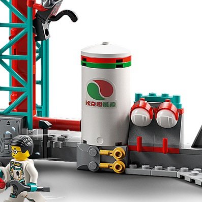
As we reach a more current age at this stage in the life of the logo, Octan now has its own suite of sub-brands in a family of sorts. Set 5563 Model Team Racing Truck brought forth the ‘Diesel Power’ branding, only for the beefiest of brick-built vehicles. With the rise in popularity of renewable energy sources, Wind Turbine Transport introduced us to Octans new ‘Octan Energy’ initiatives.
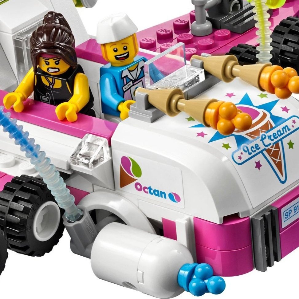
the main line of the family, not including the Kebab shop, ice cream van, rubbish disposal and plumbing service
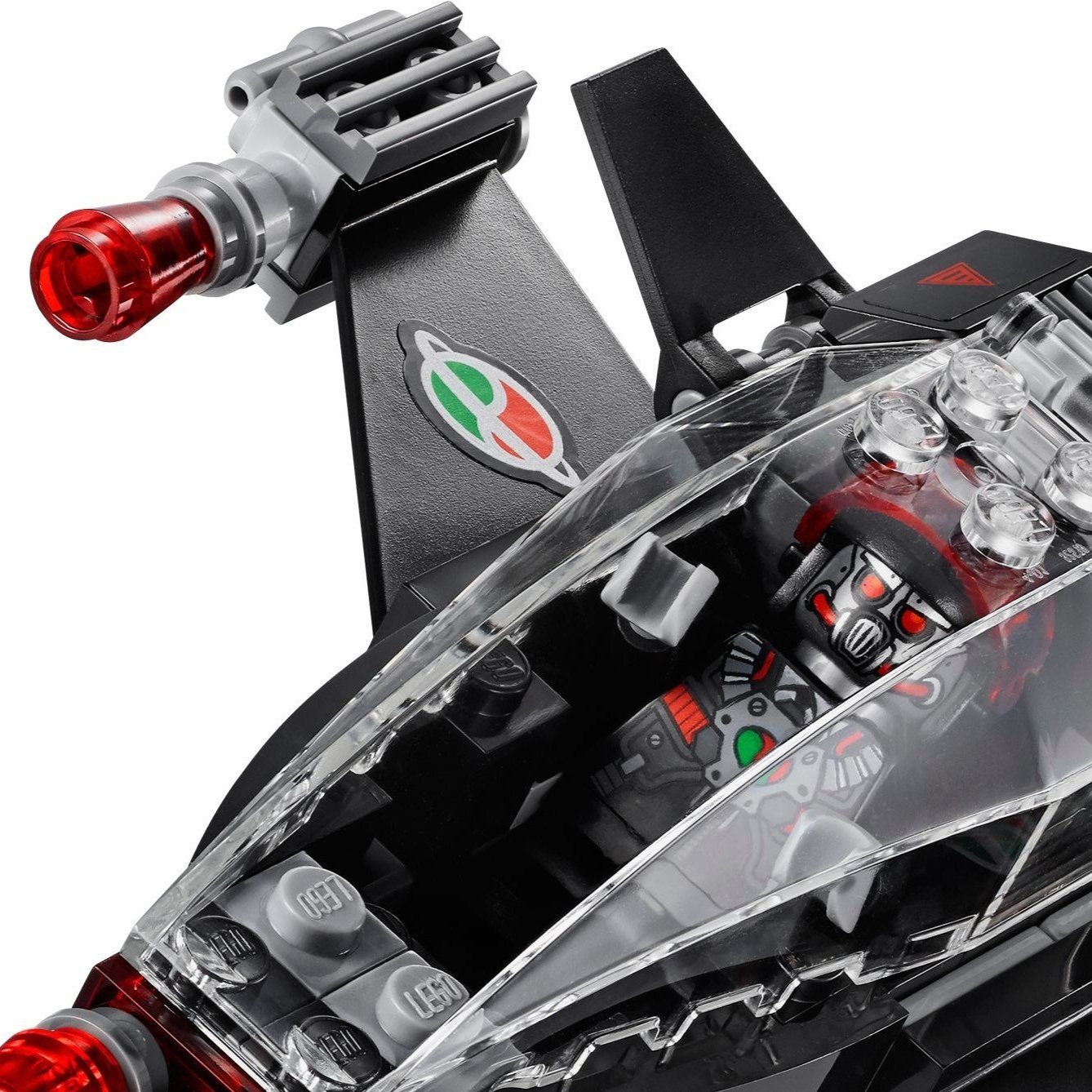
Along with these come the whole host of motorsports sponsorships and brand deals, because if there’s one way to chew up lots of product, it’s in a vehicle designed to burn it. There has however been a recent addition to the brand family with the introduction of Octan’s first dive into the electric race vehicle market in the Racing Cars set from 2020. Octan E follows the same structure as its Racing predecessor in terms of branding but with a fresh take on colour.
These logos do not take into consideration where LEGO graphic designers have gotten creative, incorporating the Octan logo into other themes like Monkie Kid, The LEGO Movie, and more.
Modernizing a Classic
All this design talk and asset production got my creative juices flowing and I wanted to experiment with an Octan of today, so to speak (a small update for sure, but I think I like it!). Please note that this is not an official redesign; I’m not a LEGO employee (call me) and this is simply a passion project.
I started with the overall symbol, softening the shapes and bringing it back to the circular shape so it could fit better on anything from a 1x1 tile for DOTS to a vehicle panel without awkward space above and below it.
pepsi meets toothpaste meets italian restaurant
Next came an update to the wordmark. I used Gotham as a starting point, which was used a few years ago in the ‘Building Bigger Thinking’ campaign. It’s a little more geometrically sound than Gill Sans but still with its own personality. The ‘a’ is once again constructed from scratch, tailored to the surrounding letters. The ‘c’ is truncated to even out that negative space, close to the amount around the ‘a’. Lastly, as a bit of an Easter egg, the proportion of the outer shape and the counter of the ‘O’ are equal to a 1x1 cylinder brick and its 3.18mm bar hole through the centre. LEGO geometry meets logo design!
I couldn’t help myself and made a small piece of advertising for the Octan Corporation, complete with an uplifting yet ominous tagline that speaks to their convenience but hints at their involvement in “music, dairy products, coffee, TV shows, surveillance systems, all history books, voting machines…”. I noticed recently in Lord Business’ Evil Lair, even the battery hooked up to the Kragleizer is made by Octan!
“Always be happy (or you’ll be put to sleep)”
Final Thoughts
It can be hard to draw specific conclusions from a study like this, but one thing I do know is that the Octan brand is fit and able to last many more decades. I know it made its debut in 1992, however, if the 2x4 brick is anything to go by and the legal document is our quantifier of a ‘beginning’, the trademark for Octan was filed in 1993, so happy 30th birthday Octan!
What other LEGO in-universe brands can you think of that have lasted so long? Are there any worth a closer look at? Let us know in the comments!
Do you want to help BrickNerd continue publishing articles like this one? Become a top patron like Charlie Stephens, Marc & Liz Puleo, Paige Mueller, Rob Klingberg from Brickstuff, John & Joshua Hanlon from Beyond the Brick, Megan Lum, Andy Price, John A. and Lukas Kurth from StoneWars to show your support, get early access, exclusive swag and more.