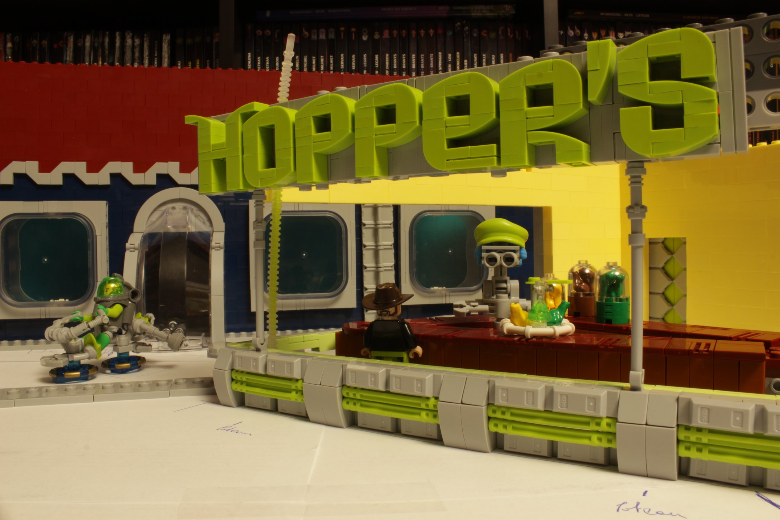
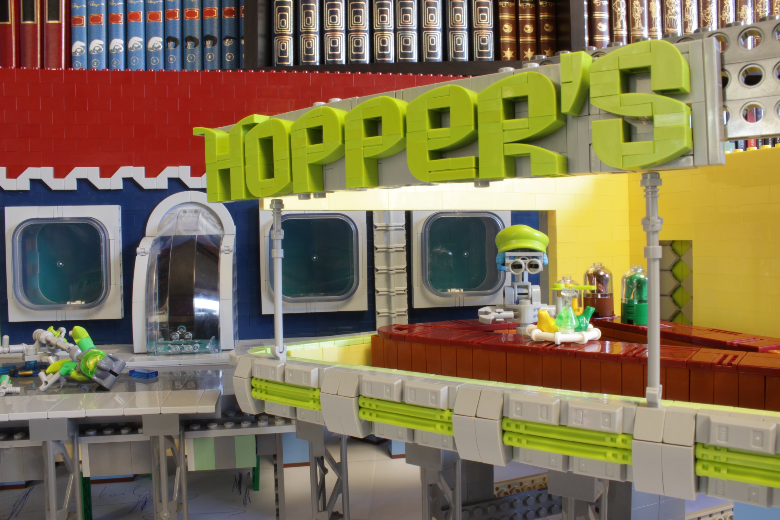
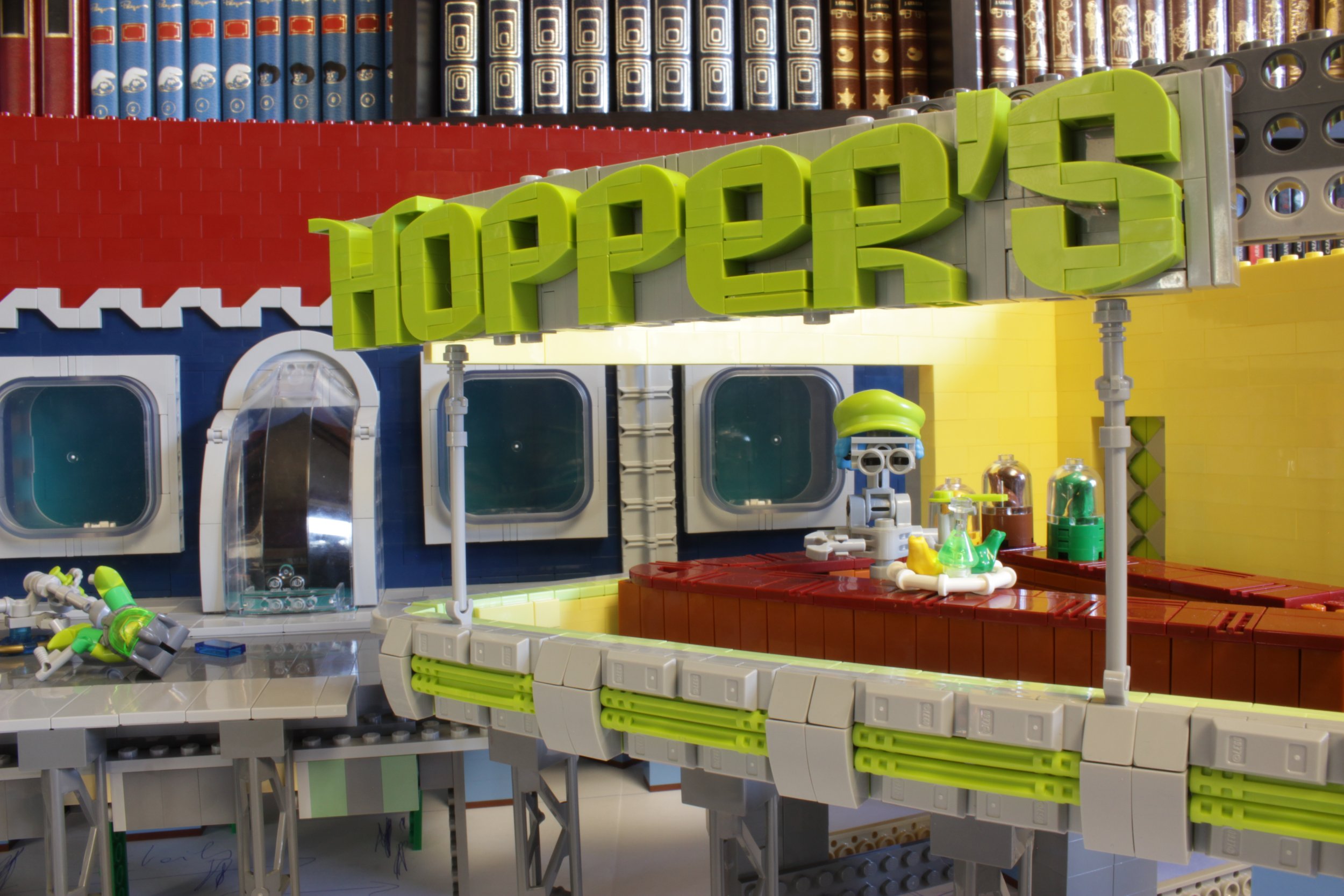
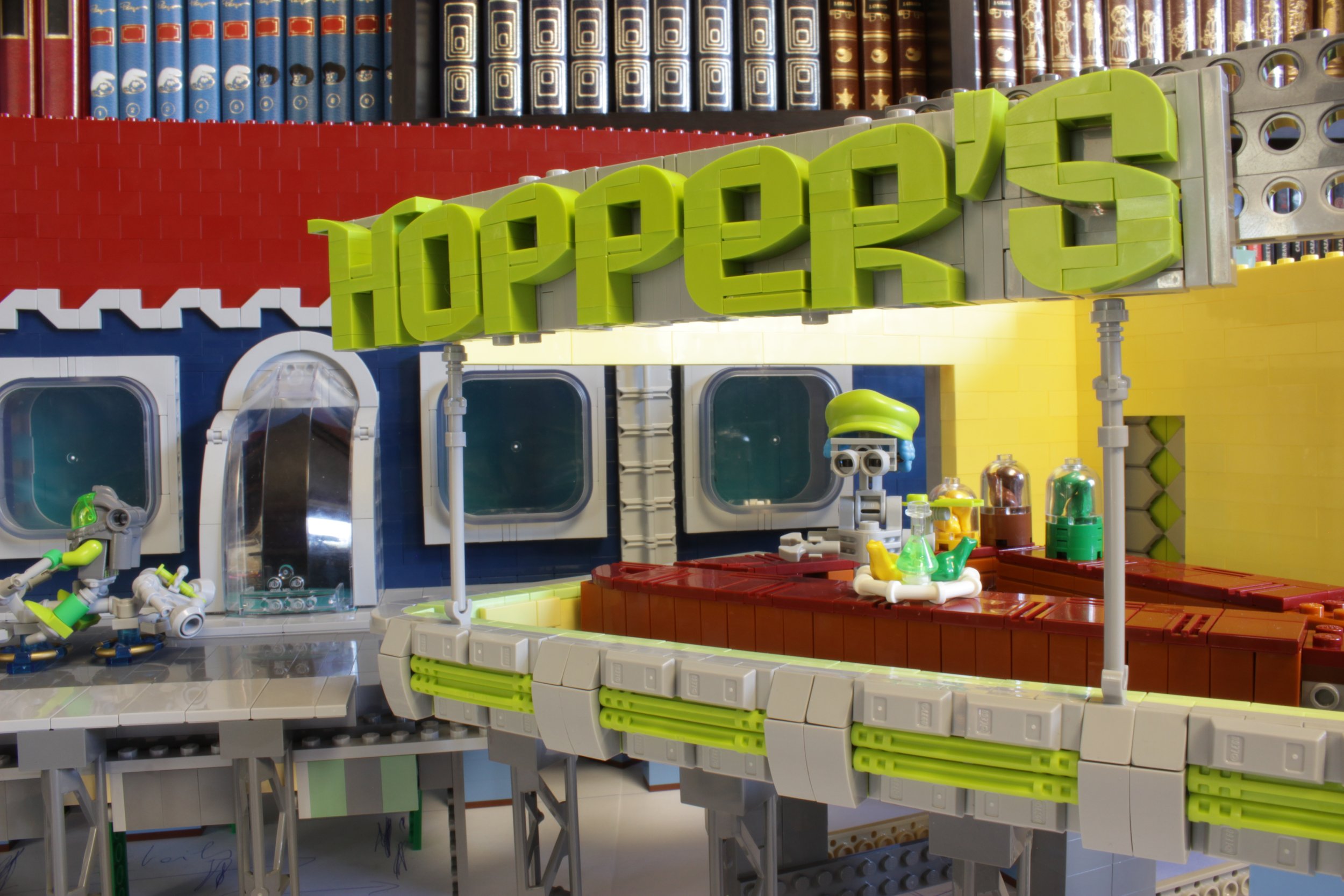
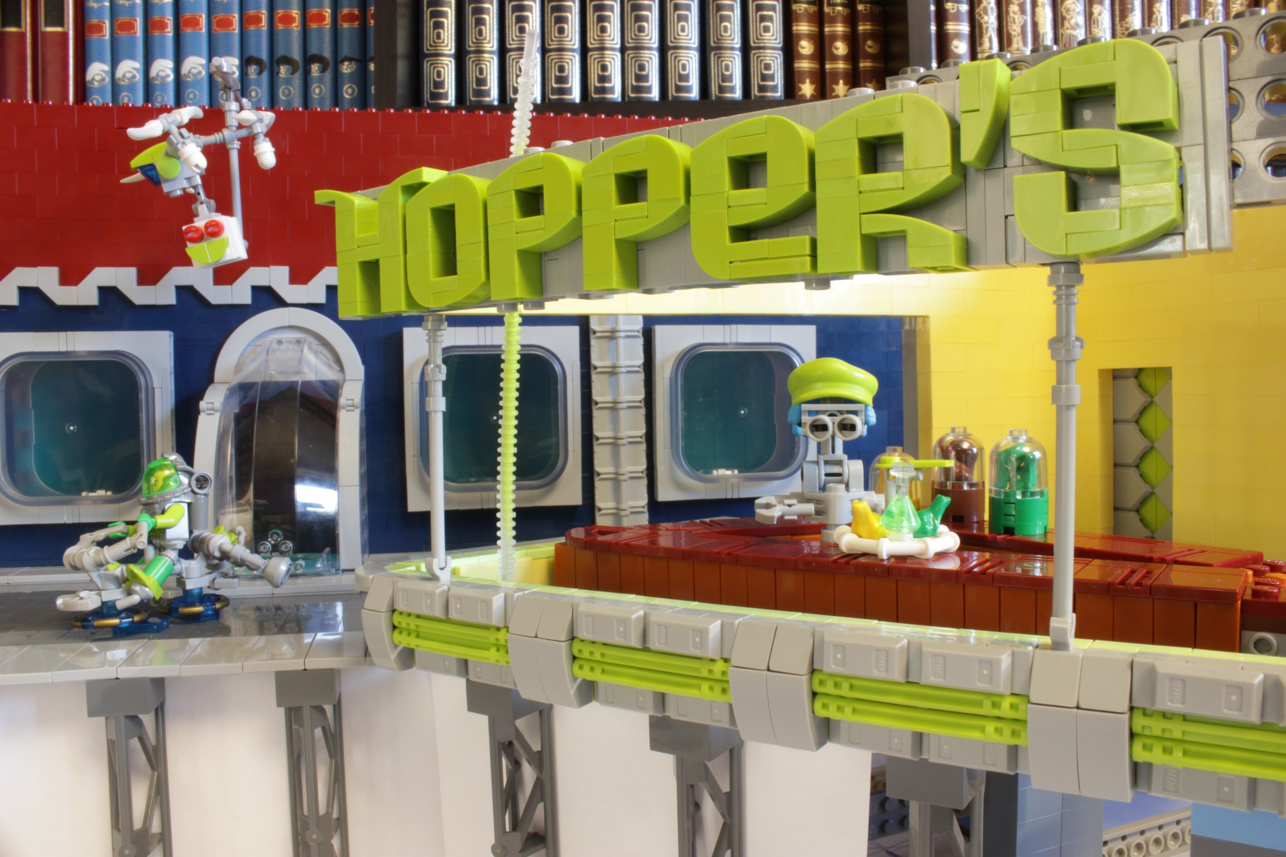
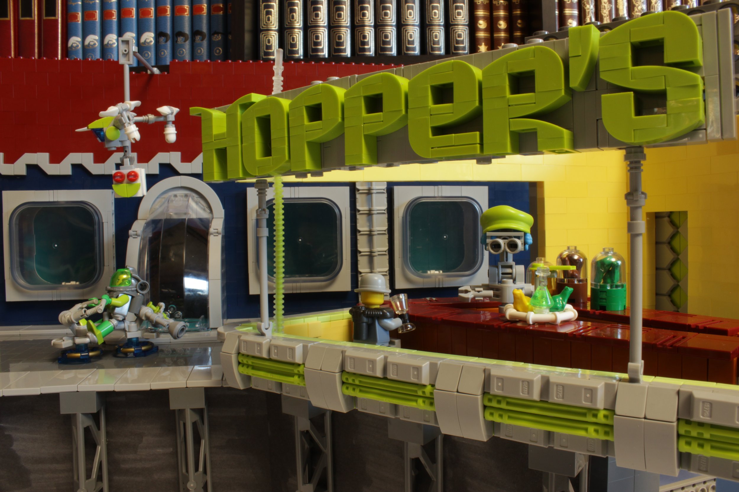
Hopper’s Nighthawks: Updating a Classic
/In December 2021 and January 2022, the Space Jam contest was held on Flickr. With my friends Lokiloki, BobDeQuatre and F@bz, we formed a team to participate in the collaborative challenge whose main goal was to invent a Sci-Fi corporation.
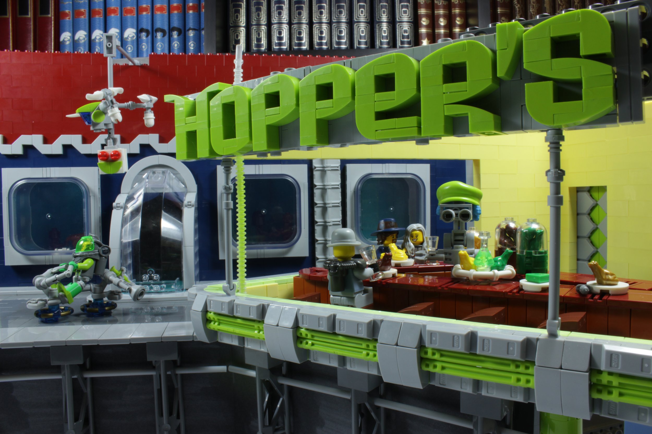
We had the idea to create a corporation around the breeding and raising of frogs until their consumption in a chain of restaurants. The full story of Hopper’s Corp and all the MOCs can be found following this link. The whole industrial frog-farm-to-table endeavor gave me the idea to embark on an artistic classic; that of diverting the famous painting of Edward Hopper. I will describe in this article all the steps on how this MOC came to be.
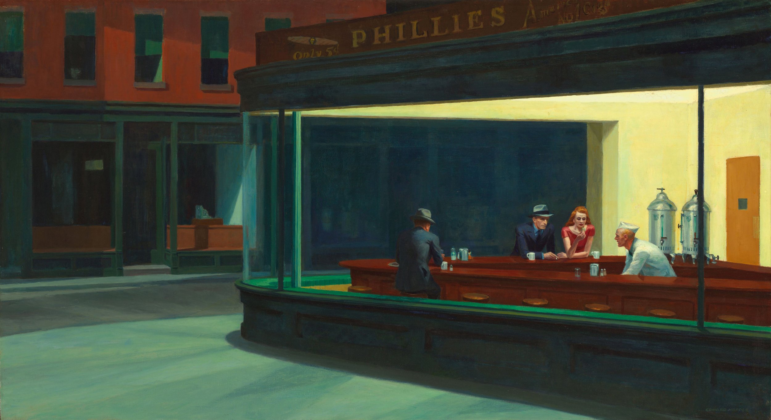
Nighhawks is one of the best-known paintings from Edward Hopper, circa 1942. I like the atmosphere that emerges from this painting, with the particular luminosity inside the restaurant.
Image via Wikipedia
Numerous Nighthawks
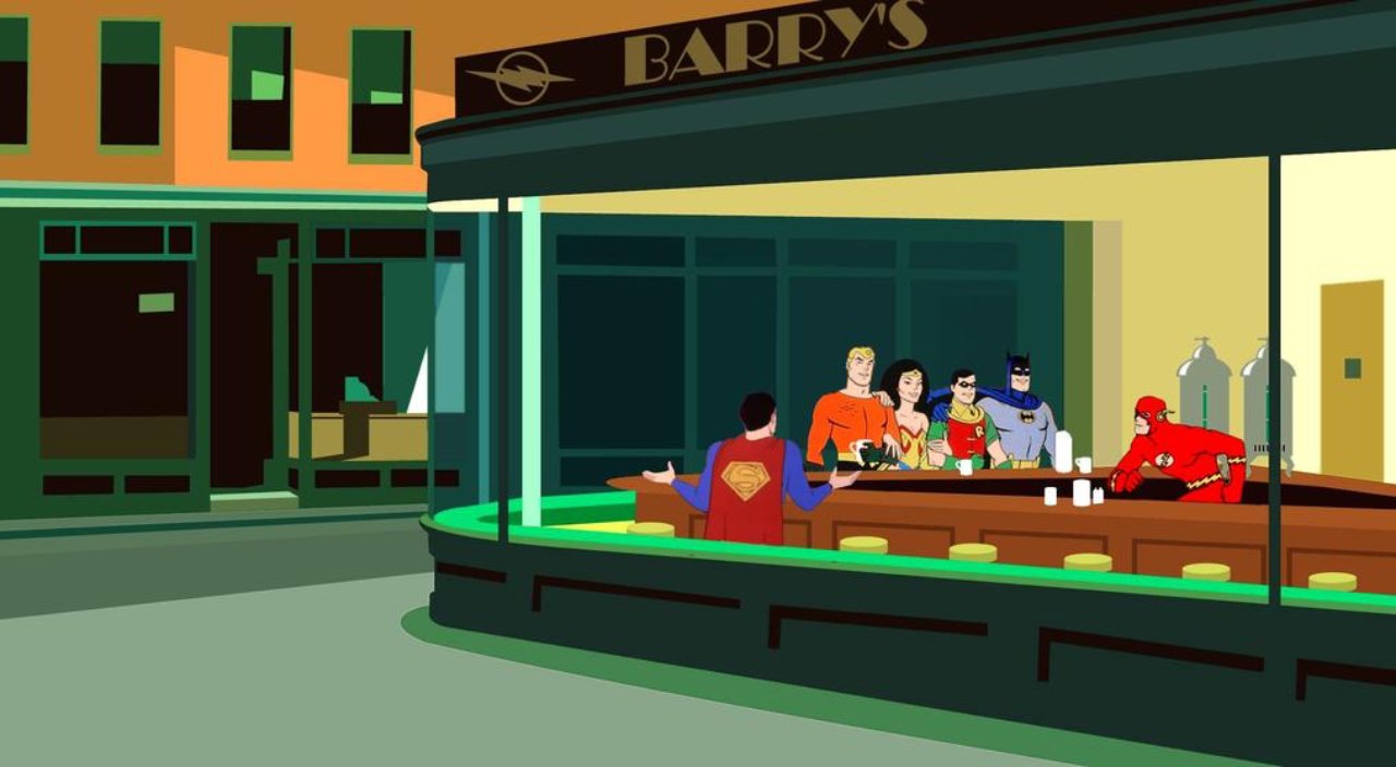
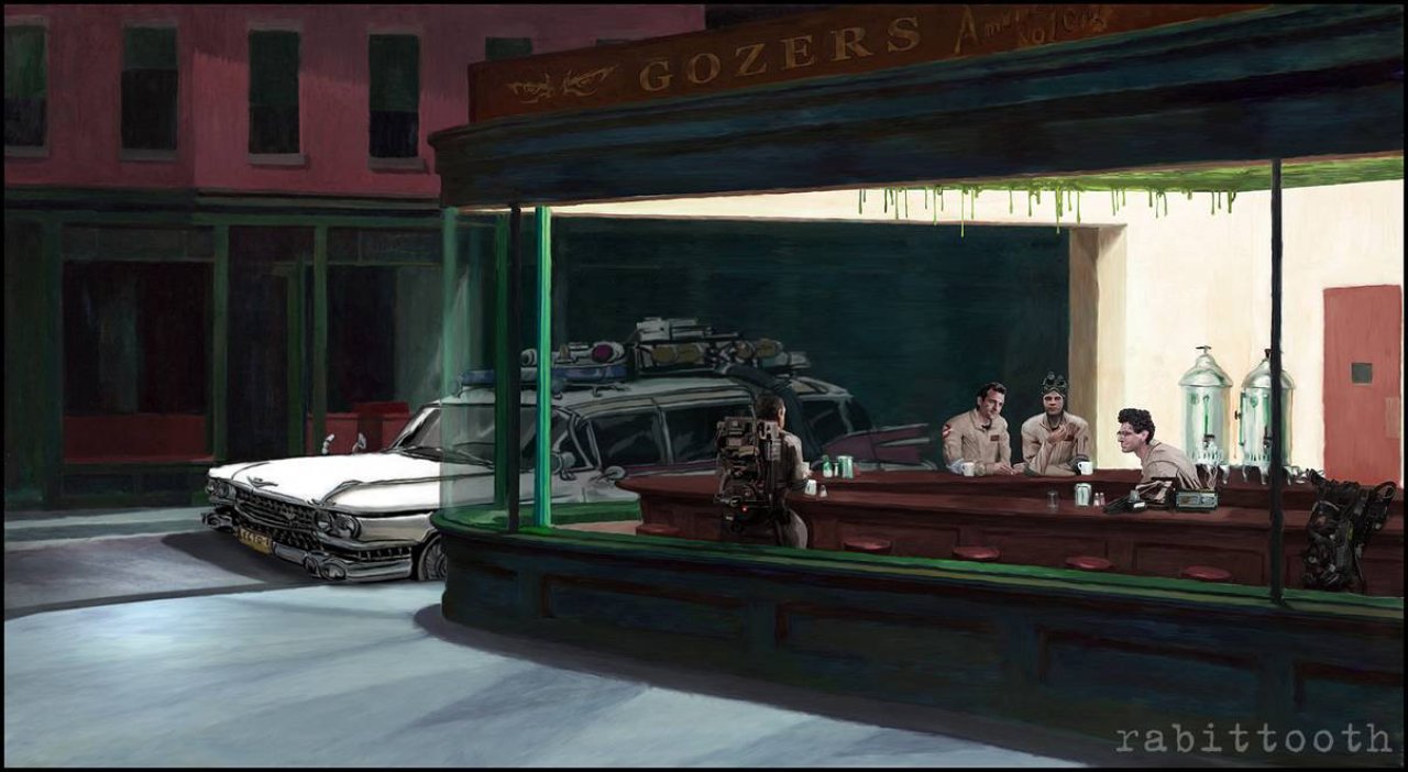
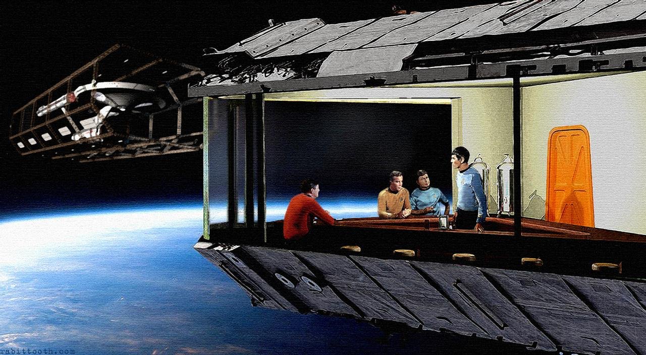
The Nighhawks painting has given rise to many different versions inspired by it. You will find here some examples with Watchmen, DC Superheroes, My Little Pony, Ghostbusters, The Simpsons, Star Trek as well as a version of one of my main sources of inspiration, Moebius. It was now time for a LEGO Sci-Fi version!
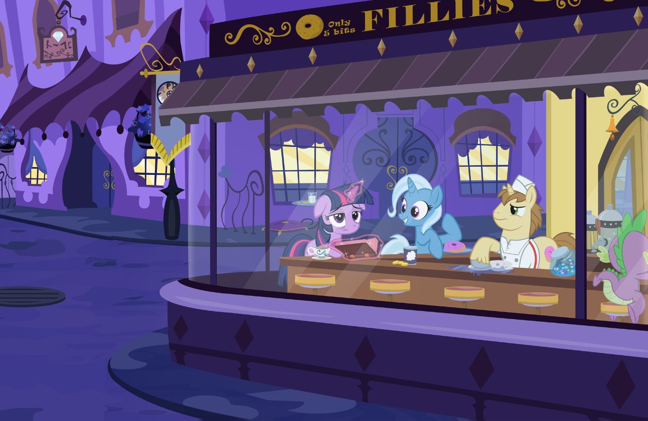
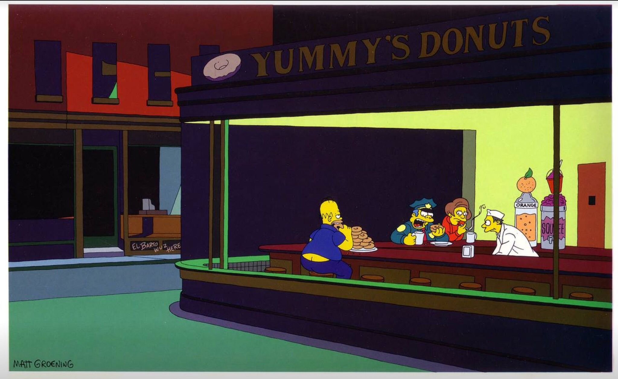
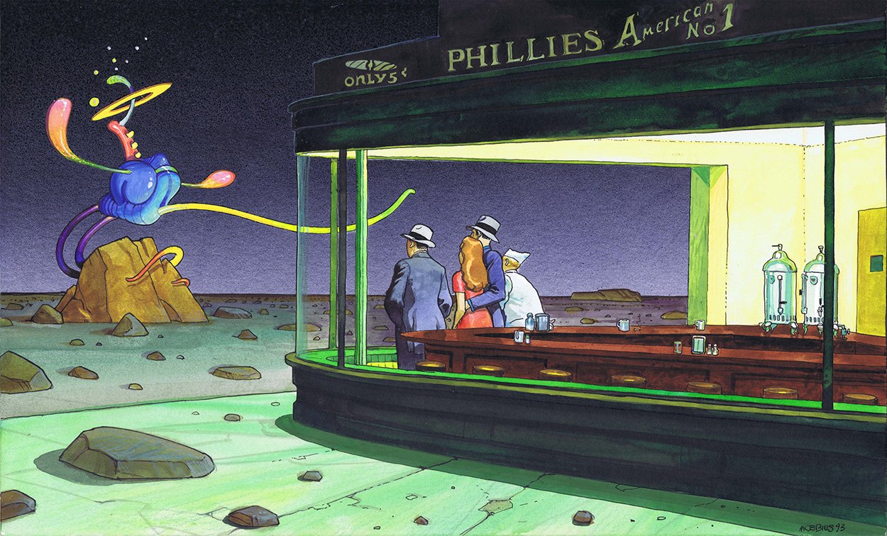
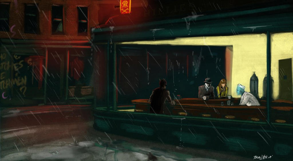
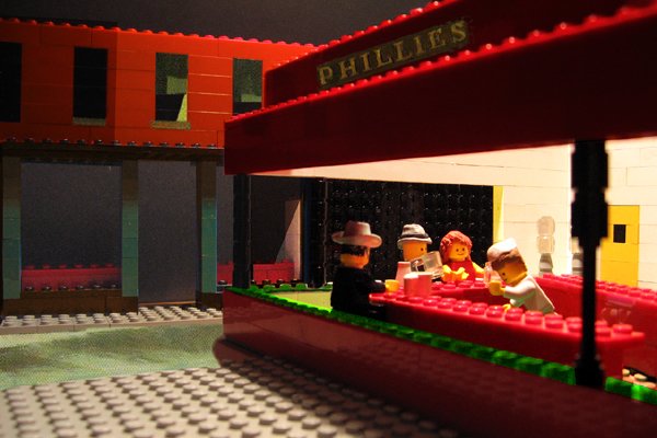
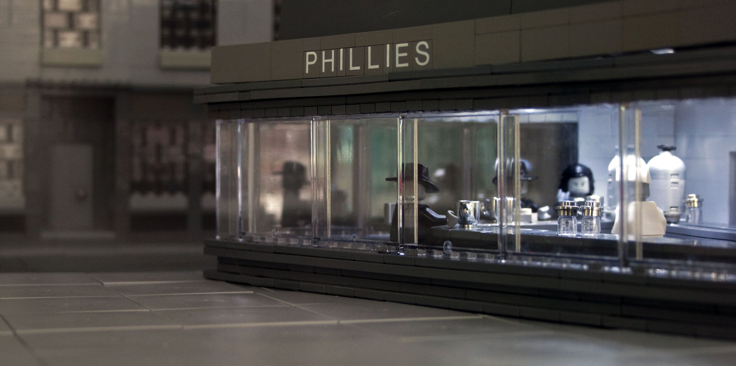
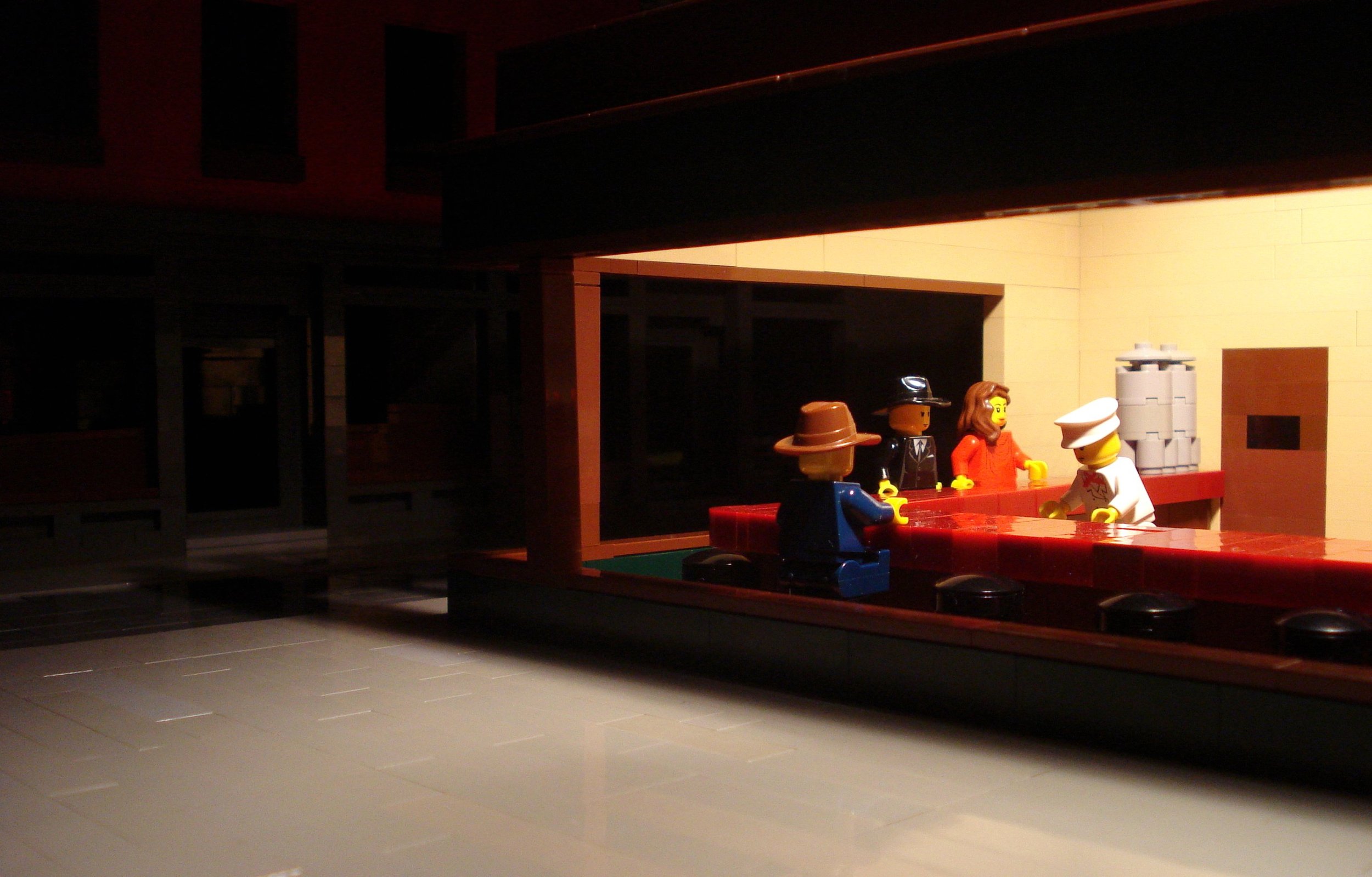
The exercise had already been done by some creators like Ryan Howerter, Alex Eylar, or Marco Pece who had created LEGO versions of the Nighthawks painting.
I always start with a sketch. It's not for the quality of the drawing—I'm not that good of a sketch artist. This one is just a base of reflection, a kind of guideline where the different ideas are going to emerge in a raw way. This one has importance in my creation process because it serves as a reference throughout the building process since I’ve already sketched out the details.
Perfecting the Perspective
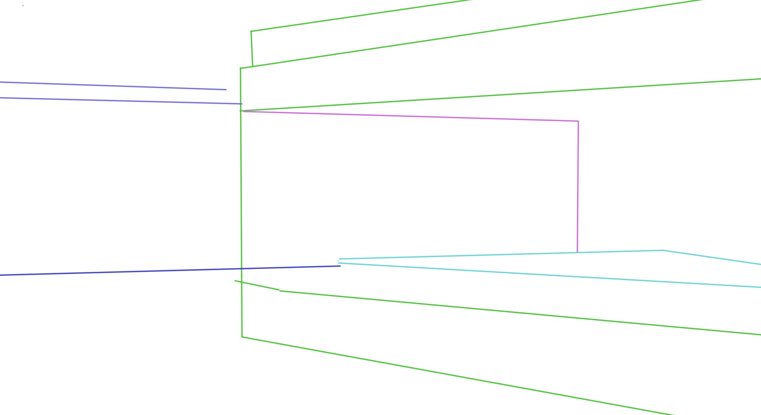
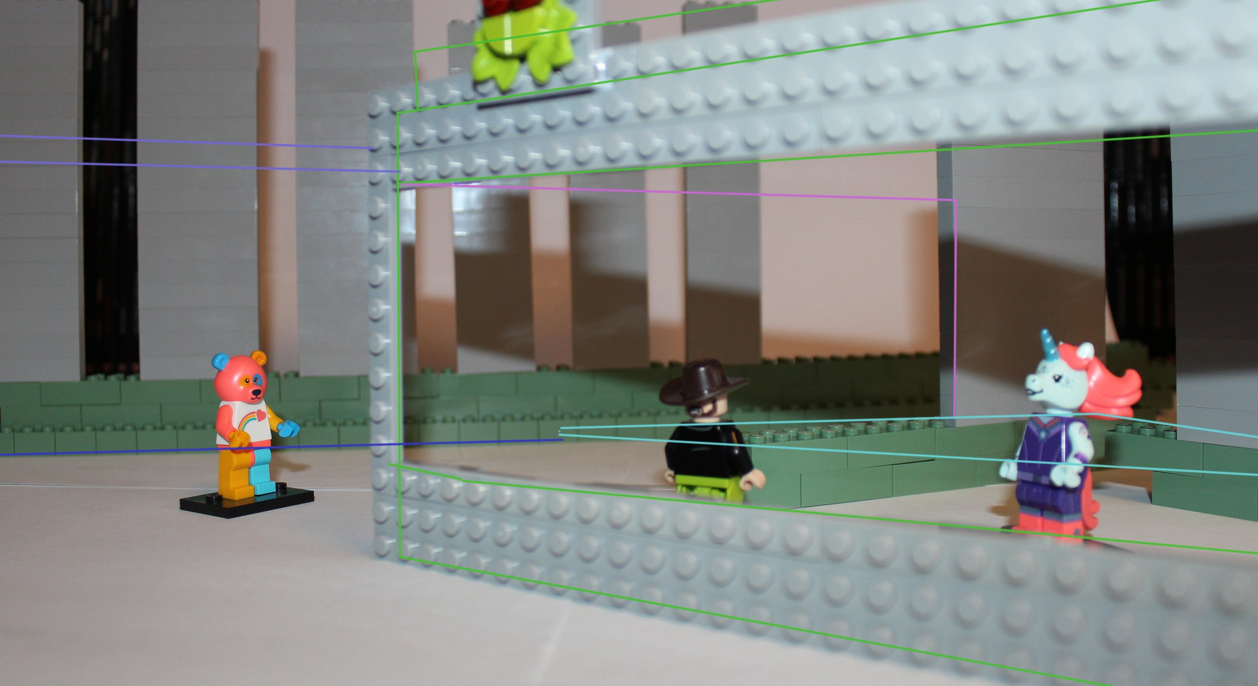
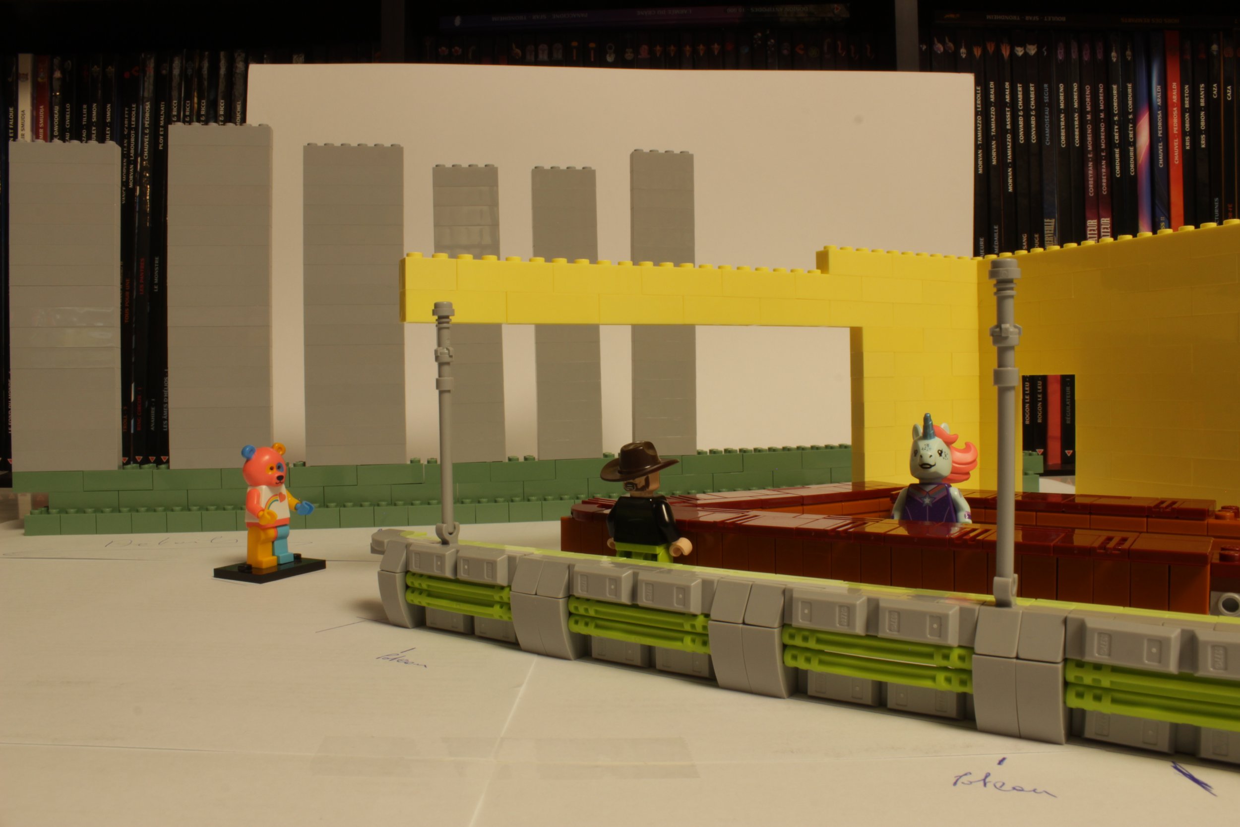
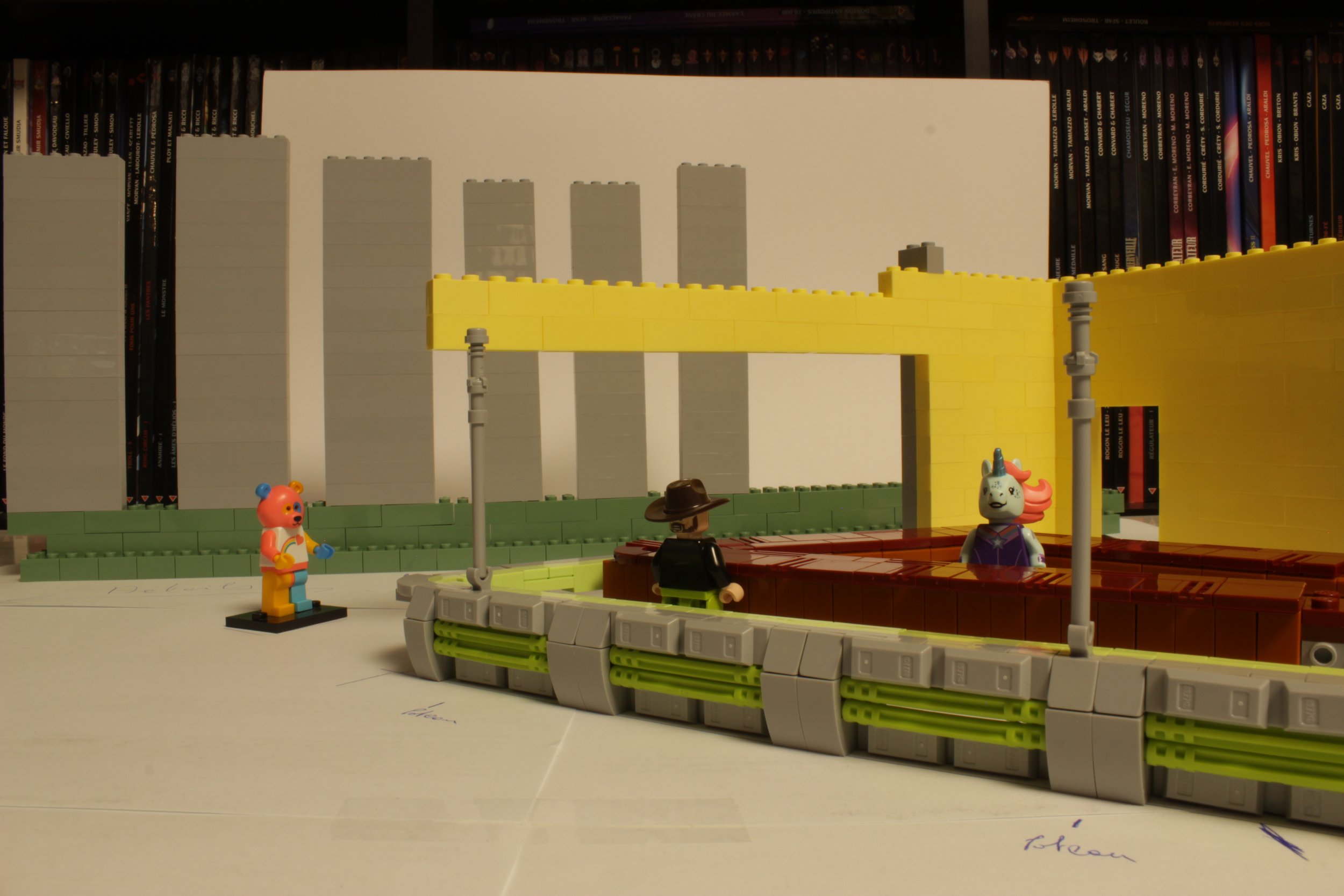
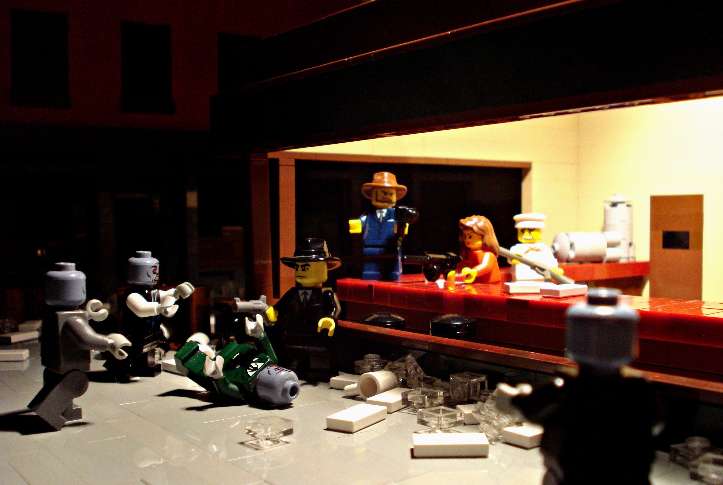
The first step was to prepare the scene. It was necessary to trace the characteristic lines of the original painting and its vanishing lines. The objective is to place the elements in a precise position and to match the placement and the framing of the camera to match the original painting’s perspective.
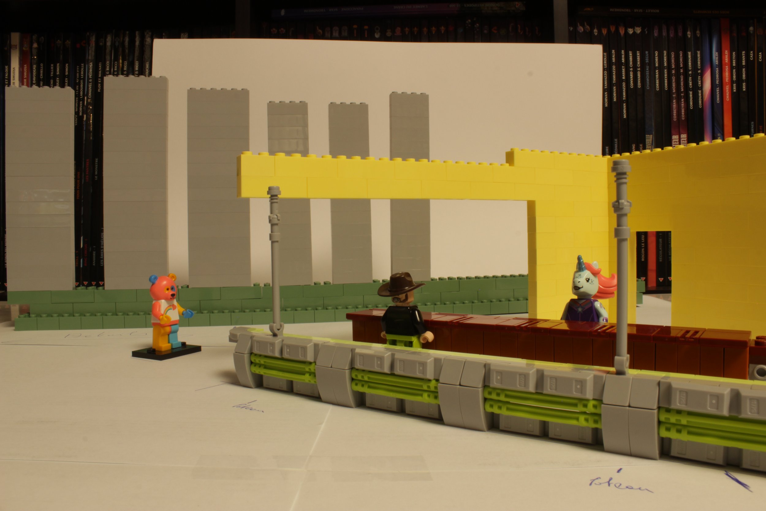
It took several attempts to place and size the different elements such as the storefront or the building in the back. The figures are used here to help understand the scale. In the next picture you can see how close the camera is to the scene which gives the picture an immersive feel. Once this position is found and the camera is set up, nothing should move until the end of the creation so the perspective is not lost.
I drew lines on the table to be sure to reposition the facades and characters in exactly the same place at each stage of progress.
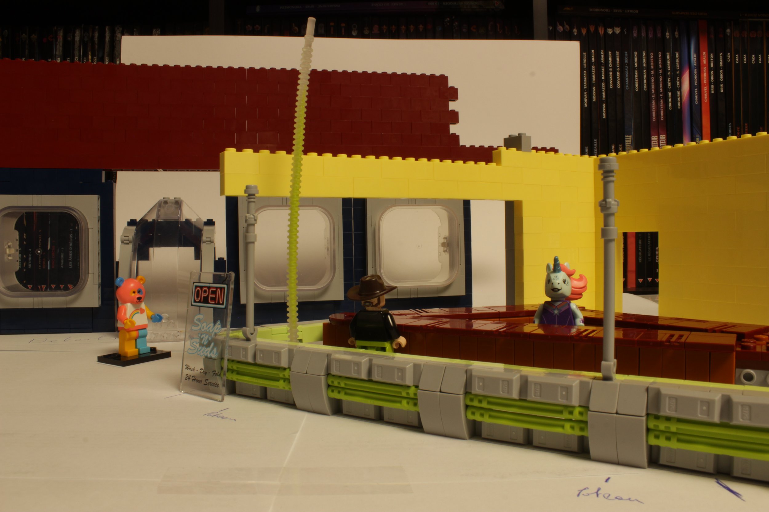
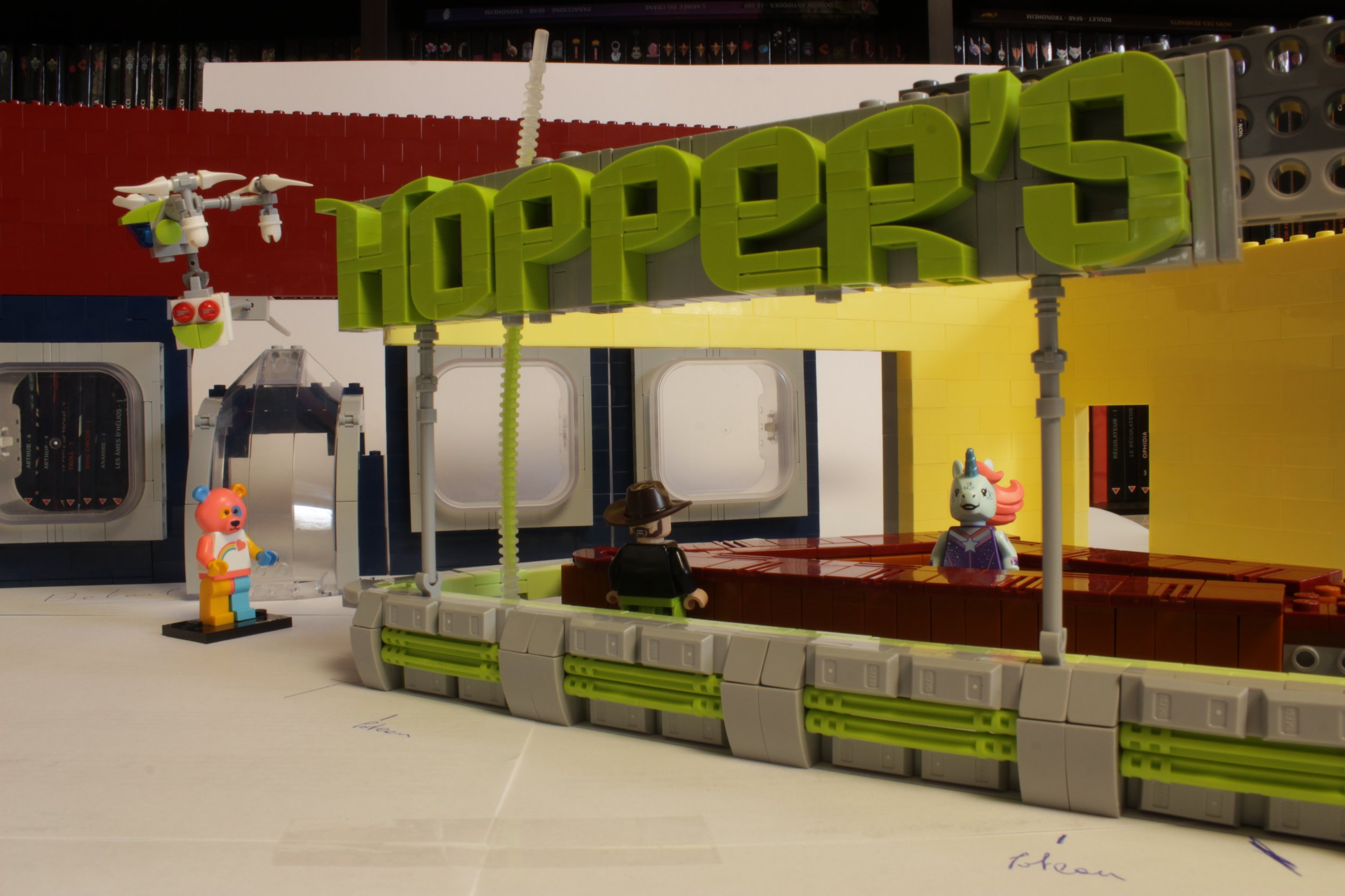
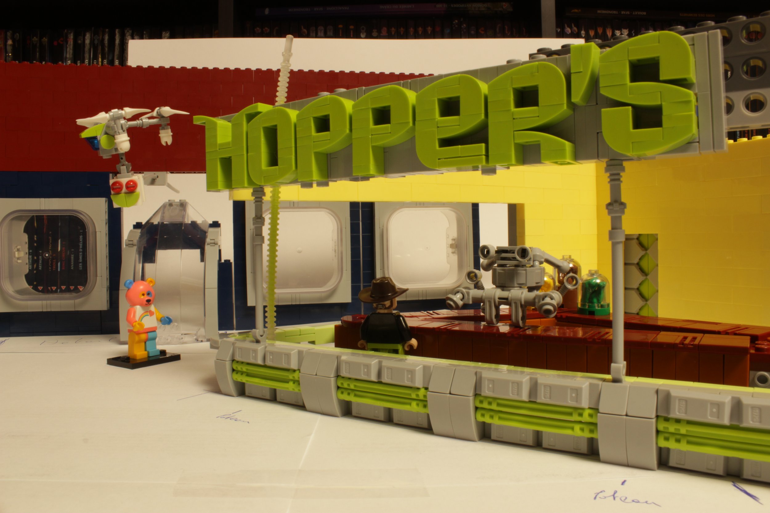
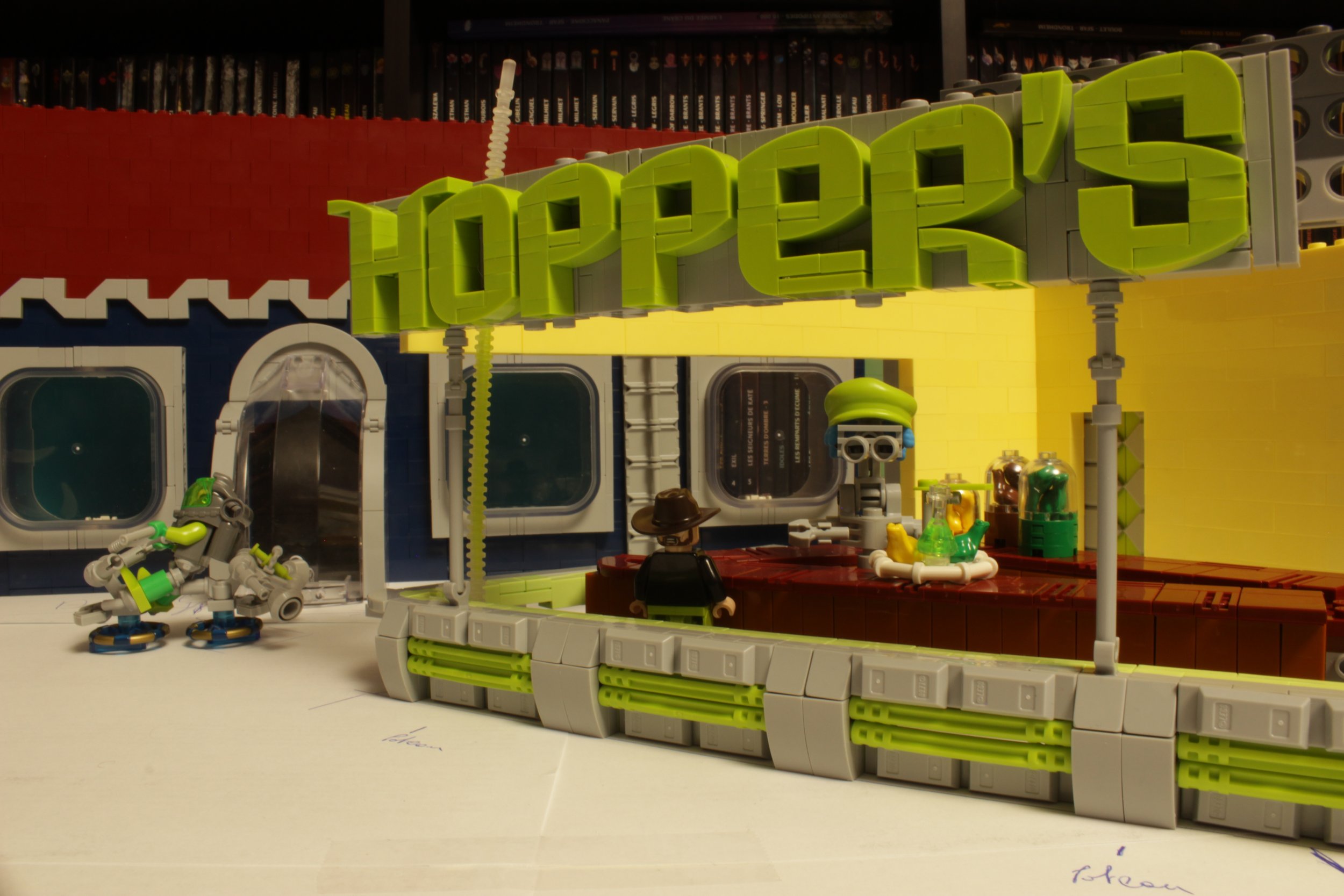
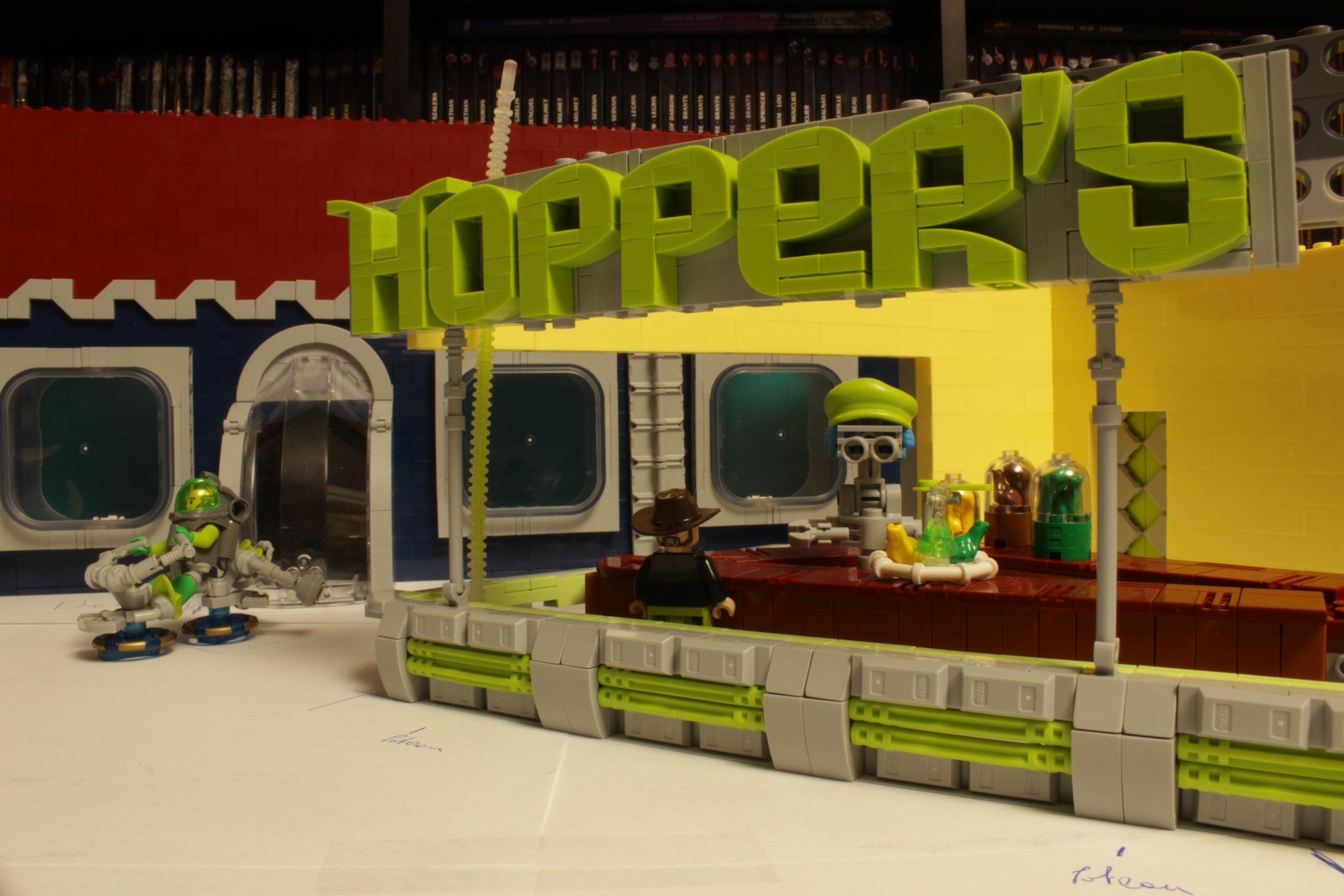
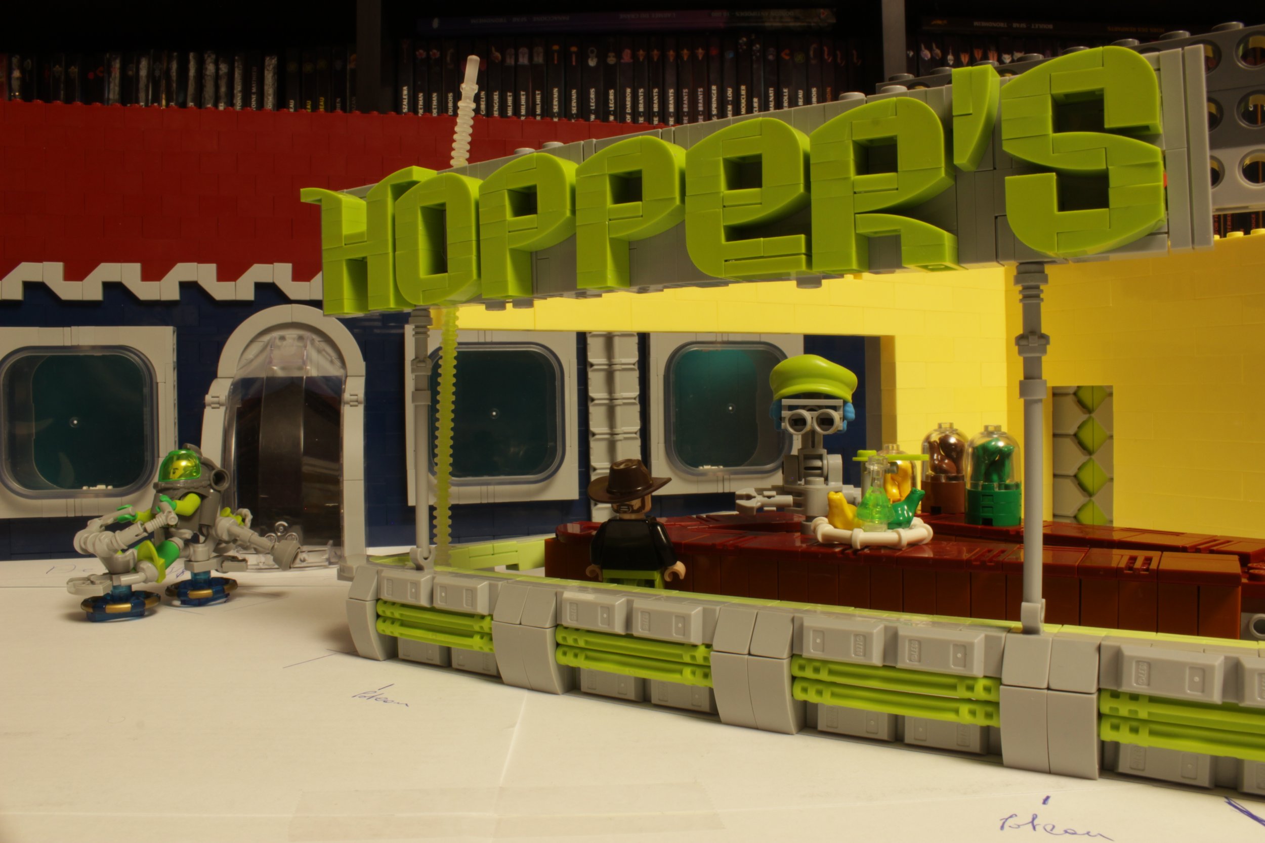
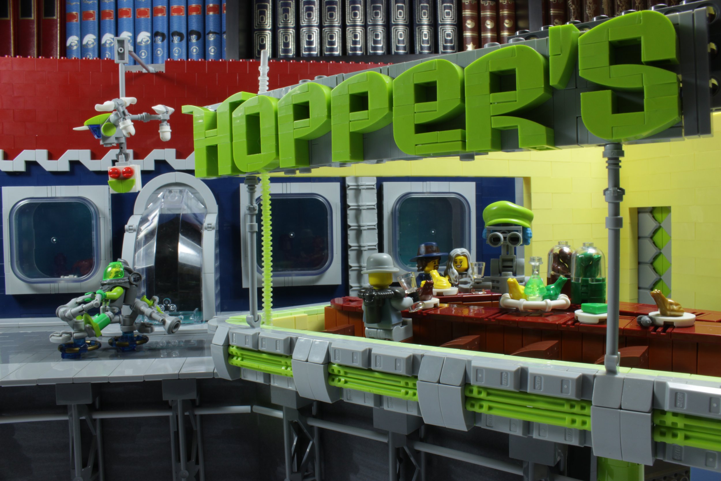
This is followed by a series of steps to achieve the various details of the scene. The facade of the restaurant, the back building, the interior of the restaurant, the protagonists with a robot waiter, a home delivery drone, and a speeder that passes in the street. You can see the progression of the MOC in the timelapse below.
Photography
Now it's time for the photography! For this, the principle of composite photography was used, which was previously explained and detailed by Ted in one of his fantastic articles.
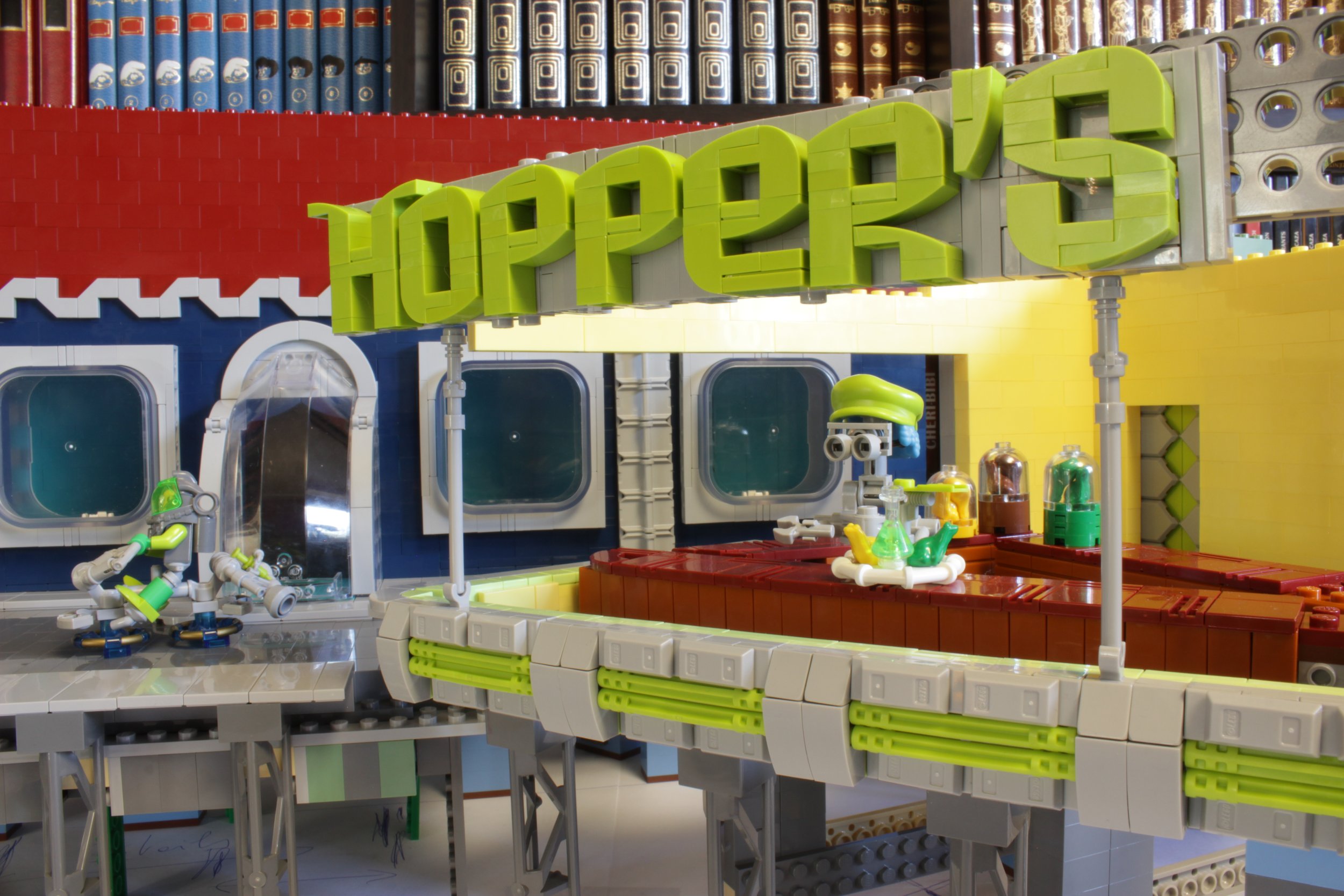
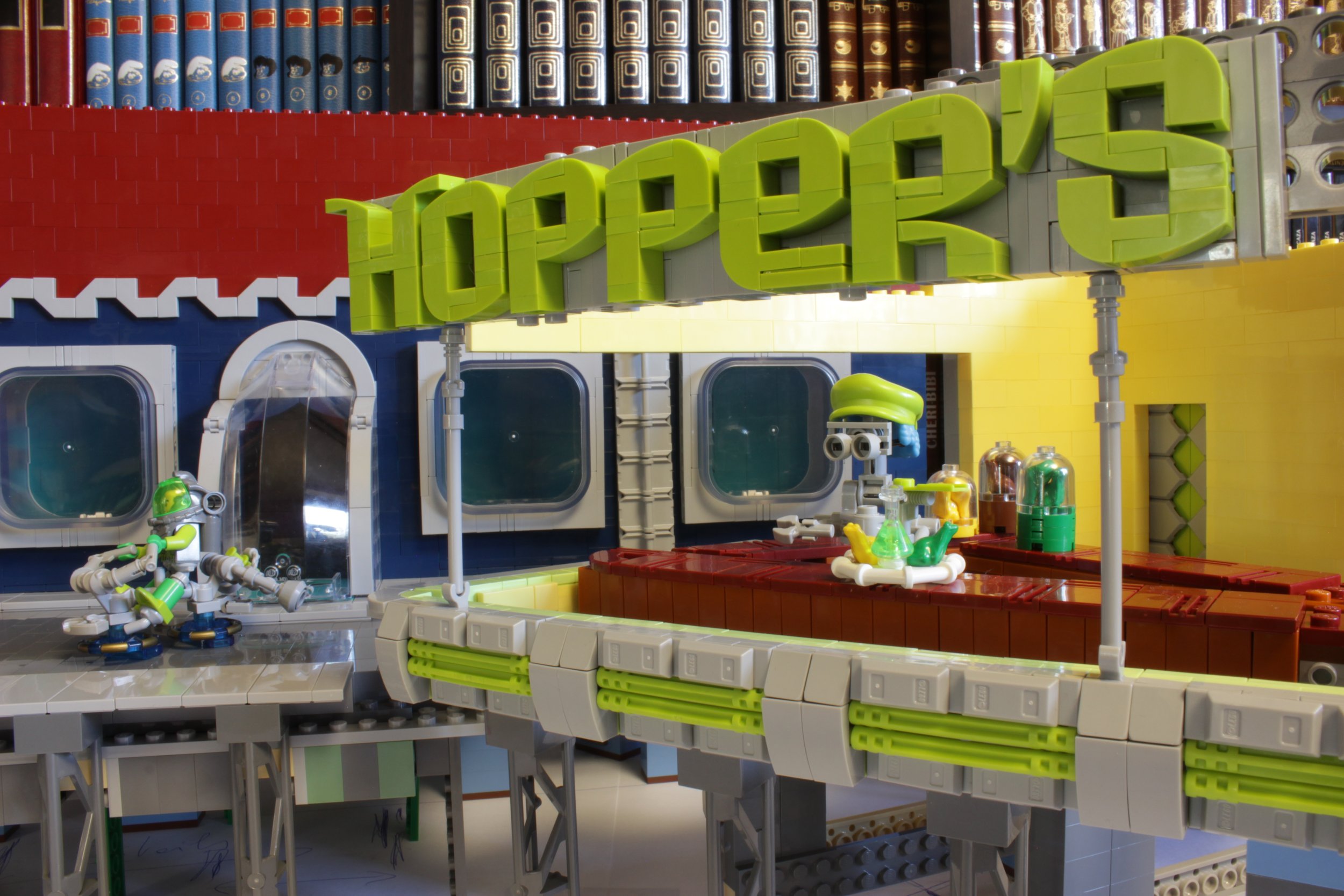
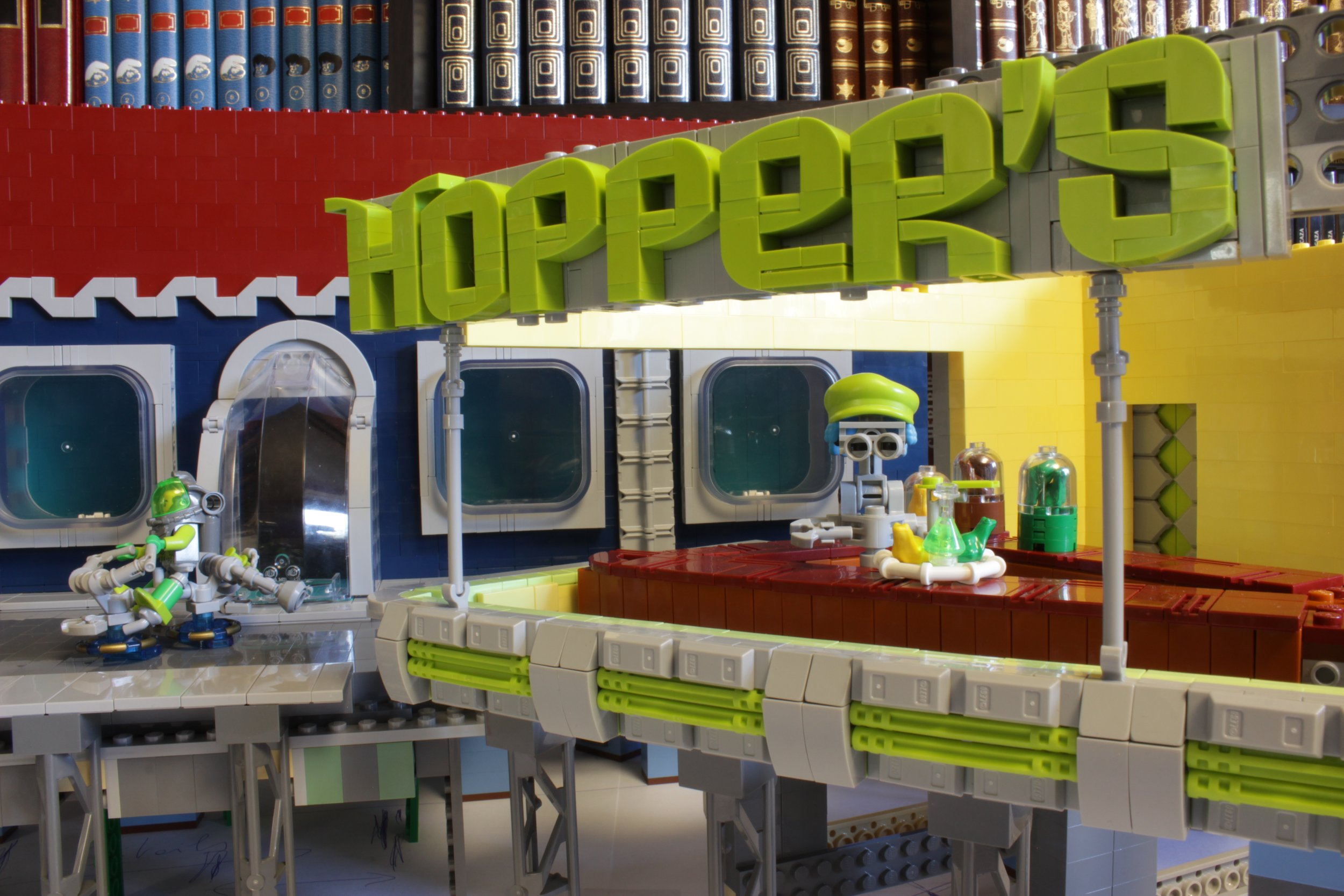
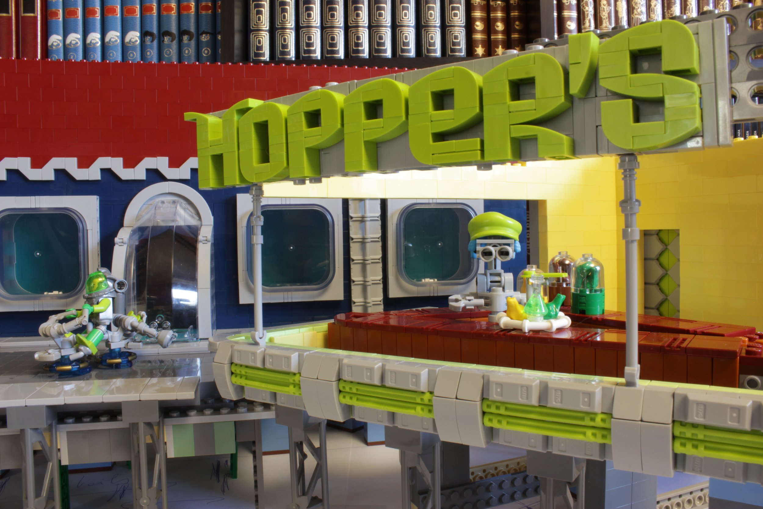
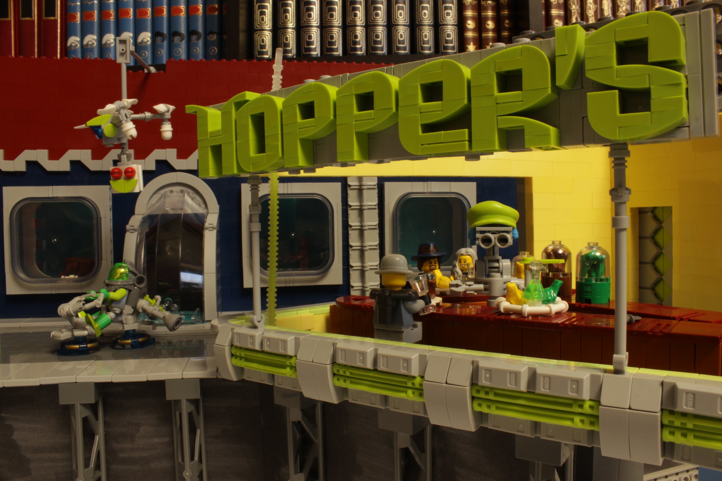
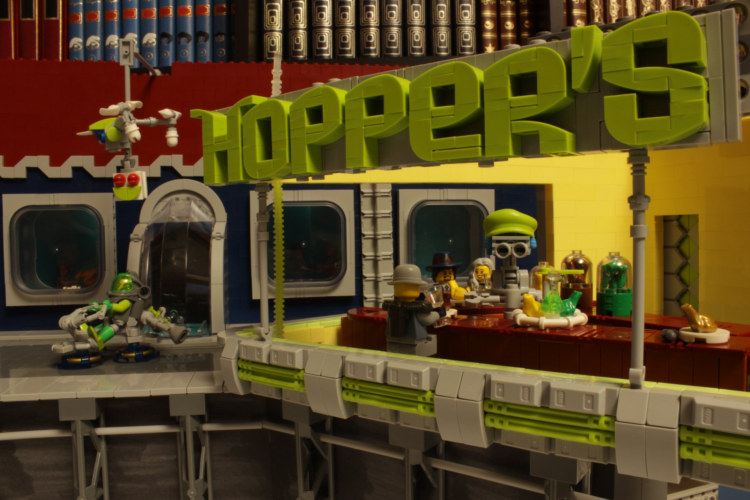
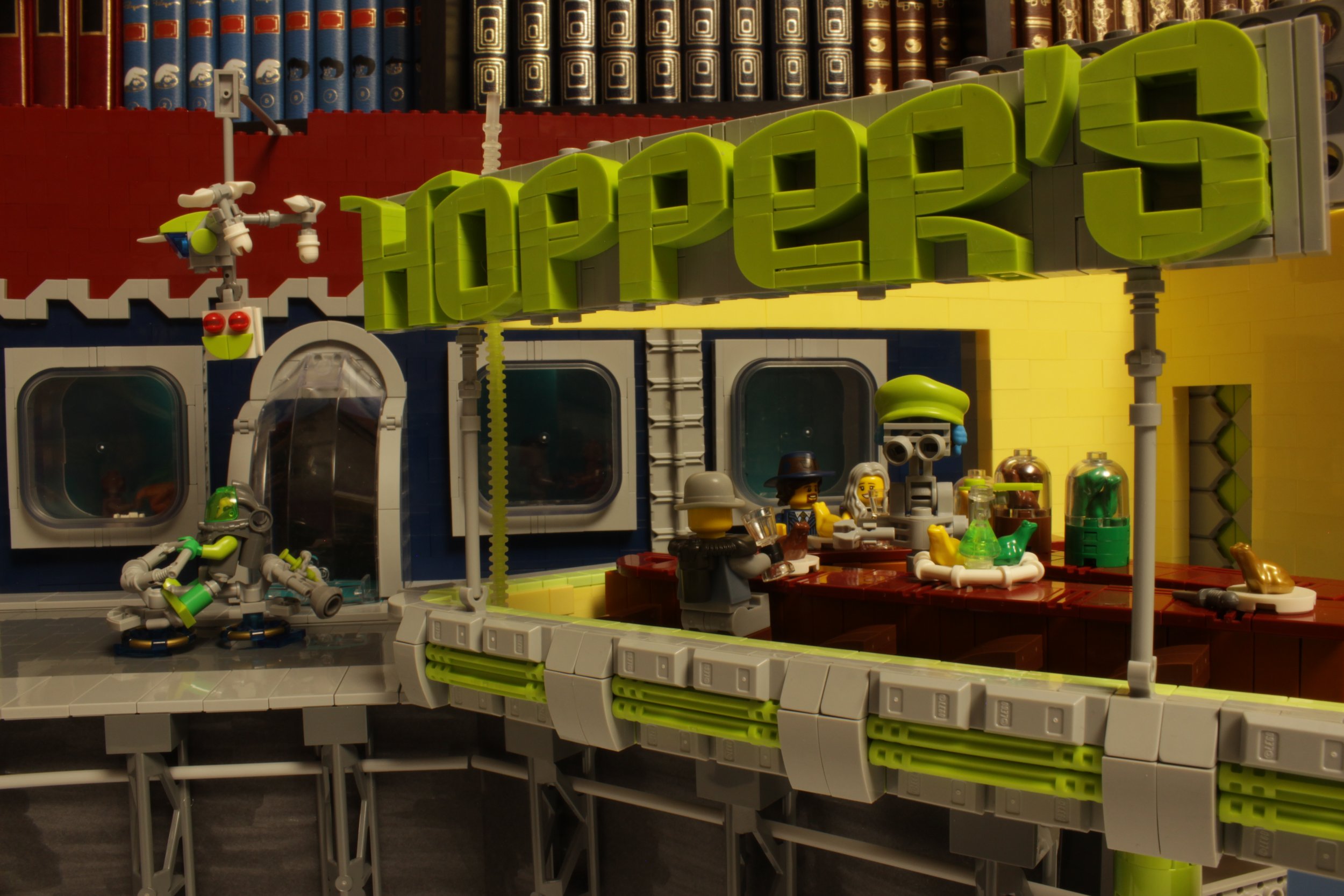
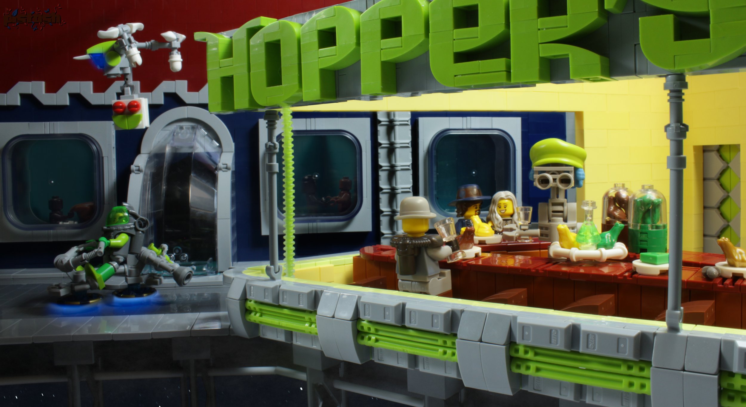
In this scene, the main goal was to superimpose different lighting to improve the legibility of certain details. For example, with the windows in the background, we can distinguish characters inside the buildings. These details were made visible in the final photo by superimposing a photo where the interior of the building was lit. It is the same for the specific brightness and luminosity inside the restaurant which required a specific focus on the lighting. I thank lokiloki and his knowledge in retouching for this step.
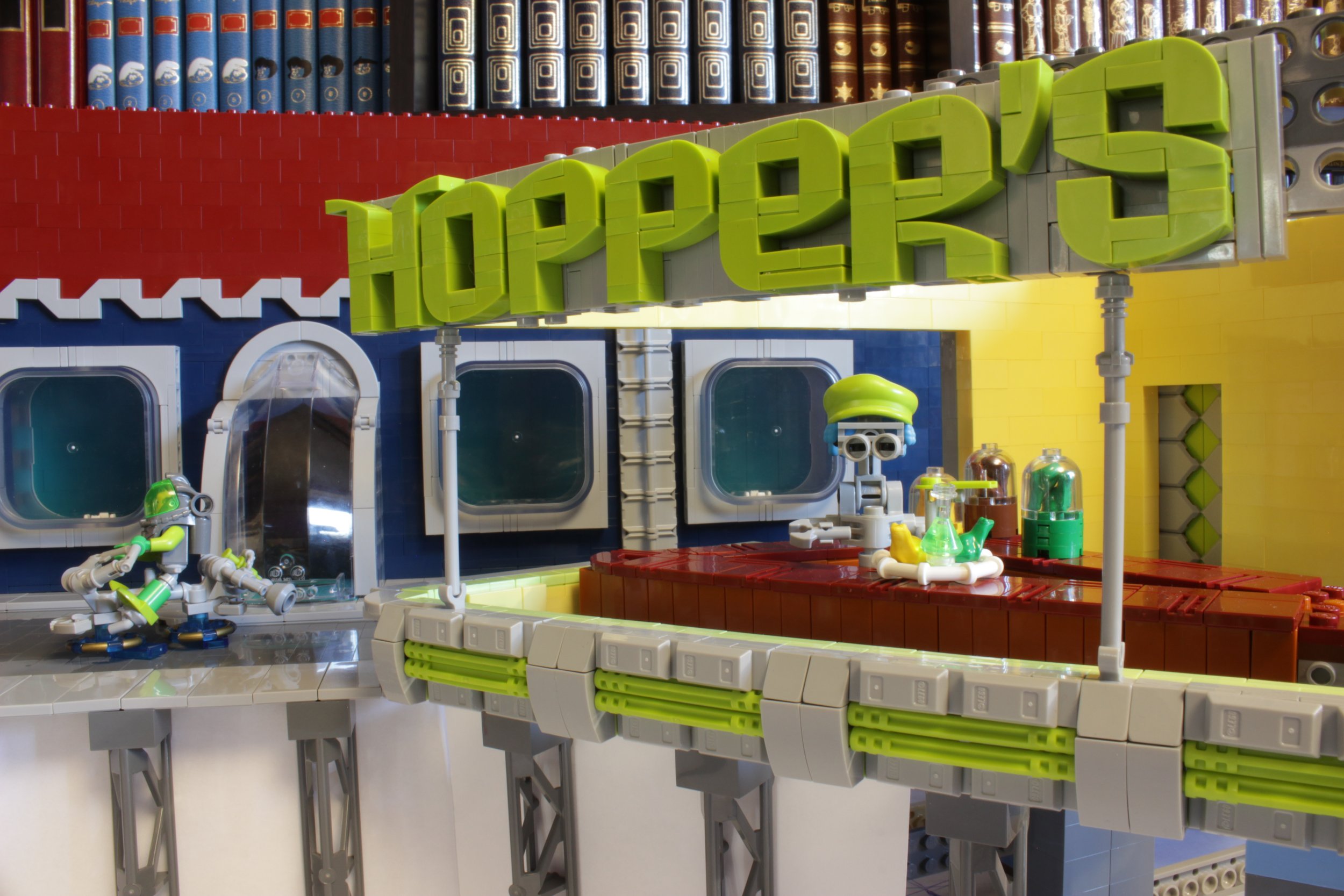
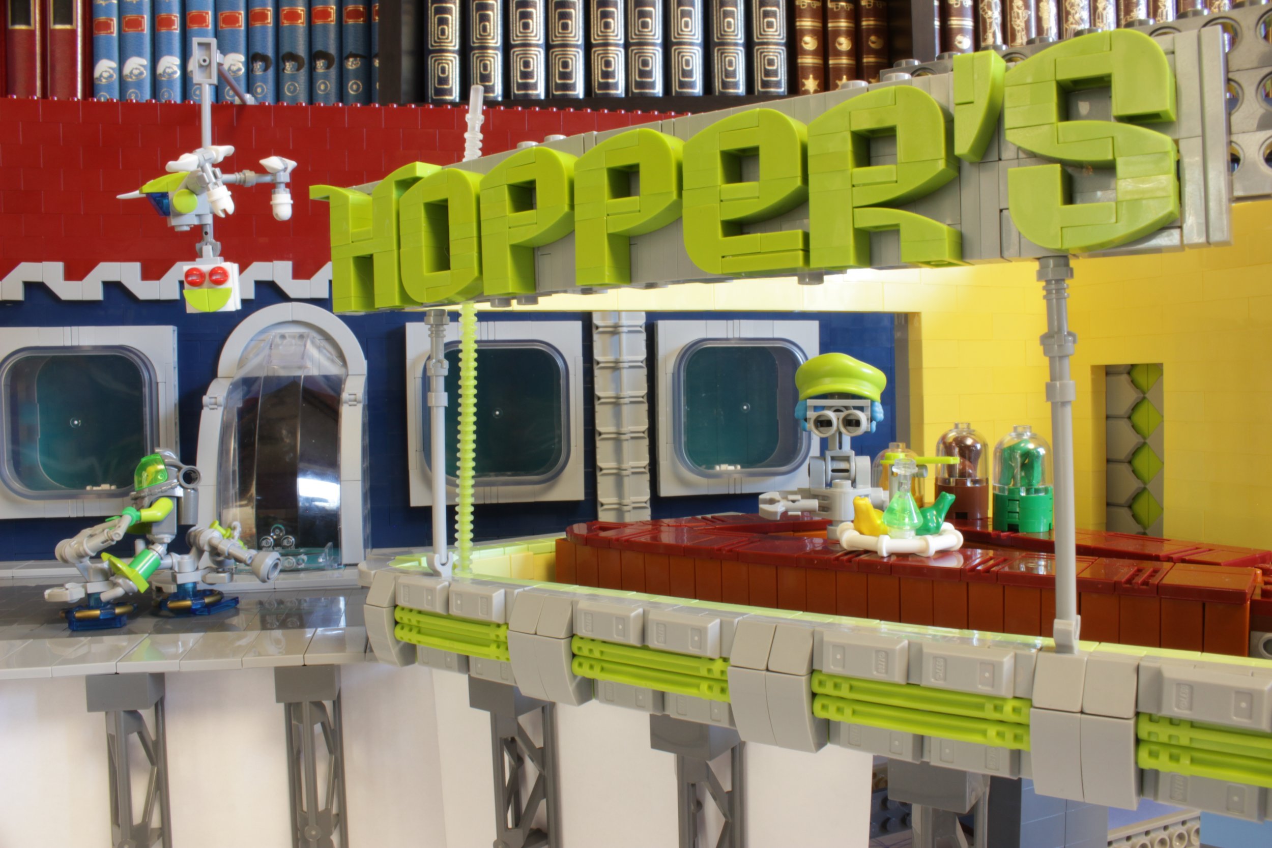
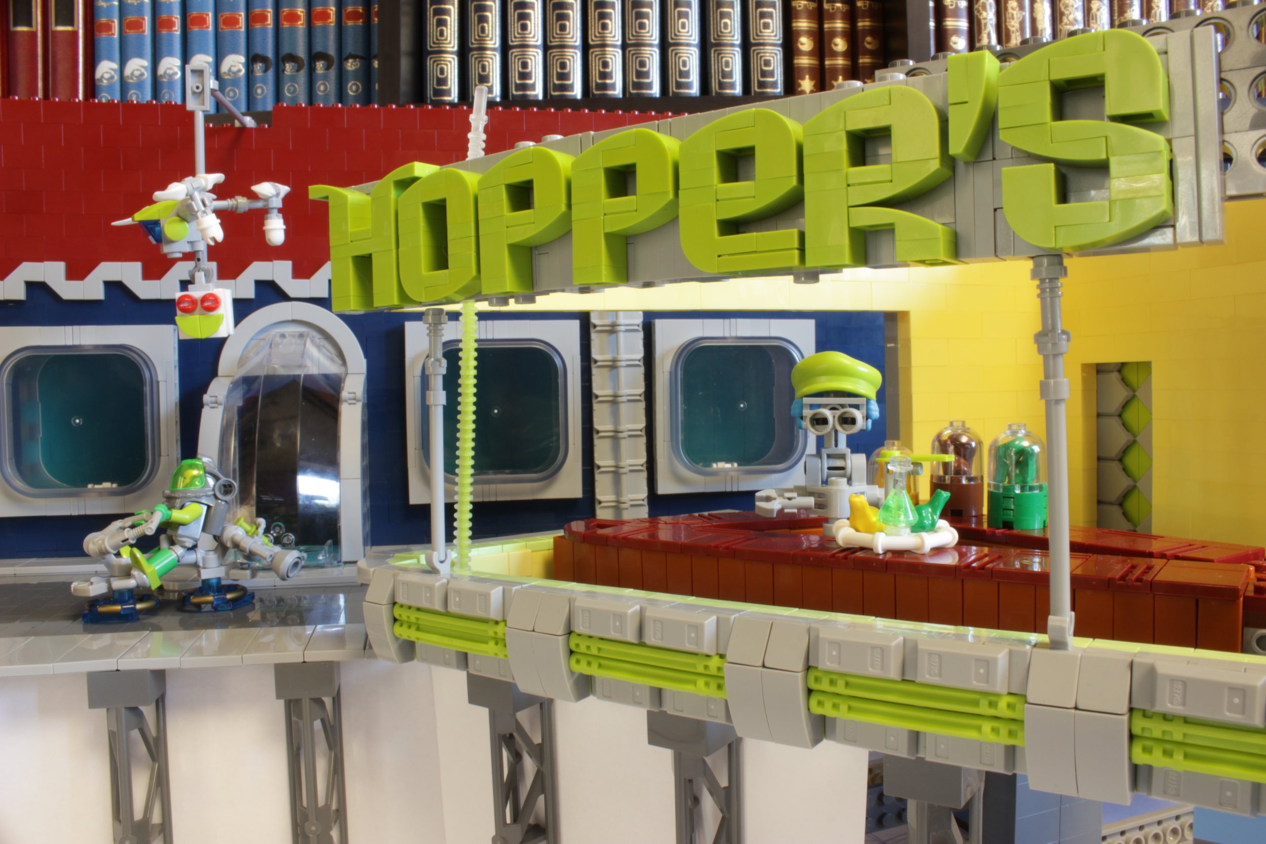
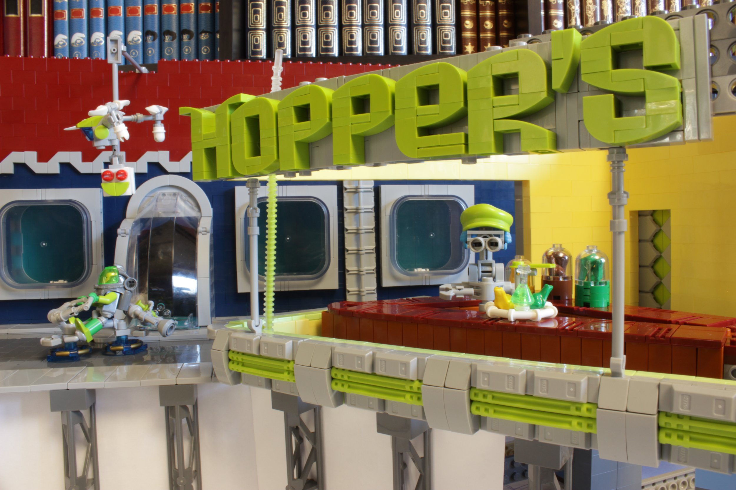
Another adjustment on the final image is to erase some structural details like the bar that keeps the drone in the air or some studs that remained apparent. It would have been possible to avoid these by working more on the SNOT techniques of the name of the restaurant, but the retouching allows here to save precious time (since this was for a contest, time was precious). You can see where the adjustments were made below.
Here is the final version of my creation superimposed on the painting Nighhawks by Hopper.
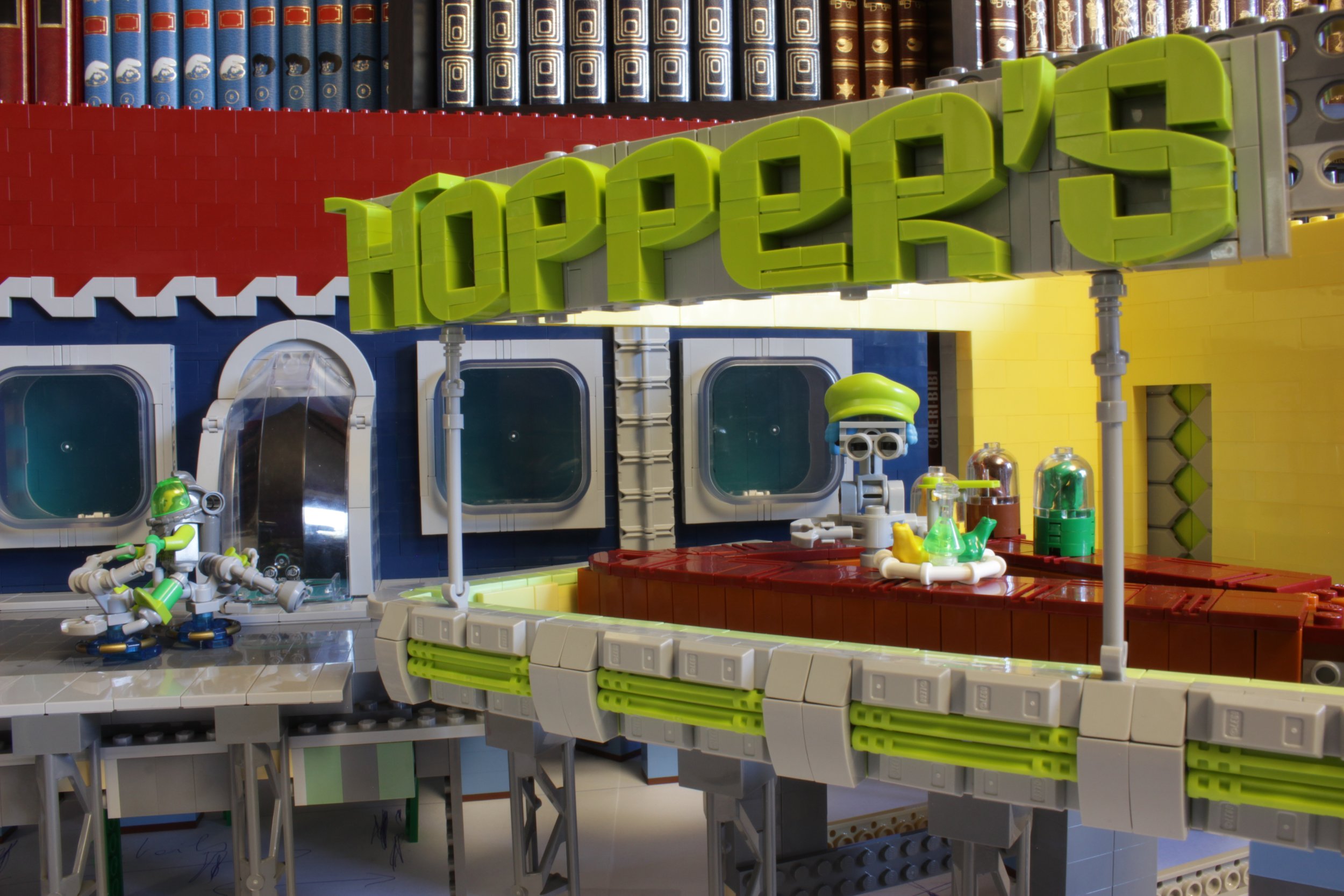
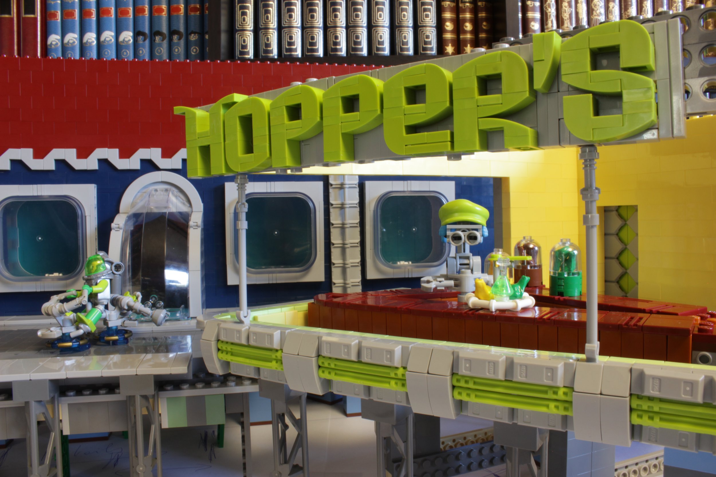
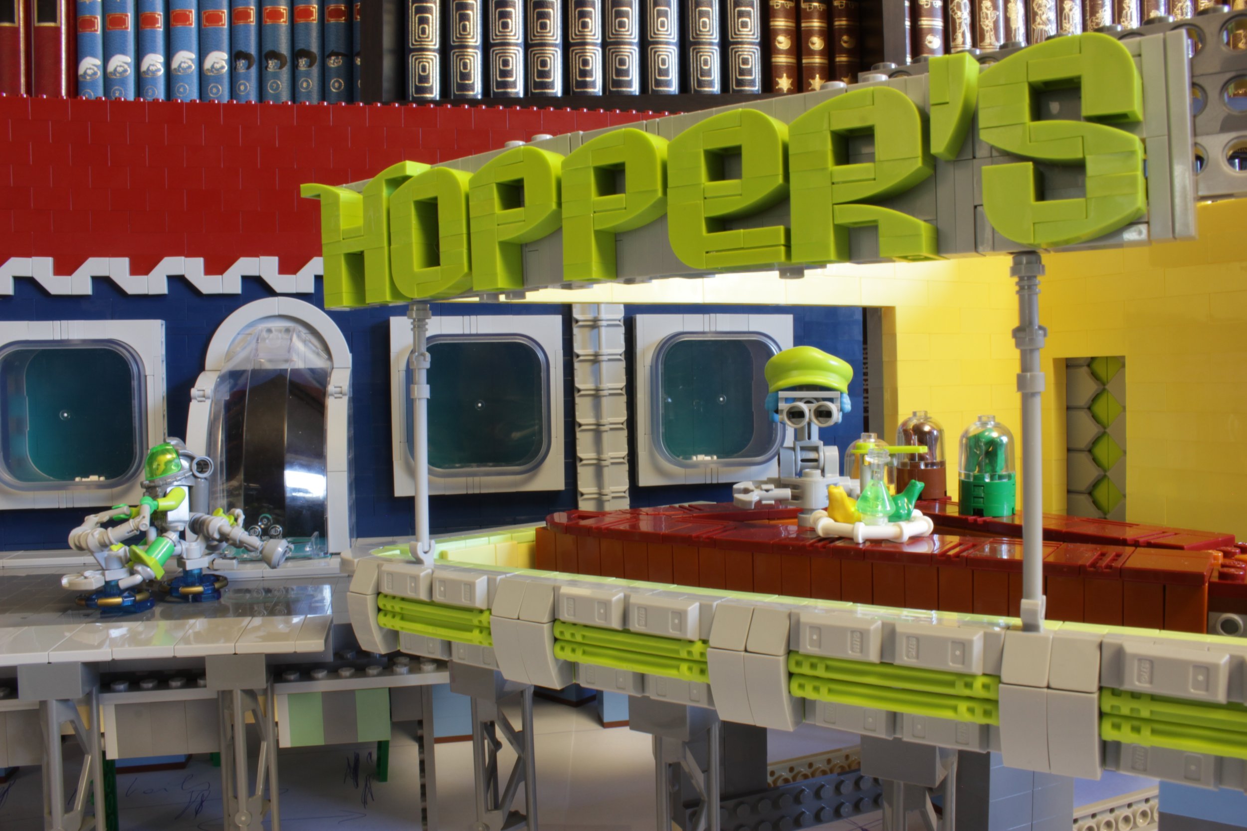
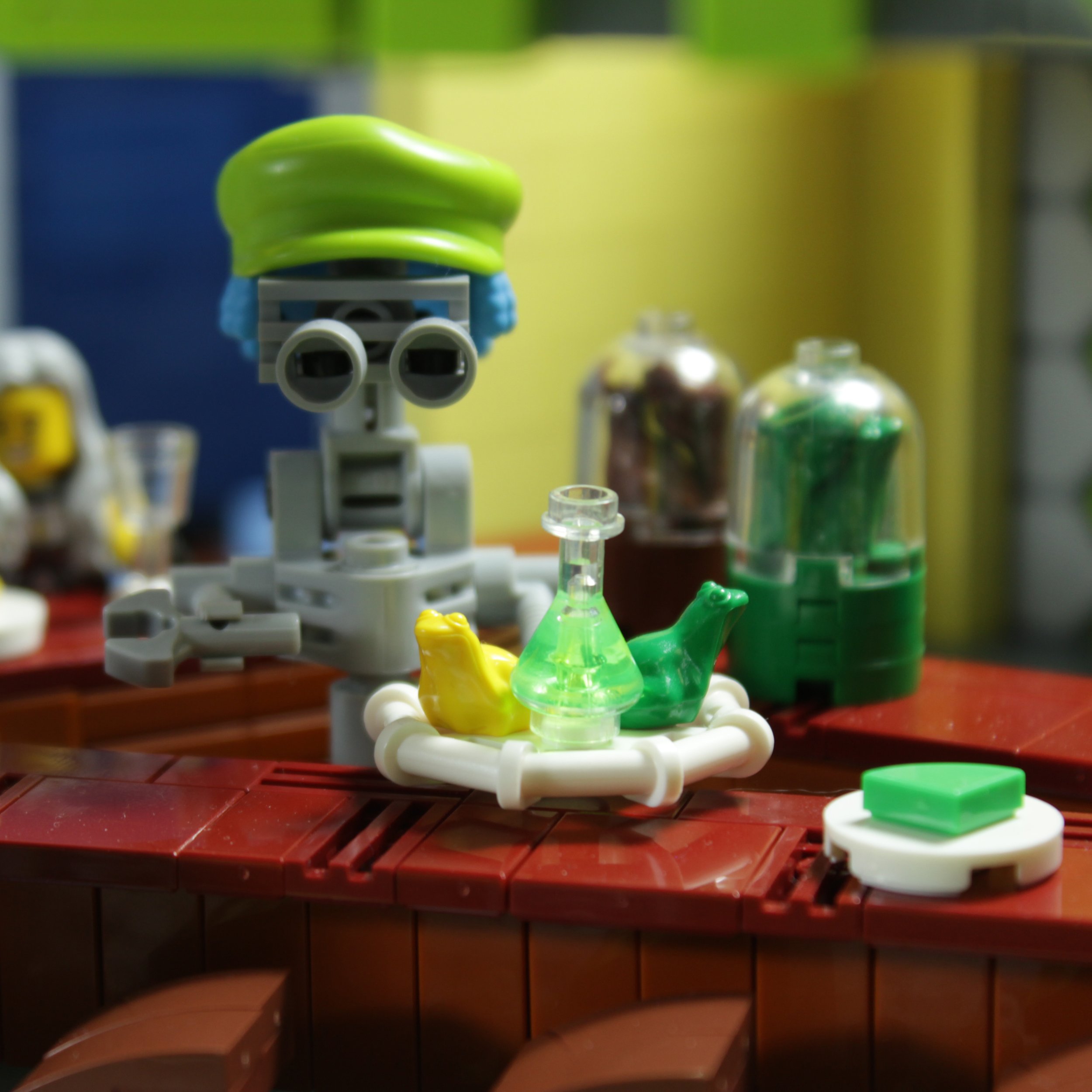
These last shots show some details of the scene as well as the detail of the windows used on the rear building using the perfect match of the Box Vidiyo Window with the 18653 arches.
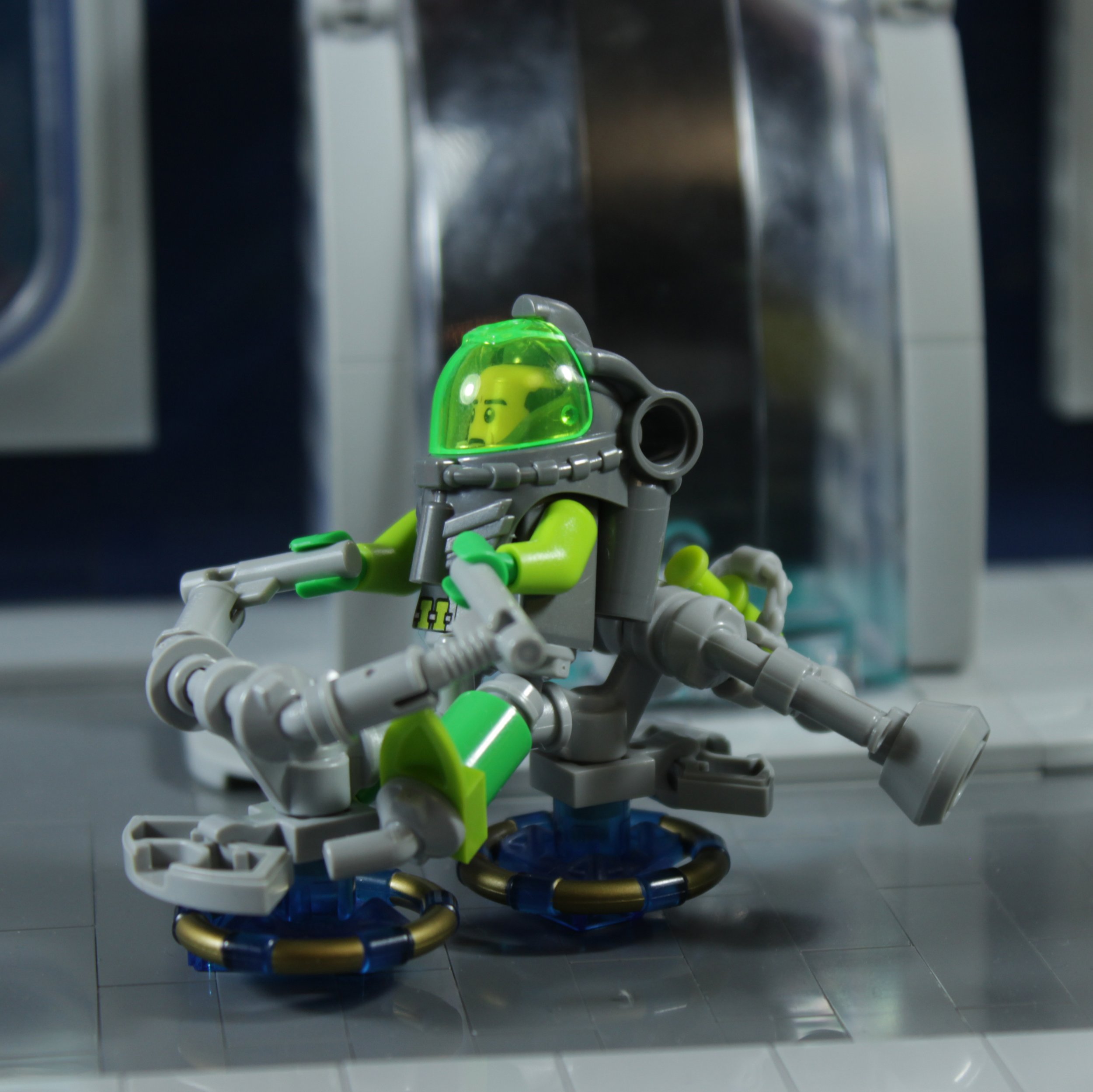
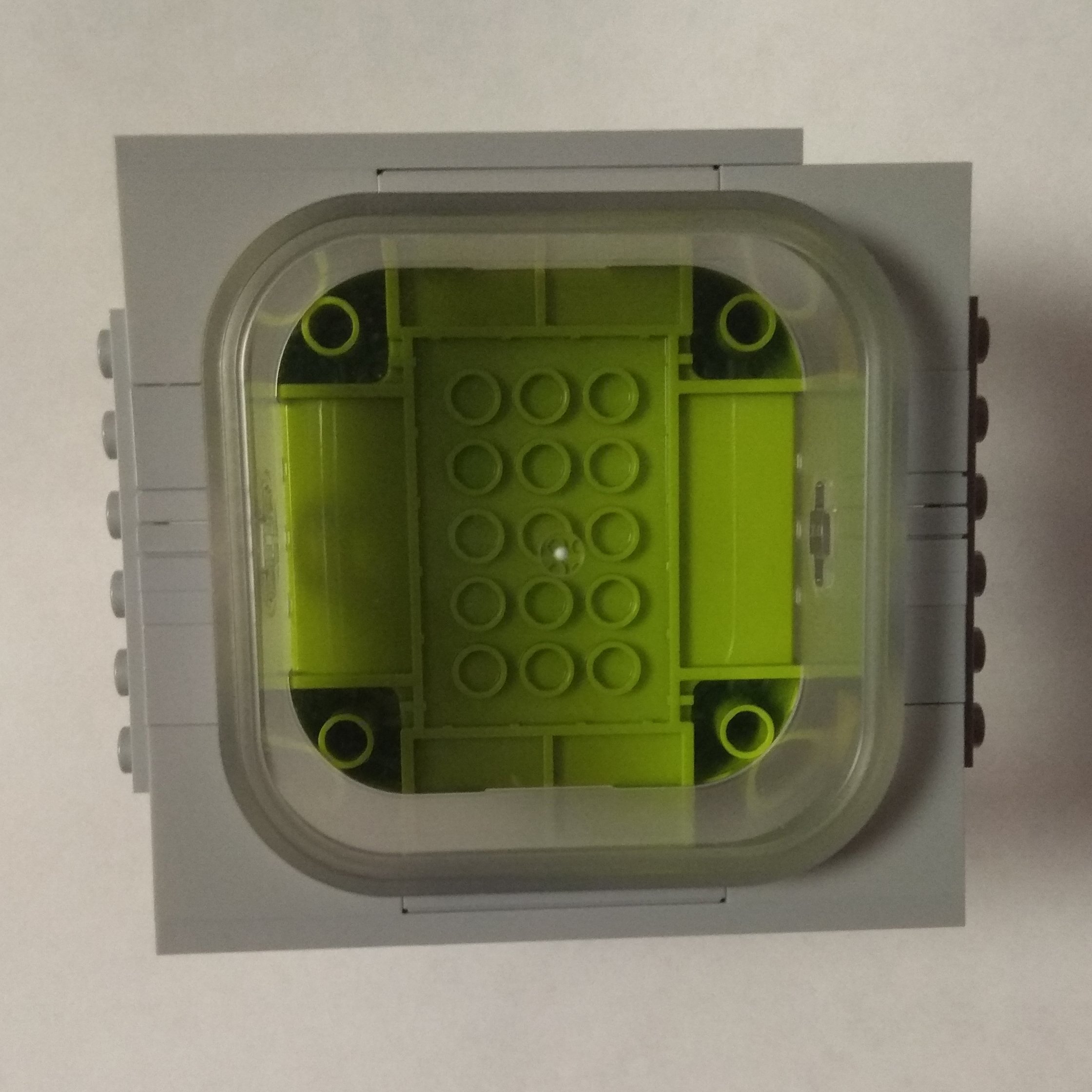
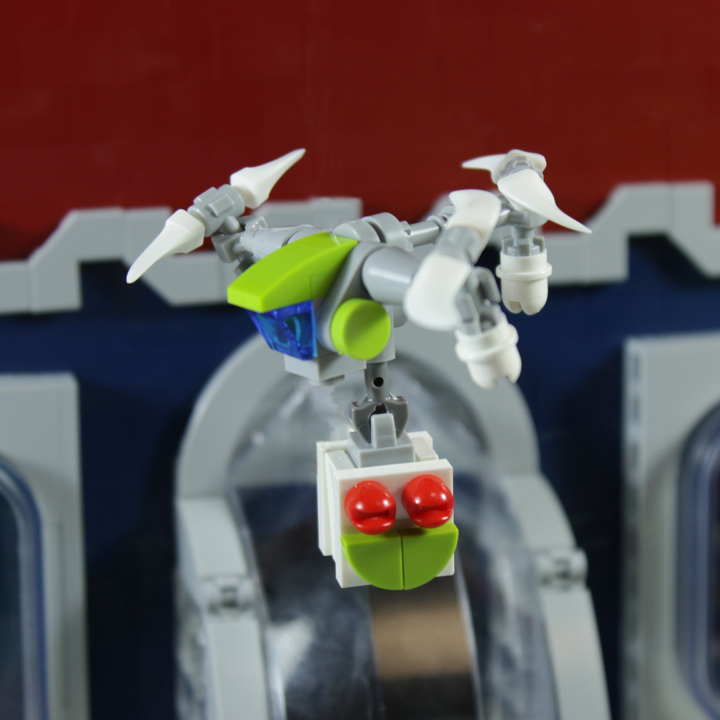
Thanks to my partners Lokiloki, BobDeQuatre and F@bz with whom we won first place in the collaborative category of the Space jam competition!
They helped me with a lot of ideas, techniques and editing to achieve the result of making the original artwork Nighthawks in a LEGO sci-fi scene. Now I just want to visit it in real life!
Best of BrickNerd - Article originally published April 27, 2022.
What is your favorite painting? How do you like your frogs’ legs? Garlic and butter, or deep fried? Do you think you can make your own LEGO version? Leave your thoughts in the comments below.
Do you want to help BrickNerd continue publishing articles like this one? Become a top patron like Charlie Stephens, Marc & Liz Puleo, Paige Mueller, Rob Klingberg from Brickstuff, John & Joshua Hanlon from Beyond the Brick, Megan Lum, Andy Price, Lukas Kurth from StoneWars, Wayne Tyler, Monica Innis, Dan Church, and Roxanne Baxter to show your support, get early access, exclusive swag and more.


