The Conversation Piece #18: Guiding the Eye
/
“The Conversation Piece” is a monthly BrickNerd series about creativity and building with LEGO authored by our friends over at the Builder Improvement Initiative (BII), a Discord-based community that helps LEGO builders of all levels get better at their craft through knowledge-sharing and constructive feedback.
Have a question you would like us to consider for a future article? You can submit it here. Enjoy!
Eye on the Prize: Connecting Focal Points

Previously, we discussed the visual weight of individual components in a LEGO model through methods such as color, size, and texture, as well as elements of visual direction. While these weight elements apply to individual parts (or “objects”) in a build, each one affects the overall composition of a MOC when viewed at the macro level.
In this article, we will examine how to incorporate multiple focal ranges into your builds to create visually pleasing models that convey your story to the viewer.
Relativity of Focus: The First Focal Point
When you first opened this article, or perhaps shortly after a bit of scrolling, you likely skipped over this chunk of text and were immediately drawn to the shapes below. What you didn’t see is a third white square to the left. The center square also looks like a simple outline, while the right looks like three squares stacked on top of each other. Albeit abstract, these squares illustrate the concept that visual weight exists in relativity rather than in isolation. The shapes caught your eye only because they contrast with the white page background. If the whole screen were red, your focus would be shifted to the white and blue elements instead.
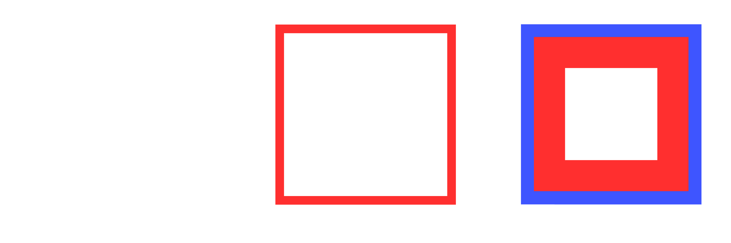
When looking at the squares, you may notice that your eye tends to be drawn to the right set of squares rather than the thin red outline. This illustrates the concept of a focal point: an area where visual weight is strongest. While each object in a composition has visual weight, they can be organized into a visual hierarchy: an organization of focal points based on their weight. These concepts aren’t new: in fact, we discussed them in the last article when we looked at color, size, and texture as elements of visual weight.
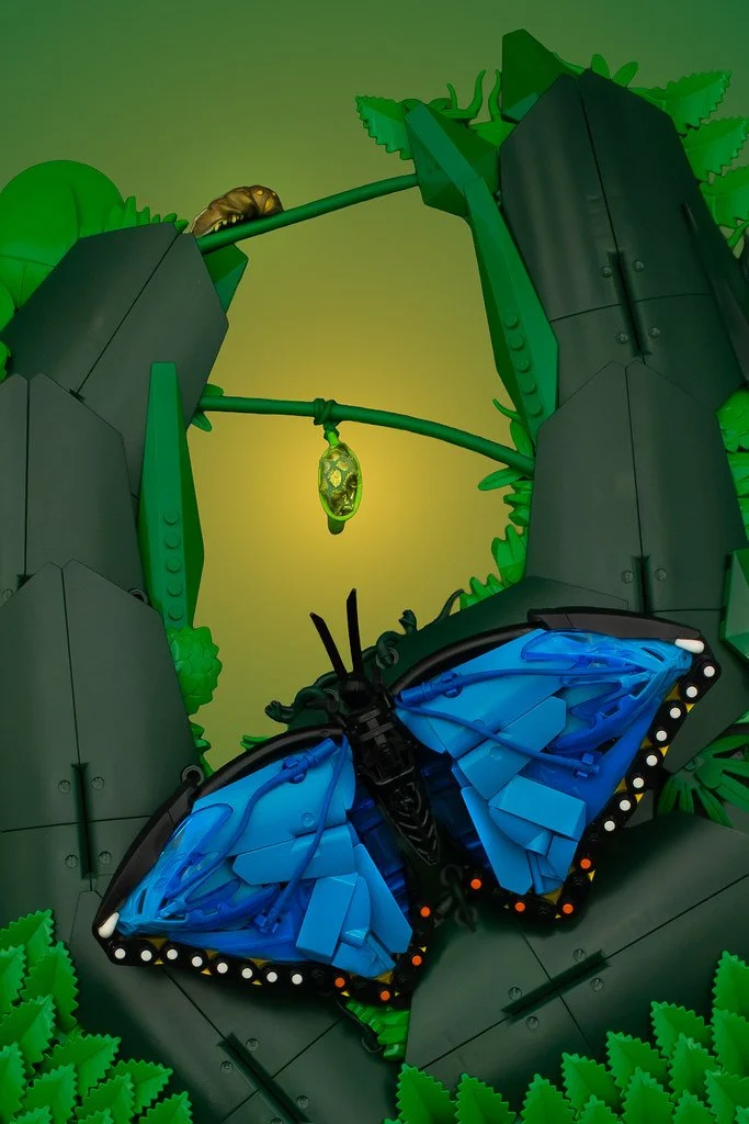
While those elements can be described in isolation, there are a few that can only exist as a relationship between two elements. For example, objects that are higher up in a photo tend to have more visual weight than those below them. Take, for example, “Hanging Out” by Little_Trash_Builder (an ironic name for a talented builder).
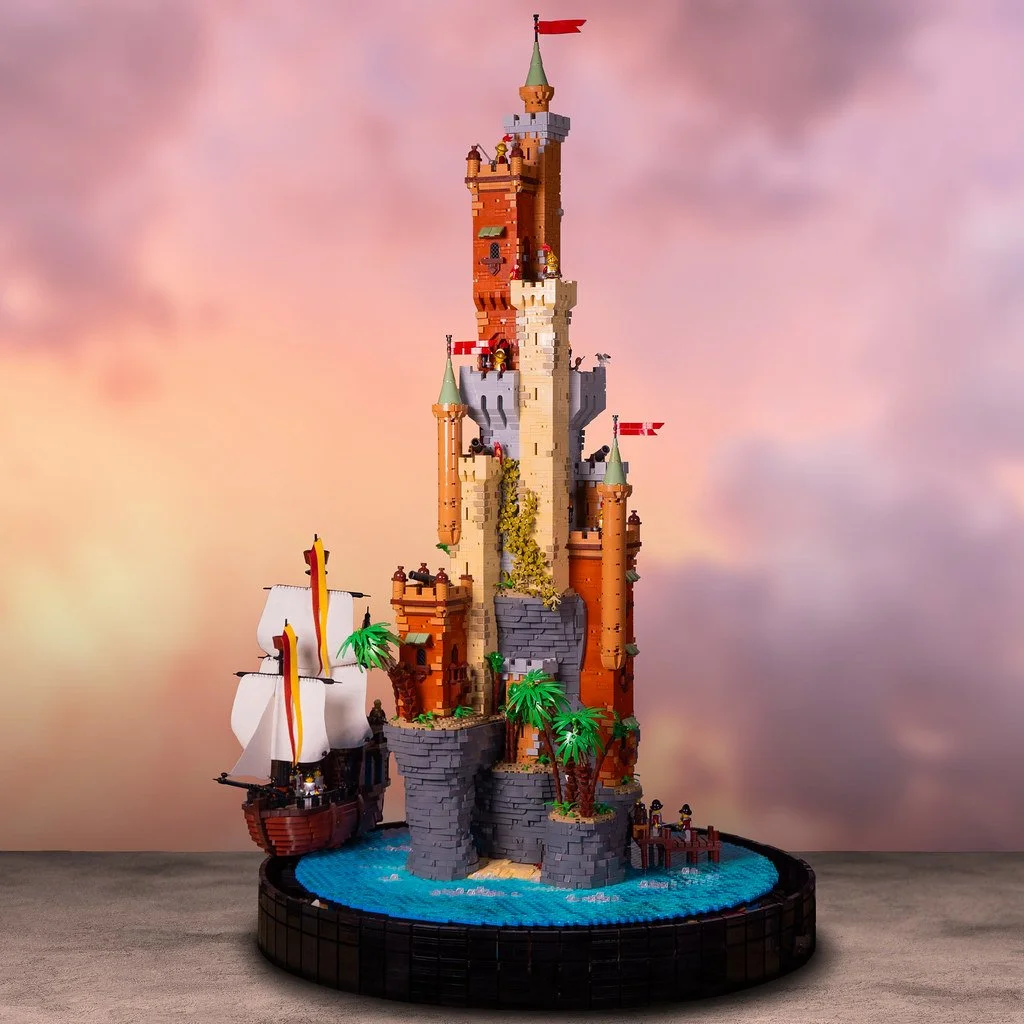
Despite the size and contrast of the butterfly, the viewer naturally gravitates to the top of the composition first and is directed towards the butterfly, fittingly guiding the viewer through each stage of its lifecycle. Similarly, despite CheesyStudio’s bottom-heavy “The Island Castle,” the viewer is initially drawn towards the thinner top of the tower rather than the base. Then, the visual weight of the rocky base and accompanying ship (a result of both size and contrast) pulls the viewer’s gaze toward the bottom.
The use of depth and the relative position of an object between the foreground and background is another example of how elements can have weight in relativity to each other. Joe’s “A Plague Tale: Sorrow” is a great example of this.
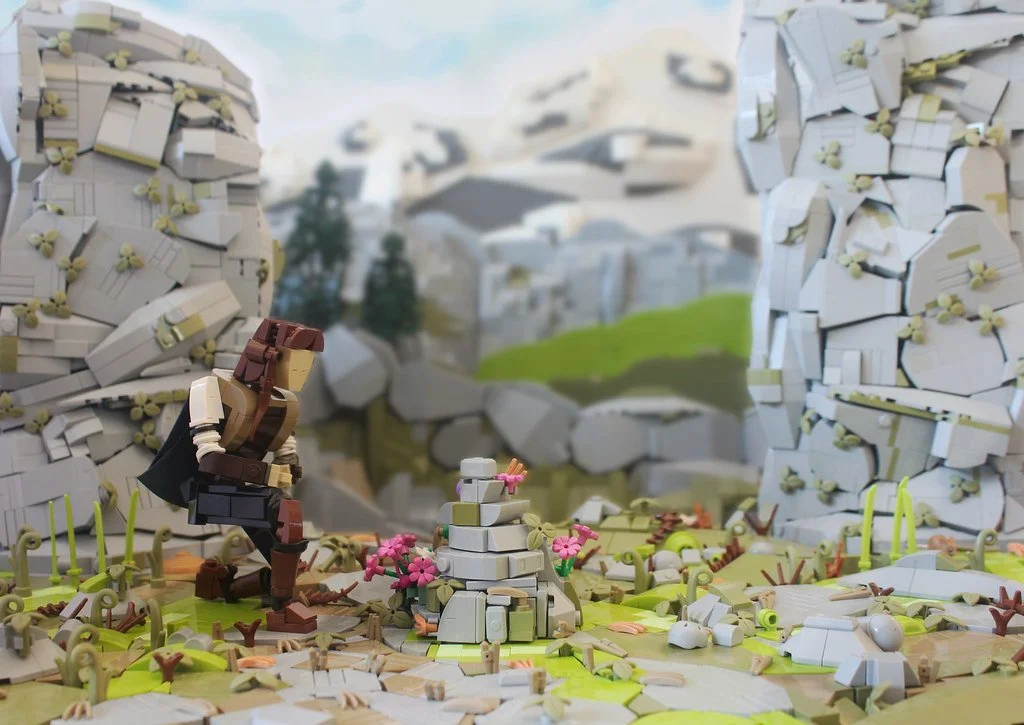
The build can be divided into three zones. The character and grave in the foreground are the first objects the viewer focuses on. The rock walls make up the middle ground and are slightly more blurred, reducing their visual weight. The background is even more blurred, and while it is very well built, is the last thing the viewer focuses on.
The Push-Pull Effect
With an understanding of focal points, visual weight, and visual direction, we can begin to tie these concepts together to explain several phenomena that can make or break a build’s visual impact. Alone, these are useful tools that can help you make more conscious decisions when designing a composition. However, these elements are also incredibly synergistic: together, they are greater than the sum of their parts.
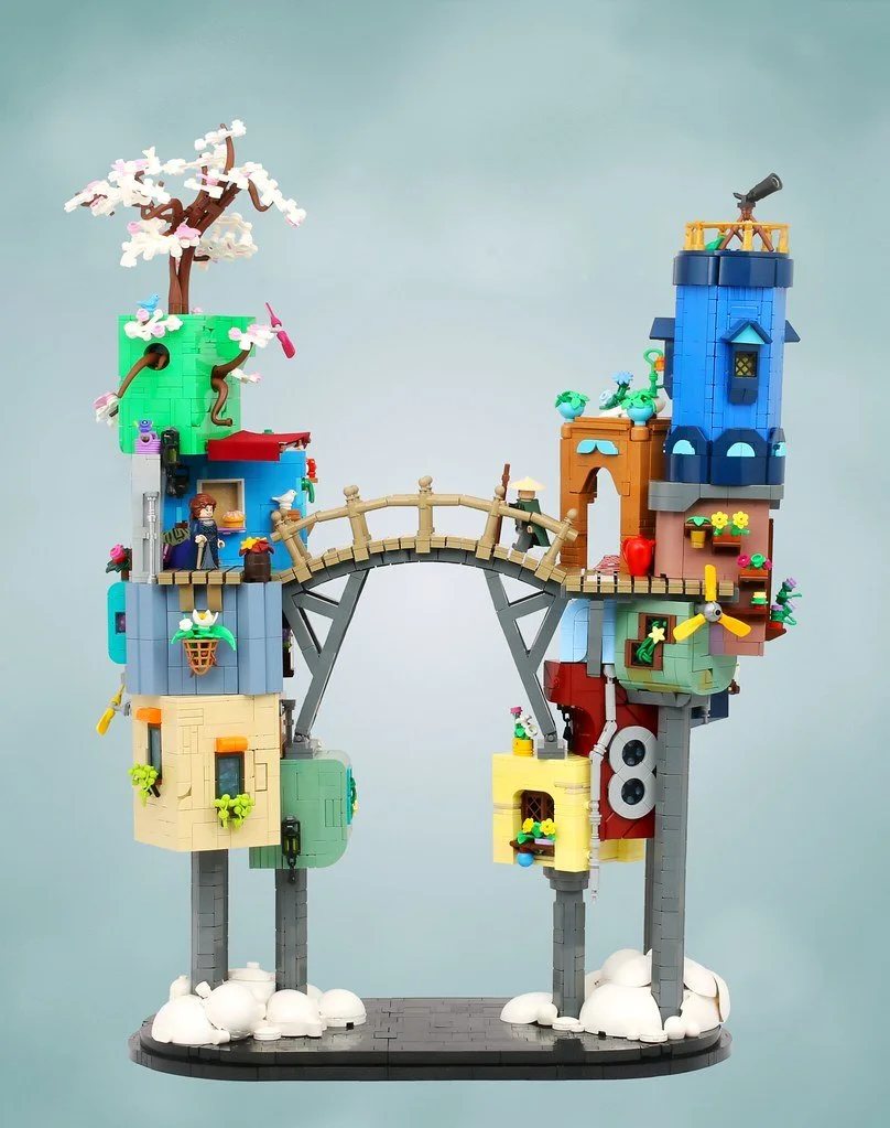
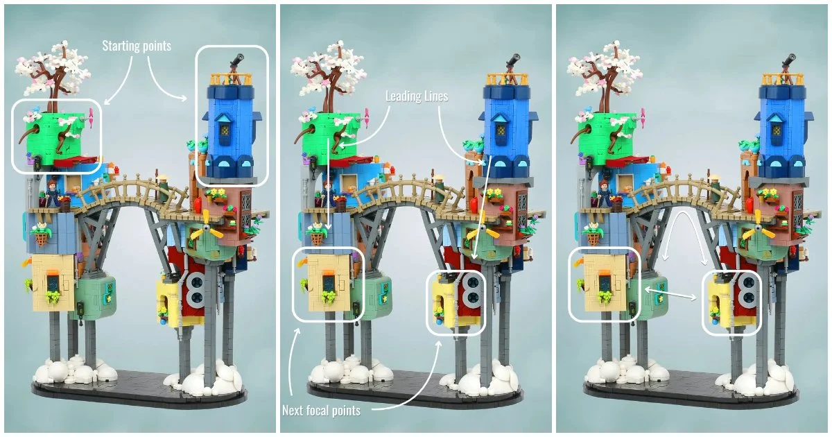
How these elements interact can be described as the Push-Pull Effect. This framework separates elements of a composition into two different categories: objects that push focus, and objects that pull focus. Elements that are focal points are used to grab, or pull, the viewer’s attention. Meanwhile, elements that create visual direction serve to push the viewer’s attention to those focal points. To illustrate these concepts, we will use Roanoke Handybuck and Carter Witz’s “Cloud Life.”
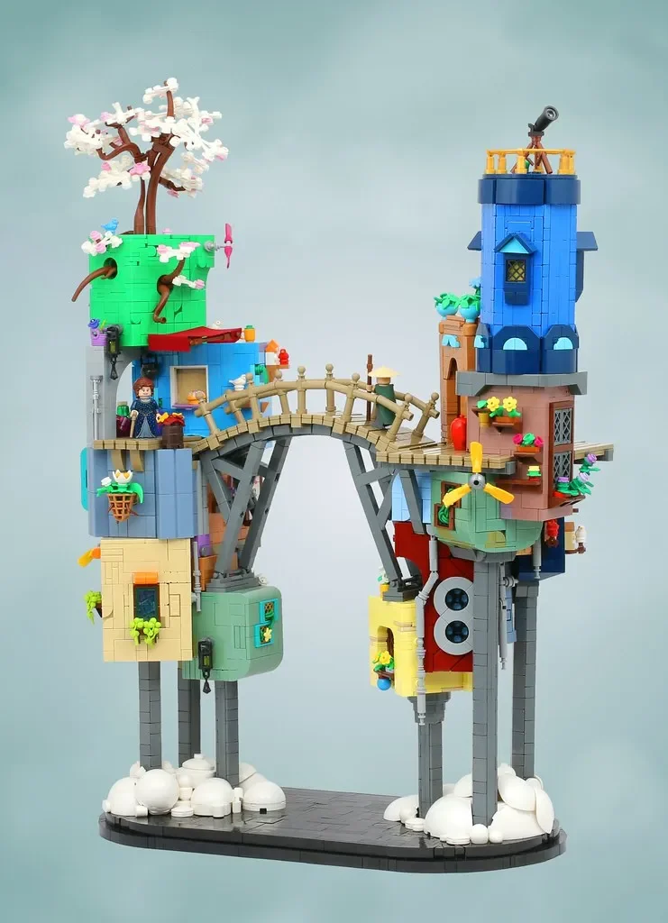
The composition features a handful of colorful, haphazardly stacked buildings that create a slice of a dense, whimsical city above the clouds. The composition has three main focal points that grab the viewer, largely relying on contrast: the green cube on the top left, the blue tower on the top right, and the tan cube on the bottom left. These three buildings stand out amongst the background and the other buildings, which tend to appear more muted or have little contrast with the background. With the green and blue buildings as the topmost elements of the composition, the viewer will likely focus first on one of these two buildings.
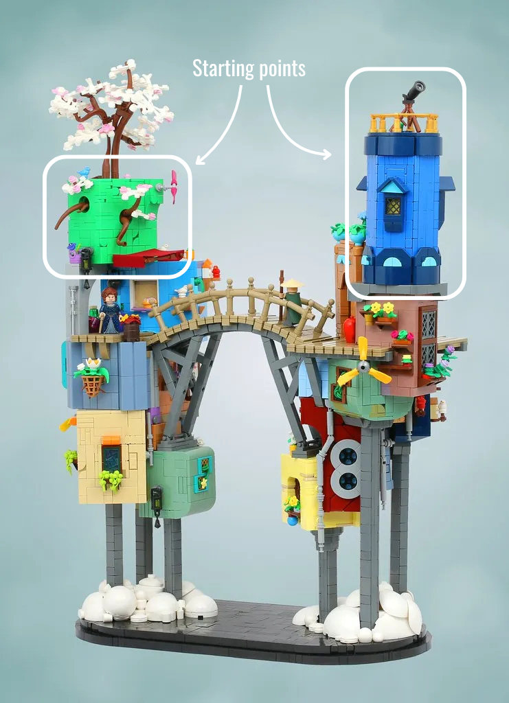
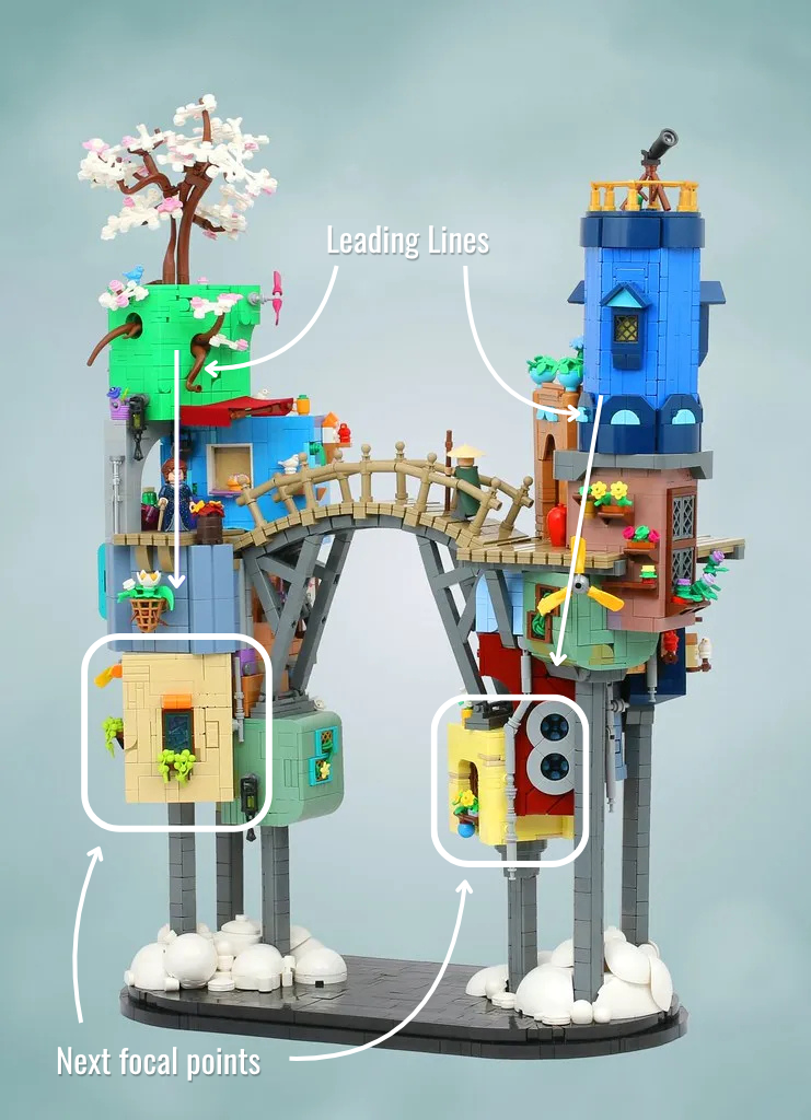
Once the viewer’s attention is drawn to the initial focal point, the other focal points begin to pull the viewer’s attention again. This is where visual direction comes into play. These elements simultaneously push the viewer toward a specific focal range. In this case, the natural leading lines created by the stacked buildings and gray support pillars push the viewer to the focal ranges at the base of the stacks.
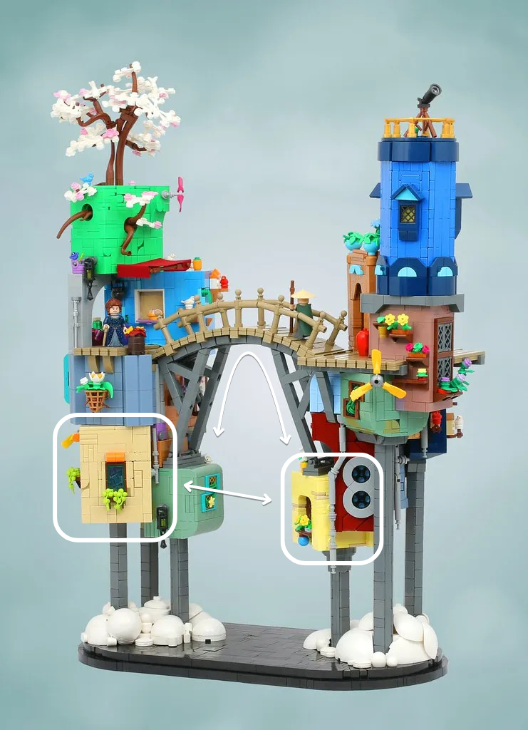
This effect continues until each focal point has had a chance to shine. Once the viewer has focused on the bottom buildings, their attention is pulled to the opposite side and back up to the top, either by immediately jumping between buildings or through the leading lines created by the bridge.
All Pull, No Push: Straining Cognitive Load
The Push-Pull effect explains not only how a composition can be visually pleasing, but also the opposite. If you’ve ever had a build catch your eye but immediately turn you away, it may have stemmed from a build that required too high a cognitive load from the viewer. A build with too many focal points of similar visual weight can confuse the viewer about what is most important and what should be viewed first.
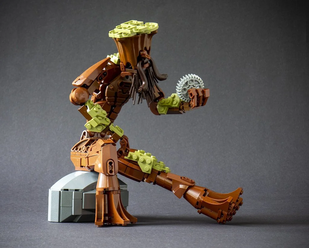
Sometimes a build has you sitting there like this (“Self-Portait as a Wooded Man” by Eero)
John Reiley’s “I SPY Blocks” is a fantastic example of this. Most of the objects are similar in size, quite vibrant, and in the foreground. The result is a multitude of objects with near-equal visual weight and no clear starting point. You may also notice that there are no strong elements of visual direction: even when you focus on an item, nothing guides you to the next focal point.
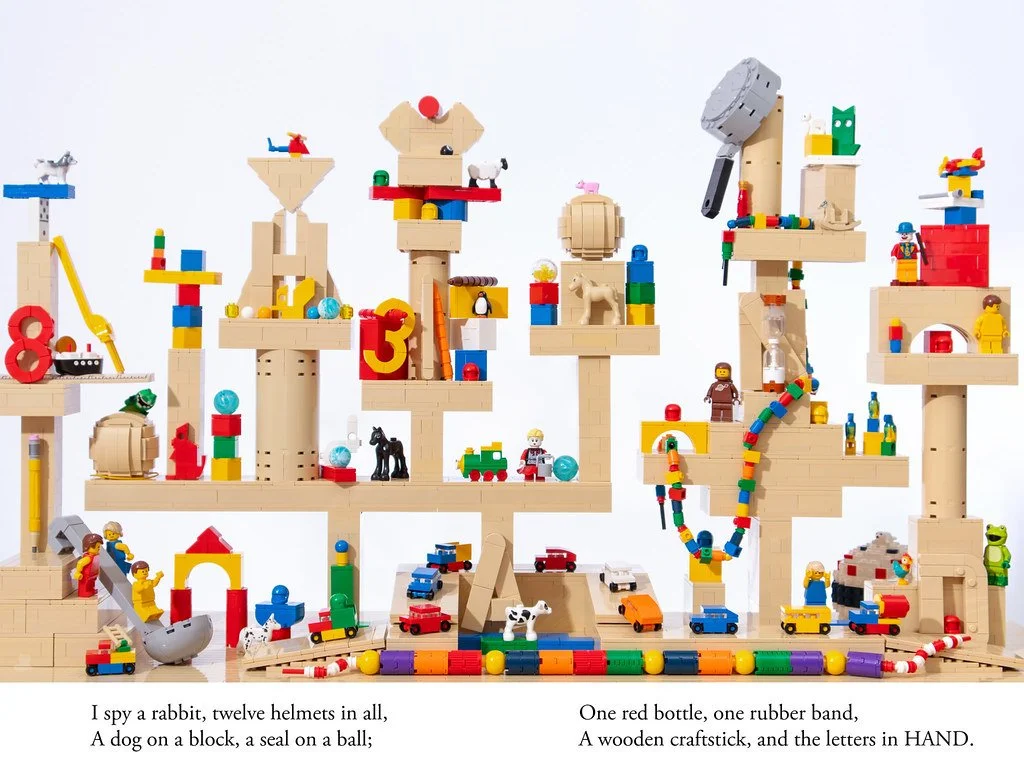
While this illustrates how a poor balance of focal range, visual weights, and elements of visual direction can lead to excessive cognitive load, this is by no means a critique of the build. “I SPY” books are quite deliberately designed to be visually confusing and challenge the viewer’s focus. John’s build perfectly encapsulates the feeling and is a great example of how and when you may want to put a cognitive load on the viewer.
Once again, we can use Roanoke and Carter’s “Cloud Life” as an example, but this time, from a different angle. From this angle, the depth of the build is reduced, and more elements move into the foreground. Additionally, the yellow building in the bottom right takes up more visual space and holds more weight. The bridge, which previously was somewhat lost in the composition, is now front and center and creates a clear silhouette.
With more focal ranges of similar weight, the build's starting point becomes less clear. In the previous angle, each side of the build was much more vertical; in this composition, however, the build sprawls out more significantly. As a result, the leading lines are much weaker and nearly non-existent, especially on the right side.
Putting It Together: Examples
Tim Schwalfenberg’s “Lighthouse” is an excellent case study of how utilizing each of these techniques can create a visually striking build. While the concept itself is nothing incredibly unique, the presentation of the build immediately catches the viewer’s attention. The weight of the main portion of the tower, combined with the stark contrast of white against dark greys and blacks (including the backdrop), guides the viewer to start at the center of the building.
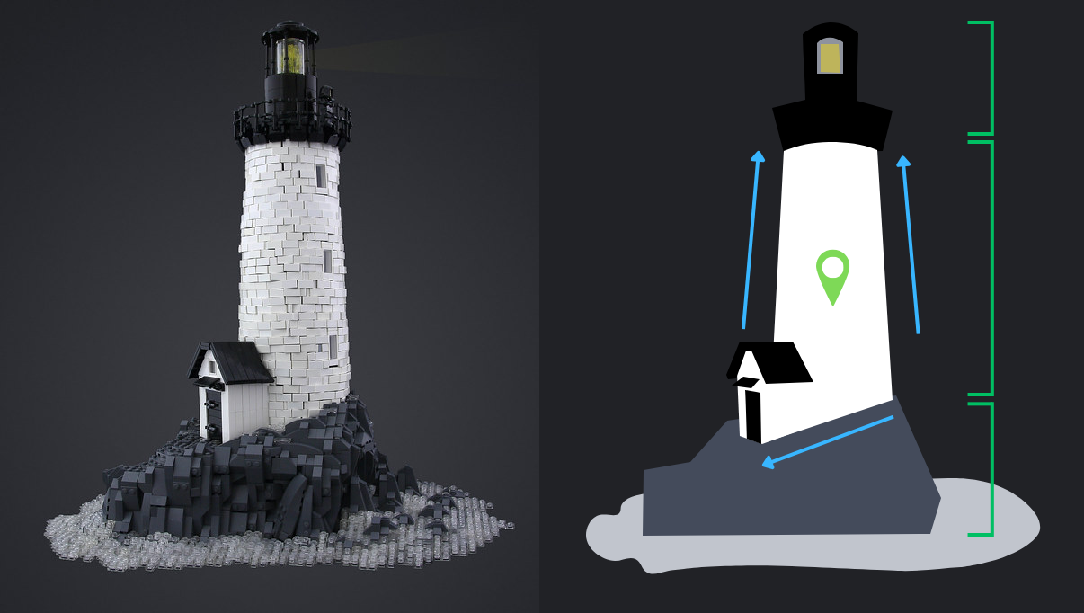
The taper of the tower creates leading lines, ending at the watch and lantern rooms. The weight of the terrain and its contrast with the transparent water help bring the viewer’s attention back to the bottom of the build. Once the viewer’s eyes find the base, the sloped line at the base of the tower finally guides the viewer to the door.
“My Neighbour Totoro” by Jayfa is another masterclass in guiding the viewer through the presentation of a set of builds. The visual weight of the Catbus’s torso and the contrast of the medium nougat and glowing yellow lights catch the viewer’s initial attention. The leading lines created by the curvature of the torso lead to the unmistakable face of Catbus.

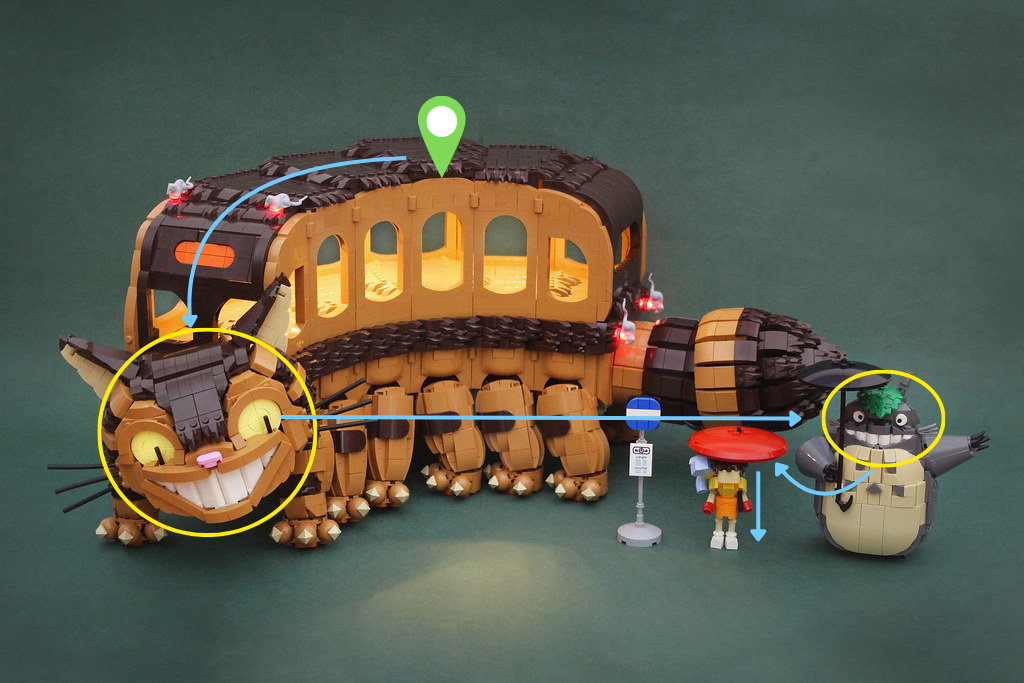
Once the viewer has taken in the phenomenal shaping of the head, the direction of the eyes guides the viewer to look towards the right – right to Totoro, whose grinning face and outstretched arm act as a pull. Finally, the vibrant red umbrella draws the viewer to the final characters: simple yet iconic depictions of Satsuki and Mei!
Our last example is “Japan,” a collaborative build between builders Francis, Eugene, Aleck, Evan, Jack, Marc, and Henry. The scene makes excellent use of depth, leading lines, and visual cues to guide the viewer through the build.
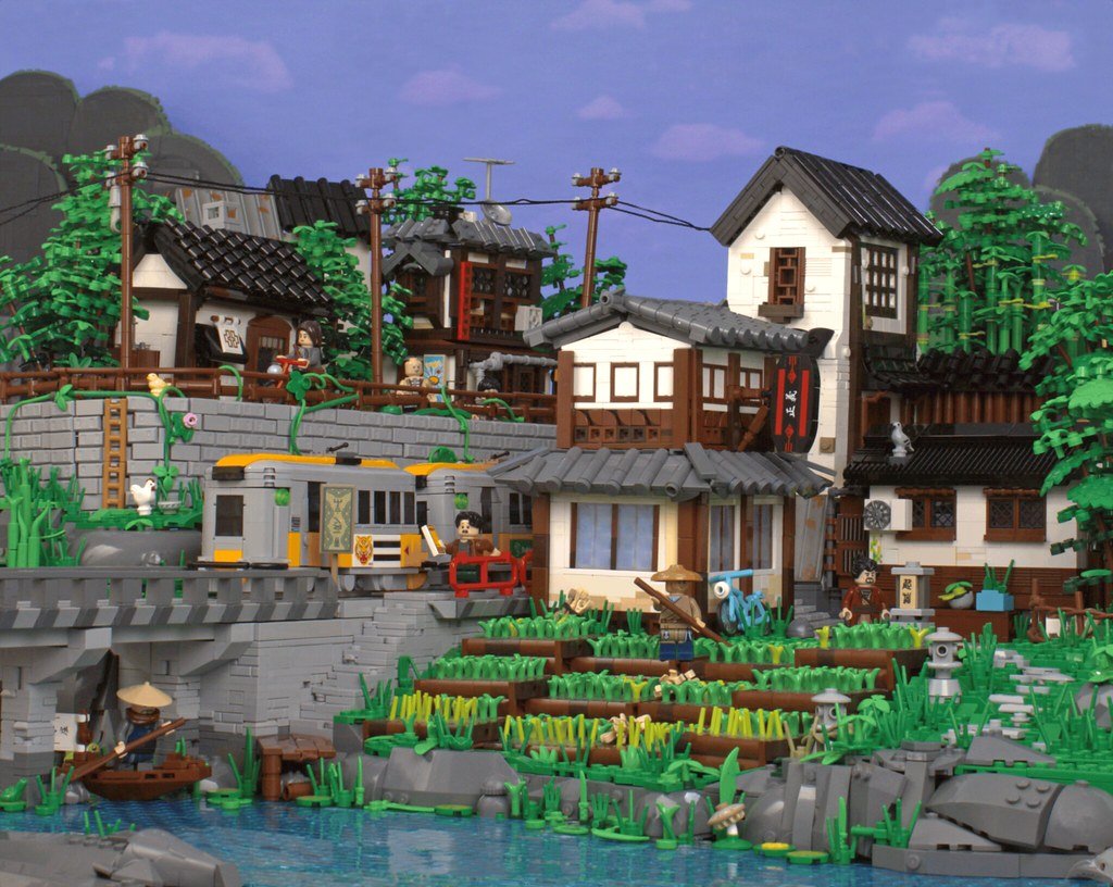
The build can be divided into four distinct “zones,” with Zone 1 being considered the foreground and Zone 4 being considered the background. Most viewers will likely focus on the terraced paddies and main buildings first, then follow the train bridge, then move to the upper town, and finally drift to the sky and mountains. The visual weight and direction of each area help enforce this. Zone 1 has strong visual weight because of its substantial buildings and foreground position, and it features vibrant colors and bright whites.
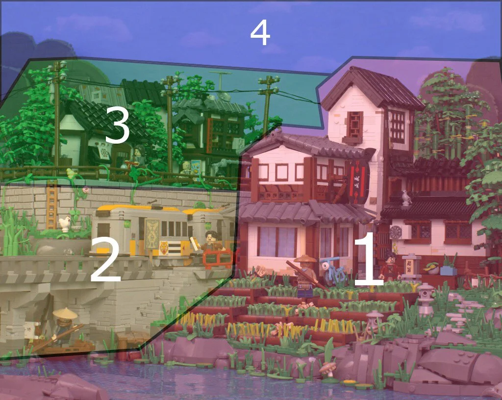
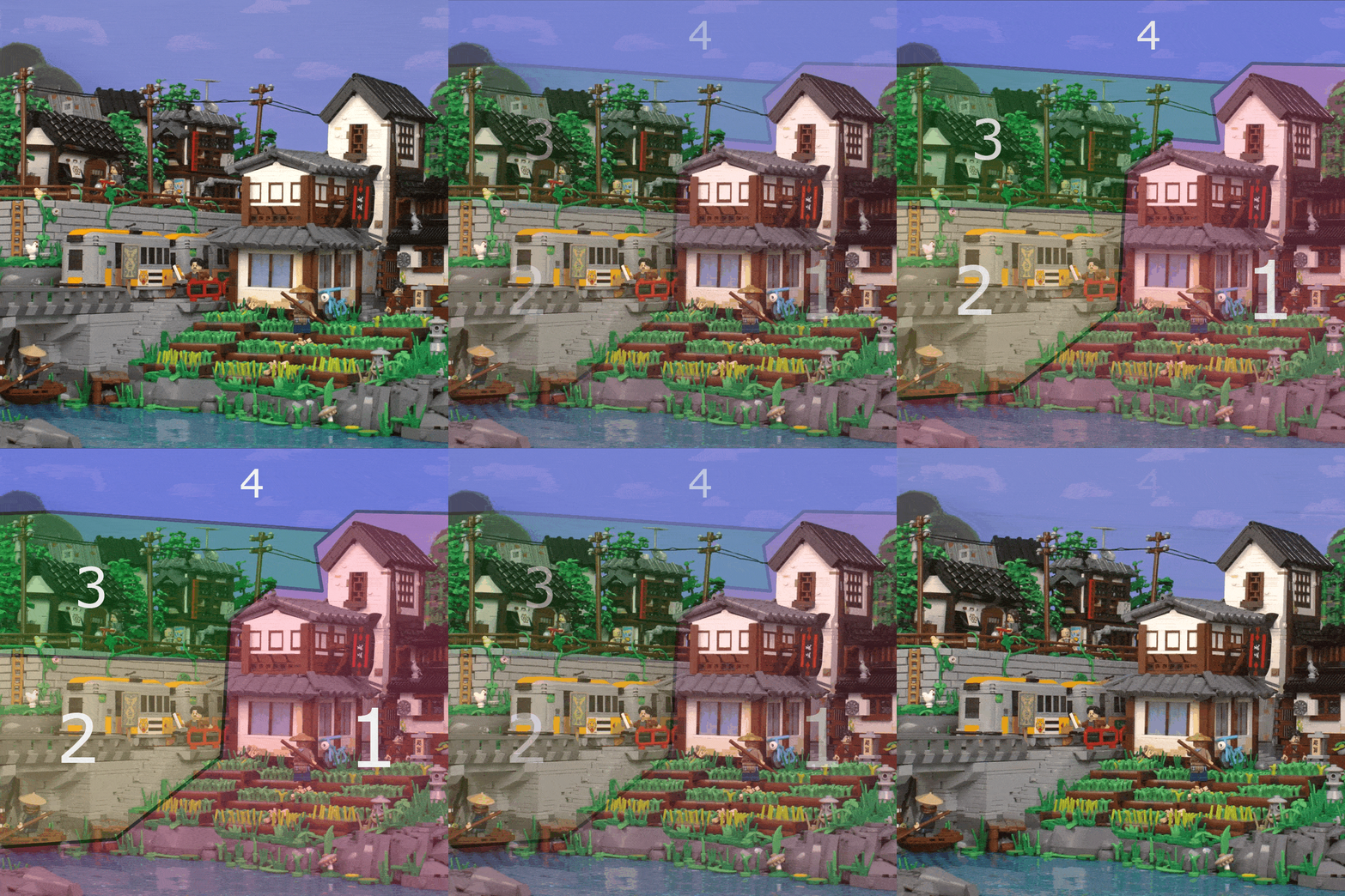
The bridge's leading lines and the train’s direction guide the viewer into Zone 2. Although the zone is smaller, the consistent use of greys creates cohesion, initially appearing as a single connected element. The ladder against the wall acts as a visual cue, leading the viewer to the upper level. Zone 3 begins to leverage camera focal depth, resulting in a slightly blurrier presentation than the rest of the build, and is much darker and more compact, with fewer distinct components. Zone 4 is even more out of focus and carries very little visual weight, giving the rest of the build room to breathe.
Applying Theory to Builds
Often, builders subconsciously use the theories and tools discussed to create interesting, engaging compositions. So, how can you incorporate these techniques into your build process? We’ll discuss a few ways in this final section!
Solving Intangible Problems
One of the most frustrating problems you can stumble upon in a build is the one you can’t explain: something feels off, but you don’t know what. In these instances, you may benefit from evaluating your build’s visual hierarchy: you may find you have too many focal points of similar weight or have put too much into something that should really be a background piece. The feeling of a build being “chaotic” is usually the biggest indicator that this is the case.
What’s the Point? Reinforcing What’s Important
When you start a build, you may have a specific purpose in mind. Leveraging visual hierarchy tools can ensure this purpose shows up in the final build (or inspire you to iterate on it!). During the build process of Eann McCurdy’s “If You Give a Mouse a Cookie,” he knew he wanted to keep the teacher rather high in the visual hierarchy. This was especially important as the build was for his Iron Builder round, and the teacher was a main source of seed part usage.
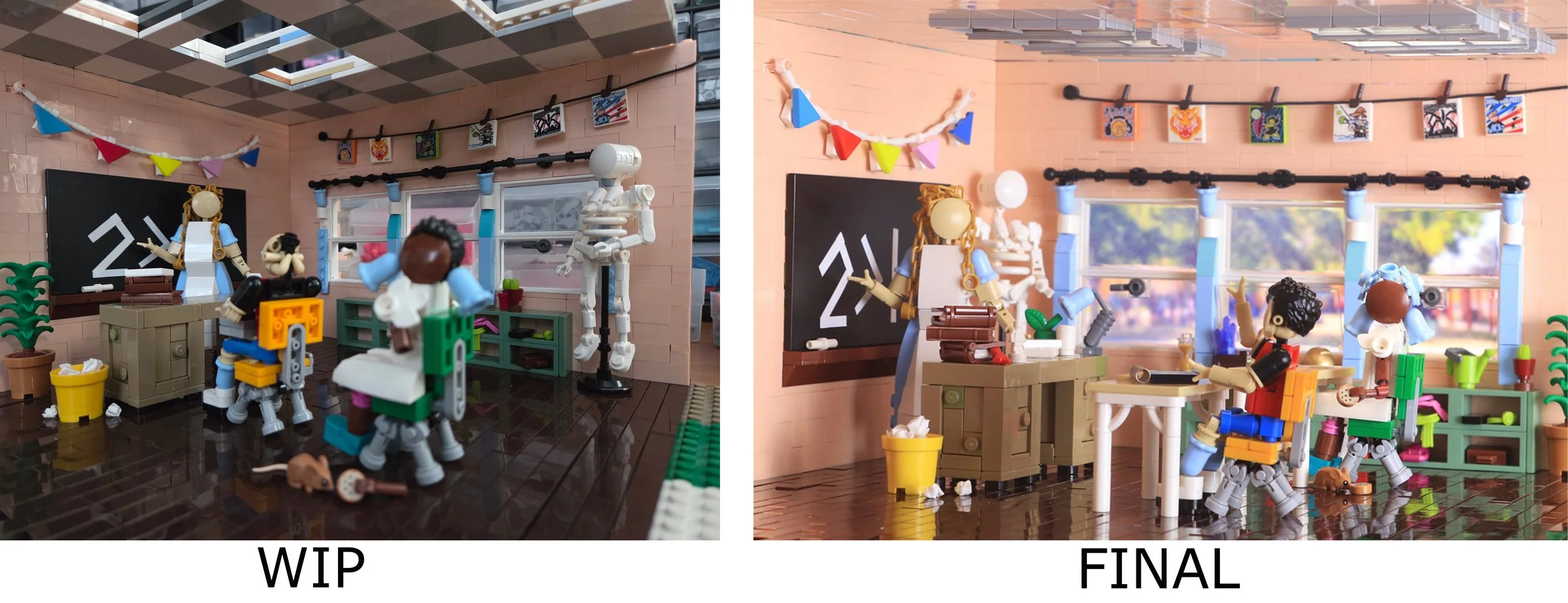
If she were to get lost in the build, the seed part usage would suffer with it, and in early WIPs, this is exactly what happened. By adjusting the angle and repositioning the items in the build, the visual weight of the students and background objects was reduced, and the teacher was more immediately visible.
Ordering Events: Visual Storytelling
Visual storytelling is a powerful tool and can make for engaging builds. By employing visual hierarchy, you can influence how a viewer interprets a story. Kit Nugent’s “Nosy Neighbors” is an excellent case study. Typically, the first focal point signals who the story's “main characters” are. In “Nosy Neighbors,” two parties are involved: a group of kids and a temple golem.
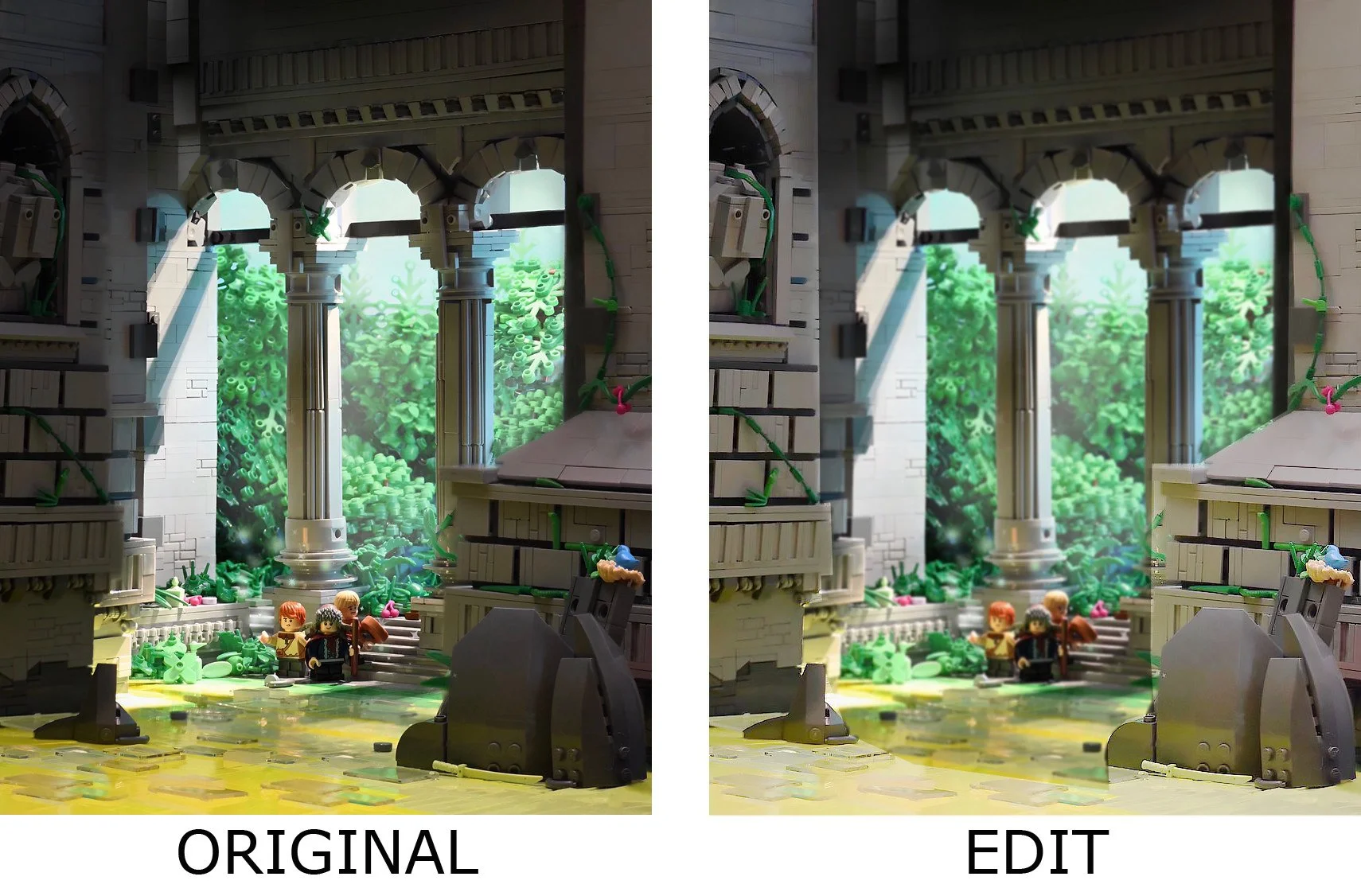
In the original build, the first focal point is the entrance, telling a story of a group of kids who wander into a large, mysterious temple. The golem sits lower in the visual hierarchy and feels more mysterious (and perhaps foreboding). If Kit wanted to tell the story of a golem awoken by a group of trespassing kids instead, he could have switched the characters’ places in the visual hierarchy and made the foreground heavier than the background.
The Artist’s Unconscious Mind
The concepts discussed are not new: in fact, you probably already employ them to some extent. But by keeping these concepts in the background of your mind, you may find yourself beginning to consciously make design decisions that strengthen your composition. Humans have an innate skill at noticing when things are “wrong,” but in the moment, it can be harder to put your finger on the root issue. With an understanding of visual hierarchy, you may find you can identify these issues much faster!
Written by Eann McCurdy in collaboration with Julian Collins, Stanley Combes, Isaiah Kepner, Simon Liu, Oshi White, and Jake Semrow.
Have you ever changed a LEGO build because the viewer’s eye was being drawn to the wrong thing? Let us know in the comments below!
Do you want to help BrickNerd continue publishing articles like this one? Become a top patron like Paige Mueller, Rob Klingberg from Brickstuff, John & Joshua Hanlon from Beyond the Brick, Megan Lum, Andy Price, Lukas Kurth from StoneWars, Wayne Tyler, Dan Church, Roxanne Baxter, and Marci Hollingsworth to show your support, get early access, exclusive swag and more.